Blue kitchens are one of the most searched design directions heading into 2026, but choosing the wrong shade, finish, or pairing turns a bold decision into an expensive regret. This guide covers 18 specific blues kitchen ideas with practical guidance on which shade works in which space, what to pair it with, and what common mistakes to avoid so your kitchen looks intentional from day one.
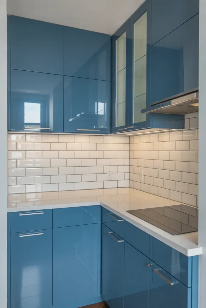
1. Navy Lower Cabinets With White Uppers to Add Drama Without Closing In a Small Kitchen
Two-tone cabinetry, where the lower cabinets are painted navy and the uppers remain white or off-white, is one of the most practical blues kitchen ideas for rooms under 150 square feet. The dark color grounds the lower half of the kitchen and creates visual weight at the base without pulling the ceiling down. White upper cabinets keep the upper portion of the room open and reflective, which prevents the navy from making the space feel smaller than it is.
This layout works in galley kitchens, L-shape kitchens, and compact open-plan kitchens with equal effectiveness. The dividing line between the two tones typically falls at the countertop level, which reinforces the horizontal layering that makes the room feel wider rather than taller.
The mistake to avoid is using a navy with strong purple undertones paired with a cool stark white. The two clash in certain lighting conditions. Instead, pair a navy with slight green or black undertones, such as a blue-black or ink navy, with a warm white or cream upper cabinet finish for consistency across lighting.
When to use it: Any kitchen under 200 square feet where a full dark cabinet treatment would feel oppressive. Also effective in open-plan kitchens where the lower cabinet line is the most visible surface from the adjoining living space.
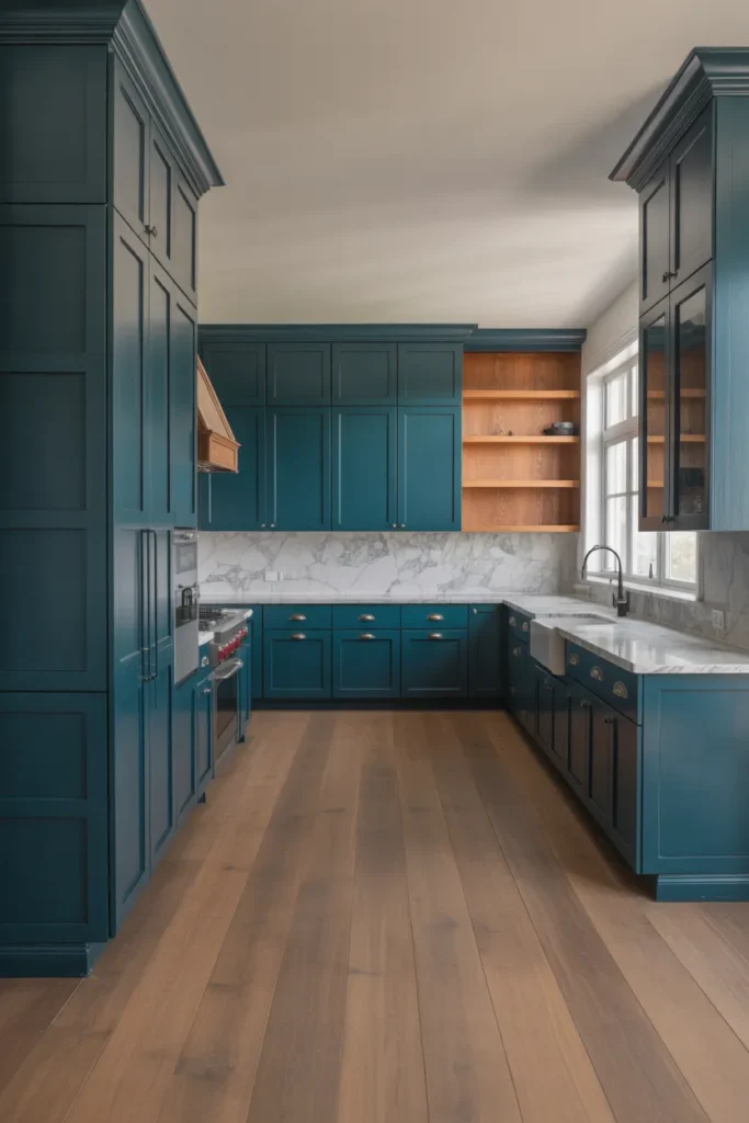
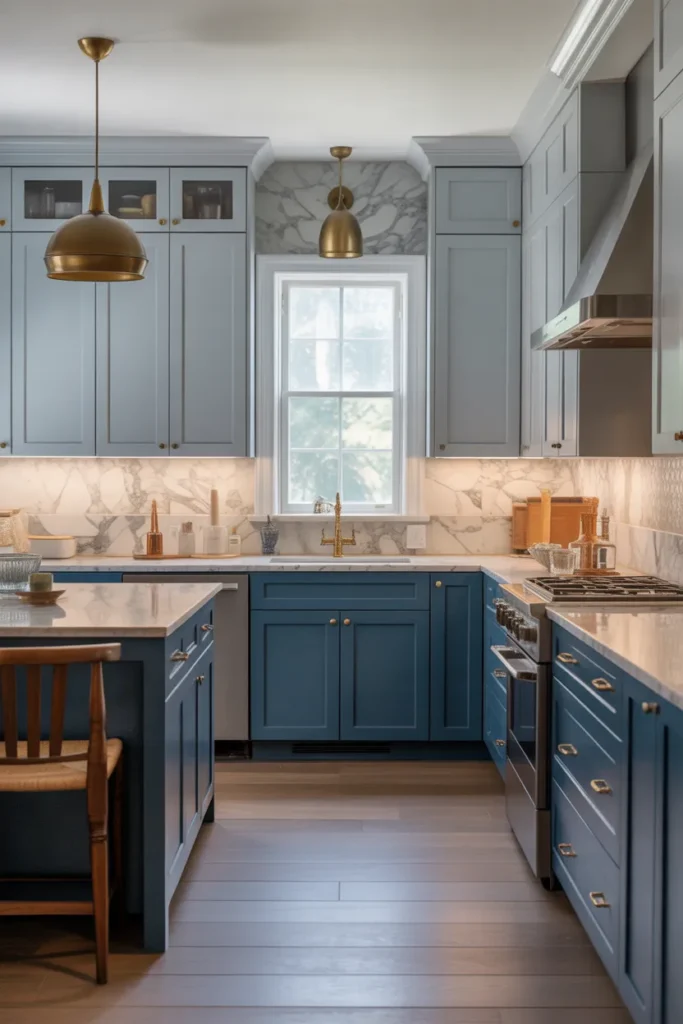
2. Slate Blue Cabinets With Warm Brass Hardware for a Kitchen That Feels Timeless
Slate blue sits between grey and blue on the spectrum, which makes it one of the most versatile and forgiving shades in blues kitchen design. It works in north-facing kitchens that receive cooler light, where a true navy or cobalt would turn murky. Slate blue holds its clarity in lower light conditions because its grey content prevents it from shifting toward purple or black the way pure blues often do.
Pairing slate blue with warm brass or unlacquered brass hardware adds a warmth that the cool cabinet color alone cannot provide. This combination reads as timeless rather than trend-driven, which matters in a space where cabinetry typically stays unchanged for ten or more years.
Avoid pairing slate blue with cool chrome or brushed nickel hardware. The two cool tones together create a flat, one-note result. The contrast between the blue-grey cabinet and the warm brass is what gives the kitchen its depth.
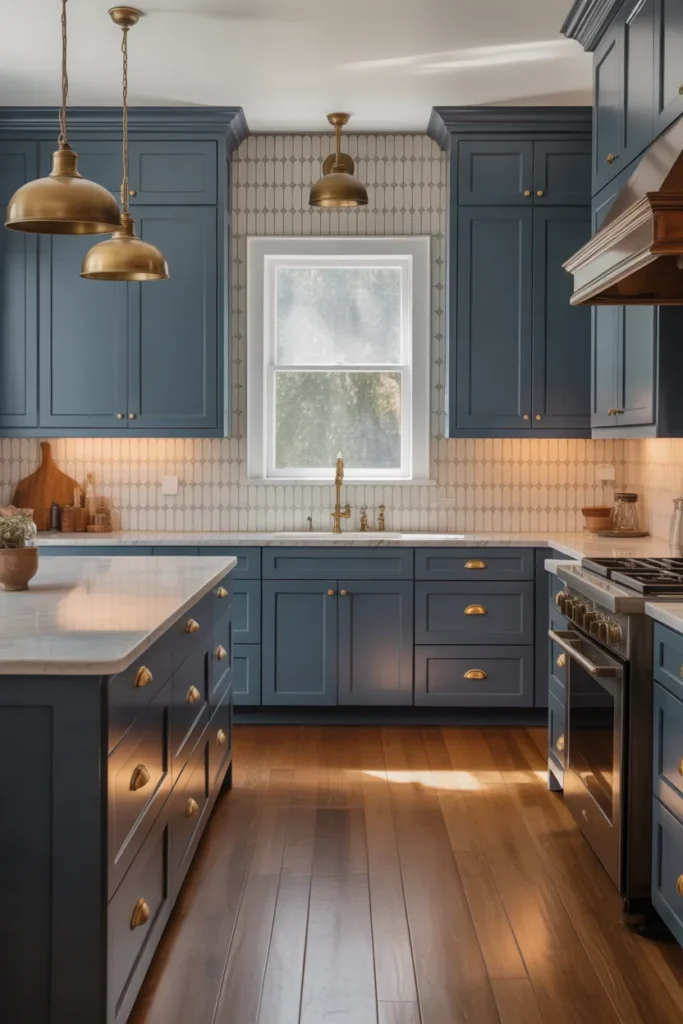
When to use it: North-facing or interior kitchens with limited natural light. Also a strong choice for homeowners who want blue cabinets but are uncertain about committing to a stronger shade. Slate blue is the most neutral entry point into the blue kitchen category.
3. Powder Blue Cabinets in a Bright, All-White Kitchen to Add Color Without Commitment
Powder blue is the softest entry point in the blue kitchen spectrum. Used on a single run of lower cabinets, an island, or a pantry wall in an otherwise white kitchen, it introduces color in a way that feels fresh and considered rather than bold or risky. This is one of the most approachable blues kitchen ideas for homeowners who want to move away from all-white but are not ready for a saturated shade.
The key is keeping everything surrounding the powder blue cabinets genuinely white rather than off-white or cream. Powder blue reads cleanest against true white because both colors share a cool, bright quality. Against cream or warm white, powder blue can look washed out or tonally disconnected.
Powder blue works particularly well in kitchens with abundant natural light. In darker rooms, it can lose its crispness and read closer to grey than blue. If your kitchen faces north or has limited window area, consider stepping up to a slightly more saturated sky blue to maintain the same fresh quality under lower light conditions.
When to use it: Bright, south or east-facing kitchens in homes with a clean, airy aesthetic. Also effective in coastal or cottage-style homes where the lightness of the shade reinforces the overall design direction.
4. Deep Teal Kitchen Cabinets to Bridge Blue and Green in an Open-Plan Space
Teal occupies the intersection of blue and green, which makes it one of the smartest blue-adjacent kitchen colors for open-plan homes where the kitchen needs to visually connect with an adjoining living or dining space. If the living room contains any green, sage, or olive tones in its upholstery or soft furnishings, teal cabinet color will bridge those spaces naturally rather than clashing with them.
Full teal cabinetry, floor to ceiling, works well in kitchens that have strong natural light or white walls and ceilings throughout. The depth of the color needs light to prevent the kitchen from looking like a separate, dark room within the open plan. A large window over the sink or a skylight compensates significantly for the saturation of the cabinet color.
Pair teal cabinets with natural stone countertops in warm white or soft beige rather than grey. Grey countertops with teal cabinets shift the overall palette too far toward cool and create a clinical rather than welcoming atmosphere.
When to use it: Open-plan homes where the kitchen, dining, and living areas share continuous floor space and a unified color story is required. Also effective in homes with existing green-toned soft furnishings that need a kitchen color to anchor the palette.
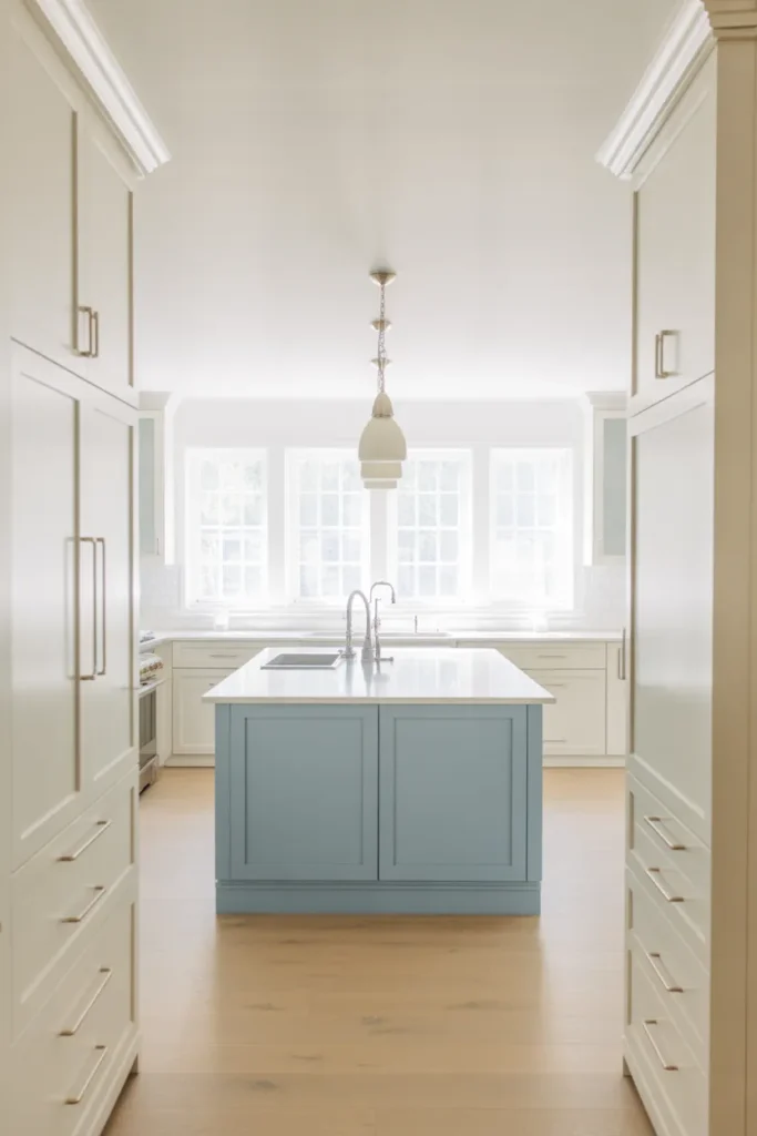
5. Cobalt Blue Island in a White Kitchen to Create a High-Contrast Focal Point
A cobalt blue island in an otherwise all-white or neutral kitchen is one of the most direct and highest-impact blues kitchen ideas for homeowners who want color without repainting all of their cabinetry. The island becomes an unambiguous focal point, and because it is a freestanding or semi-freestanding element, it can theoretically be repainted in the future if design preferences shift.
Cobalt is a true, saturated mid-blue with no significant grey, green, or purple content. It reads strongly even in lower light conditions and holds its vibrancy in photographs, which also makes it one of the most Pinterest-friendly kitchen color choices currently trending in blue kitchen design 2026. It pairs well with warm brass, polished gold, or even warm copper hardware.
The island countertop material matters significantly with cobalt. White quartz or white marble keeps the contrast sharp and the overall palette clean. A butcher block or warm wood countertop softens the cobalt and makes the island feel warmer and more casual. Choose based on the overall tone of the kitchen, clean and graphic versus warm and livable.
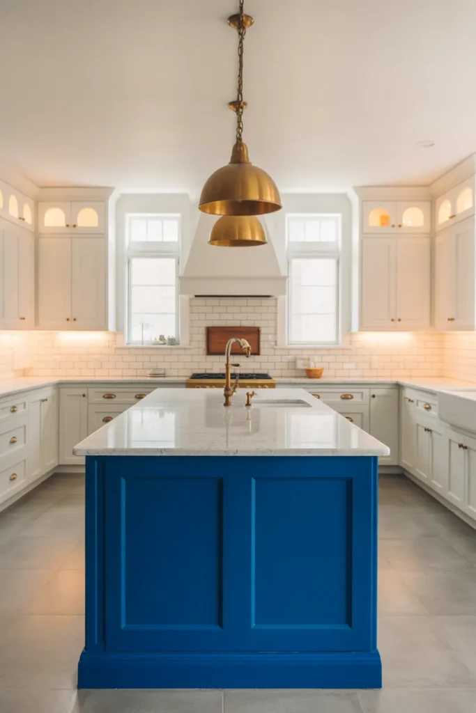
When to use it: Any kitchen with a freestanding or clearly defined island where an accent color is appropriate. Works in both large and medium kitchens. Not recommended for galley kitchens where there is no room for an island as a separate visual element.
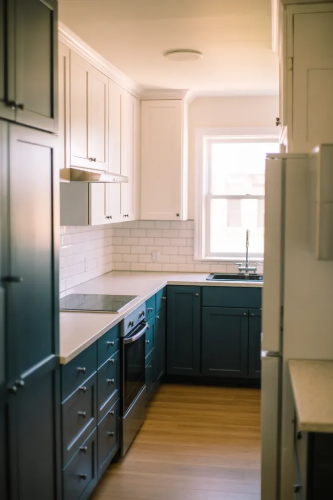
6. Denim Blue Cabinets With Matte Black Hardware for an Industrial-Modern Kitchen
Denim blue is a mid-saturated, slightly faded blue with a casual quality that works well in kitchens aiming for an industrial-modern or transitional aesthetic. Unlike navy, which is formal, or powder blue, which is soft, denim blue reads as confident without being demanding. It pairs naturally with matte black hardware, open steel shelving, and concrete or terrazzo countertops.
This combination is particularly effective in urban apartments and loft-style homes where the kitchen is visible from the main living area and the overall design direction leans industrial. The denim blue softens the industrial elements enough to make the kitchen feel livable rather than cold.
Avoid pairing denim blue with warm brass hardware. The combination works with more saturated blues but with denim, the faded quality of the blue and the warmth of the brass pull in different directions and the result feels tonally confused. Matte black or dark bronze are the most consistent hardware choices for this specific shade.
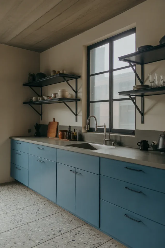
When to use it: Apartments, urban homes, or any kitchen where the design leans industrial, transitional, or modern farmhouse. Also a strong choice for kitchens with exposed brick, concrete walls, or black steel window frames that already establish an industrial context.
7. Light French Blue Cabinets to Warm Up a Kitchen With Cold North-Facing Light
French blue is a desaturated, slightly warm blue that historically reads as sophisticated and calm rather than bold or contemporary. In north-facing kitchens that receive predominantly cool, indirect daylight, French blue performs better than most other blue shades because its slight warmth prevents it from reading as cold or grey under low-light conditions. This makes it one of the most reliable blues kitchen ideas for difficult lighting situations.
French blue pairs naturally with aged brass, matte gold, or oil-rubbed bronze hardware. White or linen countertops keep the look fresh. A natural stone backsplash in cream, beige, or warm grey completes the palette without introducing competing tones.
This shade has a long precedent in European kitchen design, which gives it a sense of permanence and legitimacy that more trend-driven colors lack. It is a lower-risk choice for homeowners who want blue cabinets but are concerned about the color dating quickly.
When to use it: North-facing kitchens with limited natural light. Also appropriate for homes with a traditional, European-influenced, or transitional design aesthetic where a softer, more historical blue is more consistent with the architecture than a contemporary saturated shade.
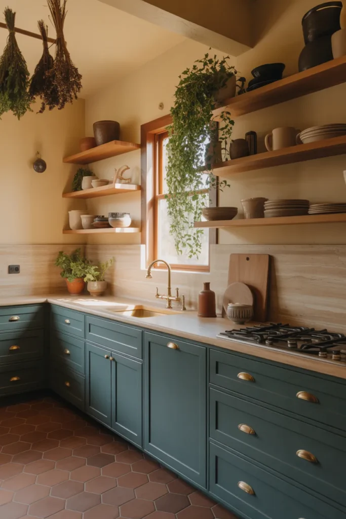
8. Blue-Green Sage Kitchen Cabinets for an Earthy, Nature-Influenced Color Story
Blue-green sage sits at the cooler end of the sage spectrum and reads as simultaneously blue and green depending on the surrounding light and materials. In a kitchen context, this ambiguity is an asset. It connects the blue kitchen trend with the earthy, organic material trend, making it one of the most current blues kitchen ideas for 2026 in homes that blend natural materials with contemporary forms.
Blue-green sage works especially well with unlacquered brass, warm wood open shelving, terracotta floor tiles, and natural stone countertops. The overall palette reads as organic, grounded, and considered. It suits design aesthetics that lean Mediterranean, Californian, or modern earthy.
The risk with blue-green sage is that it can shift significantly between artificial and natural light. Under warm incandescent or LED lighting, it reads predominantly green. Under natural light, the blue component becomes more apparent. Test this color on a large sample board under both light conditions before committing to the full kitchen.
When to use it: Kitchens with warm material surroundings, terracotta, wood, natural stone, where a pure blue would feel disconnected from the overall earthy palette. Also effective in homes with indoor plants as part of the decor, where the cabinet color reinforces the natural theme.
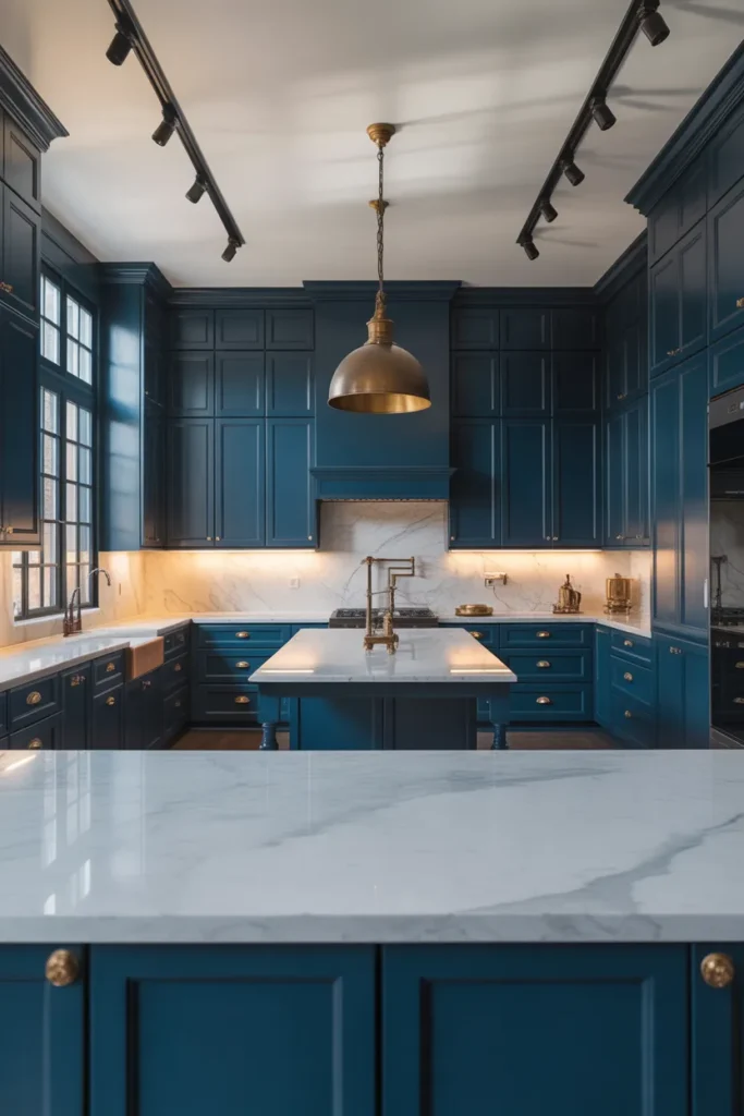
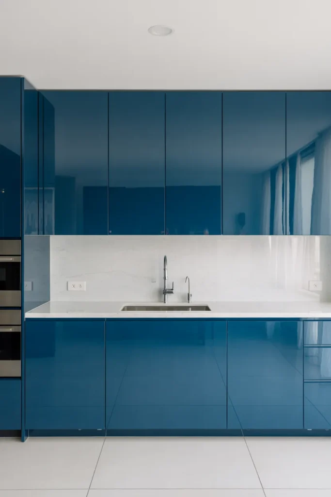
9. Midnight Blue Floor-to-Ceiling Cabinets for a Moody, High-End Kitchen
Midnight blue, a blue so deep it approaches black, is the most dramatic entry in the blue kitchen cabinet spectrum. Used floor to ceiling on all cabinetry, it creates a kitchen that reads as intentional, confident, and high-end. This is not an accidental color choice. It requires commitment and the right supporting elements to succeed.
The critical supporting element is light. Midnight blue kitchens require either abundant natural light from large windows, strong overhead task lighting, or both. Without adequate light, a midnight blue kitchen reads as a dark, closed-off room rather than a sophisticated design statement. Reflective surfaces, polished stone countertops, glossy tile backsplashes, and high-sheen hardware all help bounce light through the space.
Pair midnight blue with warm gold or polished chrome hardware rather than matte black. Matte black hardware disappears against such a dark cabinet color and the detail is lost. A hardware finish with reflective quality maintains visibility and adds contrast.
When to use it: Large kitchens with strong natural light or professional-grade task lighting. Also appropriate for dedicated kitchen spaces that are clearly separated from the main living area, where the drama of the color does not need to reconcile with a lighter adjoining room.
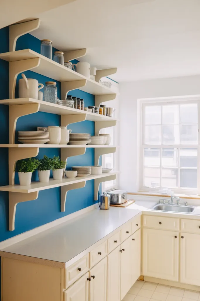
10. Sky Blue Open Shelving Kitchen for a Bright, Casual Everyday Space
Not every blue kitchen idea involves full cabinetry. Painting the wall behind open shelving in sky blue while keeping the shelving itself and the surrounding cabinetry white or natural wood is a lower-commitment approach that delivers real color impact. The blue wall read between and behind the shelf contents creates a layered color effect that changes as the shelves are styled and restyled over time.
This approach works particularly well in small kitchens where full blue cabinetry would feel heavy. The blue appears in manageable doses, framed by white shelving, and the overall effect is fresh and curated without being overwhelming. It is also one of the most reversible blues kitchen ideas, requiring only a repaint of the accent wall if preferences change.
Sky blue in this context should lean warm rather than cool. A slightly grey sky blue will read as cold behind the shelf contents. Choose a sky blue with a hint of green or white to keep it fresh and bright under both natural and artificial light.
When to use it: Small kitchens and apartment kitchens with open shelving already in place. Also effective as a way to introduce blue into a kitchen during a rental renovation where cabinet painting is not permitted but wall painting is allowed.
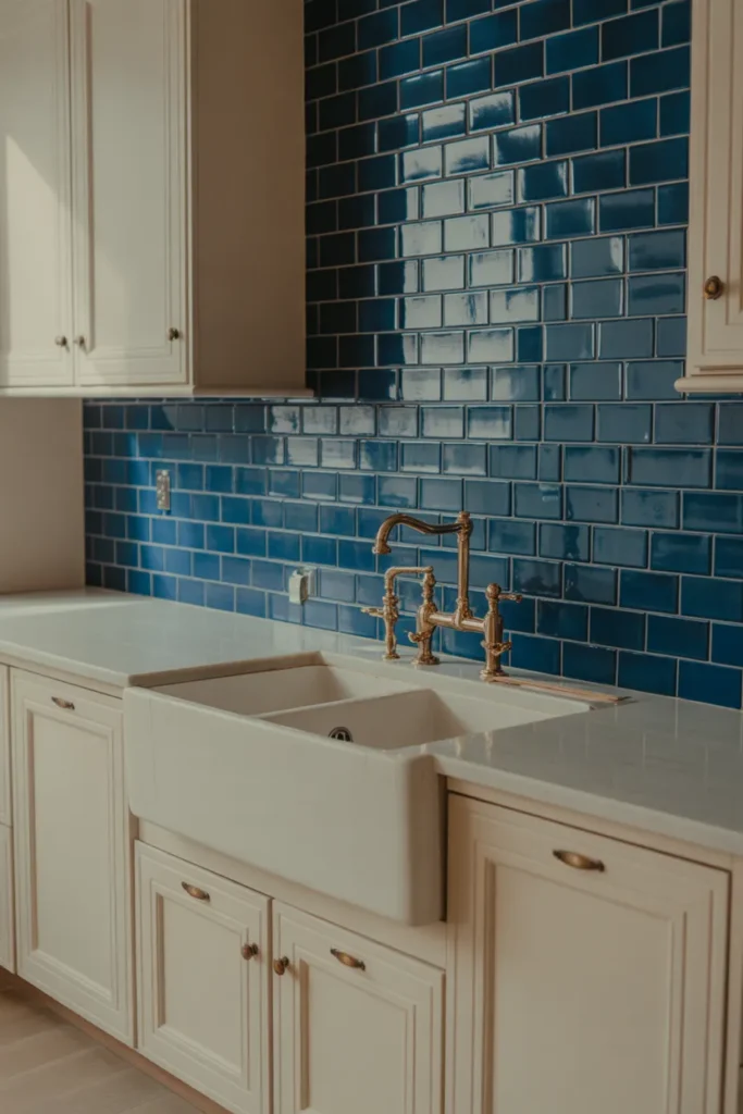
11. Blue Zellige Tile Backsplash to Bring Color Without Painting Any Cabinets
For homeowners who want the visual impact of a blue kitchen without the commitment of cabinet painting, a blue zellige or handmade tile backsplash is the most targeted solution. Zellige tile, with its irregular hand-formed surface, catches and reflects light in multiple directions, which creates movement and warmth that flat tiles cannot replicate. A backsplash in blue zellige transforms the kitchen’s focal wall without touching a single cabinet.
The most effective approach is to run the tile from countertop to ceiling on the main kitchen wall, typically the sink wall or the wall behind the range. A full-height tile run amplifies the impact significantly compared to a standard 18-inch backsplash. The surrounding white or neutral cabinetry frames the blue tile and allows it to read as the primary design element.
Blue zellige ranges in tone from ocean teal to cobalt to dusty blue-grey. Choose the tone based on the existing countertop material. Warm stone countertops pair better with teal or ocean blue zellige. Cool white quartz pairs well with cobalt or mid-blue zellige.
When to use it: Any kitchen where cabinet painting is not possible or desirable. Also a strong option for homeowners who have recently installed new cabinets and do not want to repaint them but still want to incorporate blue into the kitchen design.
12. Blue Kitchen Island With Butcher Block Top for a Warm, Casual Family Kitchen
A blue kitchen island with a butcher block countertop is one of the most family-friendly and visually warm expressions of the blue kitchen trend. The wood surface softens the visual weight of the blue cabinetry and signals that the kitchen is designed for everyday use rather than purely aesthetic display. This combination reads as practical, lived-in, and considered without being precious.
The blue shade used on the island in this configuration should be mid-toned rather than very dark or very light. A mid-blue, cadet blue, or a saturated slate works well against the warm honey or amber tones of a butcher block surface. Very dark blues make the wood top look dirty in certain light conditions. Very pale blues lose contrast with the wood and the island fails to register as a distinct element.
Maintain butcher block surfaces with food-safe mineral oil applied regularly. Butcher block that is allowed to dry out will crack and develop deep grain lines that are difficult to reverse. This maintenance reality is worth factoring into your decision before choosing butcher block over stone.
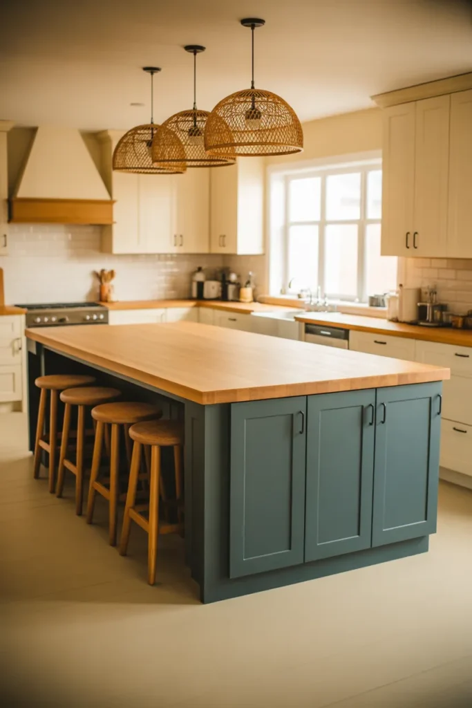
When to use it: Family kitchens where the island functions as a prep space, homework station, and casual dining area. Also effective in farmhouse or transitional kitchens where the warmth of the wood top prevents the blue from reading as too contemporary or cold.
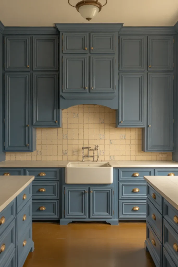
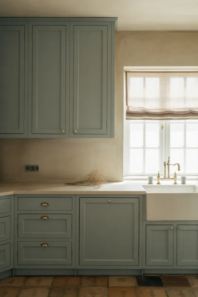
13. Dusty Blue Cabinets With Limewash Walls for a Soft, Mediterranean-Inspired Kitchen
Dusty blue, a muted blue with significant grey and white content, is one of the calmest and most sophisticated shades in the 2026 blue kitchen color lineup. Paired with limewash-painted walls in a warm off-white or pale terracotta, it creates a kitchen that reads as timeless and handcrafted rather than trend-driven. The combination evokes Mediterranean and Southern European kitchen aesthetics that feel authentic rather than themed.
The success of this pairing depends on the consistency of the muted quality across all elements. If the dusty blue is correctly desaturated but the wall color is a bright, clean white, the two tones will not harmonize. Both the cabinet color and the wall color need to share the same slightly imperfect, aged quality. Limewash walls deliver this naturally due to the variation inherent in the application technique.
Hardware in this kitchen should be simple and unobtrusive. Ceramic knobs in off-white or cream, simple iron pulls, or minimal cup pulls in a dark bronze complement the handcrafted quality of the overall palette. Bright polished hardware would undercut the tone.
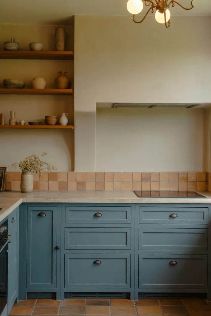
When to use it: Kitchens in homes with Mediterranean, Spanish Colonial, or European Farmhouse design influences. Also effective in any kitchen where the goal is a calm, unhurried atmosphere and a color story that reads as collected over time rather than assembled all at once.
14. Navy and Natural Wood Kitchen for a Scandinavian-Influenced Minimal Design
Pairing navy blue cabinets with natural, light-toned wood elements, open shelving, a wood island countertop, or wood flooring, is one of the most refined expressions of the blue kitchen concept for homes with a Scandinavian or Nordic design influence. The combination of dark saturated blue with pale, grain-forward wood creates a graphic contrast that reads as confident and curated without relying on metallic accents or decorative detail.
In this configuration, the wood should be genuinely light, birch, maple, or lightly oiled white oak. Darker wood tones, walnut or dark oak, absorb the navy rather than contrasting with it. The lighter the wood, the more clearly the blue reads as the primary color decision.
Keep hardware minimal or eliminate it entirely with push-to-open mechanisms. The strength of this design direction comes from the simplicity of its two-element palette. Additional hardware finishes or decorative elements dilute the composition.
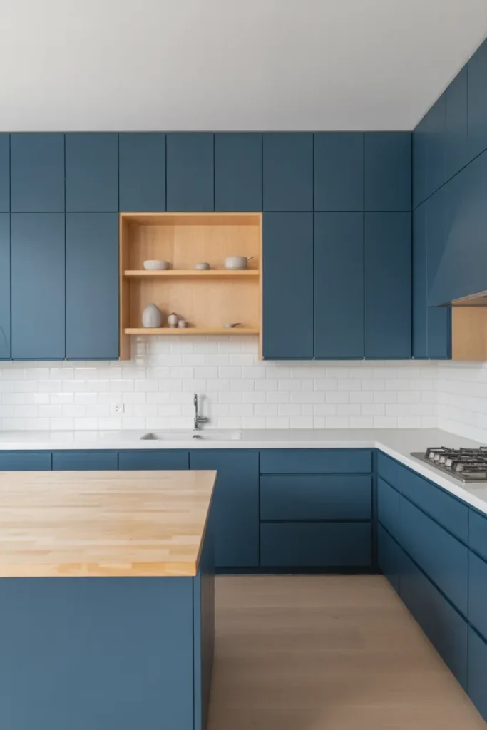
When to use it: Minimal or Scandinavian-influenced kitchens where the design philosophy values restraint over decoration. Also effective in open-plan homes where the kitchen needs to read as a composed graphic element within a larger neutral interior.
15. Two-Tone Blue Kitchen With Indigo Lowers and Ice Blue Uppers for Maximum Depth
Using two different blue tones in the same kitchen, rather than a blue and white combination, creates a more sophisticated and unexpected result. Indigo lower cabinets and ice blue upper cabinets share a color family but differ dramatically in value and saturation, which gives the kitchen depth and layering that a single blue tone cannot achieve. This is one of the most design-forward blues kitchen ideas for 2026.
The key to making this work is the separation in tone. The lower cabinet blue should be distinctly darker than the upper. If the two tones are too close in value, the combination reads as a color-matching error rather than a deliberate design decision. Test both colors on the actual cabinet surfaces and evaluate them under kitchen lighting, not just in a paint chip comparison.
Countertop and hardware selection becomes a unifying element in this scheme. Warm white stone countertops and warm brass hardware work as a neutral bridge between the two blue tones, preventing the kitchen from reading as a color experiment.
When to use it: Medium to large kitchens with sufficient cabinet volume to make both tones register clearly. Also appropriate for design-confident homeowners who want a kitchen that reads as genuinely original rather than following a standard formula.
16. Blue Kitchen in a Small Apartment With Reflective Surfaces to Avoid a Dark Result
Taking blue cabinets into a small apartment kitchen requires a deliberate strategy to prevent the color from making the space feel closed in. The solution is to compensate for the visual weight of the blue with as many reflective surfaces as possible. Glossy tile backsplashes, polished stone countertops, glass cabinet inserts, and mirrored or glass upper cabinet doors all bounce light through the kitchen and prevent the blue from absorbing it.
A high-gloss finish on the blue cabinets themselves is also worth considering in this context. A gloss or semi-gloss paint finish reflects significantly more light than a matte finish on the same color. The trade-off is that a high-gloss cabinet shows fingerprints and surface imperfections more readily than matte. In a one or two-person household this is manageable. In a family kitchen with heavy use it requires more frequent cleaning.
Overhead lighting in a small blue kitchen should be layered: general overhead light plus under-cabinet task lighting. Under-cabinet lighting directed at the countertop creates a secondary light source that warms the lower half of the kitchen and prevents the blue lower cabinets from reading as dark and heavy.
When to use it: Apartment kitchens under 100 square feet where blue cabinetry is desired but the space limitation requires compensating measures. This approach is particularly relevant to the growing category of blue kitchen apartment ideas for 2026.
17. Blue Lacquer Kitchen for a High-Gloss, Ultra-Modern Statement
High-gloss blue lacquer cabinetry is the most contemporary and uncompromising expression of the blue kitchen trend. The lacquer finish creates a mirror-like surface that reflects the entire kitchen back to itself, making the space feel larger while simultaneously making the color more intense. In a well-lit kitchen, a lacquer finish in a deep or mid-blue creates a result that reads as genuinely luxurious and architecturally confident.
Lacquer finishes require flat-front or slab-style cabinet doors without raised panels. Raised panel doors in a lacquer finish look dated because the gloss emphasizes the panel geometry in a way that competes with the contemporary quality of the finish itself. Keep the door profile completely flat for the finish to read correctly.
Maintenance is the primary consideration with lacquer. Lacquer shows scratches, fingerprints, and minor surface damage more visibly than any other finish. It is appropriate for lower-traffic households or for kitchens where the cabinetry is used carefully. For households with children or heavy kitchen use, a satin or semi-gloss paint finish in the same blue will deliver a similar visual direction with significantly greater durability.
When to use it: Contemporary or minimalist kitchens in homes or apartments where a true statement finish is the goal. Most effective when the surrounding space, flooring, countertop, and walls, are kept strictly neutral to allow the lacquer finish to be the room’s singular gesture.
18. Sage-Adjacent Muted Blue Kitchen for a Trend-Resistant Timeless Palette
As blue kitchen design 2026 matures, the most durable color choices are the ones that resist being immediately date-stamped by their trend moment. A muted, sage-adjacent blue, one that contains enough grey and green content to read as a sophisticated neutral rather than a declarative color, is the most trend-resistant choice in the entire blue kitchen category. It will look as appropriate in 2031 as it does today.
This shade sits closest to what is often described as dusty teal, aged blue, or antique blue in paint collections. It lacks the vibrancy of cobalt, the darkness of navy, and the lightness of powder blue. It occupies the middle ground where colors tend to have the longest design lifespan because they do not depend on trend context to read as intentional.
Pair this cabinet color with natural stone, raw plaster, linen, and ceramics in earthy, undyed tones. Avoid pairing it with very bright whites, which will make the muted blue look dirty. Off-white, bone, and warm cream are the correct companion neutrals.
When to use it: Any kitchen where longevity of the design decision is the primary concern. Ideal for homeowners who are renovating with the intent to sell within three to five years, where a color that reads as timeless is more broadly marketable than one that reads as strongly trend-driven.
Final Thoughts
The right shade of blue for a kitchen depends on three practical factors: the direction your windows face, the size of your kitchen, and how long you intend to stay in the home. A shade that works beautifully in a south-facing open-plan kitchen may be completely wrong in a north-facing galley, and a color that suits a long-term owner may be a liability for someone planning to sell within a few years. Use the guidance in each section above to match your specific situation to the right blues kitchen idea rather than choosing purely by visual preference.
If this guide helped clarify your decision, save it to your Pinterest boards now so you can reference it when you are ready to commit to a color. Revisit individual sections as your renovation progresses and the surrounding materials become clearer.
Explore more blue kitchen cabinet ideas, hardware pairing guides, and countertop combination resources to continue building a kitchen color story that works for your specific home and your specific light.