Choosing the right kitchen colors in 2026 is less about following trends and more about making smart, lasting decisions for your space. This guide breaks down 18 specific color ideas — each with practical advice on when to use them, what to pair them with, and what to avoid. Whether you have a small galley kitchen or a large open-plan layout, you will find clear direction here.
1. Warm White With Greige Undertones: The Timeless Reset
Warm white is not the same as bright white, and that distinction matters more than most people realize. Warm whites with greige (gray-beige) undertones absorb natural light without bouncing harsh glare, making your kitchen feel calm rather than clinical. This is particularly effective in north-facing kitchens that tend to run cool and flat.
Pair this palette with matte brass hardware and wood open shelving for a grounded, organic result. The mistake most homeowners make is choosing a paint color in isolation — always test it against your countertop and cabinet finish under both natural and artificial light before committing.
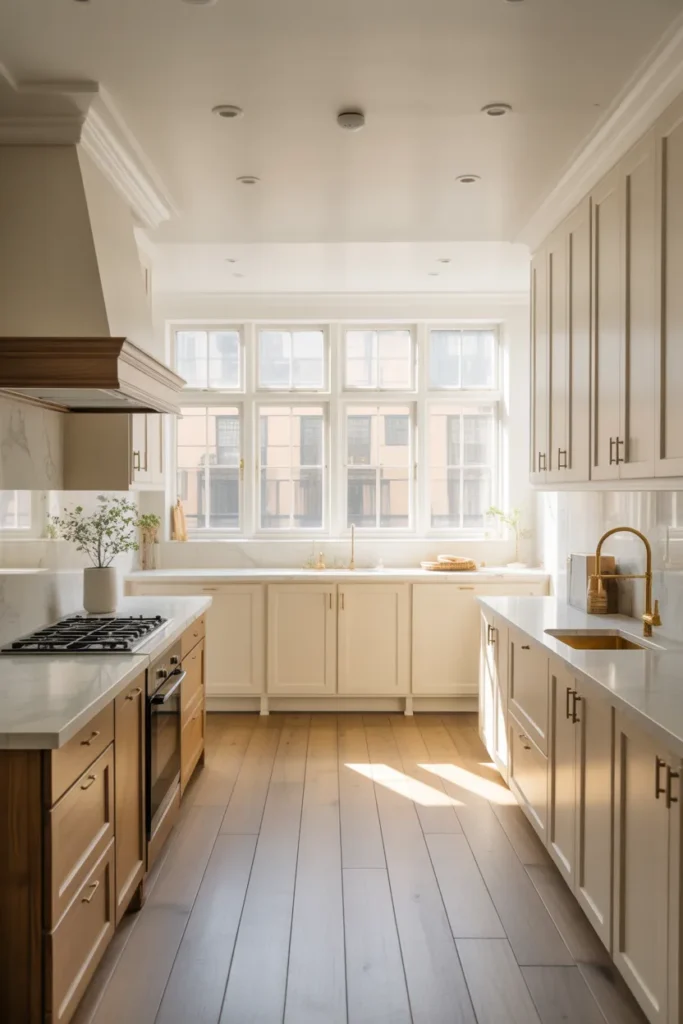
This color direction works best in medium to large kitchens where you want a clean baseline that lets textures and materials do the work. It reads as high-end without being loud.
2. Deep Forest Green Lower Cabinets With White Uppers
Two-tone kitchen cabinetry is one of the strongest functional design moves of 2026. Painting lower cabinets in deep forest green while keeping upper cabinets white creates visual weight at the base — grounding the room — while keeping the upper zone light and open. This works especially well in kitchens with 9-foot or higher ceilings.
Forest green reads as sophisticated without being cold. It pairs naturally with unlacquered brass, black iron, or warm wood hardware. Avoid cool-toned greens that veer toward teal — they date quickly and clash with warm countertop materials like butcher block or leathered granite.
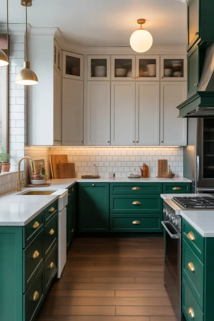
This layout strategy is ideal for standard rectangular kitchens or L-shaped layouts where you want to add depth without remodeling. It is a practical way to modernize an older kitchen without touching the structure.
3. Slate Blue-Gray for a Modern, Gender-Neutral Kitchen
Slate blue-gray sits in a unique space — it is cooler than warm neutrals but softer than stark gray. In 2026, this color is gaining ground because it photographs beautifully, works in both traditional and modern homes, and pairs with an unusually wide range of countertop materials including white quartz, black soapstone, and light concrete.
Use it on full cabinetry in smaller kitchens to create a moody, collected feel without making the space feel cramped. The key is keeping the walls and ceiling light — white or very pale gray — so the cabinets anchor the room rather than overwhelm it.
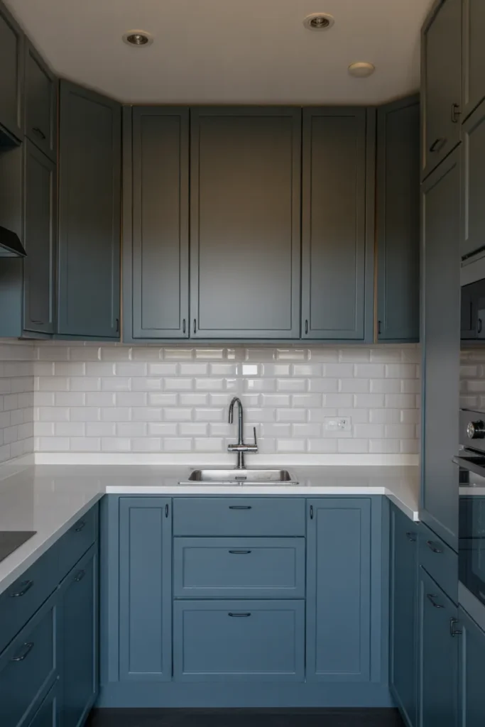
Where this goes wrong is when homeowners choose a blue-gray that leans too purple in artificial light. Always check the color under your kitchen’s specific lighting conditions in the evening, not just in daylight.
4. Terracotta Accents in an Otherwise Neutral Kitchen
Terracotta does not have to dominate a kitchen to make an impact. Used as an accent — on a single island, a row of open shelving, or a painted niche — it brings warmth and personality without overwhelming the space. This is one of the most practical kitchen colors ideas 2026 has produced because it works equally well in boho, transitional, and even minimalist interiors.
The base of the kitchen should remain neutral: white, cream, or light oak. Terracotta on the island paired with cream perimeter cabinets creates a natural focal point that makes large kitchens feel intentional and curated.
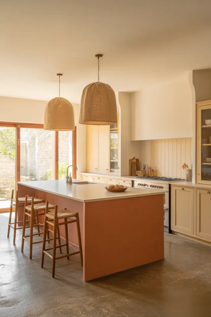
Avoid using terracotta on upper cabinets — it tends to visually lower the ceiling height and creates an enclosed feeling. Keep it low and grounded for the best result.
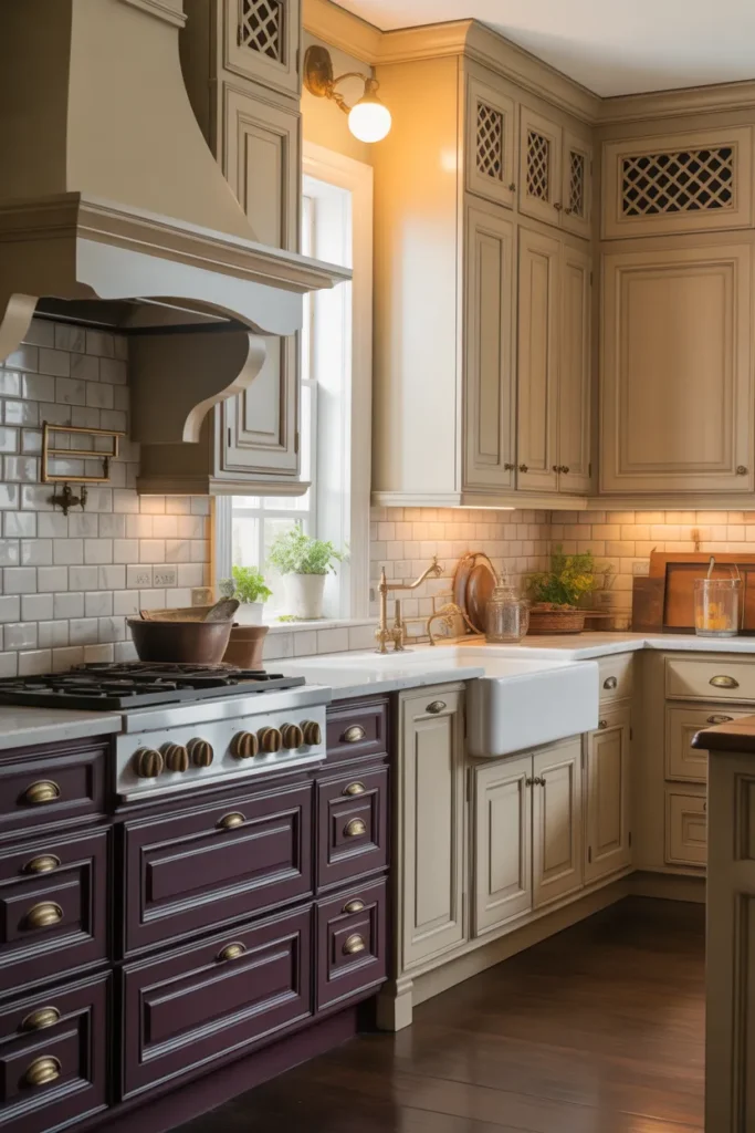
5. Matte Black Cabinets in a High-Contrast Kitchen
Matte black kitchens are no longer a bold risk — they are a proven design decision when executed with the right balance. The key word is matte. Gloss black fingerprints, shows wear, and reads harsh under most residential lighting. Matte black absorbs light beautifully and creates a quiet, sophisticated look that pairs well with both warm and cool countertop choices.
This works best in open-plan spaces or kitchens with large windows where natural light prevents the room from feeling like a cave. Pair with light countertops — white, cream, or pale concrete — and warm-toned wood floors to avoid the space feeling cold or industrial.
Do not use matte black in small, dark kitchens without a serious lighting plan. The color requires intentional layering: under-cabinet lighting, pendant lights, and recessed ceiling lights all working together.
6. Soft Sage Green for a Calm, Organic Kitchen
Sage green in 2026 has matured beyond trend status — it is now a reliable, livable color that works across many kitchen styles. The soft, muted quality of sage means it does not compete with natural materials. It sits quietly alongside wood, stone, ceramic, and linen without creating visual tension.
Use sage green on full cabinetry in kitchens that get good natural light. In low-light kitchens, it can read flat and slightly dingy. Offset this by choosing a sage with warm yellow or olive undertones rather than cool gray undertones, which tend to look washed out indoors.
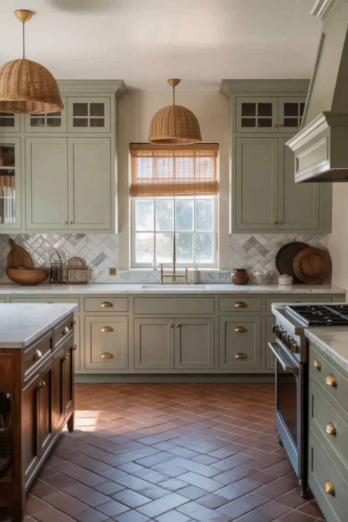
Hardware choices matter here. Aged brass or burnished copper pull the warmth out of sage green beautifully. Avoid chrome or polished nickel — they shift sage toward a colder, more clinical feel.
7. Creamy Off-White for Small Kitchens That Need to Feel Larger
In small kitchen design, color is one of the most powerful tools available without doing structural work. Creamy off-white — not stark white, not yellow, but that barely-there warmth in between — makes walls, cabinets, and countertops read as one continuous surface. This visual continuity eliminates the “chopped-up” feeling that smaller kitchens often suffer from.
The approach works best when the cabinetry, walls, and even the grout in the backsplash tile are kept within the same tonal family. Contrast is the enemy of spaciousness in tight kitchens. Every hard line between a dark element and a light element visually shrinks the room.
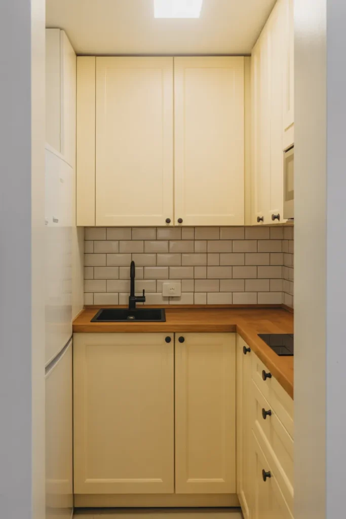
Reserve one material — natural wood open shelving or a stone countertop — to break the monotony without reintroducing fragmentation. This is functional kitchen space planning, not just decoration.
8. Navy Blue Island in an All-White Kitchen
A navy island is the single most impactful color decision you can make in a white kitchen without touching a single other surface. It creates an immediate focal point, adds storage functionality (islands are almost always larger than they appear in photos), and gives the kitchen a sense of intention and design maturity.
Navy works best in kitchens with at least 10 feet of width — anything smaller and the island starts to dominate rather than anchor. Pair it with white quartz or white marble for contrast, and choose hardware in brushed gold or polished nickel to keep it refined.
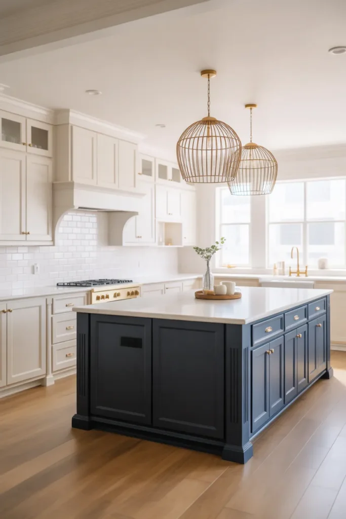
The mistake is going too dark with the navy — colors that read as navy in the paint store can shift to near-black in a kitchen with limited windows. Test under both daylight and evening light before purchasing a full can.
9. Warm Taupe With Natural Stone for a Transitional Kitchen
Warm taupe sits at the intersection of beige and gray — it avoids the sterility of cool gray and the datedness of traditional beige. In 2026, it is the color of choice for transitional kitchens that need to feel updated without abandoning warmth or comfort.
Pair warm taupe cabinets with natural stone countertops — particularly quartzite or sandstone-toned granite — and the two materials will reinforce each other in a way that feels effortless rather than coordinated. Add linen or wool textiles (dish towels, a runner, bar stools) to complete the tactile quality of the palette.
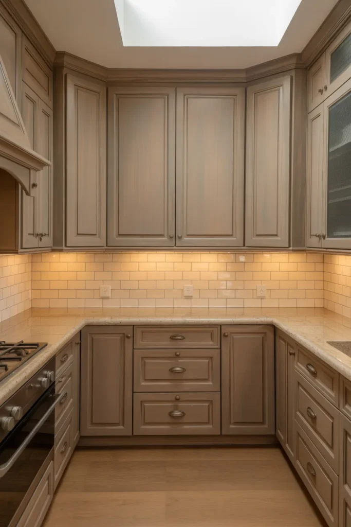
This is one of the strongest kitchen colors ideas 2026 offers for homeowners who want longevity — taupe does not read as a trend color, which means it will not look dated in five years.
10. Charcoal Gray Lower Cabinets With Open Shelving Above
Replacing upper cabinets entirely with open shelving is a functional choice that many kitchen designers are recommending in 2026, particularly for apartments and smaller homes. When the lower cabinets are charcoal gray and the upper zone is opened up with floating shelves, the kitchen immediately feels taller and less closed in.
Charcoal is more forgiving than black — it shows less dust and fingerprints, integrates better with mid-range fixtures, and works in lower-light conditions where true black would feel oppressive. Pair it with a light countertop and white walls to maintain brightness.
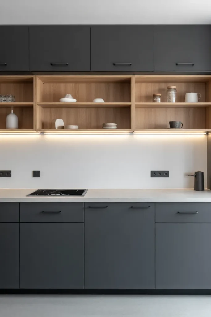
Open shelving above requires discipline — it only works well when the items on display are genuinely useful and deliberately arranged. If your kitchen tends toward clutter, this is not the right configuration regardless of the color choice.
11. Dusty Rose as a Sophisticated Accent in a Modern Kitchen
Dusty rose in 2026 bears no resemblance to the pink kitchens of the 1950s. It is muted, chalky, and when used selectively — on a single bank of cabinets or a painted island — it reads as confident and artistic rather than sweet or juvenile. The key is desaturation: the color must look like it has been mixed with gray or white.
It works best against a neutral backdrop of warm white or greige, with warm wood elements (floors, shelving, or a wood hood) to prevent the pink from floating too cool. Avoid pairing with chrome or cool gray — both combinations shift dusty rose toward an unintentionally vintage or clinical direction.
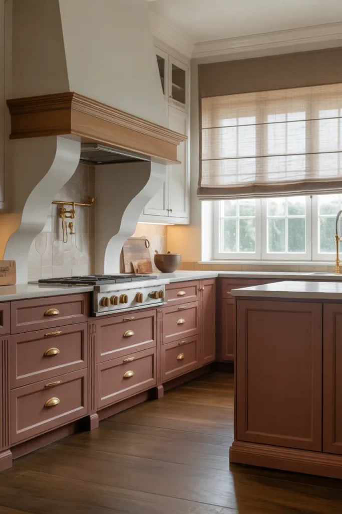
This is a strong choice for designers and homeowners who want a distinctive kitchen that stands apart from the standard green, blue, and gray options saturating the market.
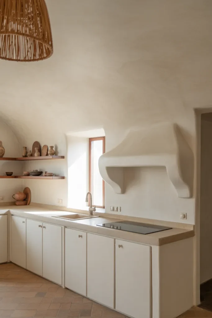
12. All-Concrete Palette With Warm Wood Accents
Full concrete kitchens — concrete countertops, concrete tile backsplash, and concrete-colored cabinets — are a distinct aesthetic that belongs in the modern minimalist category. This is not a color in the traditional sense, but a tonal palette of matte grays unified by texture and material rather than paint.
The critical warmth injection comes from wood — a wide plank floor, a wooden hood, a butcher block section, or wood bar stools. Without this, the all-concrete kitchen reads as a basement or commercial kitchen rather than a home space.
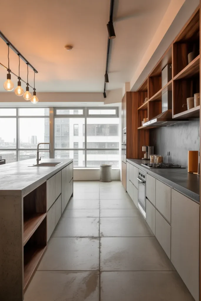
This design direction is best suited to open-plan homes where the living area provides visual warmth that the kitchen does not have to generate on its own. It is not recommended as a standalone kitchen in a closed-plan layout.
13. Cobalt Blue Backsplash in a White Kitchen
A cobalt blue tile backsplash is one of the highest-impact, lowest-risk color decisions in kitchen design. Because the backsplash is a contained zone, the color does not overwhelm the room — it energizes it. In an otherwise white kitchen, a cobalt backsplash becomes the visual anchor the space needs to feel finished and deliberate.
Choose a handmade or zellige-style tile in cobalt rather than a flat, commercial tile. The variation in tone and surface in handmade tiles prevents the color from reading as flat or plasticky. Pair with white or warm-white cabinets and a simple marble or white quartz countertop.
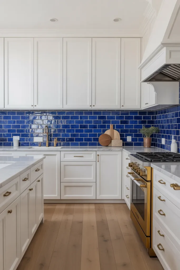
Avoid pairing cobalt with stainless steel hardware or stainless appliances — the combination reads as cold and commercial. Brass or black fixtures are the right call here.
14. Mushroom Brown for a Warm, Understated Modern Kitchen
Mushroom brown is an earthy, complex neutral that reads differently in every light condition — slightly warm in the morning, almost greige by midday, and richly brown in the evening. This tonal complexity is what makes it such a satisfying kitchen color for 2026. It never looks flat.
Use it on full cabinetry in a modern kitchen with clean-line hardware and integrated appliances. It pairs particularly well with honed black granite, dark walnut, or brushed bronze details. Avoid gloss cabinet finishes with this color — the richness of mushroom brown is best expressed in a matte or satin finish.
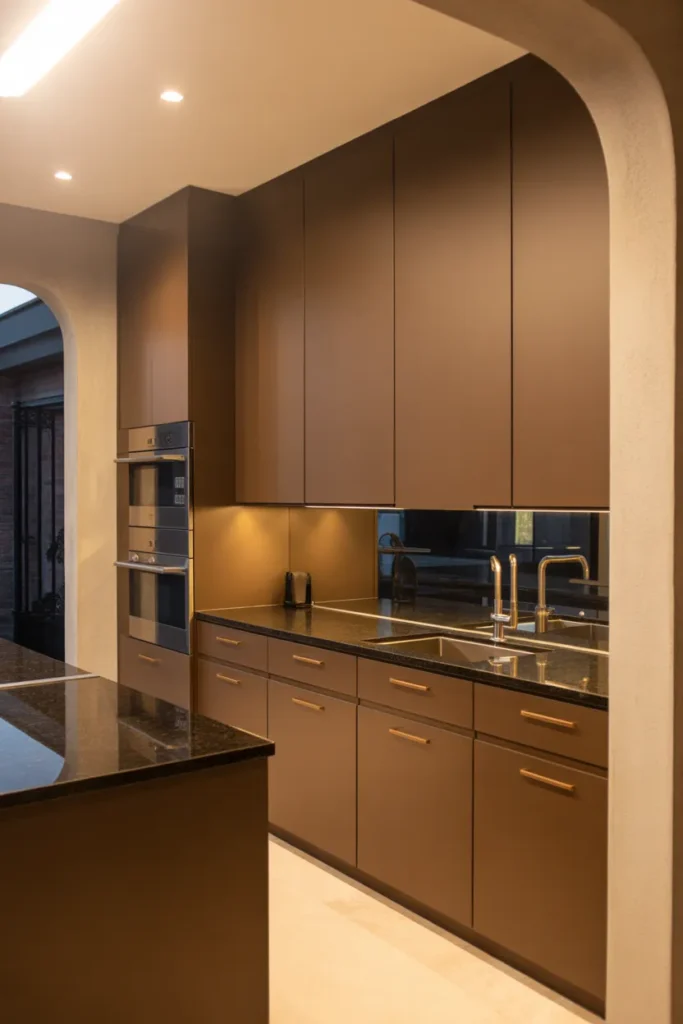
Mushroom brown works in both small and large kitchens because it reads as warm without being aggressive. In small spaces, it creates a cozy, intentional feel. In large kitchens, it provides a sophisticated, grounded base.
15. Pale Yellow as a Secondary Wall Color in an Open Kitchen
In open-plan kitchens, the wall color visible beyond the cabinetry has a direct impact on the feel of the entire space. Pale, chalky yellow on the dining-side wall — used as an accent to white or warm-gray cabinetry — creates a sunlit warmth that no amount of artificial lighting can fully replicate.
This works best in homes where the kitchen opens into a dining or living area, and the yellow is applied to the wall opposite the windows. It reflects whatever natural light exists in the space and prevents the open-plan zone from feeling too cool or too stark.
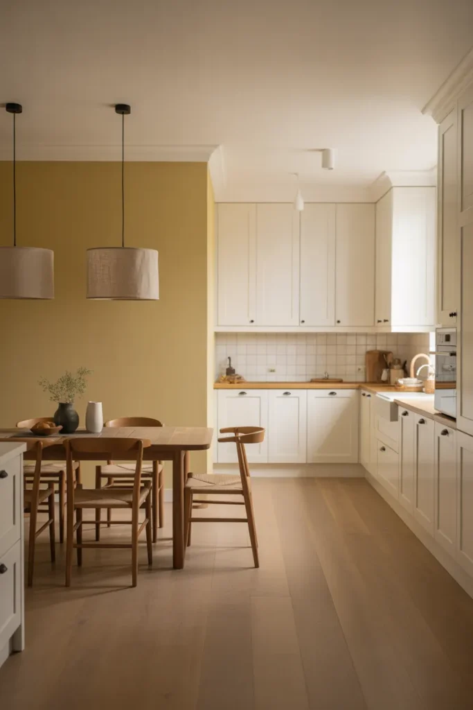
Keep the yellow highly muted — closer to aged parchment than to sunshine. Saturated yellows in kitchens age poorly and are notoriously difficult to photograph or sell around.
16. Dark Plum as a Bold Single-Wall Statement
Dark plum is an emerging choice for 2026 that occupies the same bold-but-livable space that deep green and navy held in prior years. It is warm enough to feel inviting, distinctive enough to make a strong design statement, and dark enough to ground a large kitchen without requiring full commitment across all cabinetry.
The most practical application is to use dark plum on a single wall of base cabinets — typically the range wall — while keeping the rest of the kitchen in a neutral like cream or warm white. This creates a natural focus around the cooking zone, which makes functional sense in addition to aesthetic sense.
Hardware in brushed gold or antique brass pulls the warmth out of dark plum effectively. Avoid black hardware here — it tends to disappear into the dark cabinet color rather than providing contrast.
17. Limewash Finish Walls in a Neutral Cabinet Kitchen
Limewash paint is not a cabinet color — it is a wall treatment, and in 2026 it is becoming a powerful complement to neutral kitchen cabinetry in homes that want texture without pattern. Applied to the kitchen walls (particularly the wall behind open shelving or the wall between the cabinets and the ceiling), limewash adds a depth and antiqued quality that flat paint cannot achieve.
Use this in kitchens with white, cream, or warm wood cabinetry. The organic variation in limewash color — typically ranging from chalk white to soft gray or warm ochre depending on the product — creates a backdrop that looks curated without looking decorated.
This is a particularly strong technique in apartments and rental-style kitchens where the cabinetry itself cannot be changed. Limewash walls can transform the entire character of a kitchen without touching a single cabinet.
18. Tonal Green — From Sage to Olive — Across an Entire Kitchen
A tonal green kitchen uses multiple shades of green together rather than contrasting green with white or another color. For example: sage green on the upper cabinets, olive green on the lowers, and a mid-green on the island. When done correctly, this creates a layered, botanical richness that reads as deeply intentional.
This is an advanced color strategy that requires careful selection — the greens must be close in undertone (all warm or all cool) or the combination will look mismatched. Stick to greens in the warm-olive family for the most livable result.
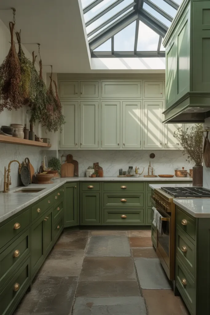
Natural materials are essential in a tonal green kitchen. Stone, wood, and ceramic ground the palette and prevent it from feeling like a theater set. This is one of the most photographed kitchen color directions of 2026 precisely because it is so visually cohesive.
Final Thoughts
The best kitchen colors ideas 2026 has to offer are not about chasing a single trend — they are about matching the right color strategy to your specific layout, light conditions, and how you actually use your kitchen. Every idea in this guide is designed to help you make a clear decision rather than leave you with more questions.
If this post helped you narrow down your options, save it to your Pinterest boards so you can reference it when you are ready to commit. Share it with anyone currently planning a kitchen update — the more specific the guidance, the easier the process.
For more layout-specific design ideas, explore content on small kitchen planning, open-plan kitchen organization, and two-tone cabinet strategies to take your planning further.