Most kitchen renovations fail not because of budget but because of decisions made without a clear design framework — and this sleek modern kitchen design guide to minimalist luxury exists to fix that. Whether you are working with a galley apartment kitchen or a large open-plan space, these 17 ideas give you practical direction on materials, layouts, lighting, and the specific decisions that separate a kitchen that looks expensive from one that merely cost a lot. Every section is built around real-world application, not mood board inspiration.
1. Flat-Front Cabinetry in Matte White That Reads as Built-In, Not Box-Store
Flat-front cabinetry is the single most impactful upgrade in a minimalist luxury kitchen because it eliminates the visual noise of raised panels, routed edges, and decorative molding. The result is a surface-level simplicity that reads as considered and architectural. In matte white, flat-front cabinets reflect light without the harsh glare of gloss finishes, which is critical in kitchens that are used heavily during daylight hours.
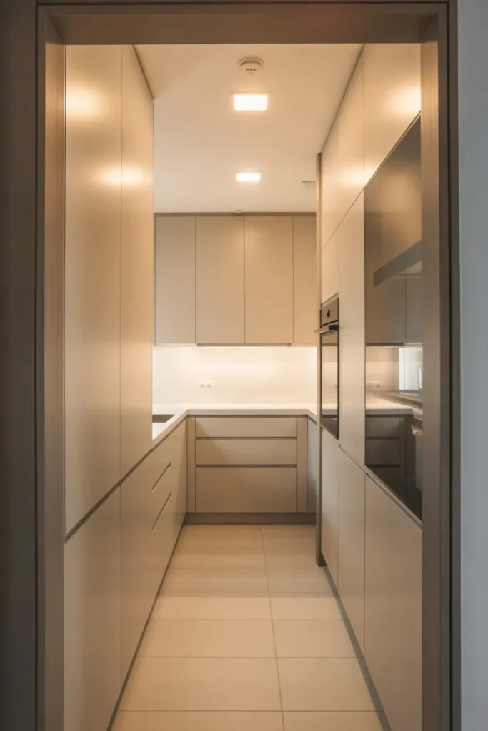
The reason this works so well is perceptual: flat surfaces recede visually, which makes the kitchen feel calmer and more expansive regardless of its actual square footage. In small kitchens under 150 square feet, this is one of the most effective tools available. The eye has nowhere to snag, which keeps the space feeling open even when fully equipped.

The most common mistake with flat-front cabinetry is pairing it with visible hardware that contradicts the minimal intent. Thin bar pulls in brushed brass or matte black reinforce the sleek direction. Large decorative knobs or ornate hardware undermine it entirely. If budget allows, push-to-open mechanisms eliminate hardware completely and take the minimalist quality to its cleanest expression.
2. Waterfall Island in Honed Marble That Anchors an Open-Plan Kitchen
A waterfall island — where the countertop material continues vertically down the sides of the island to the floor — is the most architecturally committed statement available in a minimalist luxury kitchen. In honed rather than polished marble, the surface reads as sophisticated and intentional without the reflective glare that polished stone introduces. Honed marble has a matte quality that pairs naturally with the restrained palette of a minimalist kitchen.
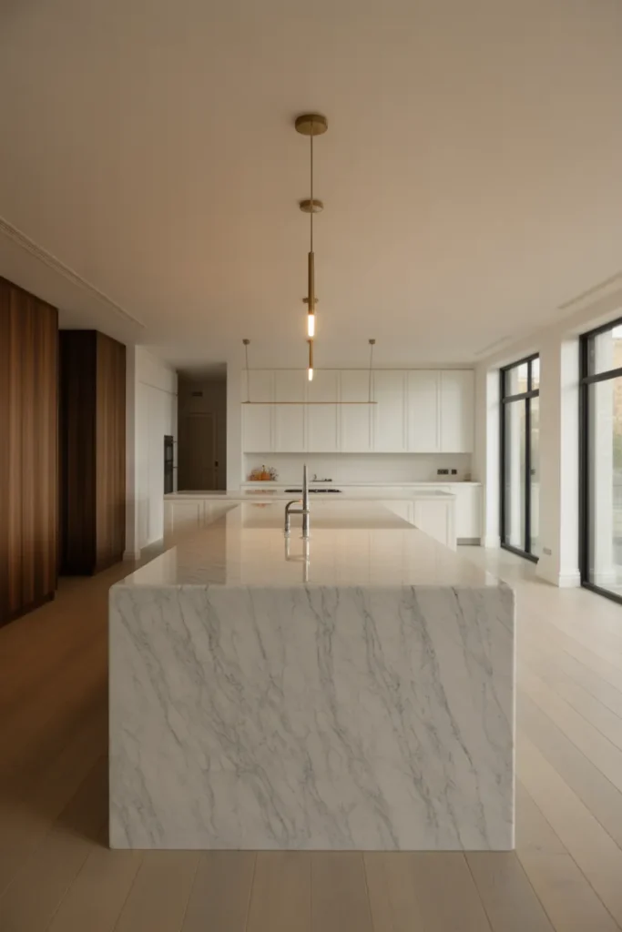
This decision works best in open-plan kitchen layouts where the island is visible from the living and dining areas. The waterfall detail reads as a design object from every angle, not just from the kitchen side. In closed or galley kitchens where the island is only seen from above, the waterfall detail is less visible and the investment is harder to justify.
Honed marble requires sealing on installation and resealing annually. It is more porous than polished marble and more susceptible to staining from acidic liquids like lemon juice, wine, and vinegar. For a working kitchen where the island surface is used daily for food preparation, a durable engineered stone in a marble look-alike finish performs identically from a distance and requires significantly less maintenance. The decision between the two comes down entirely to how much daily use the surface will absorb.
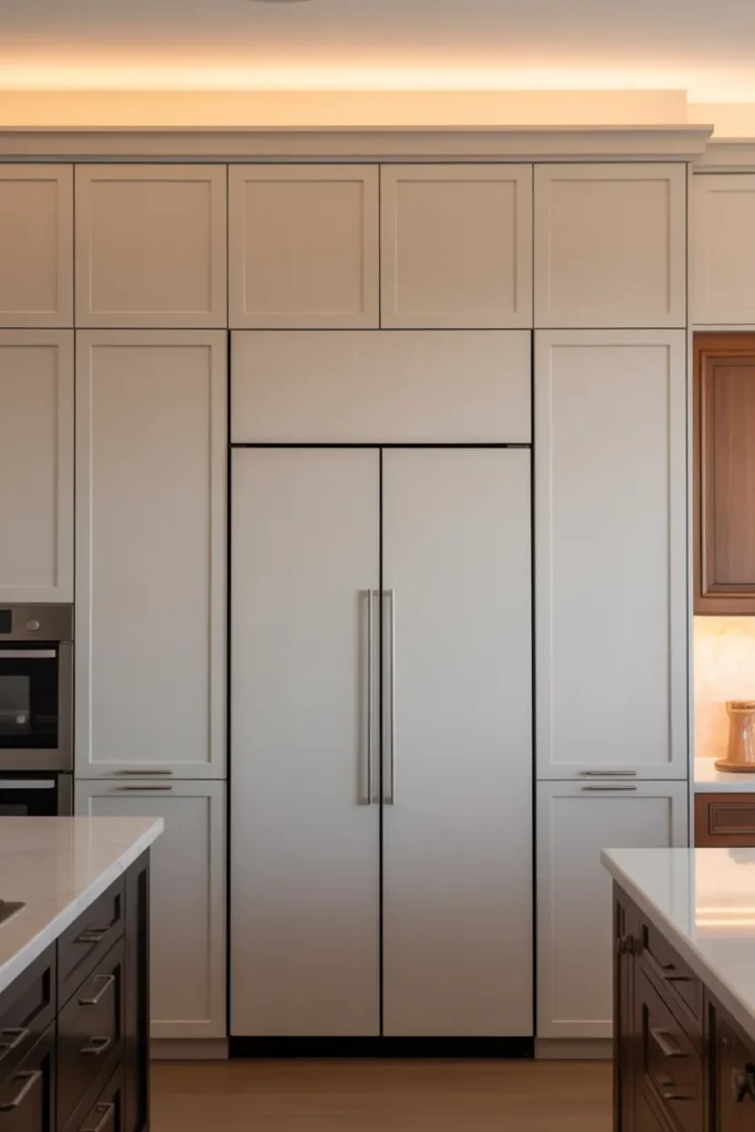
3. Integrated Appliances Behind Matching Cabinet Panels for a Seamless Wall
Integrated appliances — refrigerators, dishwashers, and even ovens concealed behind cabinetry panels that match the surrounding doors — are the defining feature that separates a truly sleek modern kitchen from one that merely has modern elements. When the appliance doors disappear into the cabinet wall, the kitchen reads as a single, continuous architectural surface rather than a collection of equipment and storage.
This approach is most impactful in open-plan kitchen layouts where the kitchen is visible from the living and dining areas. A stainless steel refrigerator visible from the sofa disrupts the visual continuity of the room. A panel-front refrigerator that matches the surrounding cabinetry disappears entirely, allowing the rest of the room’s design to remain the focus.
The practical limitation to plan around is service access. Panel-front refrigerators and dishwashers require slightly more clearance for door swing and service access than freestanding models. Before specifying integrated appliances, verify that the cabinet layout allows adequate door clearance and that the appliance brand you select offers panel-ready models in the configuration your kitchen requires. Not all appliance manufacturers offer panel-ready options in all sizes.
4. Handleless Lower Cabinets With Open Upper Shelving for Visual Breathing Room
Replacing upper cabinets entirely with open shelving — while keeping lower cabinetry handleless and flush — is one of the most effective strategies in modern kitchen layout ideas for making a kitchen feel larger and less enclosed. The open upper zone creates visual breathing room above the countertop line, which is where the eye naturally travels in a kitchen. Removing the heavy visual weight of upper cabinet boxes from that zone transforms the feeling of the space.
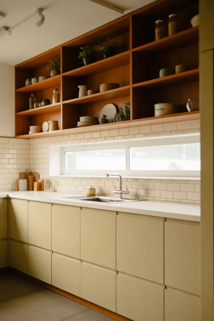
This works particularly well in kitchens adjacent to dining areas or living rooms, where the open shelving maintains a visual connection between spaces. In a fully enclosed kitchen, the same approach lightens the room and prevents the closed-in feeling that fully cabineted kitchens can create at standard ceiling heights.
The honest trade-off is storage. Open shelving holds less than closed cabinets and requires consistent organization to look intentional. Items stored on open shelves accumulate grease and dust in kitchens, which means more frequent cleaning than a closed-cabinet equivalent. This approach suits people whose kitchens are used moderately and who keep a disciplined, curated set of cookware and servingware. For households that cook intensively or store significant quantities of equipment, maintaining the open shelving aesthetic long-term is genuinely difficult.
5. Full-Height Slab Backsplash in Porcelain That Eliminates Grout Lines
A full-height slab backsplash — a single continuous panel of large-format porcelain running from countertop to ceiling behind the cooking and preparation zones — is one of the cleanest design decisions available in a minimalist luxury kitchen. Eliminating grout lines removes the grid pattern that small tile creates, and the result is a surface that reads as monolithic and architectural rather than assembled and domestic.
Large-format porcelain panels in stone-effect finishes — marble look, concrete look, or travertine look — achieve the aesthetic of natural stone at a fraction of the maintenance requirement. Porcelain is non-porous, stain-resistant, heat-resistant, and does not require sealing. Behind a cooking range or in a heavy-use kitchen, these practical qualities matter as much as the visual result.
The installation consideration is significant. Large-format slabs require professional installation by an experienced tile setter. The panels are heavy, require back-buttering with the correct adhesive, and cannot be dry-laid the way small tile can. Incorrect installation leads to lippage — where the edges of adjacent panels sit at slightly different heights — which ruins the seamless effect the slab is meant to create. Specify an installer with documented large-format slab experience before this material is purchased.
6. Ribbed Glass Cabinet Fronts That Add Texture Without Visual Noise
Ribbed or reeded glass cabinet fronts are one of the most effective texture-addition tools in a minimalist kitchen because they obscure the cabinet contents without fully concealing them, and they introduce visual interest through material texture rather than color or pattern. The ribbed surface catches light at different angles throughout the day, which gives the kitchen a dynamic quality that flat matte surfaces cannot achieve.
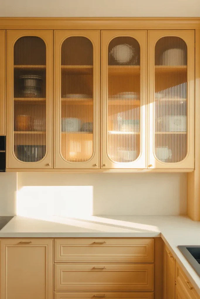
This works particularly well in kitchens where the overall palette is neutral and restrained. When everything else is flat and matte — cabinets, countertop, walls — a set of ribbed glass upper cabinets provides the tactile and visual variation that prevents the space from feeling cold or sterile. It is the minimalist alternative to open shelving: it conceals the contents but still participates in the room’s light and texture conversation.
The practical benefit is significant. Unlike open shelving, ribbed glass cabinet fronts conceal organizational imperfection. Contents are visible enough to locate items quickly but obscured enough that precise styling is not required. For households who want the aesthetic of open shelving without the maintenance discipline, ribbed glass is the right compromise.
7. Two-Tone Cabinet Design With Dark Lowers and Light Uppers for Grounded Elegance
A two-tone kitchen — dark lower cabinets paired with light upper cabinets — is one of the most practical and visually effective strategies in a sleek modern kitchen design for adding depth and visual weight without disrupting the minimal character of the space. The dark lower zone grounds the room visually, mimicking the way furniture anchors a room, while the light upper zone keeps the kitchen feeling open and connected to the ceiling plane.
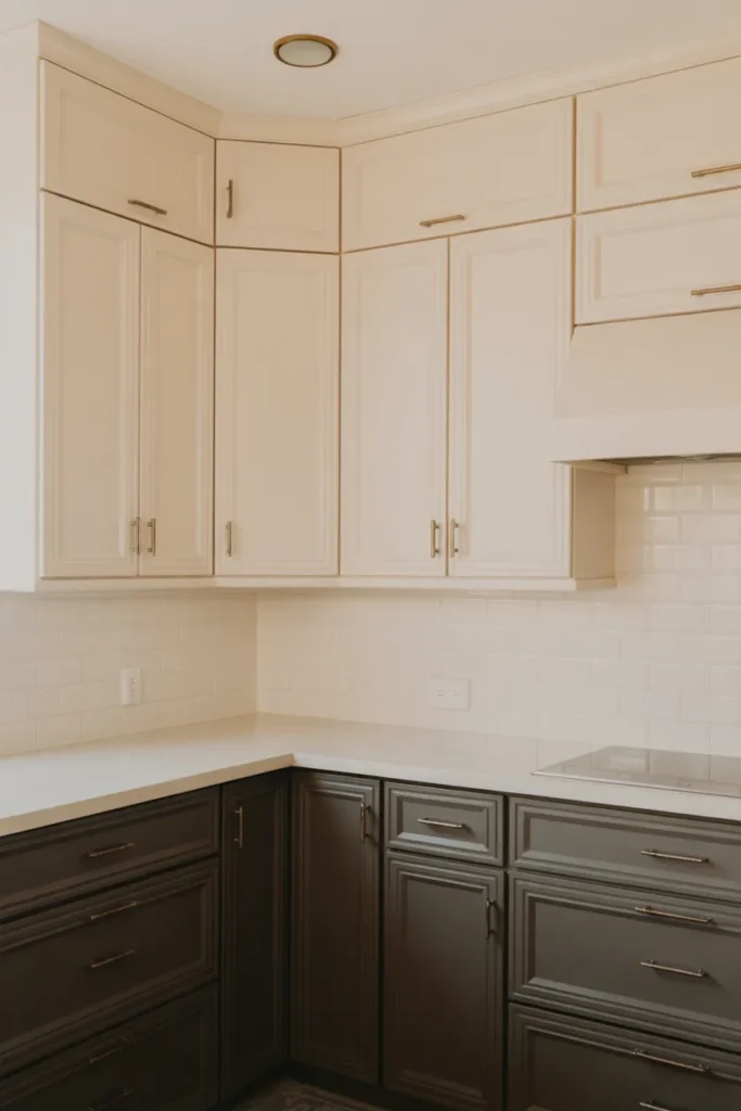
This approach suits kitchens of any size, but it is particularly effective in kitchens with standard 8-foot ceilings, where an all-dark cabinet treatment would make the space feel lower and heavier than it is. The contrast between the two tones draws the eye horizontally across the countertop line, which is the most important visual zone in any kitchen.
The material finish must be consistent between the two cabinet tones to maintain cohesion. Both tiers should be the same door profile, the same finish type — both matte, both satin, or both gloss — and the same hardware. Mixing a matte lower with a gloss upper, for example, disrupts the continuity that makes the two-tone kitchen feel intentional rather than mismatched.
8. Warm Walnut Accents in an Otherwise All-White Kitchen to Prevent Sterility
An all-white kitchen risks reading as clinical, cold, or unfinished if no warm material is introduced. Walnut — in the form of open shelving, a kitchen island top, floating shelf brackets, or cabinet accent panels — is the most effective and most used warm counterpoint in minimalist luxury kitchens because its deep grain and warm brown tone activates white without introducing color. The result is a kitchen that is still technically a neutral, minimal space but feels genuinely warm and lived-in.
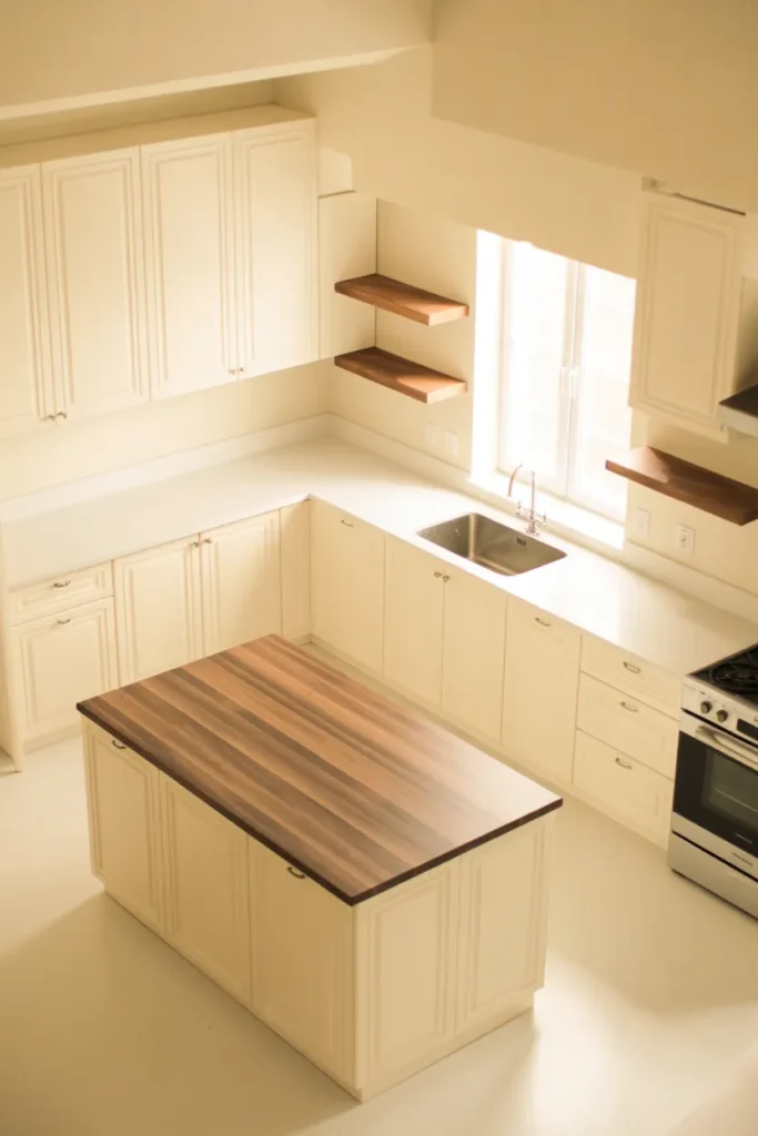
The specific locations where walnut reads best are the island top, the floating shelves, and the lower kickboard panel. These are the zones closest to human interaction — where hands, eyes, and daily activity concentrate — and where the warmth of natural wood has the most perceptual impact. Walnut on upper cabinetry, by contrast, is less visible from standard standing and sitting positions and delivers less visual return for the same investment.
Solid walnut surfaces near a sink or cooking zone require oiling on installation and periodic re-oiling depending on use intensity. Engineered walnut panels and veneer finishes require less maintenance and perform better in high-humidity kitchen environments. For any surface that will see regular water contact, an engineered walnut product with a UV-cured finish is more durable than solid wood without sacrificing the visual quality that makes walnut valuable in this context.
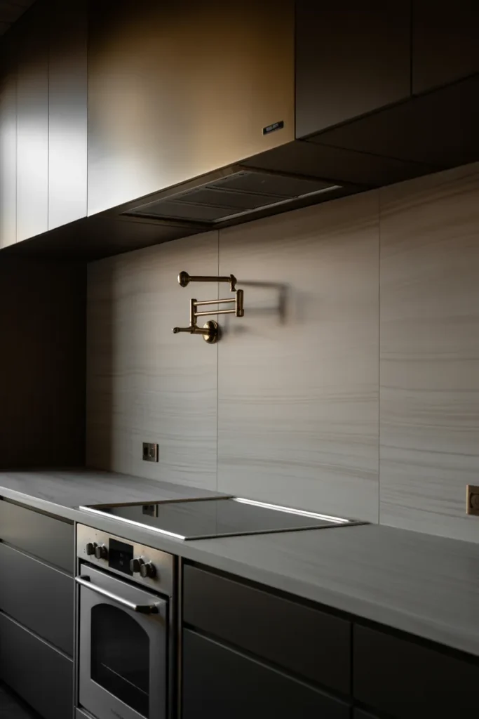
9. Concealed Range Hood Behind a Flush Ceiling Panel for an Unbroken Sightline
A concealed range hood — where the extraction mechanism is hidden behind a flush ceiling panel or built into the cabinetry above the cooking zone — is one of the most impactful upgrades in a functional kitchen floor plan focused on minimalist aesthetics. Standard range hoods, even designer ones, introduce a visual element above the cooking zone that draws the eye upward and breaks the horizontal continuity of the cabinetry run. A concealed hood eliminates that interruption.
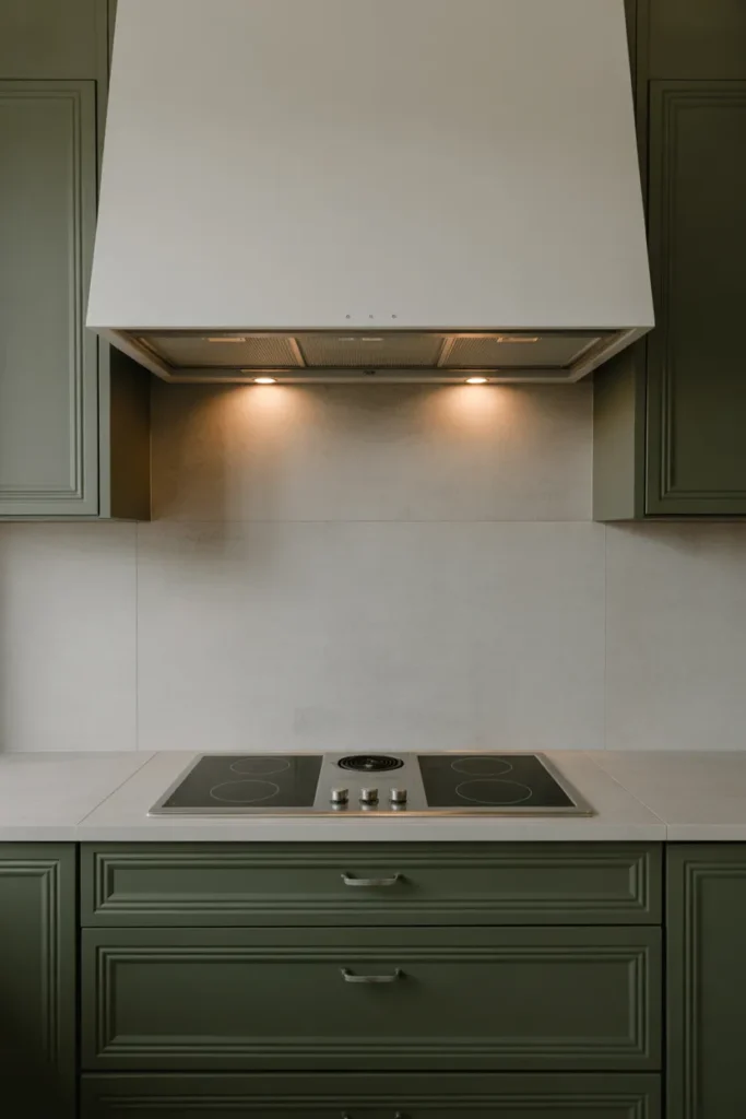
This approach is most valuable in open-plan kitchens where the range wall is visible from the living area. The absence of a visible hood keeps the kitchen wall reading as a clean, continuous cabinetry surface from every angle in the room. It is also effective in low-ceiling kitchens — under 9 feet — where a projecting range hood compresses the perceived ceiling height.
The engineering requirement is ventilation capacity. A concealed hood requires adequate duct routing through the ceiling cavity, which must be planned at the structural level before cabinetry installation. Retrofitting a concealed hood into an existing kitchen is significantly more complex and costly than specifying it in a new construction or full renovation project. Confirm duct routing feasibility with a contractor before this detail is incorporated into the design.
10. Statement Lighting Above the Island That Functions as Sculpture, Not Just Illumination
In a minimalist kitchen where every surface is restrained and material selection is deliberate, the pendant or chandelier above the island carries a disproportionate amount of design responsibility. When the cabinetry, countertop, and backsplash are all quiet and neutral, the island light becomes the room’s most expressive element — the one place where material, form, and scale are allowed to make a statement.
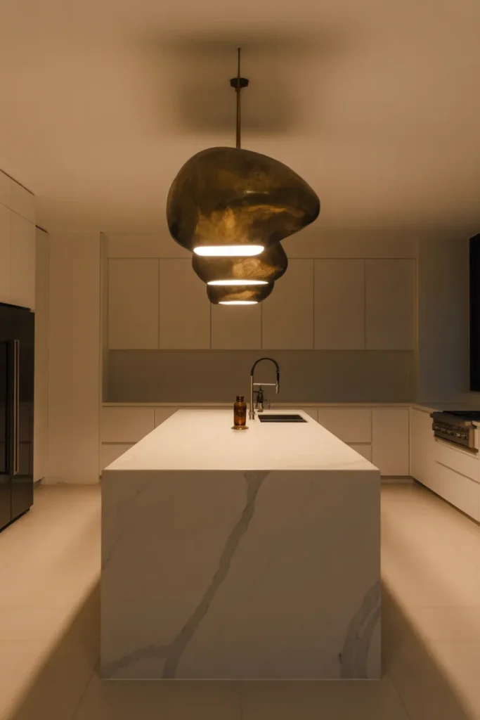
Sculptural pendant lights in aged brass, hand-blown glass, or architectural black metal work in this context because they introduce a material and visual language that the flat surfaces of a minimalist kitchen cannot express. Two or three pendants hung in a row above a rectangular island create rhythm. A single oversized pendant above a round island creates presence. The scale should feel slightly larger than conventional — undersized pendants above a large island look timid and undermine the design intention.
The functional requirement is non-negotiable alongside the aesthetic one. Island lighting must provide adequate task illumination for food preparation, not just ambient mood. Pendants hung at 30 to 36 inches above the countertop surface deliver the best combination of task light intensity and visual proportionality. Hanging them higher reduces glare but also reduces functional light output, which is a trade-off that matters in a working kitchen.
11. Integrated Toe-Kick Lighting That Makes the Floor Appear to Float
Toe-kick lighting — LED strip lights installed in the recessed base of lower cabinetry at floor level — is one of the most underused and highest-impact details in a minimalist luxury kitchen. When activated, the light appears to lift the cabinetry off the floor, creating a floating effect that makes the kitchen feel larger and more designed than the same kitchen without it. It is the detail that photographs dramatically and reads as luxury in person at a cost that is accessible in any renovation budget.
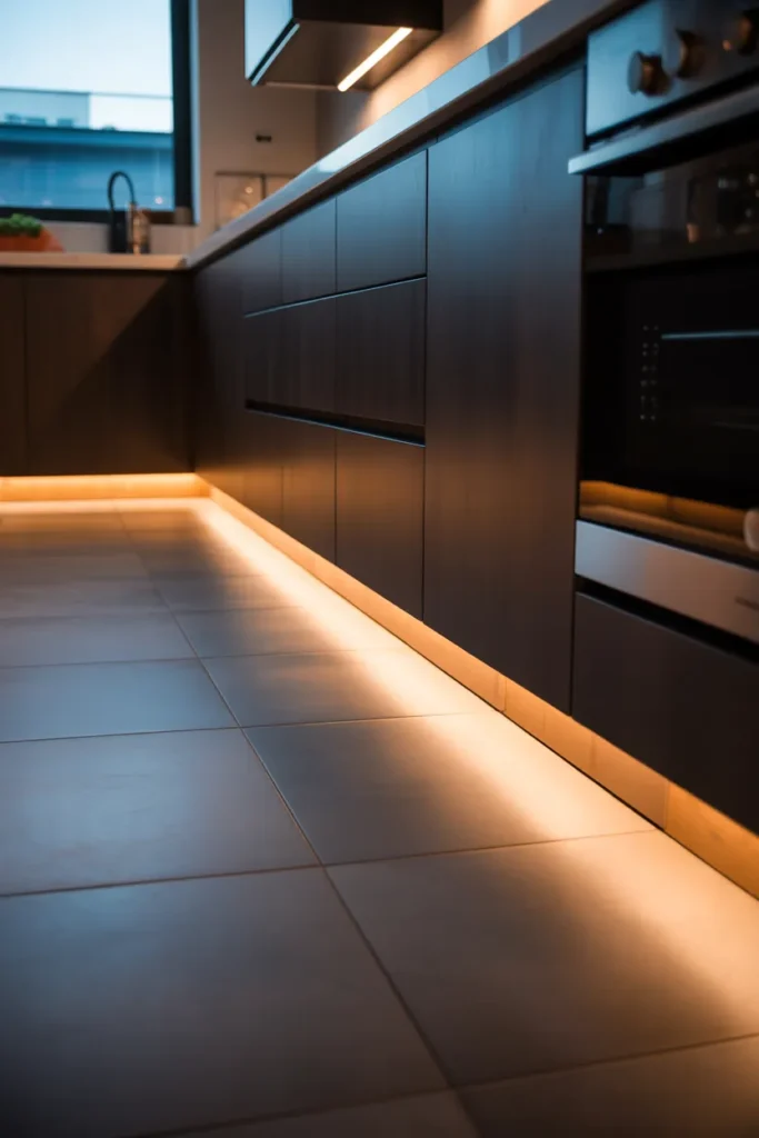
This detail works in kitchens of any size but has the greatest perceptual impact in smaller kitchens where the floor area is limited. The horizontal band of light running along the base of the cabinetry draws the eye outward toward the perimeter of the room, which visually expands the floor plane. In combination with large-format floor tiles with minimal grout lines, the floating effect is maximized.
Toe-kick lighting should be specified as warm white LED — 2700K to 3000K — not cool white or daylight. Cool-toned toe-kick light creates an institutional quality that is contrary to the warmth a luxury kitchen requires. The light output should be subtle: bright enough to see the floating effect clearly but not so bright that it competes with the primary ceiling illumination. A dimmer circuit for the toe-kick strip allows adjustment for different times of day and use modes.
12. Fluted or Ribbed Island Panel That Adds Architectural Detail Without Ornamentation
A fluted or reeded panel on the visible face of a kitchen island — vertical channels routed or molded into the island’s side or front panels — introduces architectural texture at the most visible point in the kitchen without adding decorative ornamentation. It is a material detail borrowed from classical architecture and reinterpreted in a modern context where it reads as refined and distinctive rather than traditional.
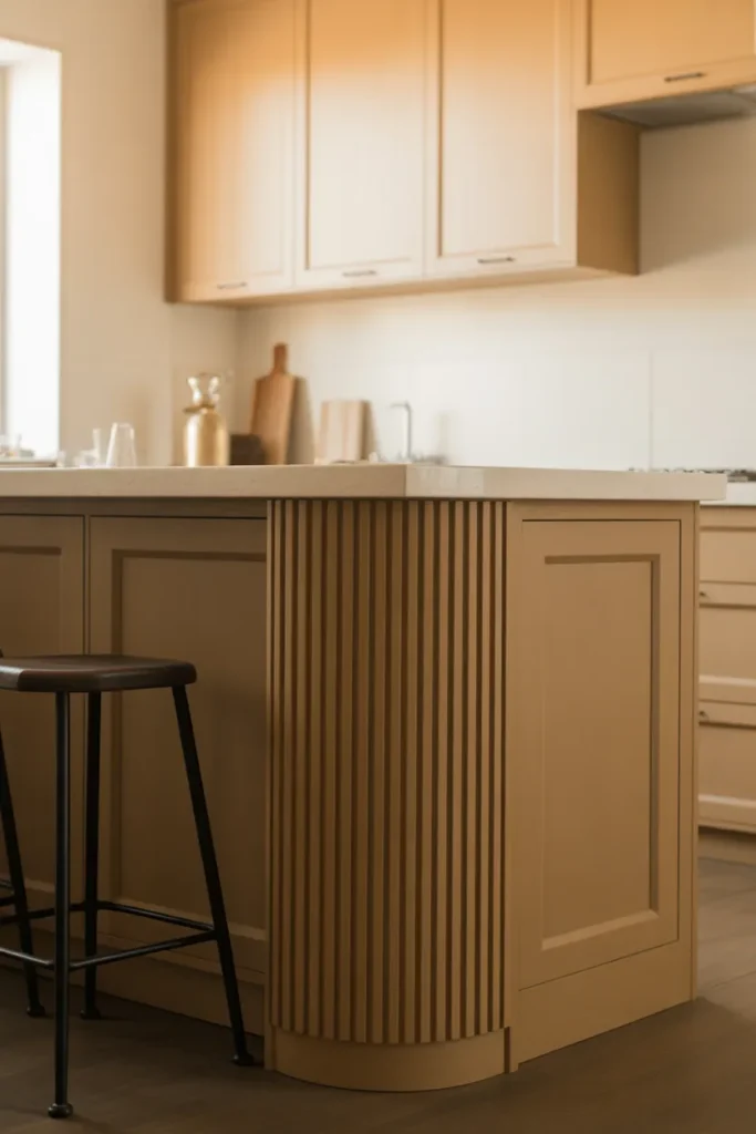
This works particularly well on islands painted in a tone that is one shade deeper than the surrounding cabinetry. The slight tonal differentiation, combined with the fluted texture, signals that the island is a deliberate design object within the kitchen rather than simply an extension of the counter space. The shadow lines created by the vertical channels respond to both natural and artificial light, which gives the island a visual quality that changes subtly throughout the day.
The fluted detail should be applied only to the non-functional surfaces of the island — the sides or the front panel facing the living area — and not to the cabinetry doors on the working side. Fluted cabinetry doors on the working side of an island complicate hardware installation and create cleaning challenges in a kitchen environment. The detail performs best as a purely visual element on surfaces that are not regularly touched or accessed.
13. Integrated Refrigerator Column Flush With a Full Cabinetry Wall for a Hotel-Like Finish
A refrigeration column — a tall, narrow refrigerator unit integrated flush into a full floor-to-ceiling cabinetry wall alongside matching cabinet panels, pantry storage, and potentially a second freezer column — is the most complete expression of kitchen space planning ideas in a minimalist luxury context. The result is a wall that reads as a single architectural element from floor to ceiling, with no visible appliance breaks or irregular heights.
This configuration suits kitchens with a dedicated storage or refrigeration wall — typically opposite the cooking and preparation run — and requires planning from the structural stage of a renovation. The columns must be aligned with ceiling height and coordinated with the surrounding cabinet depths to maintain a flush face across the entire wall.
The practical case for column refrigeration over a standard side-by-side or French door unit is flexibility. Refrigerator and freezer columns are separate units that can be positioned independently — the refrigerator near the preparation zone and the freezer near the pantry storage, for example. This flexibility optimizes kitchen workflow in a way that a single combined unit cannot. The trade-off is cost: column refrigeration is among the most expensive appliance configurations available, and the panel-front integration adds further installation cost.
14. Japandi-Influenced Minimalist Kitchen With Natural Stone and Raw Linen
The Japandi design direction — merging Japanese spatial restraint with Scandinavian material warmth — produces some of the most livable minimalist luxury kitchens because it prioritizes texture and natural material over color or decorative detail. In a kitchen context, this translates to a palette built on natural stone countertops, raw linen Roman shades, matte ceramic hardware, and cabinetry in a warm, desaturated tone like warm ash, pale sage, or natural oak veneer.
This is not a kitchen style that announces itself — it rewards close attention. The materials reveal their quality gradually, through texture and finish variation, rather than immediately through contrast or visual complexity. It is most effective in kitchens that receive significant natural light, where the stone and textile surfaces respond to changing light conditions throughout the day.
The mistake to avoid in a Japandi kitchen is over-minimizing to the point of coldness. The warmth in this aesthetic comes entirely from material selection — the grain of the wood, the variation in the stone, the softness of the textile. If any of those material categories is removed or replaced with a synthetic equivalent, the warmth disappears and the kitchen tips from serene into bare.
15. Sage Green Kitchen With Unlacquered Brass Hardware for a Timeless Modern Look
Sage green cabinetry with unlacquered brass hardware is one of the most reliably timeless combinations in modern kitchen design because neither element is trend-driven in isolation. Sage is a desaturated, gray-green that reads as a near-neutral — it functions in the palette the way a warm white does, anchoring without competing. Unlacquered brass, which develops a natural patina over time, introduces warmth and age that keeps the kitchen from feeling freshly installed and sterile.
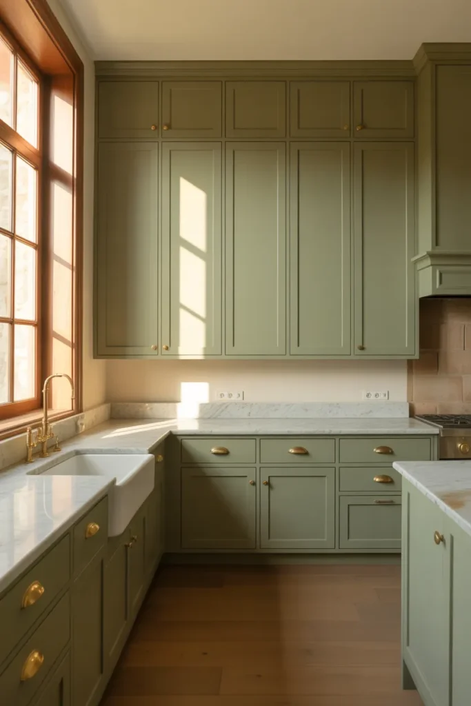
This combination works particularly well in kitchens that connect visually to outdoor spaces — a backyard, a garden, or a terrace — because the sage green resonates with the natural tones visible through the window. The visual connection between the interior palette and the exterior landscape creates a cohesion that is difficult to achieve with any other cabinet color choice.
Unlacquered brass hardware requires a practical commitment. Unlike lacquered brass, which maintains a uniform finish indefinitely, unlacquered brass develops irregular darkening and spotting as it oxidizes. This patina is the aesthetic point — it makes the kitchen feel collected and evolved rather than showroom-new — but it is a look that must be actively appreciated rather than merely tolerated. If uniform, consistent hardware finish is the preference, a brushed or satin brass with a lacquer coating achieves the warm gold tone without the patina development.
16. Microwave Drawer and Hidden Trash Pull-Out That Keep Counters Completely Clear
Counter clarity is the defining visual principle of the sleek modern kitchen design guide to minimalist luxury approach, and nothing undermines it faster than countertop appliances and visible waste management. A microwave drawer — integrated into the lower cabinetry run at a comfortable height below the countertop — and a pull-out trash and recycling unit concealed behind a cabinet door are the two most impactful practical decisions that support the minimal counter aesthetic.
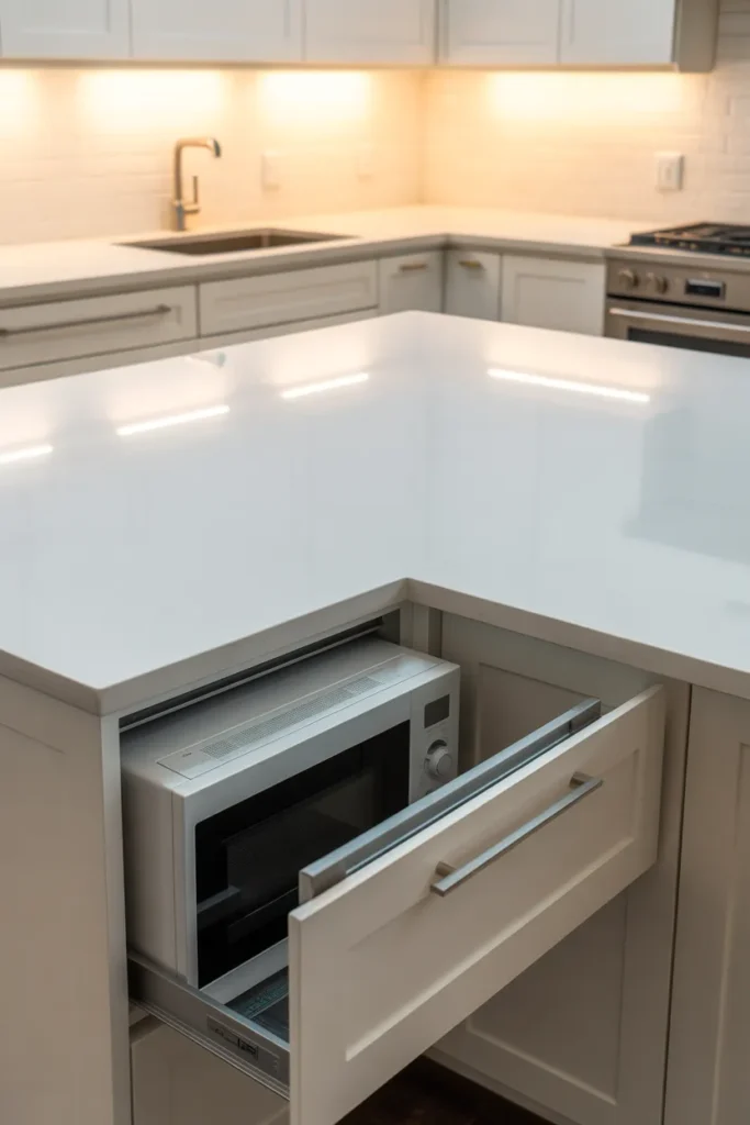
The microwave drawer eliminates the appliance from the countertop entirely without sacrificing function. Installed in the island or in a lower cabinet run, the drawer pulls out at waist height, which is actually more ergonomically appropriate than a countertop microwave at eye level and significantly more accessible than an over-range microwave above shoulder height.
The pull-out waste unit requires planning at the cabinetry stage of a renovation. The most functional configuration is a double-bin pull-out — one bin for trash, one for recycling — concealed behind a single door in the cabinetry run nearest to the primary preparation zone. A unit positioned too far from the prep area gets used less consistently, which means waste ends up on the counter between trips. Position the waste pull-out within two steps of the primary cutting and prep surface.
17. Floor-to-Ceiling Window Replacing Upper Cabinets for a Kitchen That Feels Twice Its Size
In kitchens where a window wall is structurally possible — typically on an exterior wall or adjacent to a terrace — replacing the entire upper cabinet run with floor-to-ceiling glazing is the most dramatic single decision in open kitchen layouts designed around light and space. The result is a kitchen that loses upper storage but gains an irreplaceable quality of natural light, outdoor connection, and perceived volume that no other design decision can replicate.
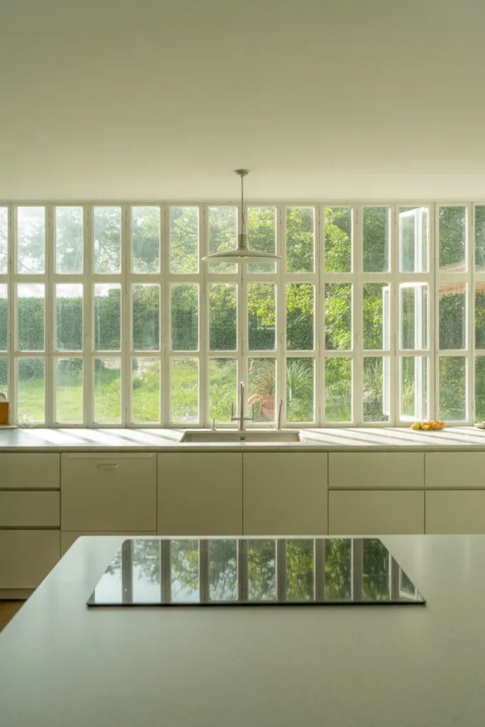
This approach requires accepting a storage trade-off and solving it elsewhere. Lower cabinetry must work harder — pull-out pantry systems, drawer stacks rather than door-and-shelf cabinets, and dedicated appliance garages within the lower run. A pantry room or closet adjacent to the kitchen can compensate for the lost upper cabinet volume if the floor plan allows. The storage solution must be planned before the window wall is committed to, not afterward.
The kitchen design result is a space that reads as a room rather than a utility. When the upper half of the kitchen wall is glazing rather than cabinetry, the kitchen participates in the light and landscape of its environment in a way that fundamentally changes how the room feels to work in. In climates with significant natural light, this decision elevates the daily experience of cooking and preparing food in a way that is difficult to communicate on a floor plan but immediately apparent in person.
Final Thoughts
This sleek modern kitchen design guide to minimalist luxury covers every significant decision point — from cabinetry profiles and material selection to lighting strategy and appliance integration — with the specificity needed to make real choices rather than simply gather inspiration. Each of these 17 ideas is grounded in how kitchens actually function and what genuinely produces the minimal luxury quality you are aiming for. Save this post so you have it as a practical reference throughout your planning process, and explore more kitchen layout and design guides to build a complete picture of what your ideal kitchen requires.