If you have recently updated your bedroom but it still does not look the way you imagined, you are dealing with one of the most common and fixable problems in home design. Why your new bedroom still looks cheap is almost never about budget — it is about a specific set of decisions that quietly undermine an otherwise decent room. This post identifies 18 of those exact problems and gives you a clear, actionable fix for each one.
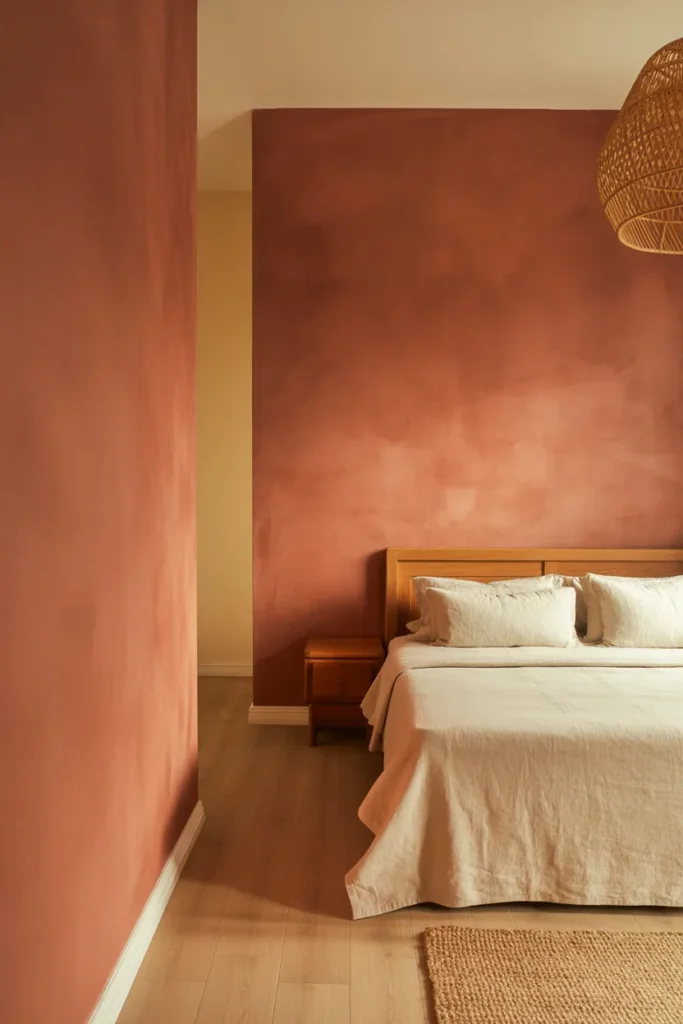
1. Your Curtains Are Hung Too Low and Cut the Room in Half
Nothing dates and cheapens a bedroom faster than curtains hung directly above the window frame. When the rod sits at window height, the curtain panel stops mid-wall, which visually cuts the room into two horizontal zones and makes the ceiling feel dramatically lower than it is. This is one of the most common reasons a new bedroom still looks unfinished despite good furniture choices.
The fix is straightforward: mount the rod as close to the ceiling as possible — ideally within two to four inches of the crown molding or ceiling line — and let the panels fall to the floor. The vertical drop from ceiling to floor is what creates the sense of height and architecture that makes a bedroom look considered and expensive.
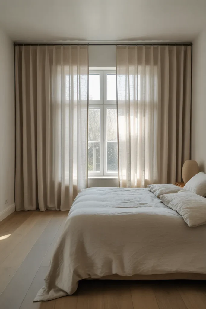

If your current curtain panels are not long enough to reach the floor from ceiling height, they are the wrong size for the room. Standard 84-inch panels were designed for rod placement at window height. Move to 96-inch or 108-inch panels before repositioning the rod. The fabric length is not decorative — it is structural to the room’s proportions.
The rod should also extend six to ten inches beyond the window frame on each side. This allows the panels to hang clear of the glass when open, which maximizes light and makes the window itself appear significantly wider than it actually is.
2. Your Rug Is Too Small and Making the Room Feel Disconnected
A rug that is too small for the room is one of the clearest signals of an under-designed space. When a rug sits entirely under the bed or barely extends past the nightstands, it reads as an afterthought rather than a foundation. The furniture appears to float above the floor with no visual anchor, and the room feels like a collection of separate objects rather than a composed space.
The correct sizing rule for a bedroom rug is that it should extend a minimum of 18 to 24 inches beyond the sides and foot of the bed. In a queen bedroom, this typically means an 8×10 rug. In a king bedroom, a 9×12 is often the right choice. The front legs of the nightstands should sit on the rug, and when you get out of bed in the morning, your feet should land on the rug — not on bare floor.
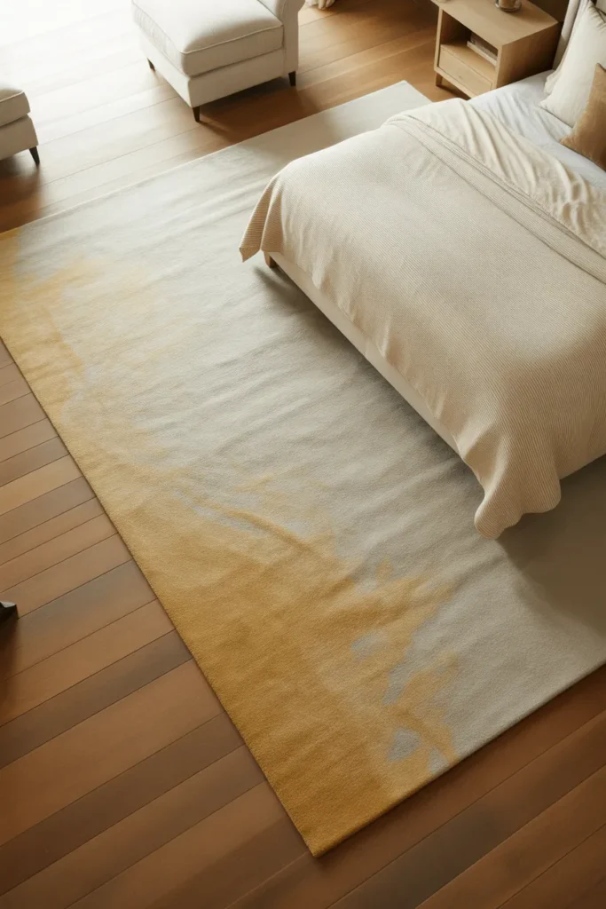
The most common mistake is buying a rug based on how it looks in a product photo rather than measuring the actual floor space first. Measure your room before you shop. Mark the rug dimensions on the floor with painter’s tape to visualize the scale before purchasing.
If a correctly sized rug is outside your current budget, a layered rug approach — a large natural fiber base rug like jute or sisal with a smaller patterned rug layered on top — gives you the correct floor coverage at a lower total cost and adds textural depth that a single flat rug cannot deliver.
3. Your Bedding Has No Layering and Reads as Flat and Unfinished
A bed made with only a comforter and two pillows is one of the most reliable visual signals of a cheap-looking bedroom. The flat, single-layer quality of an unlayered bed makes even an expensive comforter look like budget bedding because there is no depth, no texture variation, and no sense of intentional composition. This is one of the most fixable problems on this list and requires no renovation.
Layering bedding is not about excess — it is about creating the textural depth that makes a bed look rich. The basic layered formula is: a fitted sheet, a flat sheet or duvet, a folded throw blanket across the foot of the bed, and pillows in at least two sizes. The throw at the foot of the bed is the element most people skip, and it is the one that transforms the composition from flat to finished.

Pillow arrangement matters as much as pillow quantity. For a queen bed: two standard sleeping pillows in cases, two Euro shams standing behind them, and two decorative throw pillows in front. For a king: two king sleeping pillows, two or three Euro shams, and two to three throw pillows. The layered depth this creates — from tall square Euros at the back to smaller decorative pillows at the front — is what makes a bed look like it belongs in a well-designed room.
Stick to a maximum of three colors or tones in your bedding. Mixing too many colors or patterns across pillow covers, shams, and throws creates visual noise that reads as chaotic rather than layered. A simple formula: one neutral base, one texture, one subtle accent.
4. Your Lighting Is Only Overhead and Creating a Harsh, Flat Atmosphere
A single overhead light — whether a ceiling fixture or recessed can lights — is the number one lighting mistake in bedrooms that look cheap or feel uncomfortable. Overhead light comes from above, casts unflattering downward shadows, and illuminates the room evenly in a way that eliminates depth, warmth, and atmosphere. It is functional but it is not design.
A well-designed bedroom uses layered lighting from at least three sources: an overhead light for general ambient use when needed, bedside lamps or sconces for reading and evening warmth, and at least one accent light — a floor lamp in the corner, LED strips behind the headboard, or a table lamp on the dresser. Each source operates at a different height and casts light in a different direction, which creates the dimensional, warm quality that makes a bedroom feel expensive.
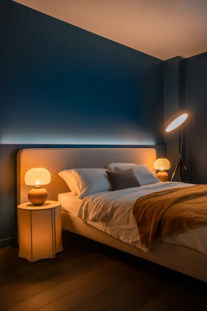
Bedside lamps are the most impactful single lighting upgrade available. They bring light to eye level when you are lying or sitting in bed, which is the position from which you experience the room most often in the evening. A ceiling light experienced from a lying-down position is glaring and unflattering. A warm bedside lamp experienced from the same position is comfortable and enveloping.
The bulb temperature matters as much as the fixture. Warm white bulbs in the 2700K range produce the amber, cozy quality associated with expensive hotel rooms and well-designed spaces. Cool white or daylight bulbs in a bedroom produce a clinical, office-like quality regardless of how nice the fixtures are. Replace any cool or daylight bulbs in your bedroom immediately.
5. Your Headboard Is Wrong for the Room and Undermining Everything Around It
The headboard is the visual anchor of any bedroom. It sits behind the bed, occupies the most prominent wall in the room, and sets the register of the entire space. A headboard that is too small, too low, the wrong material, or the wrong scale for the bed makes everything around it look cheaper by association — even good furniture, good bedding, and good lighting.
Scale is the most common headboard error. A headboard should be as wide as the mattress it sits behind, and ideally the same width as the bed frame. A queen bed with a headboard narrower than 60 inches will look mismatched and undersized. Height matters equally: a low headboard on a bed in a room with nine-foot ceilings looks insignificant. A tall upholstered headboard — 54 inches to 60 inches high — fills the wall appropriately and creates a proper visual anchor.
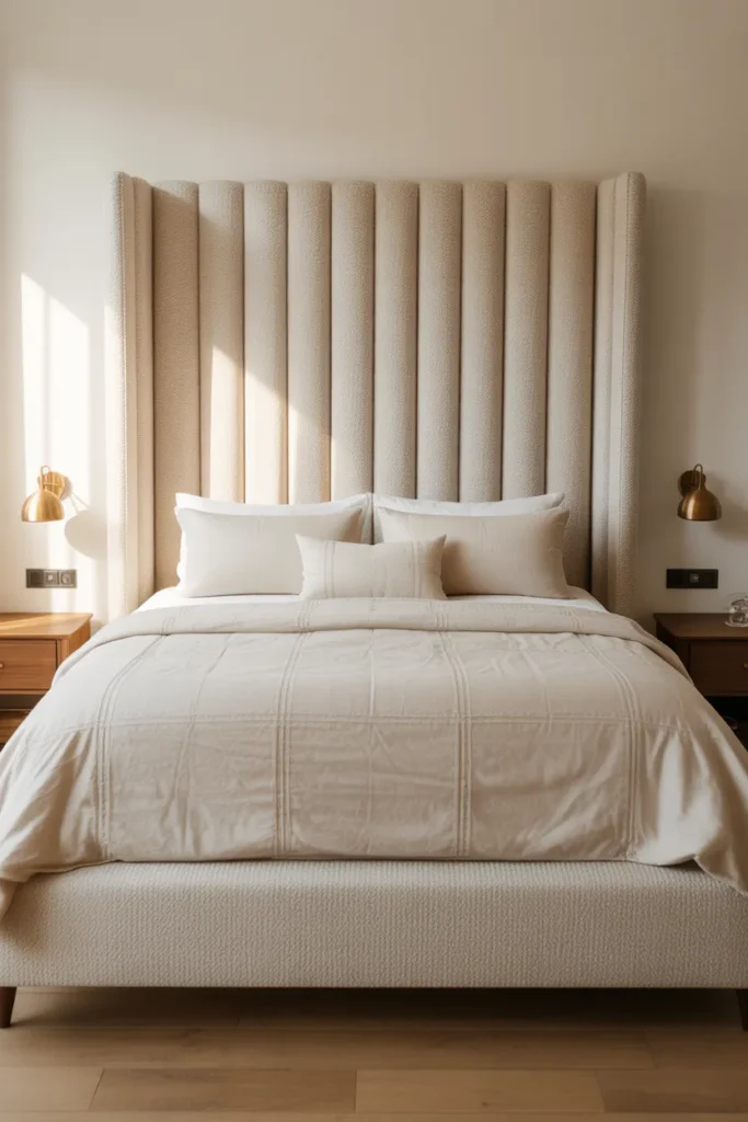
Material communicates quality immediately. Fabric upholstered headboards in linen, boucle, or velvet read as high-quality at almost any price point because the softness of the material connects the headboard to the bedding in a visually cohesive way. A cheap laminate or particleboard headboard — regardless of color or design — reads as low-quality because the material itself signals the budget it came from.
If a new headboard is not in your immediate budget, remove the existing one entirely and lean a large mirror, a grid of large framed prints, or a piece of fabric wall art behind the bed instead. A thoughtfully executed headboard alternative looks better than a headboard that is wrong for the room.
6. Your Walls Are Empty and Making the Room Feel Like a Rental
Empty walls are the fastest way to make a new bedroom look unfinished and temporary. Paint color alone is not enough to make a wall feel designed. A room with furniture on the floor and nothing on the walls reads as an incomplete space — it is why furnished model apartments always include art, mirrors, and wall accessories even when budgets are tight.
Wall art in a bedroom does not need to be expensive to be effective. A single large piece — a canvas print, a framed poster in a quality frame, or a textile wall hanging — positioned above the dresser or centered on a side wall is more impactful than a gallery wall of small mismatched frames. In most bedrooms, three to four well-chosen pieces in the right positions are sufficient. More than that begins to feel busy.
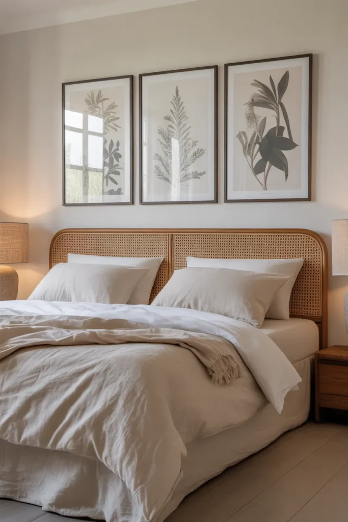
Above the bed is the most important wall zone in the room. The wall above the headboard should have something — a single large piece centered above the headboard, two medium pieces flanked symmetrically, or a horizontal grouping that fills the width of the bed. The piece or grouping should not be narrower than the headboard itself.
Frame quality matters more than art quality. A mediocre print in a well-made frame looks intentional and designed. An excellent print in a cheap plastic frame looks bargain-bought. If you are purchasing art prints, allocate as much of your budget to the frame as to the print itself.
7. Your Furniture Is All the Same Height and Feels Visually Monotonous
Rooms where every piece of furniture sits at the same approximate height — bed frame, dresser, nightstands, bench — create a flat, one-dimensional visual landscape that reads as under-designed. Variation in height is one of the fundamental principles of composed interior spaces, and its absence is one of the quiet reasons why your new bedroom still looks cheap despite having the right pieces.
Height variation creates visual rhythm. A tall dresser next to a low bed frame next to a floor-level upholstered bench creates a landscape that the eye travels across with interest. A bed frame, nightstands, and dresser all at 30 inches creates a horizontal plateau that the eye has no reason to engage with.
The easiest height variation to introduce in a bedroom is vertical: a tall mirror leaning against the wall, a floor lamp in a corner, a tall plant in a large ceramic pot, or an architectural headboard that extends significantly above the mattress line. These vertical elements break the horizontal monotony without requiring new furniture purchases.
On the dresser or credenza, create a small vignette that varies in height — a tall vase or candlestick, a medium ceramic object, a low tray with small items. This micro-scale height variation on a horizontal surface replicates the same design principle at a smaller scale and is one of the most cost-free improvements you can make.
8. Your Nightstands Do Not Match the Scale of Your Bed
Nightstands that are too small for the bed they flank are one of the most visually destabilizing elements in a bedroom. A king bed with two tiny side tables — or worse, mismatched pieces that happened to be available — looks imbalanced and haphazard. Scale relationship between the bed and its flanking pieces is a fundamental proportion rule that most people ignore when furnishing a bedroom.
The nightstand surface should sit at roughly the same height as the top of the mattress, which is typically between 24 and 28 inches from the floor in most modern bed frames. A nightstand that is significantly lower than the mattress surface looks like it belongs in a different room. A nightstand that is significantly higher creates an awkward visual step.
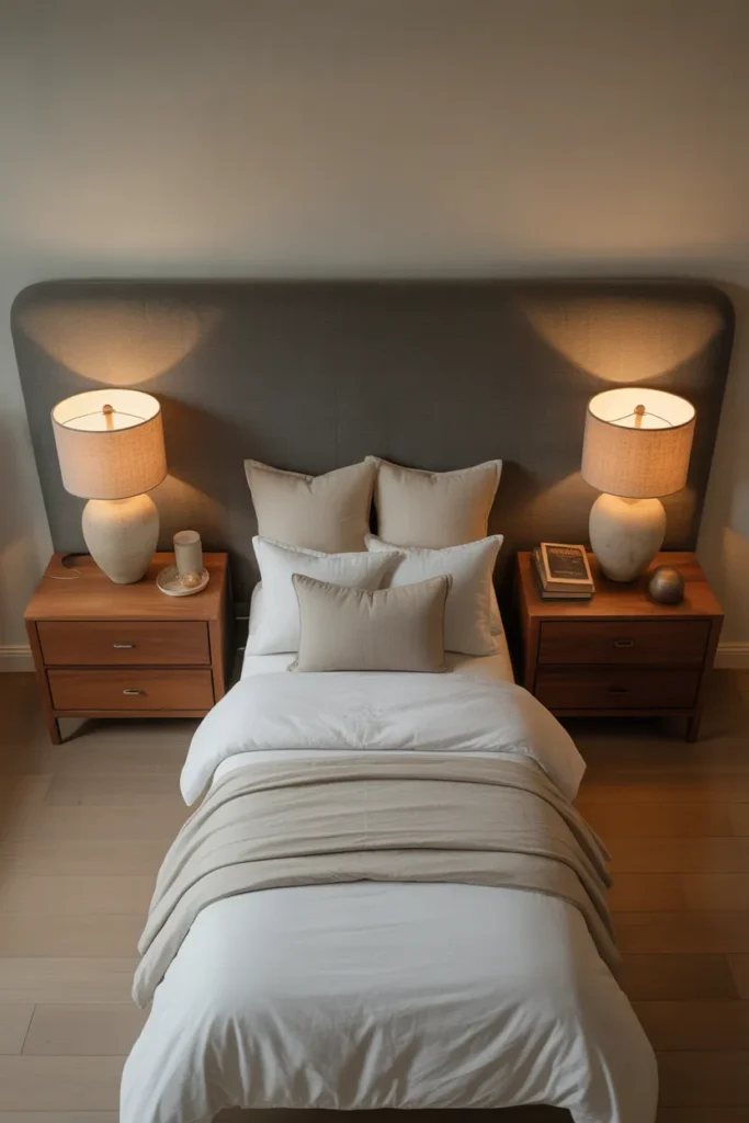
Width matters as much as height. A nightstand should be wide enough to hold a lamp, a book, and a glass of water without looking crowded. For a king bed, nightstands narrower than 18 inches look undersized. For a queen, nightstands of 16 to 22 inches are proportionally correct depending on the room size.
If you have mismatched nightstands and cannot replace them immediately, unify them visually with matching lamps, matching trays, or the same decorative object on each surface. Visual repetition across two different pieces creates the impression of intention that makes the mismatch less apparent.
9. Your Room Has No Focal Point and the Eye Does Not Know Where to Land
A bedroom without a clear focal point feels visually restless and unresolved. The eye enters the room, finds no natural anchor, and bounces between equally weighted elements without settling. This creates an impression of chaos or incompleteness even when the room is technically furnished and decorated. It is one of the subtler reasons why a new bedroom still looks cheap — not because anything is wrong individually, but because nothing is in charge.
The bed wall is almost always the correct focal point in a bedroom. Everything in the room — including how furniture is arranged, where lighting is placed, and what goes on the adjacent walls — should support and reinforce the bed wall as the primary visual destination. If the bed wall is currently competing with an equally decorated opposite wall or a strong element on a side wall, the room has no hierarchy and no focal point.
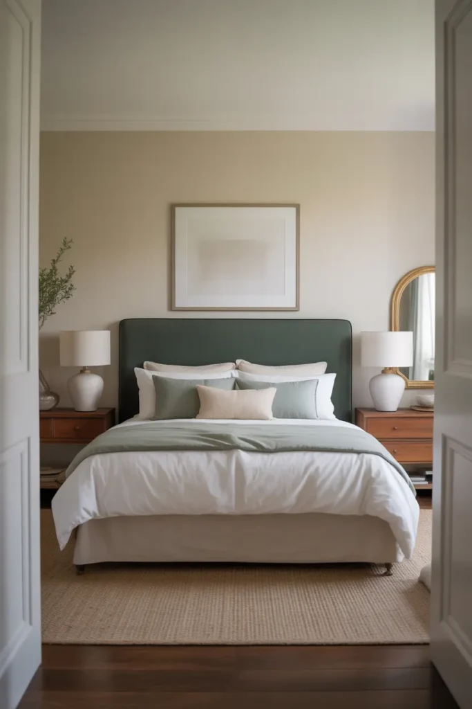
To strengthen the bed wall as a focal point: use the tallest headboard the room can proportionally support, center the bed precisely on the wall with equal space on both sides, flank the headboard with matching bedside lamps or wall sconces at the same height on each side, and place the primary art directly above the headboard. This bilateral symmetry around the headboard creates a composed, deliberate arrangement that immediately reads as designed.
Keep the opposite wall and side walls quieter in comparison. A single mirror, a single piece of art, or a furniture piece without additional wall decoration is the correct level of treatment for non-focal walls in most bedrooms. When every wall competes for attention, no wall wins.
10. Your Paint Color Is Slightly Wrong and Shifting the Whole Room
Paint color is the most underestimated source of cheap-looking bedroom problems. A color that looked warm and sophisticated on a small paint chip can read as dingy, cold, or washed-out on four full walls under your specific room’s lighting conditions. This is not a quality issue — it is a light-interaction issue, and it affects every paint color regardless of cost.
The most reliable way to avoid this problem is to test large samples — at least 12×12 inches — painted directly on the wall in your specific room, and to view them at three different times of day: morning, midday, and evening with artificial light. Colors shift dramatically between these conditions, and a color that reads beautifully in the afternoon may turn gray or orange under your bedroom’s evening lamp light.
Warm whites and off-whites are the most frequently misapplied bedroom colors. A white with even a slight cool or purple undertone will read as flat and institutional on a full wall. A white with a cream, linen, or warm gray undertone will read as soft, sophisticated, and expensive. The difference between these two whites is invisible on a chip but immediately apparent on a full wall.
If your current paint color is the problem, the fix does not necessarily mean repainting all four walls. Repainting just the bed wall in a deeper, more confident tone — while keeping the remaining three walls in a neutral — is one of the most effective and lowest-effort bedroom transformation approaches available. The accent wall approach is not outdated when it is executed with intention.
11. Your Dresser Surface Is Cluttered and Reads as Disorganized
In a well-designed bedroom, every horizontal surface is treated as a deliberate composition, not a drop zone. A dresser covered with a random collection of hair products, chargers, loose change, receipts, and mismatched objects undermines the entire room because it is typically the largest horizontal surface visible from the doorway and the first thing a visitor’s eye moves to after the bed.
The principle that applies to dresser surfaces is the same one that applies to any designed shelf or table: intentional grouping, height variation, and negative space. You need approximately 50 percent of the surface to remain clear for the composition to read as edited rather than full. A full surface, no matter how nice the individual objects, reads as cluttered.
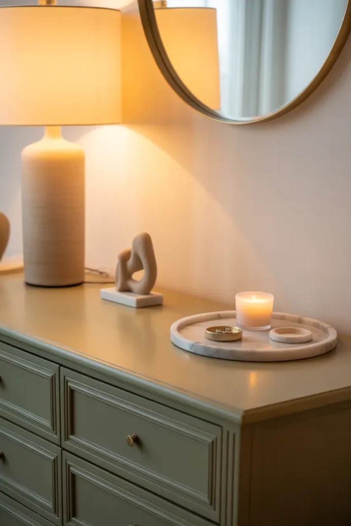
A practical dresser vignette formula: one tall element (a lamp or tall vase), one medium element (a decorative object or small plant), one low element (a tray or small dish to corral smaller items), and clear space around them. Everything that does not belong in this composition belongs in a drawer or off the dresser entirely.
Functional items — chargers, remotes, daily-use jewelry — should be corralled into a tray or decorative box rather than sitting loose on the surface. Containing them does not eliminate their presence but it organizes it, which is the difference between a surface that reads as designed and one that reads as neglected.
12. Your Bedroom Has No Plants or Organic Elements and Feels Sterile
A bedroom with no living or organic elements — no plants, no natural wood, no dried botanicals, no stone or ceramic objects — has a quality that is difficult to name but immediately recognizable: it feels sterile. Interior designers consistently use organic elements to introduce life, warmth, and a quality of incompleteness that makes a space feel inhabited rather than staged.
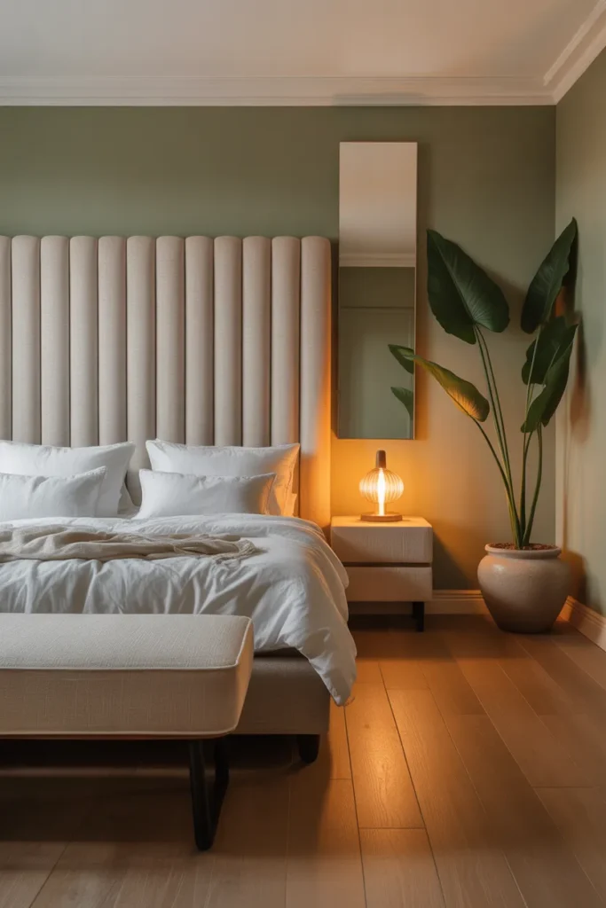
Plants are the most impactful organic element available in a bedroom. A single large plant — a fiddle leaf fig, a monstera, a large pothos in a hanging planter, or an olive tree in a ceramic pot — introduces a scale of organic presence that no decorative object can replicate. It also introduces height variation, which addresses one of the other common problems on this list simultaneously.
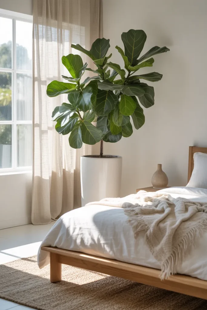
If plant maintenance is a genuine concern, a high-quality faux plant in the correct scale is a legitimate alternative for this specific application. The key word is scale: a small faux plant on a nightstand does not deliver the same visual impact as a large potted plant in the corner of the room. Buy the largest scale faux plant you can source in a ceramic or terra cotta pot that is proportionally correct.
Organic elements beyond plants — raw linen textiles, unfinished wood furniture, ceramic vessels, natural stone objects — contribute to the same lived-in, material-rich quality. A bedroom built entirely from synthetic or manufactured-looking materials lacks the warmth and sensory interest that natural materials provide almost automatically.
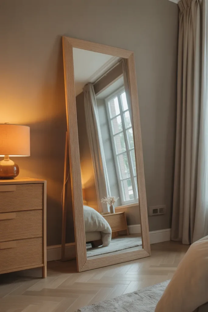
13. Your Mirror Is the Wrong Size or in the Wrong Place
Mirrors in a bedroom serve two distinct functions: practical reflection and spatial amplification. A mirror that is too small does neither effectively. A mirror placed on a wall where it reflects a door, a blank wall, or a ceiling fixture misses the opportunity to reflect light and expand the room’s perceived size. Placement and scale are the two decisions that determine whether a mirror improves a room or is simply present in it.
A leaning full-length mirror is the most versatile mirror option for a bedroom because its placement is flexible. Leaned against the wall beside the dresser, in a corner, or beside the wardrobe, a full-length mirror adds height, amplifies natural light if positioned to reflect a window, and provides the practical function of a full-body reflection without requiring wall mounting.
Above the dresser, a mirror should be proportionally related to the dresser width — approximately two-thirds to three-quarters of the dresser’s width is the visual sweet spot. A mirror that is narrower than half the dresser width looks undersized and unrelated to the furniture below it. A mirror wider than the dresser creates an imbalanced top-heavy effect.
Avoid mirrors that reflect the bed directly. In both practical sleep hygiene terms and in design terms, a mirror that reflects the bed back to its occupant creates a visual restlessness that makes the room feel smaller and the bed less private. Position mirrors to reflect windows, lamps, or open wall space rather than the sleeping surface.
14. Your Throw Blanket Is Decorative But Not in the Right Position
The throw blanket is one of the smallest and highest-impact decorative decisions in a bedroom, and most people either skip it entirely or place it incorrectly. A throw folded neatly and placed at the exact center of the foot of the bed is the most common wrong approach — it looks symmetrical but rigid, like a piece of furniture rather than a lived-in textile. The goal of a throw in a bedroom is to add softness, warmth, and a sense of casual comfort.
The correct approach depends on the room’s design register. In a formal or structured bedroom, a throw neatly folded in thirds and draped across the lower third of the bed reads as composed and intentional. In a more relaxed or organic bedroom, a throw casually draped off one corner of the bed — as if someone just pulled it aside — creates a more natural, inviting quality.

Texture and weight are as important as position. A thin, flat throw does not photograph well and does not read as a luxurious textile. A chunky knit, a heavy waffle-weave cotton, or a nubby boucle throw has enough visual texture to read clearly as a designed element from across the room. The throw’s texture should contrast with the smoothness of the duvet beneath it.
Color is the third decision. The throw should connect to the room’s palette — either matching a pillow cover, a rug, or a wall color — while being slightly different in tone or warmth to create a layered effect rather than a matched set. An all-matching throw and pillow in the exact same color and material reads as a set purchase, which signals budget decorating even when it is not.
15. Your Bedroom Smells Neutral and Is Missing a Sensory Layer
This is the one improvement on this list that has nothing to do with what you see and everything to do with what you experience when you walk into the room. A bedroom that looks well-designed but has no intentional scent — or worse, smells stale or of laundry — misses a complete sensory dimension that luxury hotels and well-designed residential spaces treat as seriously as the visual layer.
Scent in a bedroom is not about room spray or synthetic fragrance. It is about a consistent, subtle, natural scent that the room carries as a background presence. A reed diffuser in a corner, a ceramic vessel with dried lavender or eucalyptus, a lightly scented candle burned for thirty minutes before bed — any of these delivers the scent layer without requiring a visible product on the dresser.
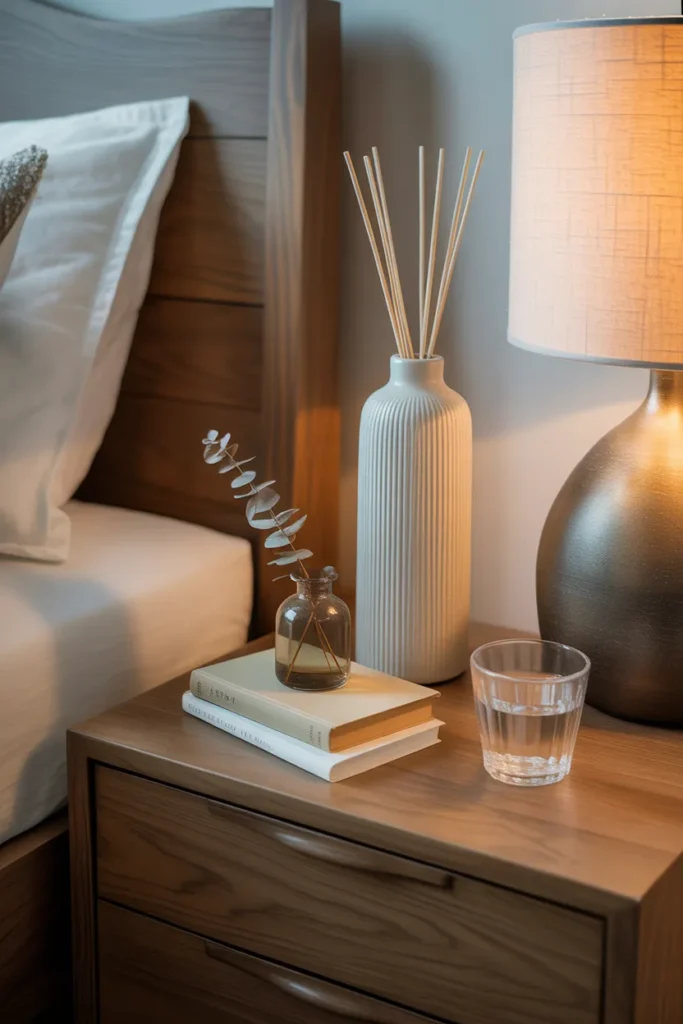
The scent should be consistent and not rotated frequently. Part of what makes a bedroom smell luxurious is that its scent is associated with the experience of being in that specific room. Changing scents weekly or using different products in the same space creates a disjointed sensory experience.
From a design visibility standpoint, the vessel that delivers the scent should be treated like any other decorative object: placed intentionally on the dresser vignette or nightstand, chosen for its visual quality as well as its functional purpose. A beautiful ceramic diffuser vessel or a simple glass candle in a quality container contributes to the room’s visual composition while performing its sensory function.
16. Your Bedroom Door, Trim, and Hardware Are Overlooked and Undercutting the Room
The architectural details of a bedroom — door hardware, window trim, door color, baseboards, and light switch plates — are the elements that separate a room that looks renovated from one that looks truly designed. When these details are mismatched, cheap, or simply left in their builder-grade default state, they signal that the room’s design stopped at the furniture level and did not reach the architecture level.
Door hardware is the fastest architectural upgrade available. Replacing builder-grade brass or chrome lever handles with a matte black, brushed brass, or satin nickel alternative takes thirty minutes per door and costs very little. The change is immediately visible every time someone enters or exits the room, and it connects the door to the room’s broader hardware palette — bedside lamp finishes, curtain rod finish, mirror frame.
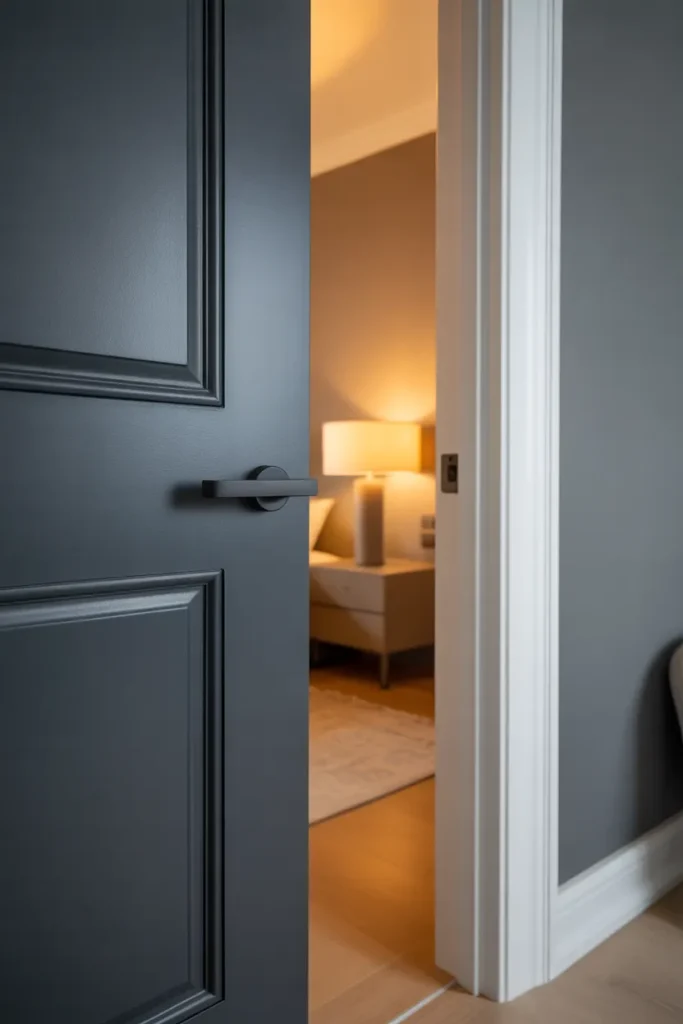
Light switch plates are equally overlooked. Standard white plastic switch plates that have yellowed or cracked are a detail that signals neglect. Replacing them with a matching metal or quality plastic plate in a finish consistent with the room’s hardware costs almost nothing and takes under five minutes. Rocker-style or decora-style plates in brushed nickel or matte black immediately elevate the wall they are on.
If your bedroom door is a hollow-core builder-grade door painted in flat white, consider repainting it. A door painted in a slightly deeper version of the wall color, or in a contrasting color like warm black or deep navy, becomes an intentional design element rather than a default. The trim and baseboards in a bright, clean semi-gloss white — even if the door is painted — signals maintenance and care that flat or scuffed trim does not.
17. Your Bedroom Has Too Much Furniture and No Breathing Room
One of the most counterintuitive reasons why a new bedroom still looks cheap is that it has too much furniture rather than too little. When every wall has a piece of furniture against it, when the floor plan is fully occupied, and when there is no open space for the eye to rest, the room feels compressed and crowded regardless of the quality of the individual pieces. Restraint in furniture selection is a design principle, not a budget compromise.
The minimum clearance measurements that make a bedroom feel spacious are: 36 inches of clearance on at least one side of the bed for comfortable movement, 18 inches of clearance at the foot of the bed, and a clear sightline from the doorway to at least one wall that is not blocked by furniture. If your current layout violates these clearances, the room will feel small and cramped no matter what you do to the walls or bedding.
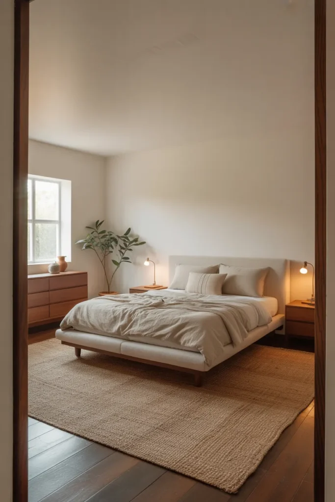
The most common furniture excess in a bedroom is a matching furniture set purchased as a complete suite — bed frame, two nightstands, dresser, chest of drawers, and armoire, all in the same style and finish. A fully matched bedroom suite reads as a department store floor display rather than a designed room. Removing one or two pieces and replacing them with nothing — or with a single different piece that adds material contrast — immediately makes the room feel more considered.
Editing furniture is more difficult than adding it, but it is the most powerful single improvement available in an over-furnished room. Remove one piece and live with the space for two weeks before deciding whether to bring it back. In most cases, the removed piece is not missed, and the room feels significantly better without it.
18. Your Bedroom Has No Personal Layer and Feels Like a Hotel Without the Budget
A bedroom that is correctly proportioned, properly lit, and well-furnished but still feels generic and slightly cheap is usually missing the one thing that connects a designed room to the person who lives in it: a personal layer. This is different from clutter. It is the specific set of objects, materials, and choices that signal a human being with taste and preferences chose this room — not an algorithm.
The personal layer is delivered through three to five highly specific choices that break the generic quality of the design. A book on the nightstand that you are actually reading. A piece of art chosen because it genuinely means something to you rather than because it matched the color palette. A ceramic object bought from a local market rather than a chain store. A throw inherited from somewhere or purchased because the texture was exceptional.
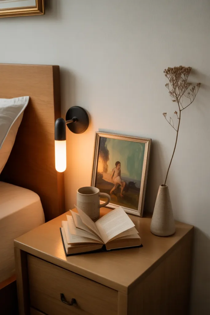
These objects do not need to be expensive. They need to be specific. A generic woven basket from a home goods chain communicates nothing. A ceramic bowl thrown by an individual maker with a specific glaze color has a presence that no mass-produced object can replicate, even if both cost the same amount.
The mistake to avoid is confusing the personal layer with sentiment. You do not need family photos or childhood objects in your bedroom. The personal layer is communicated through the quality of attention you brought to each object choice — whether every piece was chosen deliberately rather than defaulted to. That quality of attention is visible in the finished room, and its absence is what makes a bedroom feel like a hotel room rather than someone’s home.
Final Thoughts
The reason why your new bedroom still looks cheap is almost never the budget — it is the specific decisions that quietly undermine the room’s composition, scale, and atmosphere. The eighteen problems above are fixable in almost any bedroom, in almost any home, without a full renovation or a significant new investment. Start with the two or three that most closely describe what you are seeing in your own room, fix those first, and then work through the rest.
Save this post before you move on — it is the kind of reference that becomes more useful the second time you read it, once you are standing in your bedroom trying to identify exactly what still feels off. If you are continuing to work on your bedroom design, explore bedroom layout guides, small bedroom space planning ideas, and bedroom lighting design resources to make sure every decision in your room supports the others.