Decorating a rental comes with real limits — no painting, no drilling, no permanent changes — but that does not mean you are stuck with bare walls and builder-grade everything. These renter friendly decor ideas are chosen specifically for USA apartments and rentals where damage-free solutions are the only option, giving you a fully designed space without risking your security deposit.
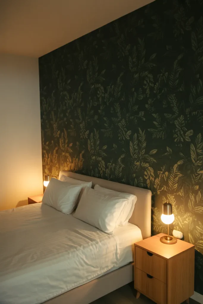
1. Peel-and-Stick Wallpaper That Transforms a Wall Without Any Damage
Removable wallpaper is the single most impactful renter friendly upgrade available right now. A single accent wall in a living room or bedroom can shift the entire feel of a space — from adding warmth with a linen-texture print to creating a dramatic focal point with a dark botanical pattern — and it comes down cleanly when you move out.
The key to making it work is surface preparation. The wall needs to be clean, dry, and free of dust or grease before application. On freshly painted walls, wait at least 30 days before applying removable wallpaper, otherwise the adhesive can pull the paint when removed.
Choose large-scale patterns for small rooms rather than small repeating prints. Large patterns actually read better in tight spaces because the repeat is not cut off awkwardly at the edges. Small, busy patterns in a small room create visual noise that makes the space feel more cramped.
This works best on a single feature wall rather than all four walls. Renting a studio or one-bedroom apartment and applying removable wallpaper to the wall behind the bed or sofa is the highest-impact, lowest-risk move available.
2. Freestanding Furniture Arrangements That Create Room Structure Without Built-Ins
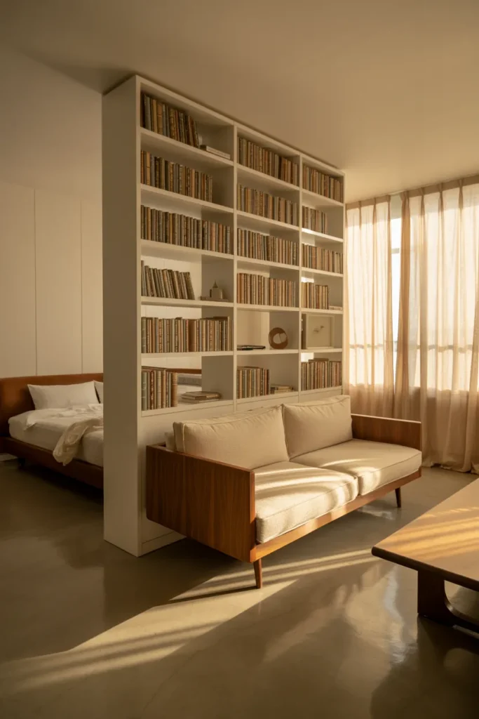
In a rental, you cannot build in shelving, add room dividers, or change the floor plan. Freestanding furniture arrangement is how you solve that. A tall bookcase placed perpendicular to a wall in a studio apartment creates a visual separation between the sleeping and living areas without touching a single surface permanently.
The principle here is using furniture mass and placement to define zones. A sofa with its back facing the entry of an open-plan apartment signals where the living area begins. A tall wardrobe placed along an empty wall in a bedroom with no closet solves a storage problem and adds architectural weight to an otherwise bare room.
Choose furniture with legs rather than pieces that sit directly on the floor. Legged furniture allows light to pass underneath, which keeps a room feeling open even when it is well-furnished. This matters most in smaller apartments where visual floor space directly affects how large the room feels.
Avoid pushing all furniture against the walls. This is the most common rental decorating mistake. Floating furniture away from the walls — even just 4 to 6 inches — creates depth and makes the room look more intentionally designed.
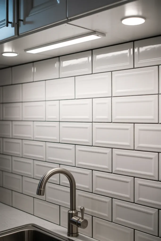
3. Removable Tile Stickers That Fix an Ugly Kitchen or Bathroom Instantly
Builder-grade kitchens and bathrooms in USA rentals typically have plain white or beige tiles that are technically fine but visually flat. Removable peel-and-stick tile stickers apply directly over existing tiles to completely change the look — and remove cleanly without adhesive residue.
For kitchen backsplashes, Moroccan-style or geometric tile stickers in a contrasting color against existing white subway tile create a pattern-on-pattern effect that reads as intentional and designed. For bathroom floors, large-format marble-look tile stickers over plain beige floor tile lift the entire room without any installation.
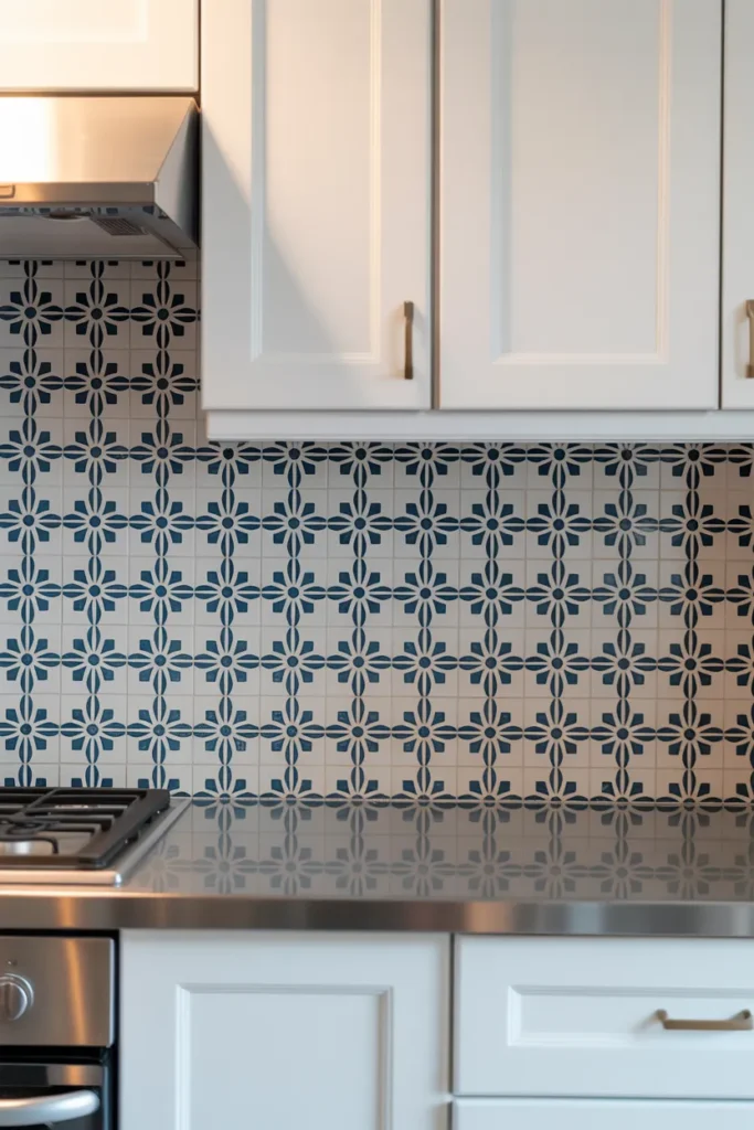
The practical rule is this: measure your tile size before ordering. Tile stickers are designed to fit standard tile dimensions (most commonly 4×4 inch). If your existing tiles are a non-standard size, the stickers will not align correctly and the pattern will not work.
Apply only to tiles that are in good condition. Cracked, chipped, or grout-heavy tiles will not give a flat surface for the sticker to adhere properly, and edges will lift within weeks. This is a finish solution, not a repair solution.
4. Command Hook Gallery Walls That Look Built-In Without a Single Nail
A gallery wall is one of the strongest visual anchors a room can have, but in a rental, traditional nails and wall anchors are off-limits. Damage-free adhesive strips and hooks rated for the correct weight make a full gallery wall completely achievable without touching the wall permanently.
The design decision is whether to go symmetrical or organic. Symmetrical gallery walls — matching frames in a clean grid — work best in more modern or minimal apartments. Organic gallery walls with mixed frame sizes and irregular spacing suit maximalist or eclectic interiors. Choose one approach and stick to it. Mixing the two looks unresolved.
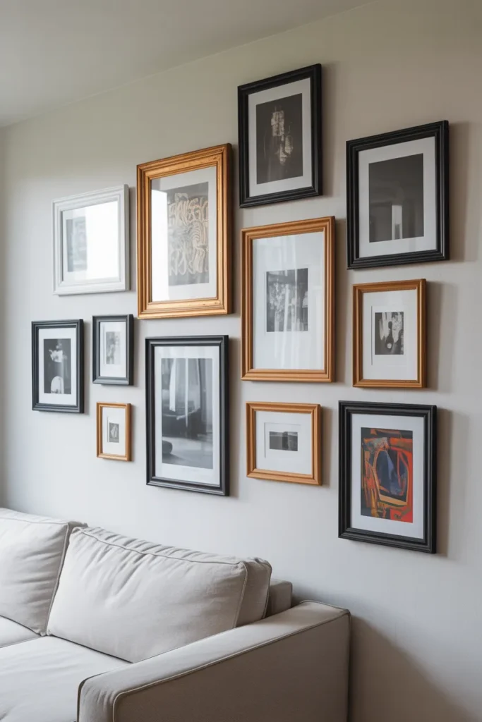
Before adhering anything, lay the entire arrangement out on the floor first. Photograph it, then transfer it to the wall. Use painter’s tape to mark frame positions on the wall before committing any adhesive strips. This single step prevents the most common gallery wall mistake: crooked or misaligned frames that require repositioning and damage the adhesive’s strength.
For heavier frames over 5 pounds, use multiple adhesive strips per frame and follow the weight rating on the packaging exactly. Overloading a single strip is what causes frames to fall — not the product itself.
5. Curtains Hung High and Wide to Make Rental Windows Look Expensive
Window treatments are one of the most overlooked renter friendly decor ideas, and the way most renters hang curtains — at window frame height and exactly frame width — is the version that makes a room look small and the windows look cheap. The correct approach is hanging the rod as close to the ceiling as possible and extending it 8 to 12 inches beyond the window frame on each side.
This technique makes the window appear significantly taller and wider than it actually is. The curtains, when open, stack outside the window frame and allow full light to enter. When closed, the full expanse of fabric from ceiling to floor creates a wall of softness that no window treatment hung at frame height can achieve.
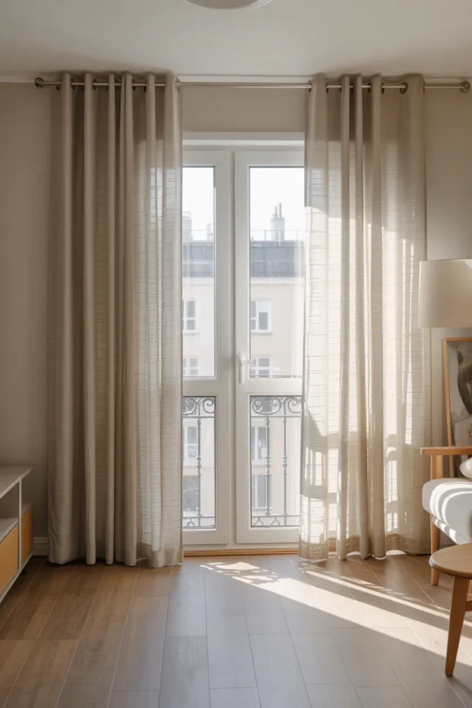
Use a tension rod or a no-drill curtain rod bracket for rental-safe installation. Tension rods work inside deep window recesses. No-drill brackets grip the outside of the window frame or use adhesive mounting — check weight limits before choosing which panels to hang.
For fabric, linen and linen-blend panels in off-white, warm beige, or soft sage work across almost every rental aesthetic. Avoid short curtains that hang to the windowsill — they cut the room visually and look incomplete regardless of the quality of the fabric.
6. Area Rugs That Define Zones and Cover Ugly Rental Flooring
Most USA rental apartments come with either worn carpet, scratched hardwood, or plain vinyl flooring. A well-chosen area rug solves multiple problems at once: it defines a zone, adds texture and color, covers damaged or unattractive flooring, and absorbs sound in hard-floor apartments.
The sizing decision matters more than the style choice. In a living room, the rug should be large enough that at least the front two legs of every sofa and chair sit on it. A rug that only sits under the coffee table is too small — it floats in the center of the furniture arrangement and makes the seating area feel unanchored.
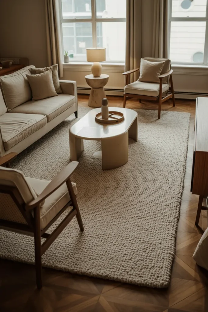
For open-plan studio apartments, a large area rug under the living area furniture is one of the clearest ways to signal a zone boundary. It tells the eye where the living room begins and ends without any physical division.
In bedrooms, the rug should extend at least 18 inches past each side of the bed so your feet land on the rug when you get up, not on the floor. A rug that only slides under the lower half of the bed looks accidental rather than designed.
7. Temporary Dado Rails and Trim Using Removable Molding Tape
One of the most sophisticated renter friendly decor ideas that most renters never consider is faking architectural detail using paintable removable molding strips or thick washi tape applied in geometric patterns on walls. This creates the look of paneling, dado rails, or board-and-batten without any permanent application.
The most effective version of this is a half-wall grid pattern — horizontal and vertical strips of molding tape applied from the baseboard to about 36 inches up the wall — which mimics the look of traditional wainscoting or modern board-and-batten. Paint the wall a single color before applying (or work with the existing wall color), apply the strips in a regular grid, and the effect is genuinely architectural.
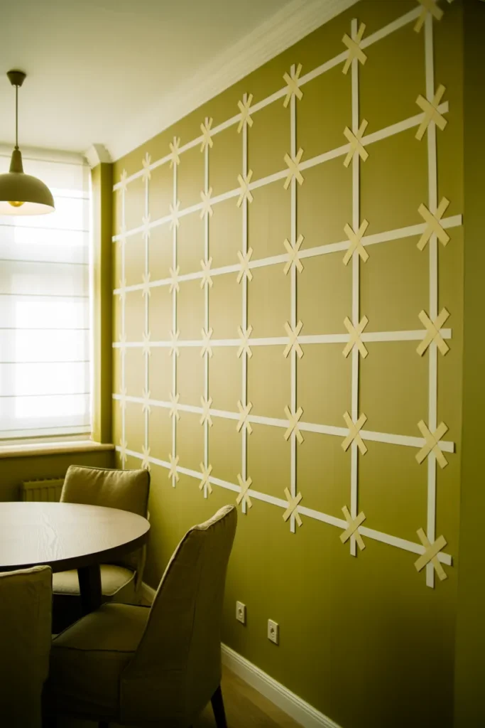
This works best in dining areas, entryways, and bedroom accent walls where wall detail would normally be a selling point. It is especially effective in older apartment buildings where the walls are already white, because the added grid detail gives dimension to an otherwise flat surface.
The key measurement rule is keeping the grid spacing consistent. Measure and mark with a level before applying any strips. Uneven spacing is immediately visible and ruins the architectural effect.
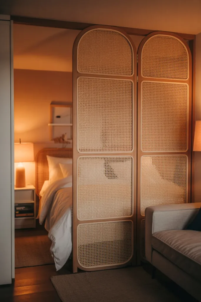
8. Freestanding Room Dividers That Add Privacy and Style in Open Studios
Studio apartments in particular suffer from a lack of visual separation between sleeping, living, and working areas. A freestanding room divider — whether a folding screen, an open-shelf unit, or a hanging curtain panel on a freestanding rod — creates that separation without any wall attachment.
A folding screen in rattan, wood, or metal works well in smaller studios because it can be angled to create a soft corner around the bed, providing privacy from the entry without blocking light. An open bookshelf unit used as a divider maintains sight lines through the space while still creating a clear zone boundary.
For a more flexible option, a freestanding curtain rod with a sheer panel gives the most light-permeable division. During the day, the curtain can be pushed fully open. At night, drawn across, it provides visual privacy for the sleeping area.
The sizing rule for room dividers is height. A divider that does not reach at least 5.5 to 6 feet high does not function visually — it is too easy to see over, which undermines the separation effect entirely.
9. Peel-and-Stick Backsplash in the Kitchen That Requires Zero Tools
Beyond tile stickers, full peel-and-stick backsplash panels — designed to mimic real subway tile, marble, or stacked stone — are one of the most practical renter friendly upgrades for a kitchen that feels unfinished. These panels are thicker than tile stickers, have dimensional texture, and cover larger areas faster.
The installation requires only scissors or a utility knife to trim panels to size, a clean surface, and patience to align the first row correctly. The first row is the most critical — if it is not level, every row above it will be progressively more misaligned.
This is the right solution for a rental kitchen where the backsplash area is currently bare painted drywall rather than tile. Peel-and-stick backsplash panels adhere best to smooth surfaces. On textured or heavily painted walls, use a thin coat of paintable primer first to create a smoother bonding surface.
When moving out, use a hair dryer on low heat to warm the adhesive before peeling — this prevents any paint from coming off with the panel. Do this section by section rather than trying to pull a full panel off cold.
10. Layered Lighting to Fix the Overhead-Only Lighting Problem in Rentals
Almost every USA rental apartment has a single overhead ceiling light per room — often a basic flush-mount fixture with a flat bulb that casts harsh, flat light across the entire space. This one design failure makes more rentals feel institutional and unpleasant than any other single factor. Layered lighting fixes it without touching the electrical.
The layered approach uses three levels: ambient (the existing ceiling fixture, often left off or dimmed), task lighting (a floor lamp or table lamp for functional activities), and accent lighting (LED strip lights behind furniture, small plug-in sconces, or a lamp in a dark corner). Together, these three layers make the room feel warm, dimensional, and intentional.
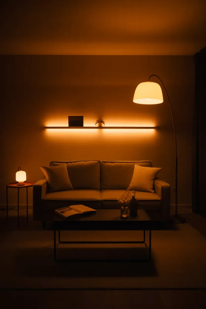
For renters, plug-in wall sconces are one of the most underused tools. These mount with a single adhesive strip or small hook, plug into a standard outlet, and provide the look of hardwired wall lighting with no installation. Position one on each side of a bed as a bedside light replacement, or flank a mirror with two in a bathroom.
The single switch upgrade that makes the biggest difference: replace the existing overhead bulb with a warm white LED bulb at 2700K. This one change, which costs almost nothing and is fully reversible, shifts the entire room’s tone from cold and clinical to warm and residential.
11. Contact Paper Cabinet Upgrades That Transform a Rental Kitchen in One Afternoon
Rental kitchen cabinets are almost always the same: flat, builder-grade, slightly dated, and usually white or off-white with no detail. Contact paper — available in wood grain, marble, matte black, sage green, and dozens of other finishes — applies directly to cabinet doors and drawer fronts to completely change the material appearance.
The transformation is most effective when you choose a finish that contrasts with the existing hardware. Applying a warm oak wood-grain contact paper to plain white cabinet doors and pairing it with the existing chrome hardware creates a modern two-tone kitchen look. Applying matte black contact paper to upper cabinet doors only creates a split-level contrast that reads as intentionally designed.
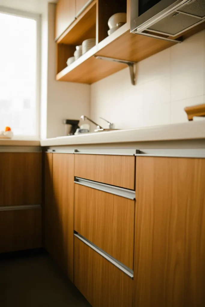
Clean the cabinet surface thoroughly with a degreaser before applying. Kitchen cabinet surfaces accumulate a film of grease and dust that prevents proper adhesion even on new contact paper. Apply in sections rather than trying to cover an entire door in one piece — it gives you more control over bubbles and edge alignment.
Use a credit card or squeegee tool to press out bubbles as you apply each section. Start from the top center and work outward. Bubbles that are not pressed out during application will not flatten on their own.
12. Indoor Plants Arranged Strategically to Add Structure and Fill Dead Corners
Plants are one of the most cost-effective renter friendly decor ideas because they add color, texture, life, and scale to a room without any permanent installation. The difference between a plant-filled rental that looks designed and one that looks cluttered is placement and scale.
A single large-format floor plant — a fiddle leaf fig, olive tree, or bird of paradise in a 10 to 14 inch pot — placed in a dead corner of a living room or bedroom provides the same visual anchoring as a piece of furniture. It fills vertical space, adds an organic shape that contrasts with the rigid lines of furniture, and draws the eye upward, making the ceiling feel higher.
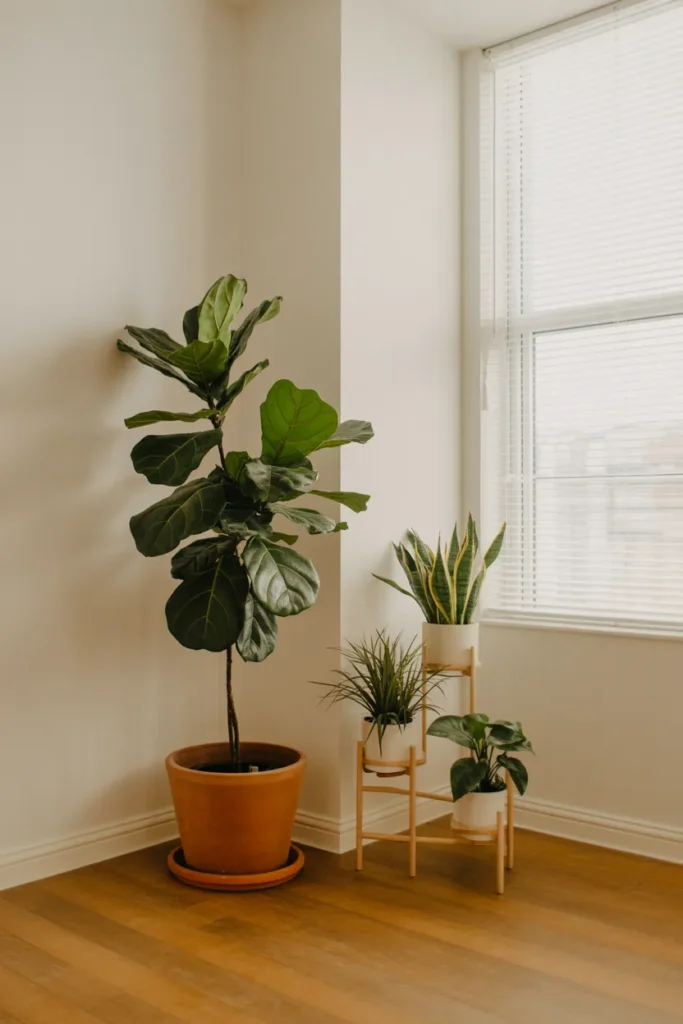
Group smaller plants in odd numbers (three or five) on a shelf, windowsill, or plant stand for a collected, intentional look. A single small plant on an empty shelf looks forgotten. Three plants at different heights — one trailing, one upright, one compact — look curated.
Match plant choice to actual light conditions rather than aesthetic preference. A rental with north-facing windows cannot sustain a fiddle leaf fig or any high-light plant. Pothos, ZZ plants, snake plants, and peace lilies genuinely thrive in low-light rental conditions and stay full and healthy without supplemental lighting.
13. Styled Open Shelving That Makes Rental Storage Look Like Interior Design
Most rentals have at least one area of exposed shelving — whether a built-in bookcase, a floating shelf in the bathroom, or a freestanding unit in the kitchen. How these shelves are styled is one of the clearest signals of whether a space looks designed or default.
The fundamental rule for shelf styling is the combination of three element types: functional items (books, storage boxes), decorative objects (a vase, a sculpture, a framed print), and something organic (a small plant, a dried stem, a natural material). When a shelf has only one type, it either looks like a storage unit or a store display. The mix of all three creates lived-in intentionality.
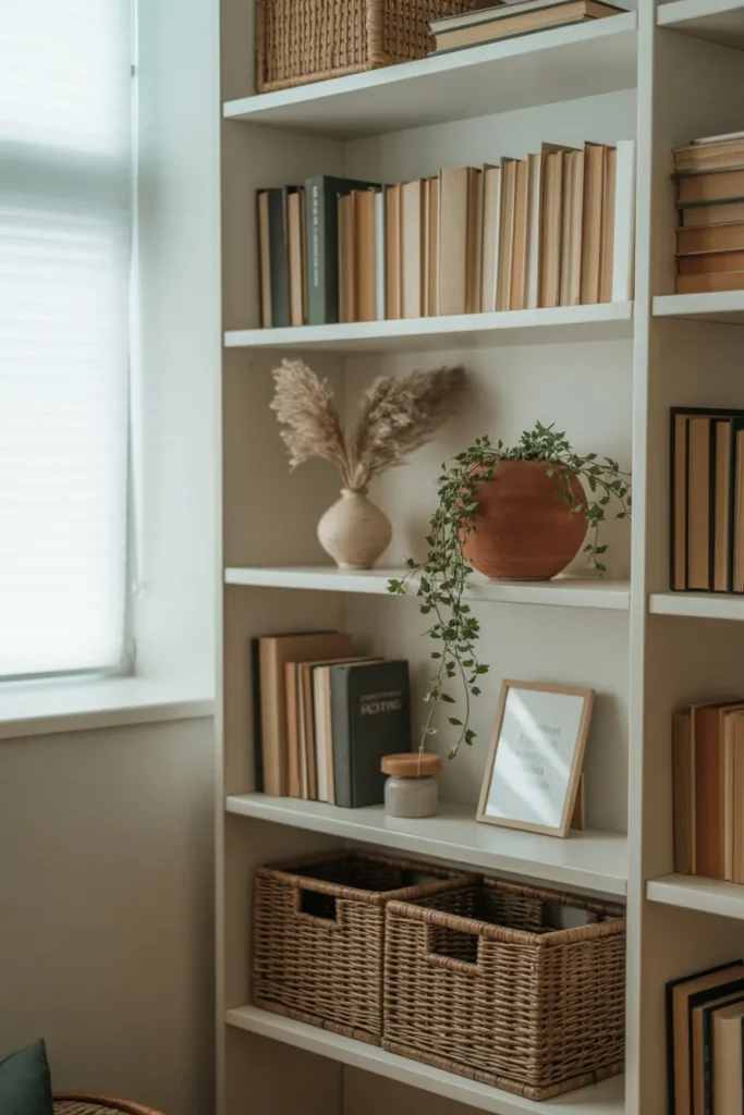
Leave space on each shelf. Shelves packed to capacity look cluttered regardless of how nice each individual item is. Fill approximately 70 percent of each shelf and leave the remaining 30 percent open. That open space is not wasted — it gives the eye a place to rest and makes the styled items stand out.
In rental kitchens with open shelving, stack dishes neatly with the most visually interesting pieces at eye level. Group items by color rather than by category for a more cohesive look. A row of white dishes next to a stack of terracotta bowls reads better than mixed colors scattered across the shelf at random.
Final Thoughts
These 13 renter friendly decor ideas cover the most practical, high-impact changes you can make in a USA rental apartment — from walls and windows to lighting and shelving — without putting your deposit at risk. Every idea here is fully reversible, damage-free, and designed to produce a result that looks intentional rather than temporary.
Save this post now if any of these ideas fit your current rental situation. The details on sizing, placement, and common mistakes are the part most guides leave out — and those details are exactly what determine whether a renter-friendly update looks polished or patched together.
For more apartment decorating guidance, explore ideas focused on your specific room type, square footage, or rental style to narrow down what will work best in your actual space.