Most travel-inspired bedrooms fall apart at the execution stage — souvenirs get scattered, maps get pinned randomly, and the room ends up looking cluttered rather than curated. The real globe trotter bedroom secrets are not about decorating more, they are about making smarter decisions with layout, material layering, and display strategy so the room tells a coherent visual story. This guide covers 18 specific, actionable approaches that work in real USA homes — apartments, small primary bedrooms, guest rooms, and large open layouts — so you can choose what fits your space and build it correctly.
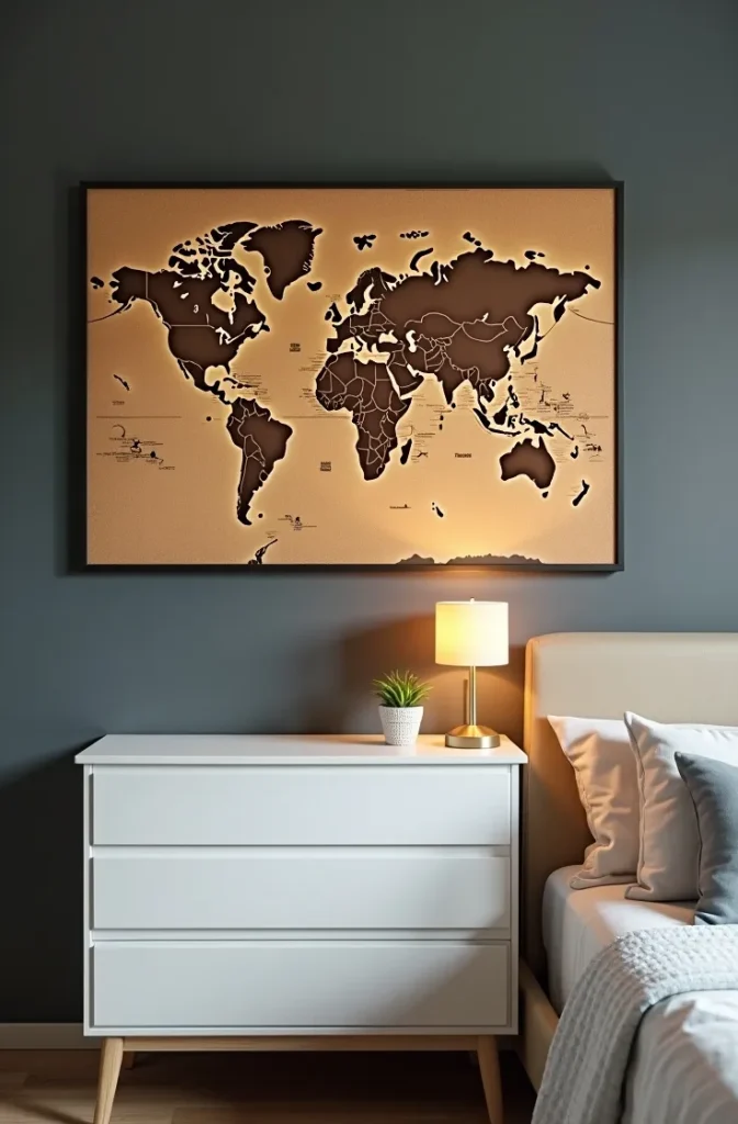
1. The Vintage Map Gallery Wall That Creates an Instant Focal Point Without Looking Cluttered
A well-executed map gallery wall anchors the entire travel bedroom concept without requiring any other travel decor in the room. The key is treating the maps as art objects — framed consistently, arranged with compositional intention, and curated to a specific region or era rather than a random collection of every place visited.
The layout that works best for a bedroom is a horizontal cluster above the bed headboard, spanning roughly the width of the mattress plus 12 inches on each side. Use three to five maps maximum in coordinating frame finishes — all black, all natural wood, or all antique gold — at varying sizes within the same tonal range. Mixing frame materials across a single gallery wall fragments the eye.
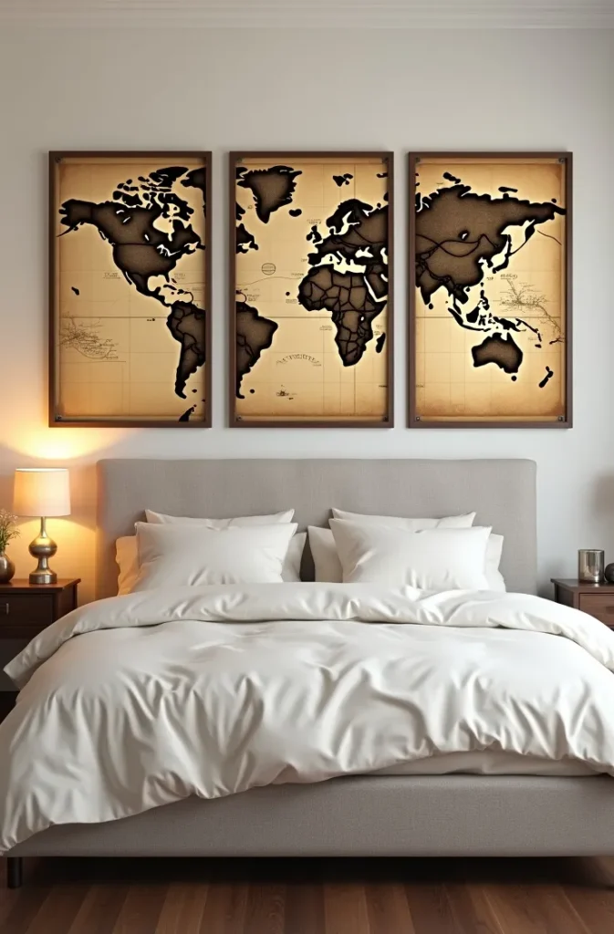

Map selection matters more than most people expect. Antique-style sepia-toned maps create a warm, scholarly atmosphere suited to moody, layered rooms. Modern flat-graphic maps in a limited color palette work in minimalist or Scandinavian-influenced bedrooms. Topographic maps with contour lines read as architectural and suit industrial or masculine spaces.
Avoid the common mistake of framing tourist maps printed on thin paper — they pixelate when enlarged and the paper quality shows through glass. Source reproduction antique maps from archival print providers or photograph your own travel maps and print them professionally at scale.
2. The Layered Textile Strategy That Brings Global Texture Into a Bedroom Without Visual Chaos
Layering textiles from different regions — a Moroccan wool throw, a hand-loomed Indian cotton duvet, a Turkish flat-weave rug — is one of the most practiced globe trotter bedroom secrets among experienced interior designers. The strategy works because texture variation reads as richness and depth, not clutter, provided the color palette is kept tightly controlled.
The rule is one dominant color family across all textiles, with pattern and texture doing the variation work. If the color palette is warm earth tones — terracotta, sand, rust, and deep ivory — every textile can carry a different weave, pattern scale, and cultural origin without the room looking disjointed. The color harmony overrides the pattern complexity.
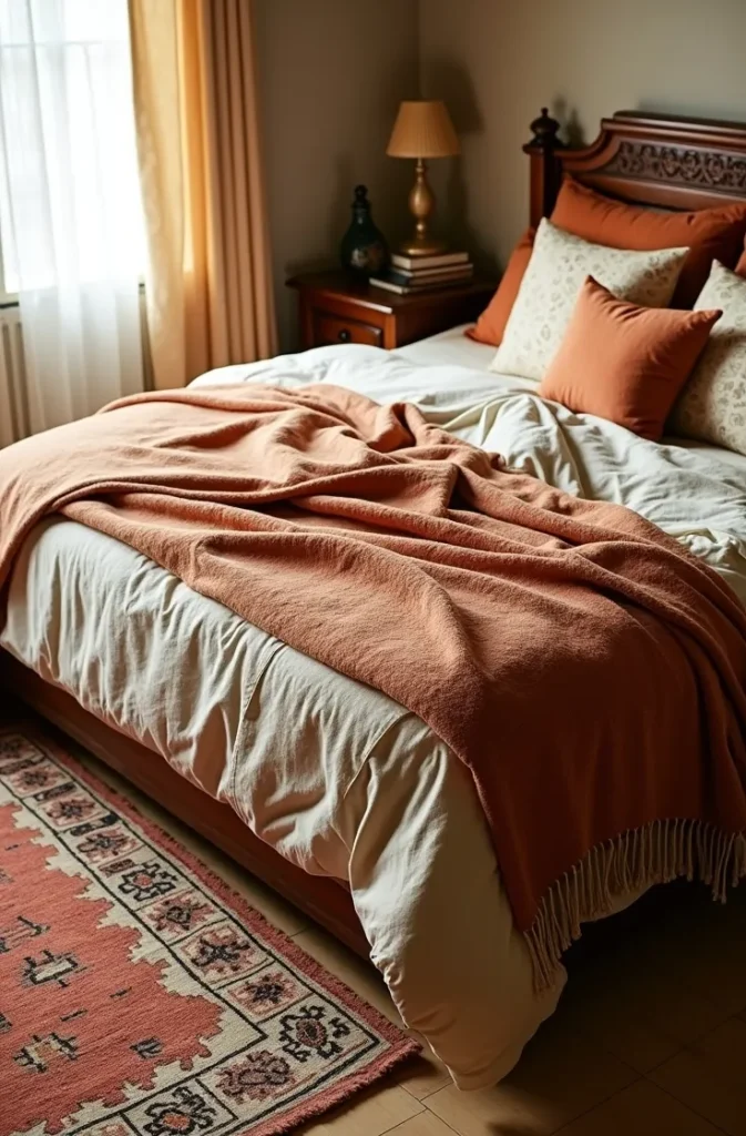
Layer from large to small: rug on the floor as the largest textile element, then the duvet or coverlet, then decorative pillows, then a throw at the foot of the bed. Each layer should introduce a slightly different texture — flat weave, loop pile, embroidered, fringe — to build sensory depth.
The mistake is mixing too many saturated colors. Deep jewel tones from different cultural traditions — Moroccan red, Indian saffron, Turkish teal — compete against each other if all present at the same intensity. Desaturate at least two of the three dominant textiles to let the most important one lead.
3. The Passport Stamp Wall Art Installation That Displays Travel History as Decorative Typography
Enlarged passport stamp imagery — custom-printed reproductions of visa and entry stamps from countries visited — arranged as a typographic art installation turns a deeply personal record into wall art with genuine visual character. This is a travel bedroom design element that is both specific to the occupant and immediately readable as intentional design.
The execution uses large-format digital prints of real or reproduction passport stamps, printed in black or a single dark ink on heavyweight matte paper, and mounted either frameless with flush clips or in simple thin black frames. A grid arrangement of 6 to 12 stamps in consistent sizing creates the strongest typographic effect.
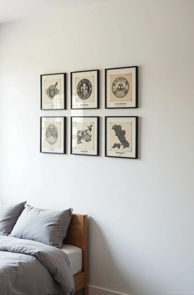
Scale is critical. Passport stamps printed at actual size read as random marks. Enlarged to 8-by-10 or 11-by-14 inches, the typography, imagery, and country name within each stamp becomes clear and legible from across the room — they function as proper wall art rather than oversized postage.
Use this installation on a single unbroken wall section — ideally a side wall rather than the headboard wall, which typically carries the primary art piece. A side wall installation creates a secondary focal point that rewards closer inspection without competing with the main bedroom view.
4. The Vintage Luggage Stack That Works as a Nightstand and a Design Statement
Stacked vintage suitcases used as a bedside surface — the classic globe trotter bedroom secret that predates the Pinterest era — remain one of the most functional repurposing strategies in travel bedroom design when executed with restraint. A stack of two or three cases, aligned on the same side plane, reaches nightstand height and provides surface area for a lamp, book, and phone without requiring any additional furniture.
The cases should coordinate in size and tonal range without being identical. Matching cases read as a prop rather than a curated find. Look for gradation — a large base case, a medium mid-case, and a smaller top case — in colors that range within a single warm or cool family: all warm brown leathers, all cool grey canvas, or all muted olive and cream.
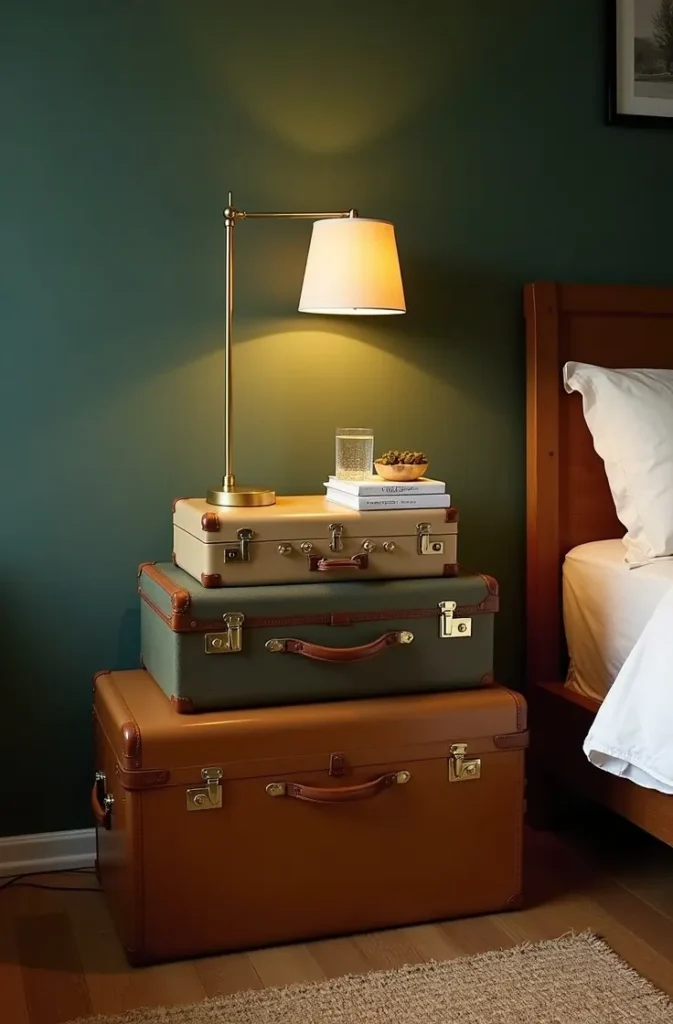
Interior storage is the functional payoff. The cases actually open and hold seasonal linens, extra bedding, or clothing — functioning as a genuine dresser supplement in small bedrooms where storage is tight. This dual function justifies the space the stack occupies better than purely decorative alternatives.
Avoid plastic vintage-look reproduction suitcases — they are light enough to tip when a lamp or book is placed on top and the surface finish does not hold up over time. Source real vintage cases from estate sales, flea markets, or reputable vintage dealers, which also ensures the tonal variation that makes the stack look collected rather than purchased.
5. The Destination Pin Map That Gives a Small Bedroom a Personalized Feature Wall
A large push-pin world map — mounted on a corkboard panel or printed directly on a canvas and pinned with colored markers — is a bedroom feature element that is interactive, personal, and inherently decorative. Unlike static wall art, a pin map grows and changes with the occupant and carries a narrative that makes the room feel lived-in rather than staged.
For small bedrooms, a 24-by-36-inch map mounted at eye level on the wall facing the bed creates a strong focal point without dominating the entire wall. In larger rooms, a 36-by-54-inch map fills a wider wall section more convincingly and allows for readable country-level detail.
The surrounding wall treatment shapes how the map reads. A pin map mounted on a raw plywood or corkboard panel set against a dark wall reads as a serious, cartographic installation. The same map on a light wall in a simple frame reads as lighter and more casual. Match the mounting approach to the overall bedroom mood.
Color consistency in the pins matters. Random multi-colored pins create visual noise that reduces the map’s legibility as a design element. Use a single pin color — brass, matte black, or deep red — for visited locations and a contrasting second color for future destinations. Two colors maximum.
6. The Local Craft Collection Display That Adds Authentic Cultural Dimension to a Bedroom Shelf
Displaying small handcrafted objects collected from travel — carved wooden figures, ceramic vessels, woven baskets, hand-painted tiles — on a dedicated open shelf creates a curated cabinet-of-curiosities effect that gives the bedroom genuine cultural depth. The shelf becomes a visual record of place rather than a generic decorative display.
The display strategy that prevents a shelf collection from reading as clutter uses three organizing principles simultaneously: height variation, material contrast, and deliberate negative space. Objects of different heights — a tall narrow vessel beside a low wide basket beside a small carved figure — create visual rhythm. Mixing materials — ceramic beside wood beside woven fiber — prevents monotony. And leaving 30 to 40 percent of the shelf surface empty gives the eye places to rest between objects.
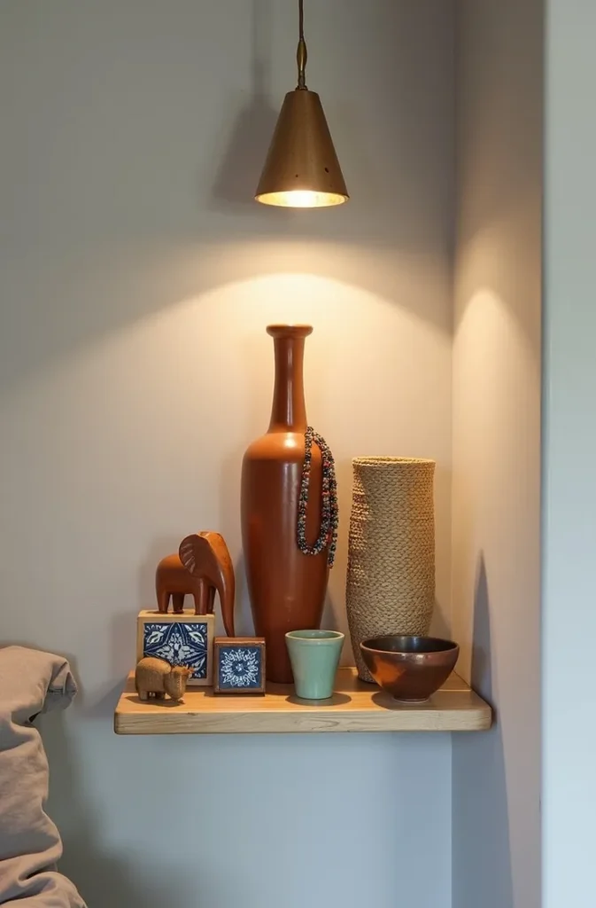
Shelf placement within the room affects how the collection is perceived. A shelf at eye level beside the bedroom door is the last thing you see leaving and the first thing you see entering — it sets the room’s character from the threshold. A shelf above the desk or reading chair creates a visual backdrop for the most-used area of the room.
Avoid grouping all items by country of origin — it turns a display into a series of geographic categories rather than a unified composition. Mix objects from different places by visual quality — scale, color, material — rather than by where they came from.
7. The Canopy Bed With Ethnic Textile Panels That Creates a Global Sanctuary Effect
A four-poster or canopy bed with fabric panels hung from the frame — using textiles sourced or inspired by specific cultural weaving traditions — creates an enclosure around the sleeping zone that feels both intimate and globally informed. This is one of the more architecturally impactful globe trotter bedroom secrets because it changes the spatial character of the room rather than just the surface decoration.
The textile panels do not need to enclose the bed fully. Two panels hung from the headboard posts and allowed to drape loosely to the floor create the effect without blocking light or airflow — the canopy suggests enclosure without enforcing it. This lighter approach works in small and medium-sized bedrooms without making the bed feel like a fortress.
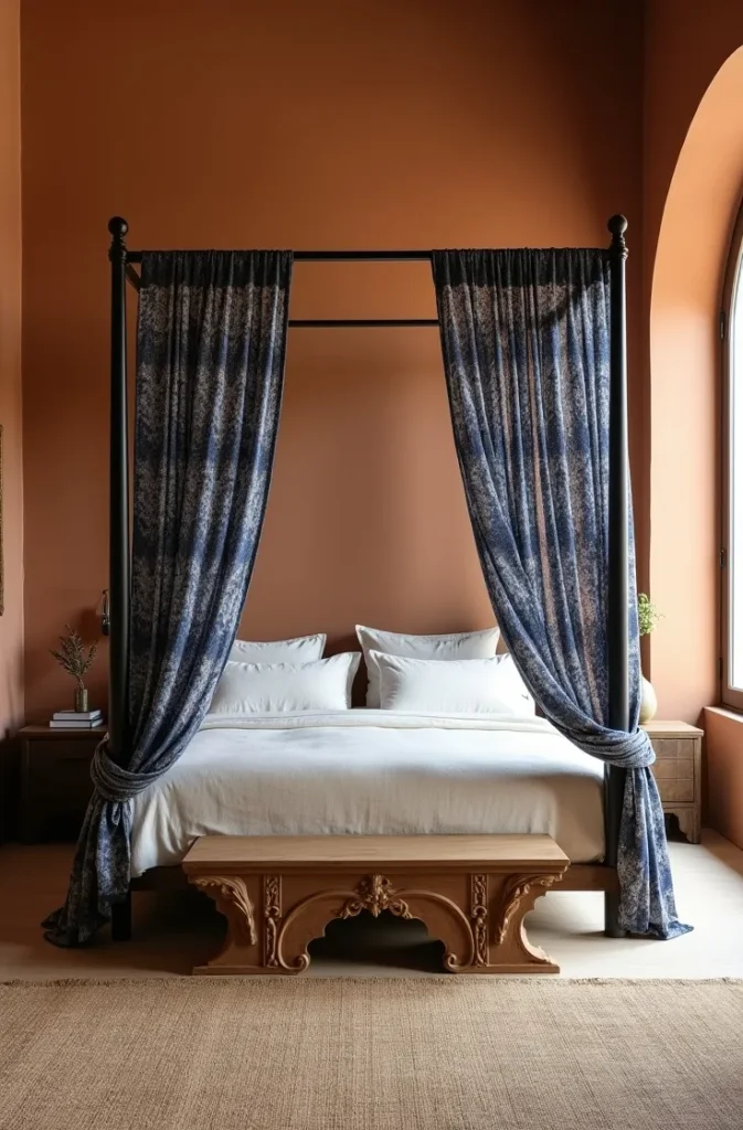
Pattern scale on canopy panels should be large enough to read from across the room. Small repeating geometric patterns at canopy scale blur into a textured solid — which can be intentional, but means you lose the pattern’s cultural reference. Large-scale block print patterns, wide stripe weaves, and bold ikat designs hold their visual character at full panel length.
The panels should coordinate in color with the primary bedding — not match exactly, but share the same tonal family. If the bedding is ivory and warm white, the panels should read within a warm neutral to warm color range, not introduce a contrasting cool tone that splits the color composition.
8. The Atlas and Book Collection Styled as Bedroom Decor That Adds Intellectual Warmth
A curated collection of travel books, atlases, and geographic reference volumes arranged on bedroom shelving or a bedside stack is one of the most understated globe trotter bedroom design moves — it signals the occupant’s relationship with travel through the content of the room rather than souvenir display.
The styling difference between a book collection that reads as decor and one that reads as a pile of reading material is organization by visual consistency rather than by subject. Group books by spine color — warm tones together, cool tones together, neutrals together — rather than alphabetically or by topic. This creates a chromatic pattern across the shelf that reads as intentional composition from across the room.
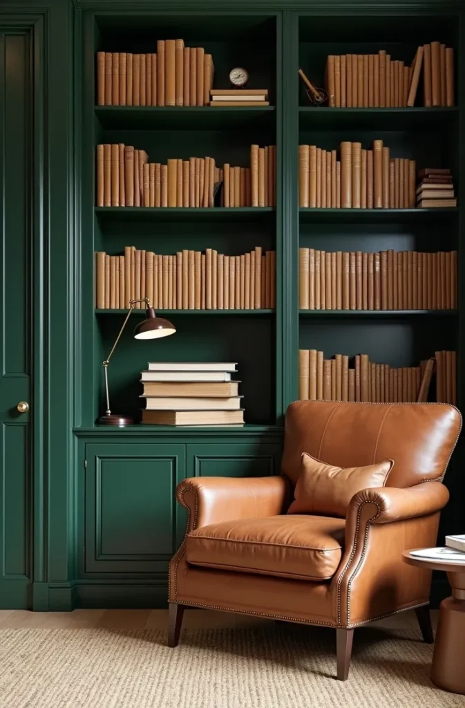
Oversize atlases and coffee-table travel photography books belong flat, not upright. Stack two or three horizontally on a bedside table or at the end of a shelf and place a small decorative object — a smooth stone, a small sculptural piece — on top. This grounds the stack visually and differentiates it from a book waiting to be returned to an upright shelf.
Paperback travel narratives and worn field guides have a specific visual quality — varied patina, soft spines, slightly irregular alignment — that signals genuine use rather than decoration. Mixing a few well-worn paperbacks into an otherwise neat arrangement adds authenticity to the collection.
9. The Repurposed Window Shutter Headboard That Brings Old-World Architectural Character
Architectural salvage from international contexts — old wooden window shutters, carved door panels, or decorative lattice screens — repurposed as a bedroom headboard brings authentic historical materiality that manufactured headboards cannot replicate. A pair of wide shutters mounted flat against the wall behind the bed, painted or left in their original distressed finish, creates a headboard of genuine character.
The width of the shutter pair should match or slightly exceed the width of the mattress — a queen mattress at 60 inches needs shutters totaling 60 to 70 inches wide. Narrower shutters create an undersized headboard that looks like it belongs to a smaller bed frame.
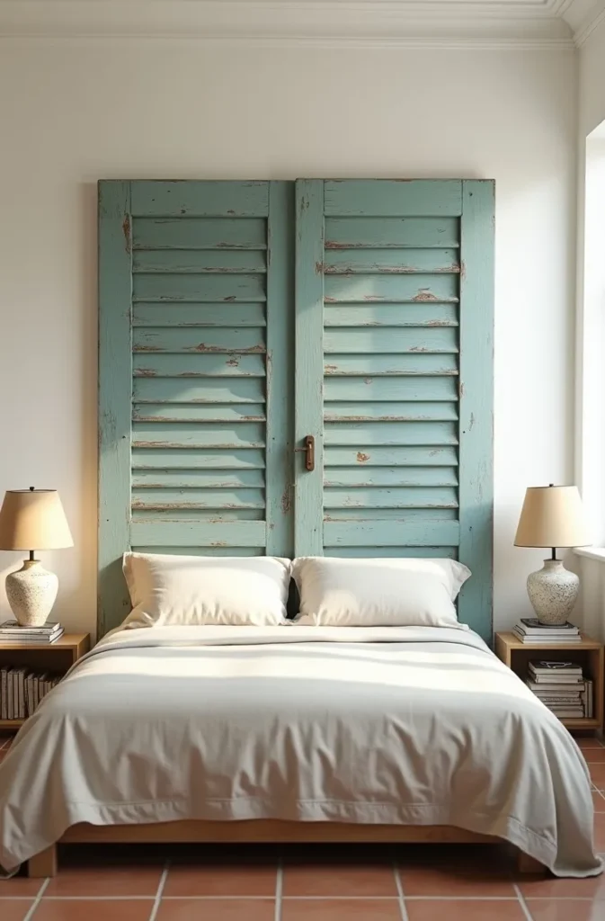
Mounting shutters as a headboard requires attaching them to the wall rather than to the bed frame — which means the mounting hardware is hidden behind the shutter face and the bed is positioned in front. This also means the headboard stays in place when you move the mattress or change bed frames, which is a practical advantage in rental situations.
Finish decisions significantly change the character of the headboard. Original distressed paint with peeling layers and weathered wood beneath reads as European farmhouse or Caribbean colonial. Stripped and re-oiled natural wood reads as Mediterranean coastal. A uniform repaint in a deep color — navy, forest green, or black — strips the history but allows the architectural form to carry a more modern aesthetic.
10. The Hanging Tapestry That Replaces Traditional Wall Art and Adds Acoustic Softness
A large woven or printed tapestry hung on the primary wall behind the bed is the single highest-impact, lowest-commitment wall treatment in a travel bedroom. It covers significant wall area, introduces texture that no framed print can replicate, and — practically — adds a layer of sound absorption that reduces echo in hard-surface rooms.
Size matters more than any other tapestry selection criterion. A tapestry that is too small for the wall it occupies looks like a decorative afterthought. For a queen or king bed, the tapestry should span at minimum the width of the mattress plus 12 inches on each side — approaching 72 to 96 inches wide for a full wall presence behind a standard headboard.
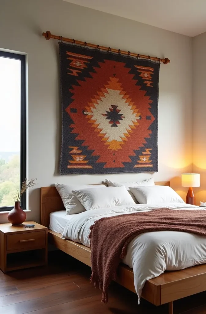
Hanging method affects how the tapestry reads. A tapestry hung on a visible wooden or metal rod with visible hardware reads as deliberate and architectural. The same tapestry pinned directly to the wall at the top edge reads as informal and temporary. Match the hanging method to the room’s overall finish level.
The design and origin of the tapestry shapes the entire room’s cultural reference. A Kilim-style geometric weave references Central Asia and the Middle East. A batik-print tapestry references West Africa or Indonesia. A hand-block-printed cotton panel references South Asian craft traditions. Choose the reference intentionally and let it inform the other textile and object choices in the room.
11. The Dark Moody Palette That Makes a Travel Bedroom Feel Like a Five-Star Hotel Suite
A dark, saturated bedroom palette — deep teal, charcoal, forest green, or midnight navy on the walls — creates the enclosed, enveloping quality that makes high-end travel accommodations feel luxurious. This is a globe trotter bedroom design approach that prioritizes atmosphere over openness, and it works particularly well in bedrooms used primarily at night or in rooms with limited natural light where a light palette reads as flat rather than airy.
The logic is straightforward: dark walls visually push the perimeter of the room inward, which shrinks the apparent size but increases the sense of intimacy and warmth. In a bedroom — a room where intimacy is appropriate — this trade-off works in favor of the design. The room feels like a destination rather than a domestic space.
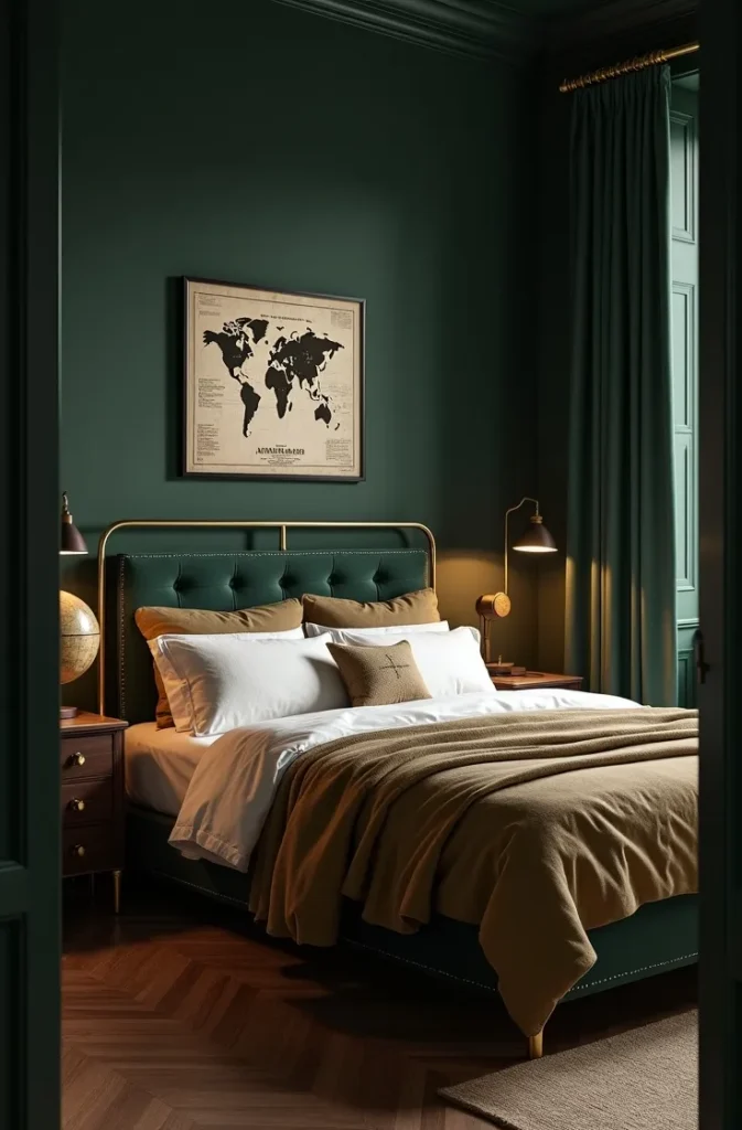
Bedding and textiles in a dark-walled bedroom need to read clearly against the wall color without the contrast being so high it looks jarring. Deep ivory, warm camel, aged brass, and soft terracotta all hold their visual weight against dark walls without bleaching out. Pure white reads stark against very dark walls and is better suited to monochrome rooms where that contrast is the entire point.
Lighting must compensate for the light absorption of dark walls. Layered warm light sources at multiple heights — a bedside lamp, a wall sconce, a floor lamp in the corner — are non-negotiable. A single overhead fixture in a dark-walled room creates a flat, institutional look that undermines the entire atmosphere.
12. The Souvenir Shadow Box Wall That Displays Small Objects as a Curated Exhibition
A shadow box display — a series of deep-frame boxes with compartments holding small travel objects — organizes the kinds of items that typically end up scattered across a dresser top into a wall-mounted exhibition format. Coins, small figurines, sea glass, pressed flowers, ticket stubs, and postage stamps all belong in a shadow box rather than in a drawer or on a surface.
The most visually effective shadow box arrangements use a consistent frame size and finish across multiple boxes, arranged in a tight grid or horizontal row. A set of three identical 12-by-12-inch shadow boxes each holding objects from a different region — arranged horizontally above a dresser or desk — is one of the cleanest executions of this format.
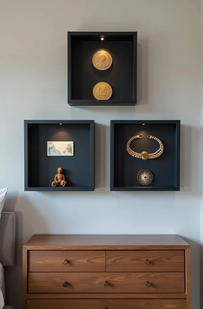
Interior background color of the shadow box affects object visibility dramatically. A dark navy or black interior makes light-colored objects — sea glass, white coral, pale coins — stand out sharply. A cream or natural linen interior makes darker objects more legible. Choose the interior color based on the specific objects being displayed rather than the wall color behind the frame.
Label each shadow box with a small text strip at the bottom inside — country name, region, or year — in a consistent typeface. This transforms a decorative display into a documentary one and adds the narrative layer that makes it genuinely interesting to visitors.
13. The Global Pattern Wallpaper Accent Wall That Sets the Room’s Entire Cultural Direction
A single accent wall in a globally-patterned wallpaper — behind the bed headboard or on the wall the bed faces — establishes the cultural direction of the entire room without requiring any other travel-specific decor. The wallpaper carries the design concept and every other element in the room either supports or stays neutral against it.
Pattern selection is the most consequential decision in this approach. Geometric Islamic tile patterns in deep blues and terracotta read as Moroccan and Andalusian. Large-scale botanical prints reference colonial-era botanical illustration and work in adventure-tinged or British Colonial-influenced rooms. Hand-drawn topographic line patterns reference cartographic tradition and suit minimal or academic aesthetics. The pattern is not just decoration — it is a cultural statement.
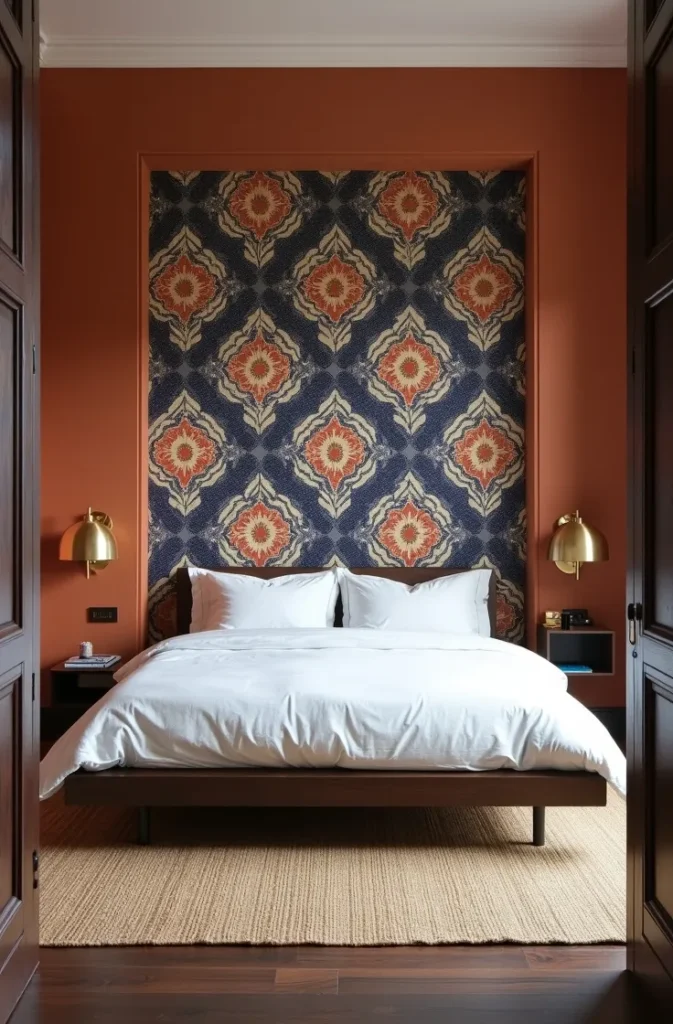
In small bedrooms, a patterned accent wall reads best when the other three walls are held in a solid color pulled from within the pattern’s palette — not white or grey, which can create too much contrast, but a mid-tone that bridges the pattern and the room. This keeps the room from feeling divided between a busy wall and a plain room.
The mistake to avoid is pairing a large-scale global pattern wallpaper with heavy travel souvenir display on the same wall or the adjacent wall. The pattern is already doing significant visual work — adding objects, frames, or additional texture to the same zone creates visual competition that neither element wins.
14. The Minimalist Travel Bedroom With Only Three Carefully Chosen Statement Objects
The most restrained of all globe trotter bedroom secrets is the minimalist approach: instead of layering multiple travel references, identify the three most visually and personally significant objects from your travels and display each one as a standalone statement. Everything else in the room remains neutral.
This approach works because it respects the visual weight of genuinely exceptional objects. A hand-thrown ceramic bowl from a specific Japanese kiln, a small bronze figure from an Indian antique market, or a framed silk scarf from a Burmese textile workshop carries more visual authority in a quiet room than the same object surrounded by competing items. The restraint amplifies the significance of each piece.
The three objects should vary in scale, material, and placement. A large object on the floor — a tall ceramic or woven vessel — a medium object on a surface at waist height, and a small object at eye level on a shelf or ledge creates vertical distribution that draws the eye through the full height of the room.
This approach suits small bedrooms particularly well — where space limits the number of display surfaces — and apartments where a minimal footprint is essential. It also suits travelers who have one or two genuinely exceptional pieces they want to honor rather than a broad collection that needs organizing.
15. The Reclaimed Wood Feature Wall That References Coastal and Maritime Travel Themes
A feature wall in weathered reclaimed timber planks — installed horizontally at varying widths and with visible grain variation — references coastal architecture, maritime heritage, and the worn surfaces of port towns and fishing villages. In a travel bedroom, it provides natural texture that no paint finish or wallpaper fully replicates and creates a backdrop that makes the rest of the room’s travel elements read as found rather than purchased.
Plank installation runs horizontally in most bedrooms, which emphasizes the room’s width. In narrow bedrooms, horizontal planks make the space read proportionally wider — a practical advantage in apartment bedrooms with tight dimensions. Vertical plank installation reads more formal and architectural, suited to rooms with high ceilings where the vertical emphasis reinforces the room’s height.
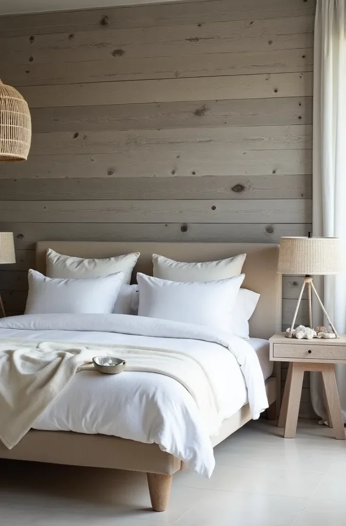
Finish options range from completely raw with visible weathering and nail holes intact — the most rustic expression — to lightly sanded and sealed in a matte clear coat that preserves the weathered appearance while reducing surface roughness. Avoid glossy polyurethane on reclaimed wood. It fills the texture and creates a laminated appearance that defeats the purpose of using real reclaimed material.
The reclaimed wall needs to be the room’s dominant material statement. Pairing it with another heavy texture — a rough stone floor, a heavy exposed brick wall — creates competition between two dominant surfaces. Keep the floor and ceiling surfaces clean and simple so the wood wall carries the texture narrative alone.
16. The Vintage Travel Poster Collection That Adds Graphic Energy to a Neutral Bedroom
Mid-century travel poster art — the graphic illustration style associated with railway, shipping line, and early aviation travel advertising from the 1920s through 1960s — brings bold, flat graphic color into a bedroom without the visual weight of a patterned wallpaper or a heavy textile. A curated set of three to five posters in coordinating frames creates a graphic wall installation with genuine historical and aesthetic appeal.
The art direction style of this era is highly compatible with modern interior palettes. The flat color fields and simplified forms of mid-century travel posters work as well against a contemporary neutral wall as they do in a period-appropriate interior — the graphic quality bridges decades without looking dated.
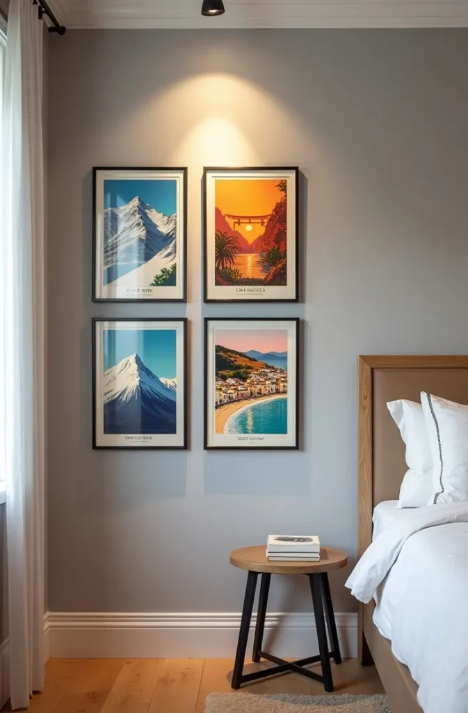
Poster selection for cohesion should focus on either a consistent color palette across the set or a consistent destination region, not necessarily both. A set of five posters all featuring deep cobalt blue, cream, and gold — regardless of whether they depict Italy, Japan, or the French Riviera — holds together as a palette-unified collection. Alternatively, five posters all depicting Mediterranean destinations in varying palettes creates regional coherence.
Scale the poster size to the wall section. A 24-by-36-inch poster on a narrow wall section reads correctly. The same poster on a 12-foot wide wall reads undersized and tentative. Use larger formats — 36-by-48-inch or custom printed — for expansive bedroom walls, or group multiple smaller posters tightly to fill the space with the density of a gallery wall.
17. The Reading Nook With Travel Library That Makes One Corner the Room’s Most Used Feature
A dedicated reading nook in the bedroom — a corner chair with its own lamp, a small side table, and a surrounding shelf arrangement of travel literature and reference books — creates a secondary zone within the bedroom that functions as both a design feature and a genuinely used daily space. Travel bedrooms benefit from this format because it gives the room a reason for the book collection and map displays beyond aesthetics.
The physical setup of a functional reading nook requires three things: a properly sized and comfortable chair (seat height 16 to 18 inches, back support to shoulder height, wide enough for a curled position), task lighting positioned to the reading side at elbow height or above rather than directly overhead, and a surface at arm’s reach for a drink, a bookmark, and a phone.
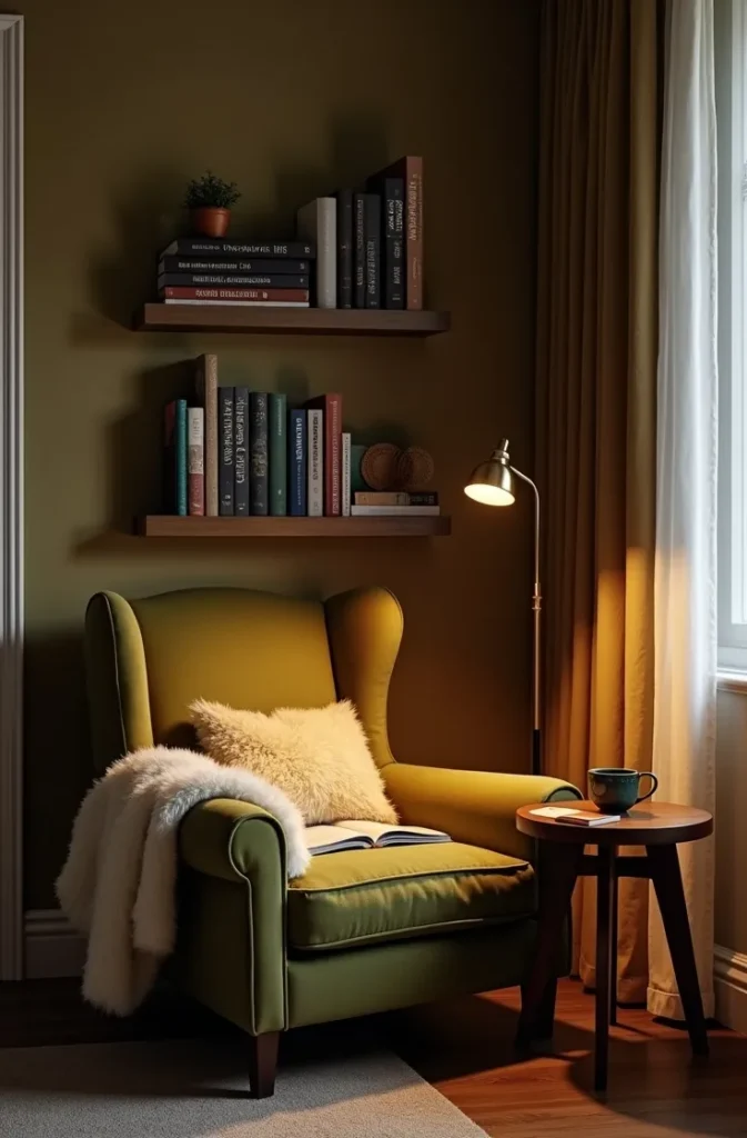
The surrounding shelving amplifies the travel character of the nook. Open shelves on the wall behind and beside the chair, stocked with a curated mix of travel literature, atlases, and field guides, visually frame the nook as a destination within the room. The books need not be perfectly organized — a slightly imperfect arrangement of well-read volumes reads as more authentic than a styled shelf.
In smaller bedrooms, a corner reading chair without dedicated shelving achieves the same spatial separation. A single wall-mounted swing-arm reading lamp and a small round side table are sufficient — the nook can rely on a nearby bookcase or a stack of books on the floor beside the chair for the travel library element.
18. The Coordinated Scent and Sensory Layer That Completes the Immersive Travel Bedroom
The final — and least discussed — dimension of a well-executed travel bedroom is the sensory layer beyond the visual. A bedroom that looks globally inspired but smells like a standard home product fails to fully commit to the experience. Scent is the most direct trigger of place memory, which makes it the most powerful finishing tool in a travel-inspired space.
The practical implementation uses a single scent reference that coordinates with the room’s primary geographic influence. A room referencing North African and Middle Eastern design benefits from warm, resinous scents — oud, sandalwood, amber, or frankincense — delivered through a simple ceramic oil diffuser or quality candle. A room with Southeast Asian textile and object references suits lighter green and floral notes — bamboo, jasmine, or vetiver. A Nordic or coastal room reads with clean, mineral, and oceanic notes.
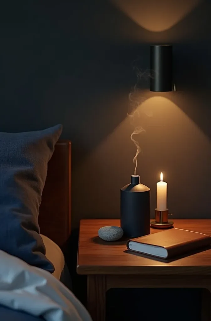
The diffuser or candle belongs on a surface at nose height or below — a bedside table, a low dresser, or the reading nook side table — rather than on a high shelf where the scent rises away from the occupying level of the room.
Sound is a secondary sensory consideration that most bedroom decorating guides ignore entirely. A small tabletop water feature — a modest stone fountain or bamboo water element — introduces ambient water sound that references coastal and garden environments. Even a minimal version produces enough ambient sound to soften the acoustic character of a hard-surface room and deepen the sensory displacement that makes a well-designed travel bedroom feel genuinely transported.
Final Thoughts
Designing a travel-inspired bedroom well requires the same discipline as designing any other interior — every element needs a reason for being there and a relationship to everything else in the space. The globe trotter bedroom secrets in this guide are not about accumulating more objects from more places; they are about selecting the right format for display, building a coherent color and material logic, and making decisions that serve both the aesthetic and the daily use of the room.
Save this post so you can return to it room by room, section by section, as you plan your own setup. Each idea here is designed to work independently or in combination with others, which means you can implement one element this month and build toward a complete room over time. For your next step, explore world-inspired living room decor ideas and global textile sourcing guides to extend the design language beyond the bedroom.