The dorm room themes you’ve been saving for months deserve more than a mood board — they deserve a real plan that works inside a 12-by-14-foot cinderblock box. Your roommate has already claimed half the space, the furniture is bolted to the floor, and the lighting situation is fluorescent. This post will show you exactly how to pull off eighteen specific design directions that translate from your Pinterest board to your actual room, without the chaos of impulse buying everything from three different stores the week before move-in.
The Warm Mushroom Palette That Makes a Dorm Room Feel Like a Designer’s Apartment
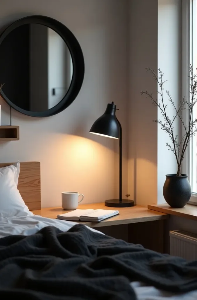
The fastest way to make a dorm room look intentional is to choose a color palette before you buy a single thing — and the warm mushroom palette is working harder in small spaces right now than anything else. This is the combination of soft taupe, oat, and warm greige applied across bedding, a rug, and two or three textile accents. What it does physically is absorb the visual chaos of a shared, pre-furnished room and replace it with one quiet, cohesive layer you control.
This theme works best for women who want their space to feel calm and adult rather than maximalist or color-saturated. It photographs beautifully in low light, which matters when you are taking Instagram pictures in a room with one overhead bulb. The palette also layers well: add a dusty sage plant or a single terracotta candle and it immediately reads as curated rather than neutral-by-default.
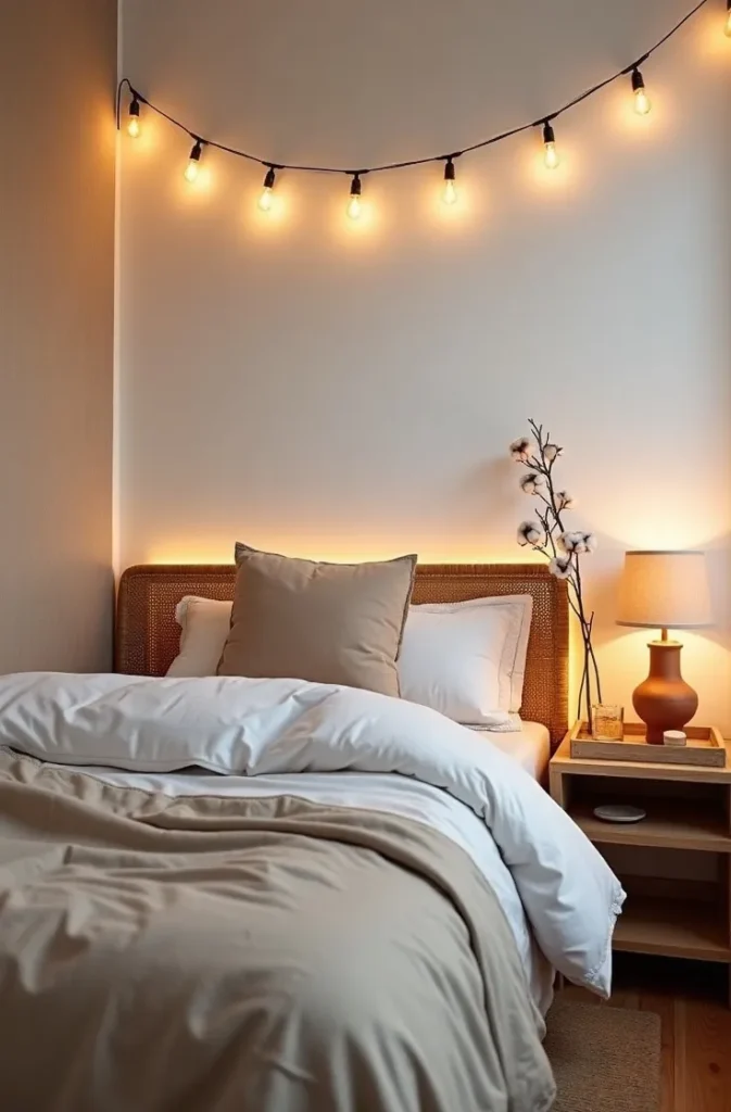

The mistake most students make with neutral palettes is buying things in five slightly different undertones of beige and wondering why it looks muddy. Anchor the palette with one warm white (not cool white), one medium taupe, and one deeper mushroom-brown, and stop there. Your linens, your rug, and your curtain panel should all sit in those three tones.
When you walk into this room at the end of a long Tuesday, it should feel like exhaling.
The Maximalist Botanical Theme That Feels Lush, Not Chaotic
There is a version of the botanical dorm room that looks like a greenhouse exploded inside a shoebox, and there is a version that looks like a calm, verdant sanctuary. The difference is editing: choose one dominant plant shape and repeat it rather than collecting every species you find at the campus farmers market. A cluster of trailing pothos in three different sized pots, all in the same warm terracotta, creates botanical density without visual noise.
The layout mechanic here is vertical stacking. In a dorm room with limited floor space, you use a floating shelf, a windowsill, and a tall bookshelf as three distinct height levels for plants and objects. The eye travels upward, which makes the ceiling feel higher and the room feel larger. This is one of the most effective dorm room themes for east-facing windows, where indirect morning light keeps trailing plants happy without requiring a grow light.
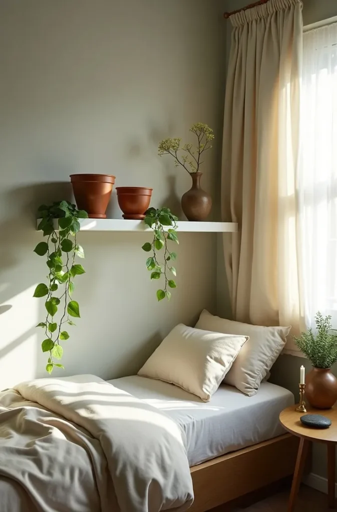
What does not work: buying artificial plants to fill the gaps. The texture of fake greenery in a small space reads immediately — especially in photos — and it flattens the organic warmth that makes this theme worth doing. If you cannot maintain real plants, choose one or two slow-growing succulents and supplement with dried botanicals in sculptural vases.
Picture this: you wake up in a room that smells faintly of soil and natural fibers, with green trailing over your bookshelf and soft morning light coming through your sheer curtain. That is not aspirational — that is completely achievable.
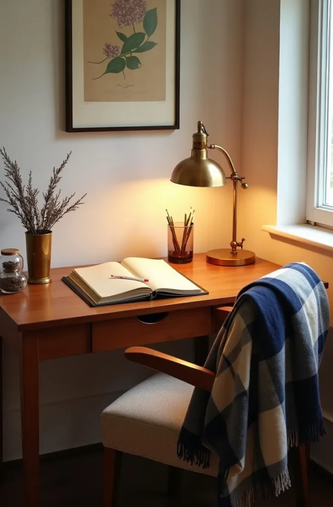
The Dark Academia Theme Done Right — Without Making Your Room Feel Like a Cave
Dark academia is one of the most requested dorm room themes online, and also one of the most commonly botched in execution. The aesthetic — deep, moody tones, stacked books, candlelight, velvet — sounds perfect until you realize a dorm room with no natural light and charcoal walls is genuinely depressing by November. The solution is to go dark in your textiles and accents while keeping your walls and ceiling light.
Use forest green velvet for a throw pillow and a small curtain panel. Bring in warm wood tones through a desk organizer or a floating shelf. Stack actual books spine-out, not for performance but because you are actually reading them — this theme has the most EEAT credibility when it reflects a real intellectual life rather than a Pinterest recreation. A brass desk lamp with a warm Edison bulb does more atmospheric heavy lifting than any other single purchase.

The layout that supports this theme best is the study-anchor arrangement: position your desk as the focal point of the room, not the bed. Push the desk toward the window and treat it as the design hero. A well-styled dark academia desk with a stack of annotated books, a small plant, and good directional light is the image that gets saved.
What to avoid: buying everything in black. Black in a small space without deliberate lighting becomes a void. Stay in the deep green, cognac brown, and aged gold range, and let your bedding be the one lighter note in the room.
The Coastal Grandmother Dorm Theme That Feels Elevated, Not Kitschy
Coastal grandmother is one of the dorm room themes that gets dismissed as “too old” by nineteen-year-olds who then discover it at twenty-six and wish they had done it sooner. The aesthetic — linen, wicker, faded blues, soft texture — creates a room that photographs beautifully and holds up emotionally across an entire academic year in a way that trend-driven maximalist themes do not.
The key layout decision with this theme is textile layering on the bed. A linen duvet in faded sky blue, a loosely woven cotton throw in cream draped at the foot, and one or two solid pillows in chambray blue create depth without clutter. The wicker element — a small magazine basket, a round mirror frame, a lamp base — adds the tactile, organic quality that separates this from generic blue-and-white coastal.
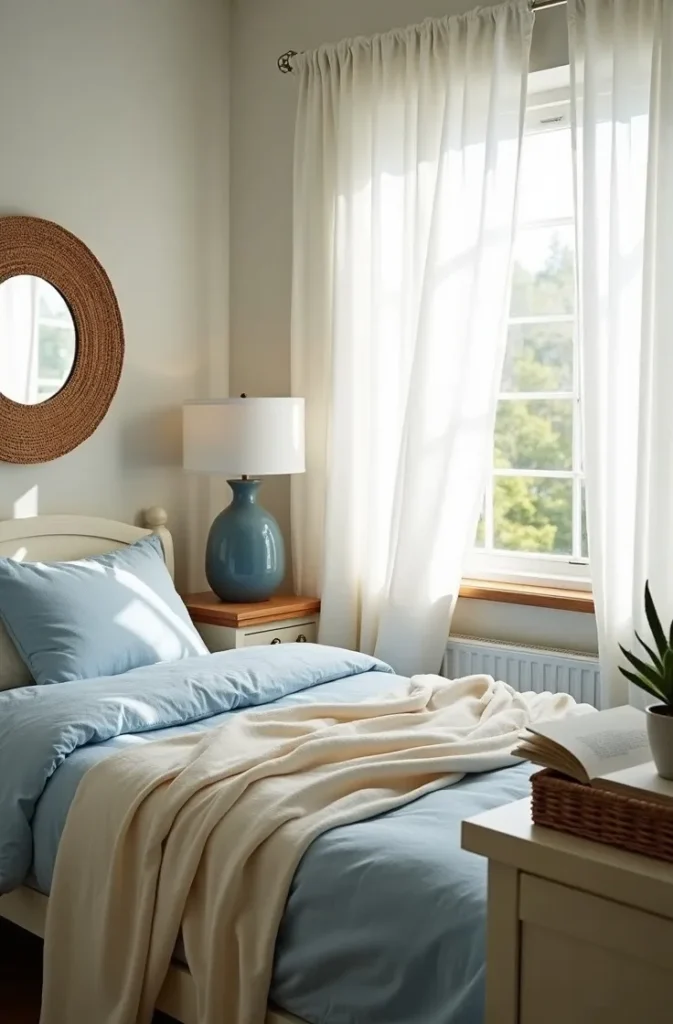
This theme works especially well in dorms with large windows or rooms that face south, where natural light can catch the linen texture and warm it up throughout the day. For north-facing or windowless rooms, compensate with warm light sources rather than cool daylight bulbs — the entire palette shifts from serene to sterile under fluorescent or cool white light.
The mistake is adding actual seashells as decor. The coastal grandmother aesthetic is about texture and restraint, not literal seaside objects. No sand dollars on the windowsill.
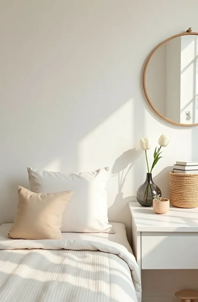
The Soft Minimalist Theme That Works Even When Your Roommate Has Different Taste
Minimalism in a shared dorm room is not about getting your roommate to agree to nothing on the walls. It is about creating a visual boundary within your half of the room that reads as cohesive even when the other half is full of color. The soft minimalist dorm theme uses a restrained palette of one warm white, one dusty blush, and natural wood to define your side as its own complete space.
The layout principle here is the defined zone. Use a small rug on your side — even a 3×5 placed at the foot of your bed — to visually anchor your area. Keep your shelf styling to three objects maximum per shelf level. Remove visual clutter from the desk surface at the end of every day. These are not aesthetic choices; they are psychological ones. A minimalist zone in a chaotic shared environment is where your nervous system gets to rest.
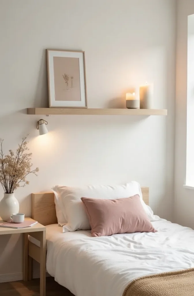
This is one of the most practical dorm room themes for women who are easily overwhelmed by visual noise, who study better in a clear environment, or who simply want their space to feel like theirs regardless of what is happening on the other side of the room.
The mistake is conflating minimalism with emptiness. An empty shelf is not minimalist; it is unfinished. Three deliberately chosen objects — a sculptural candle, a single framed print, a small trailing plant — make it minimalist.
The Preppy Dorm Theme Reimagined for 2026 — Less Vineyard Vines, More Quiet Luxury
The preppy aesthetic has been going through a quiet reinvention, and the new version is significantly more interesting to design than the old stripe-and-monogram formula. The 2026 interpretation of preppy dorm room themes leans on navy and cream with warm brass hardware, plaid in muted rather than bright tones, and exactly one traditional element — a monogrammed item, a classic shape — used as a deliberate wink rather than a theme.
The layout that carries this aesthetic is the organized desk arrangement. Preppy done right is disciplined. A clear acrylic organizer, a leather-bound planner, a brass table lamp, and one framed print (think botanical illustration or a simple crest) on the wall above. The desk is the identity of this room, not the bedding.
This theme translates particularly well in older university dorms with wood trim or traditional architectural details — the architecture supports the aesthetic. In newer, more generic concrete-and-drywall dorms, you create the traditional feeling through object selection: opt for warm-toned items over anything sleek or modern.
Avoid the instinct to buy the matching set. A preppy room that looks coordinated from a catalog reads immediately as a costume. The art is in mixing — a grandmother’s plaid blanket with a new brass lamp and a classic hardcover from a used bookstore.
The Cottagecore Dorm Room That Feels Genuinely Romantic, Not Theatrical
Cottagecore is one of the most visually saturated dorm room themes online, which means most versions look derivative before you even start. The theme works when it reads as personal — like a woman who actually loves botanical illustration, pressed flowers, and the smell of old paperbacks — rather than as a mood board recreation. The distinction shows up in the details.
Use actual pressed flowers (press them yourself from flowers you bought or found) rather than manufactured pressed-flower art bought from a big-box store. Frame them in mismatched vintage-style frames you found at a thrift store. One botanical illustration from a library book sale. Two candles in ceramic holders that look handmade. These objects tell a story; the manufactured version does not.
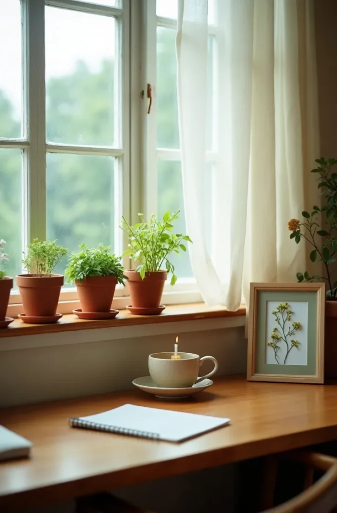
The layout for cottagecore is about layering on the desk and windowsill rather than the walls. A windowsill lined with small pots of herbs — rosemary, thyme, a tiny basil — with mismatched ceramic saucers is more visually authentic than any wallpaper or tapestry. This also works practically: you use the herbs, you water them, they grow, and the windowsill evolves across the semester.
What fails: buying the cottagecore starter pack (mushroom print tapestry, a fairy lights strand, a faux antique key). If your room looks exactly like a search result, it has no point of view. The charm of this aesthetic is the sense that it belongs to a specific person.
The Clean Girl Aesthetic Applied to a Dorm Room — Edited to Actually Function
The clean girl dorm room aesthetic is not about having no belongings. It is about the appearance of effortlessness, which requires more deliberate organization than almost any other design direction. Everything that must exist in a small dorm room — chargers, textbooks, skincare, laundry supplies — has a place that hides it without losing it.
The layout principle is surface clarity. Every horizontal surface in your visible zone has one styled object and nothing else. The charger goes behind the shelf. The skincare lives in a small tray inside the closet. The current textbook sits on the desk and nothing else sits beside it. When the surface is clear, the one object — a sculptural glass vase, a single candle, a phone in a marble stand — becomes the statement.
This theme is most effective for women living in a dorm where the layout allows the bed to be the primary visual. A clean girl bed is made every morning, uses a monochromatic palette (all-white or all-cream or all-oat), and has exactly two throw pillows. The act of making the bed is part of the design practice, not optional.
The mistake is buying organization products that are themselves visually noisy. Clear acrylic with gold hardware, large colored labels, and plastic bins all undermine the calm the aesthetic depends on. Use natural materials — rattan, light wood, ceramic, linen — even for your functional organizers.
The Vintage-Eclectic Dorm Room Theme That Looks Collected, Not Cluttered
There is exactly one rule for the vintage-eclectic dorm theme: every object must earn its place through either beauty, usefulness, or personal meaning. If it is none of those three things, it is clutter wearing a thrift-store costume. This distinction separates the rooms that read as curated vintage from the rooms that read as a storage problem.
The layout here is the gallery wall done with restraint. Four to six frames in mismatched vintage styles, all hanging at the same horizontal centerline, create a collected feeling without visual chaos. Mix actual prints — a vintage botanical, a black-and-white photograph, a page from an old atlas — with one framed piece of personal meaning (a postcard from a trip, a childhood drawing, a poem you love). The personal piece is the one that makes the wall yours.
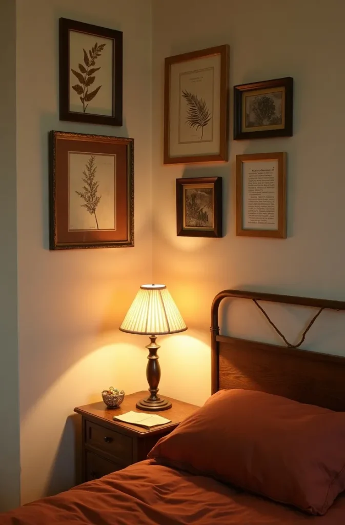
This works particularly well in dorms with high ceilings or older buildings with character — the worn, storied quality of the architecture supports the aesthetic. In brand-new, generic residence halls, lean on warm lighting to create the aged, layered feeling that the room’s architecture cannot provide.
The mistake most people make with vintage eclectic is buying too many things at once. Start with three or four meaningful pieces and add slowly across the year. The best vintage rooms are the ones that show time.
The Monochromatic Black-and-White Dorm Room That Reads as Sophisticated, Not Cold
Black and white in a small dorm room is a high-risk, high-reward combination. Done wrong, it reads as stark and uncomfortable — a room that looks good in photographs at noon and depressing at 9 PM in January. Done right, it is the most graphically confident of all dorm room themes, a room that feels editorial and fully intentional from the first glance.
The key is temperature layering within the monochromatic palette. Warm white (linen, cotton, cream) rather than cool white (bleached, stark, bluish). Soft black (charcoal, deep ink, warm black) rather than pure stark black. A natural wood element — one shelf, one picture frame edge — gives the palette organic warmth and keeps it from feeling clinical.
The layout that serves this theme is the high-contrast desk vignette: a black desk lamp against a white wall, a white ceramic mug on a dark wood surface, a black-and-white print in a simple frame. The contrast does the visual work; you do not need many objects.
What fails is mixing graphic black-and-white pattern (stripes, bold geometric) with this already-strong palette. Solid tones in near-black and warm white, with texture doing the variation work, is the formula that holds the room together across a full year.
The Boho-Luxe Dorm Theme That Earns the Word Luxe
Boho has become one of the most misused labels in dorm room design. Half of what is called “boho” online is simply a collection of cheap macramé and neon fairy lights with no coherent design logic. The boho-luxe version is different: it uses the vocabulary of bohemian design — layered textiles, mixed metals, organic shapes — but applies them with restraint and quality.
The foundational move is layering two rugs instead of one. A flat-weave natural jute rug as the base, with a smaller vintage-style wool rug in deep burgundy or rust layered on top. In a dorm room, this fills the cold linoleum floor entirely and immediately changes the entire sensory experience of the room. It is the single highest-return investment in this aesthetic.
The sculptural element that defines boho-luxe is the lamp. Choose a floor lamp with a basket-woven rattan base or a sinuous ceramic base in a warm earth tone, not a standard retail lamp. The lamp is doing character work in this room. Everything else — bedding, shelves, small objects — can be simpler because the lamp is the statement.
This works best in dorms where you can move furniture. If your bed is fixed to a wall, create the boho-luxe feel through the floor and the lighting rather than the layout.
The Gallery-Girl Art Studio Dorm Theme for Women Who Live in Their Sketchbooks
This is the dorm room theme for the woman whose walls are always full and whose desk is always in productive chaos — but whose room still manages to look intentional because she has made the art itself the design. The art studio dorm room uses works in progress, pinned sketches, and art supplies as the decor rather than purchased prints and shelf objects.
The layout is the pin wall. A large corkboard or a section of wall treated with removable cork panels becomes the anchor of the room — not as a functional bulletin board, but as a living, evolving display. Pin sketches in progress, color swatches, postcard references, and small pressed botanical specimens alongside personal photographs. This wall changes across the semester and is never the same twice. It is the most personal of all dorm room themes because it cannot be copied.
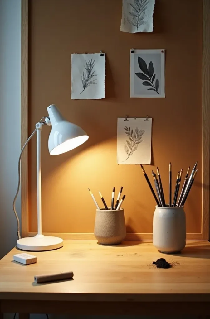
The rest of the room is deliberately simple to let the wall breathe. A wooden desk, a simple lamp, a neutral bed. The art is the statement; the furniture is the stage.
What fails here is treating the corkboard as an afterthought — too small, pinned to one corner. The pin wall needs to be at least four feet wide to read as a design choice rather than a habit.
The Serene Japandi Dorm Room That Resets Your Nervous System After Class
Japandi — the blend of Japanese minimalism and Scandinavian warmth — is one of the most livable dorm room themes for women who spend a lot of time in their room, because it is specifically designed for psychological ease, not visual performance. The aesthetic is anti-stimulation: low furniture where possible, warm natural materials, deliberate negative space, no visual competition between objects.
In a dorm room with fixed furniture, you approximate the low-profile quality of Japandi by dressing the bed without a high headboard alternative — a simple fabric panel pinned to the wall or a flat rattan mat hung horizontally creates a low, grounded quality. Keep the bed very close to the floor visually by avoiding anything stacked above pillow height on the immediate walls.
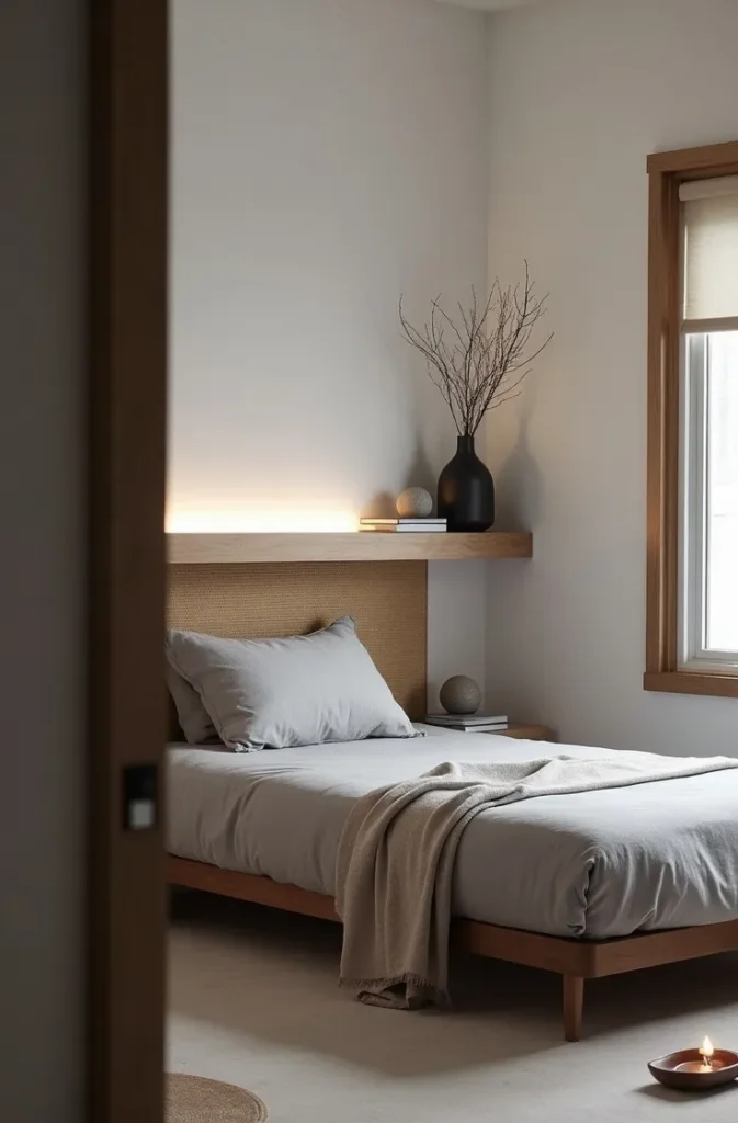
The material palette for this theme is specific: unfinished or lightly finished wood (not warm golden pine, but cooler ash or birch tone), natural linen in stone or warm grey, raw ceramic in matte finishes, and one dark accent — deep charcoal or inkwell blue — used sparingly. A single black ceramic vase. One dark-framed print.
This is the hardest dorm room theme to execute at a college budget, not because the items are expensive, but because it requires buying fewer, better things rather than many things from a fast-home-goods retailer.
The Maximalist Color Dorm Room That Looks Bold, Not Busy
Maximalism in a small dorm room is the highest-risk direction and also — when it works — the most memorable of all dorm room themes. The difference between a maximalist dorm room and a chaotic one is color logic: in a successful maximalist space, every color is chosen from a deliberate palette, even if that palette is wide. Without color logic, maximalism is just accumulation.
Choose a three-color framework: one dominant (appears in your bedding and largest objects), one secondary (appears in two to three accents), one surprise (used once, in something unexpected like a lamp base or a small framed print). Apply those three colors only, at every scale, across every purchase. Nothing outside the palette comes in.
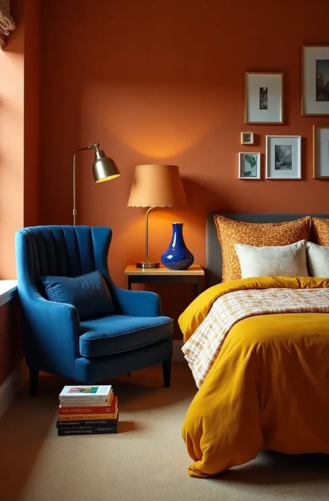
The sculptural element that maximalism demands is something truly unusual: a lamp in a completely unexpected shape, a chair in a color that makes you stop, a plant container that is itself a piece of art. This room needs one object that makes people walk in and immediately say something about it.
This theme requires the most intentional floor plan of any direction here. Map out your furniture positions before you buy anything decorative. A maximalist room with poor traffic flow and blocked natural light becomes a visually overwhelming maze. A maximalist room with clear walking paths and well-placed lighting feels abundant rather than cluttered.
The Vintage French-Girl Dorm Room That Photographs Like a Film Still
French-girl aesthetic in a dorm room is not about buying Eiffel Tower prints. It is about a very specific sensibility: things that look slightly undone in a way that took effort. The bed is made but the throw is loose. The desk has one personal object but it is a beautiful one. The walls are not full but what is on them is interesting. The French-girl dorm room feels like a room in a film you want to rewatch.
The layout anchor of this theme is a single large-format art print or poster — not framed — pinned to the wall with four brass tacks at the corners. This single image does more work than an entire gallery wall. Choose something that would not be immediately recognized: a vintage fashion illustration, a detail from a classical painting, a vintage French cinema poster in the original language.
The textile that defines this theme is a soft robe or blanket draped over the chair. It reads as effortless but is very deliberate. Everything else in the room is tidy; this one draped fabric suggests a life being lived in the space.
Avoid anything that overtly references France — the Eiffel Tower, the word “Paris” in script, baguette-print fabrics. French aesthetic is about restraint and self-possession, not tourism.
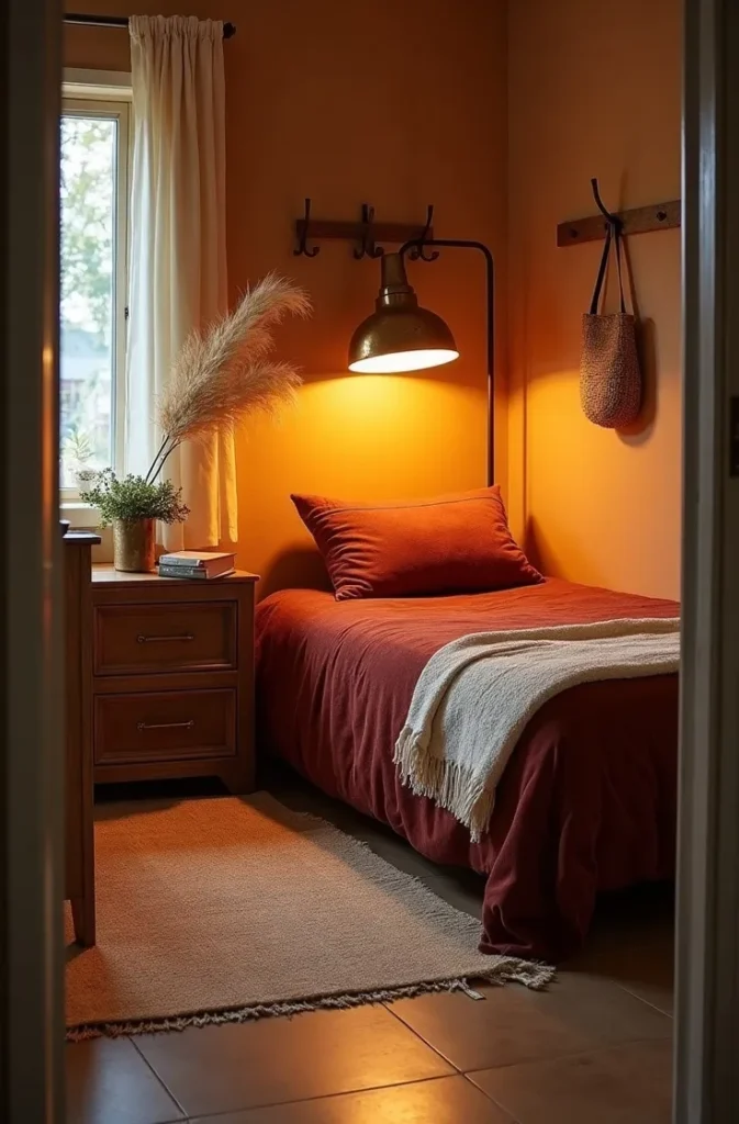
The Moody Romantic Dorm Room That Feels Like It Was Made for Long Winter Evenings
The moody romantic dorm room is built around one central design decision: the lighting is the room. Every other choice — the textiles, the colors, the objects — exists in service of creating an atmosphere that makes a cold Tuesday night in February feel like a choice rather than an endurance. This is the dorm room theme for women who burn candles, read novels, and want their space to feel like an emotional refuge.
The palette is deep but warm: dusty mauve, old rose, warm claret, and cream. These tones absorb light rather than reflecting it, which makes the space feel enveloping rather than dim. The bedding in this room is layered: a matte satin duvet in dusty mauve, a velvet throw in deep claret, two pillows in old rose and one in cream. The layering is not decorative; it is sensory.
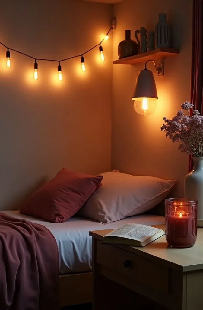
The lighting formula for this room is three sources, none of them overhead: a warm-toned lamp on the shelf, a string of Edison bulbs draped above the bed (the one exception to the rule that string lights look cheap — here they function as ambient candlelight), and a small candle on the desk when you are awake in the evenings.
This is the most mood-dependent of all dorm room themes: it requires you to commit to the atmosphere. You cannot have a moody romantic room and then leave a bright white laptop charger brick on the nightstand.
The Functional Aesthetic Dorm Room for the Woman Who Needs to Study AND Feel Good Doing It
This is the dorm room for the woman who has learned the hard way that a beautiful room she cannot actually work in is just an expensive problem. The functional aesthetic theme is built around a simple hierarchy: study performance first, visual beauty through the tools of that performance. The two are not opposites. They are, when designed correctly, the same thing.
The desk setup is the design hero. A dedicated task lamp with a warm-to-cool adjustable temperature. A monitor riser in natural wood that creates a second surface below for a keyboard or notebook. A small ceramic tray corralling everything that lives on the desk surface. A cable management solution that is invisible. The desk, styled this way, photographs like an editorial home-office setup — and it is also the place where you can sit for four uninterrupted hours without your eyes hurting.
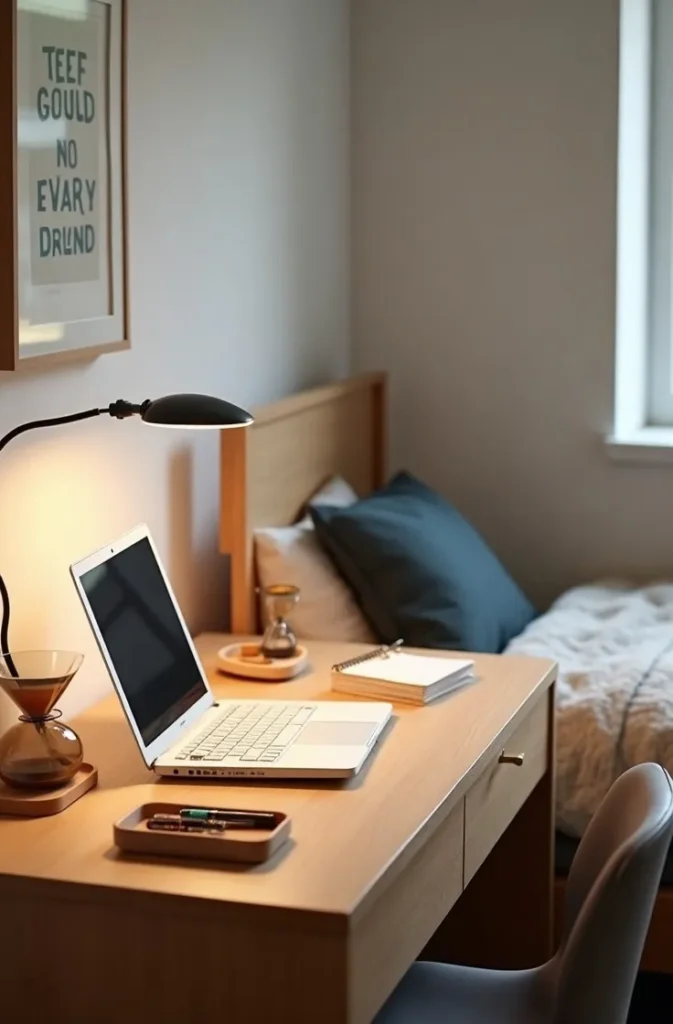
The rest of the room is deliberately quieter so the desk reads as the focal point. Neutral bedding. Simple shelving. Minimal wall objects. The functional aesthetic dorm room is the one that looks the most “grown up” of all the dorm room themes here, because it reflects a woman who knows exactly what she needs from her space.
The mistake is over-investing in the desk setup and neglecting the sleep zone entirely. A high-performance study area inside a visually chaotic sleep environment will eventually undermine both.
The Dopamine Décor Dorm Room for the Woman Who Cannot Do Beige
Dopamine décor is the permission slip for the woman who has been told her taste is “too much” her entire life. This dorm room theme is built on the principle that color, pattern, and joyful objects are not design failures — they are design choices that happen to require more skill to execute than a neutral room. The skill is in the edit: everything present must be genuinely loved, not just colorful.
The layout that supports dopamine décor is the curated surface. Pick three to four places where color and object clustering will happen — the desk, the windowsill, one wall, and the bed — and keep everything else simple. The floor stays clear. The closet door stays closed. The joyful things get stages, not the whole room at once.
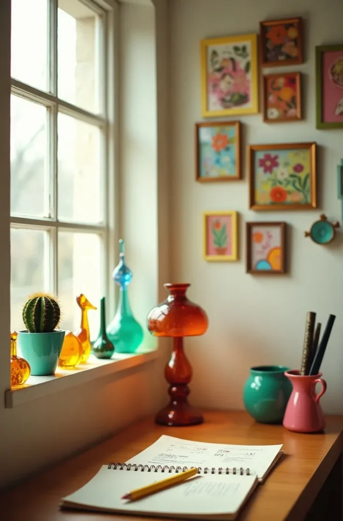
The defining object in this theme is something completely personal: the one strange, colorful, specific thing that is yours and only yours. A collection of vintage glass animals. A wall of handmade paper flowers in every shade you love. A vintage globe painted in a way it was never meant to be. This is the object that turns dopamine décor from a trend into a room.
This theme is highest-impact in a private dorm room, though it can work in a shared room when limited to your defined zone. If your roommate is on the neutral side of the spectrum, dopamine décor on your half of the room can create a beautiful contrast that makes both sides look more intentional by comparison.
You came into this with a collection of saved pins and a cinderblock room. You are leaving with eighteen specific visual directions, each with a real design logic behind it — not just an aesthetic name attached to a shopping list. Save this post now so you can come back to it when you are standing in your empty dorm room in August deciding where everything goes. The right dorm room theme is not the one with the most saves on Pinterest. It is the one that still makes you want to be in your room by October, when the novelty has worn off and the real test of a designed space begins. That is the standard worth designing to.