
A reading nook in bedroom layouts is one of the hardest small-space wins to pull off well, mostly because most advice assumes you have a spare corner and a window seat waiting to be dressed up. You do not. You have a bedroom that is already working hard to hold a bed, a dresser, and a closet door that needs to swing open, and you want a corner that feels like it belongs to you and not to the laundry pile. After this, you will know exactly which layout fits your room’s shape, your window situation, and your actual reading habits, instead of pinning ideas that only work in a magazine spread.
The Six-Inch Rule That Turns a Dead Corner Into a Reading Nook
Most bedrooms have one corner that nobody uses on purpose. It is where the closet door swings, where a laundry basket lands, where nothing ever gets placed intentionally because it feels too small to matter. The trick is not to fill that corner with a full armchair. A slim slipper chair, no wider than 24 inches, pulled in six inches from both walls rather than pushed flush into the corner, creates enough negative space around it that the eye reads it as a designed nook rather than a leftover gap. This works especially well in rectangular bedrooms where one short wall has no window and no furniture obligation.
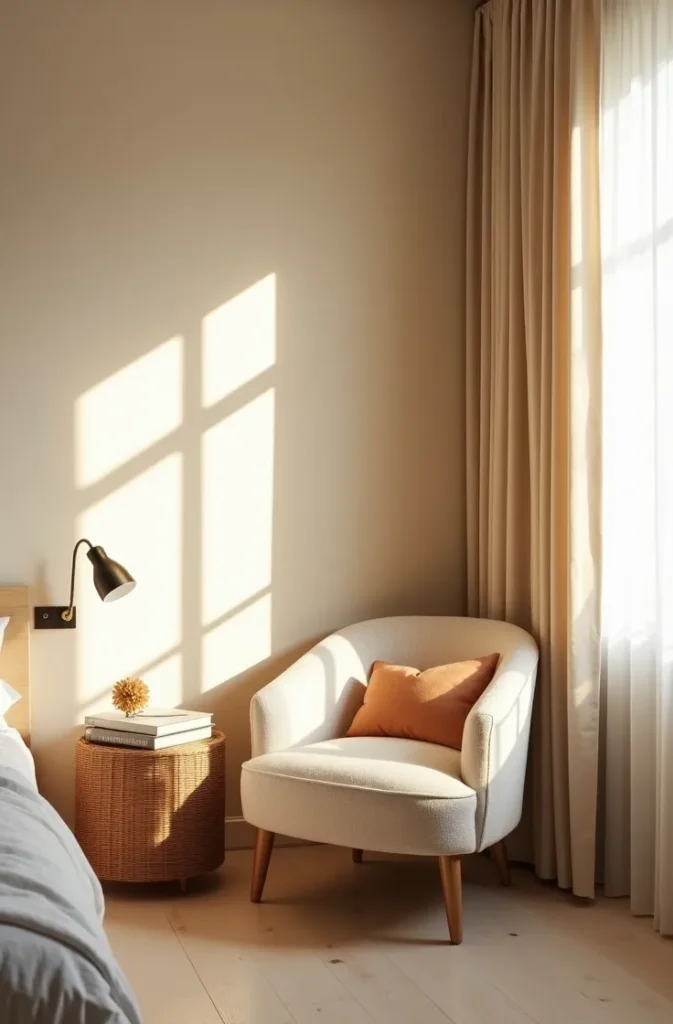
This layout is best for renters and studio dwellers who cannot alter the room but need a spot that feels like theirs. The mistake most people make is choosing an oversized armchair because it looks cozier in photos. In a room under 100 square feet, an oversized chair reads as clutter within a week. A slim frame with a soft cushion reads as intentional for as long as you keep it there.

Picture the corner by your closet door, empty right now except for whatever landed there without being asked. That is your reading nook in bedroom layout waiting to happen, and it costs one chair, not a renovation.
Why a Window Seat Reading Nook Works Even Without a Real Window Seat
A true built-in window seat needs carpentry most renters will never get approved. But the feeling of one, the low seat height, the cushion that meets the windowsill, the sense of being tucked into the light, can be recreated with a floor cushion or a low daybed frame pushed directly beneath the window and nothing else. The mechanic here is proximity, not construction. When seating sits close enough to the window that your shoulder could touch the glass, your brain reads the whole area as a window seat reading nook, even if it is technically just a cushion on the floor.
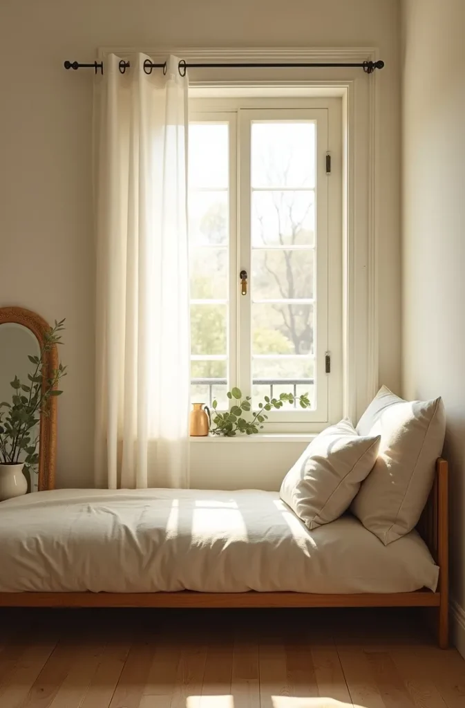
This works best in bedrooms with a single window and no radiator or vent running beneath it, which rules out a lot of Northeast apartments but is common in California bungalows and Texas ranch-style secondary bedrooms. The mistake to avoid is adding a full bolster and a stack of decorative pillows that never get moved. If the pillows never leave the seat, it is decoration, not a reading nook. Leave room for your own body to actually sit there.
Imagine morning light landing directly on the page of your book instead of across the room. That is the entire argument for this layout.
The Foot-of-Bed Layout for Bedrooms With No Spare Corner at All
If your bedroom genuinely has no unused wall, the foot of the bed is your only real option, and it works better than people expect. A narrow bench or a single low-back chair placed perpendicular to the footboard, angled slightly toward the window rather than facing the bed directly, creates a reading spot without needing a separate zone of the room. The mechanic is angling, not placement. A bench facing the bed feels like an extension of the bed. A bench angled 30 degrees toward the light feels like its own destination.
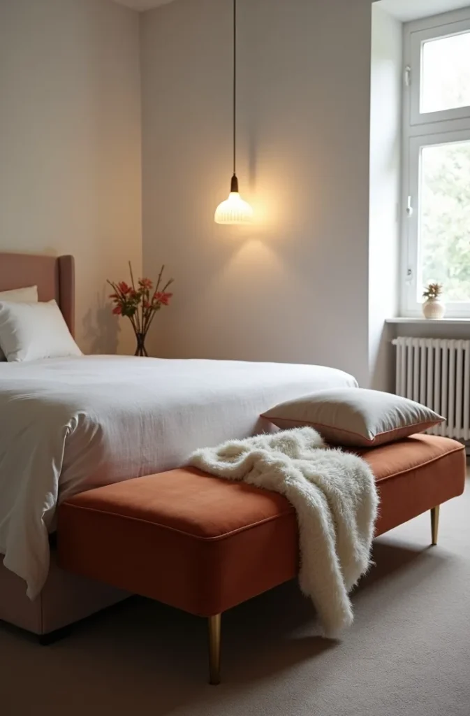
This is the layout for true studio apartments and shared bedrooms where every wall already has a job. The mistake most people make is choosing a bench the same width as the bed frame, which visually merges the two pieces into one large block. Keep the bench at least 12 inches narrower than the bed on each side so it reads as a separate object.
You will notice the difference the first time you sit down and your eye lands on the window instead of the back of your own headboard.
Why Floor Seating Outperforms a Chair in Bedrooms Under 100 Square Feet
In a genuinely tiny bedroom, any chair, no matter how slim, competes with the bed for floor space and visual weight. Floor seating, a low cushion, a floor pouf, or a Japanese-style zabuton mat, solves this because it has almost no vertical presence and can be tucked half beneath a windowsill or shelf when not in use. The mechanic is that furniture height, not footprint, is what makes a small room feel cramped, and floor seating removes height from the equation entirely.
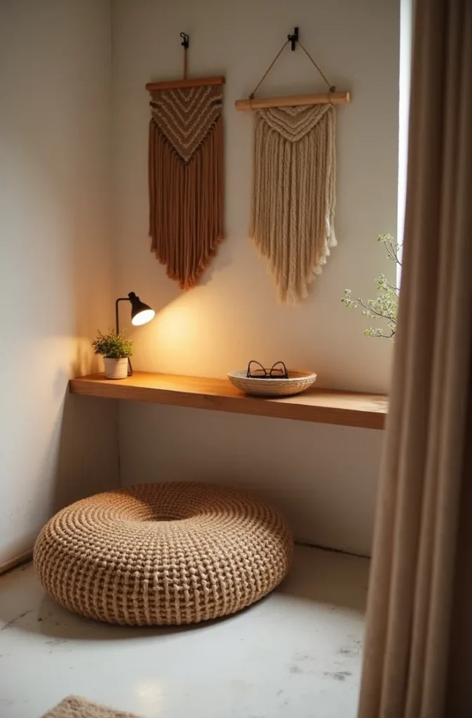
This works best for minimalist small bedroom layout lovers and anyone in a room where the bed already takes up most of the square footage, which describes a huge share of New York studio apartments. The mistake to avoid is choosing a floor cushion with no back support at all. Without a wall or a low shelf to lean against, nobody actually sits there for more than five minutes, and the nook becomes decorative rather than used.
Picture sliding the cushion out from under the shelf for twenty minutes with your tea, then sliding it back before bed. That is a reading nook that respects a room with no space to spare.
The Closet-Free Layout: Turning a Missing Closet Into Your Best Reading Corner
Older homes, particularly Midwest starter homes and prewar apartments, sometimes have bedrooms with no closet at all, which sounds like a loss until you realize it is extra wall footage most bedrooms never get. Rather than filling that wall with a wardrobe, a narrow reading chair paired with two floating shelves above it turns the missing closet into the room’s best feature instead of its biggest flaw. The mechanic is that a full wall of open shelving reads as intentional design when anchored by a single seat beneath it, rather than reading as makeshift storage.
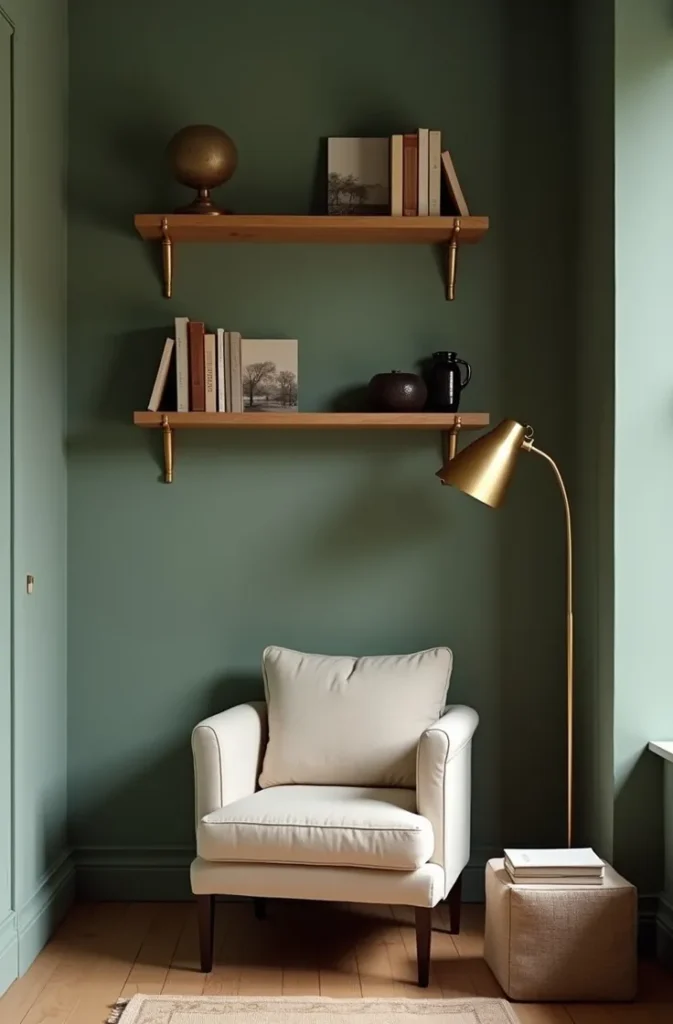
This is one of the more specific small bedroom with no closet layout ideas because it solves two problems at once, storage and seating, without adding floor furniture. The mistake most people make is filling the shelves edge to edge with books, which visually flattens the wall. Leave at least a third of each shelf empty so the eye has somewhere to rest.
Standing in that spot, you would never guess it used to be nothing but a gap where a closet was supposed to go.
Why a Curtain-Divided Nook Feels Bigger Than an Open One
Counterintuitively, adding a curtain to partially enclose a reading corner makes a small bedroom feel larger, not smaller, because it gives the eye a defined boundary instead of one continuous open box. A ceiling-mounted curtain track running along one wall, positioned to partially wrap a chair and a small table, creates a sense of a separate room within the room. The mechanic is that the brain measures a space by its distinct zones, not just its total square footage, and a curtained nook reads as an additional room rather than a corner of the existing one.
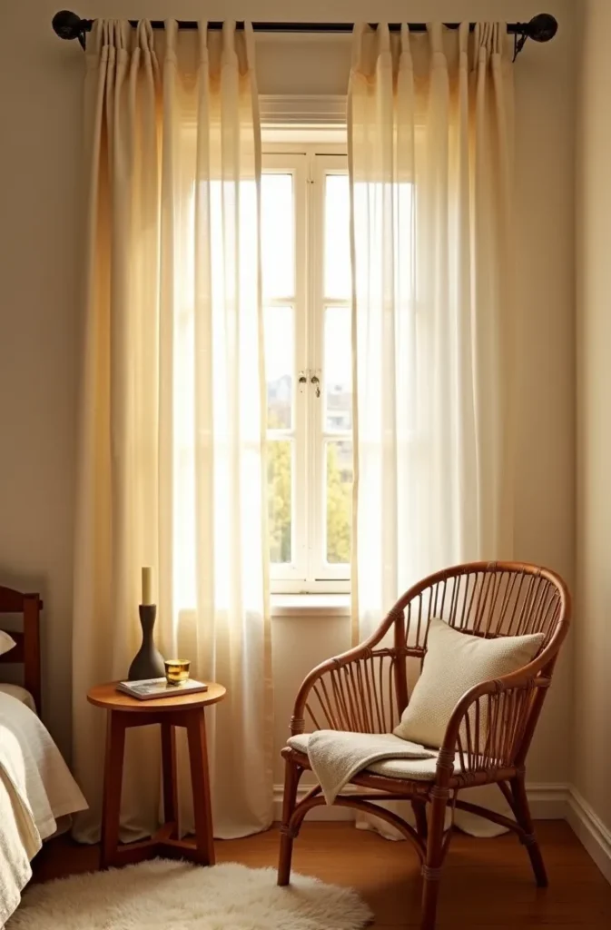
This works particularly well in studio bedroom layout for small spaces situations, where the bedroom is also the living room and a visual break between functions matters more than it would in a dedicated bedroom. The mistake to avoid is using a heavy blackout curtain here, which feels like hiding rather than framing. A sheer or medium-weight linen curtain lets light pass through even when drawn, keeping the nook from feeling sealed off.
Drawing that curtain closed for twenty minutes with a book is closer to a private study than most people expect from a rented studio.
The Bed-Adjacent Ladder Shelf That Doubles as a Reading Station
A narrow ladder shelf leaned against the wall beside the headboard, rather than a separate armchair setup, gives you a place to prop a book, a lamp, and a cup without requiring floor space for seating at all, because the “nook” becomes the bed itself paired with a beautifully styled vertical surface within arm’s reach. The mechanic is that the ladder shelf’s open-back design keeps the wall from feeling blocked, unlike a solid nightstand, which matters enormously in bedrooms where every wall inch is visible from the doorway.
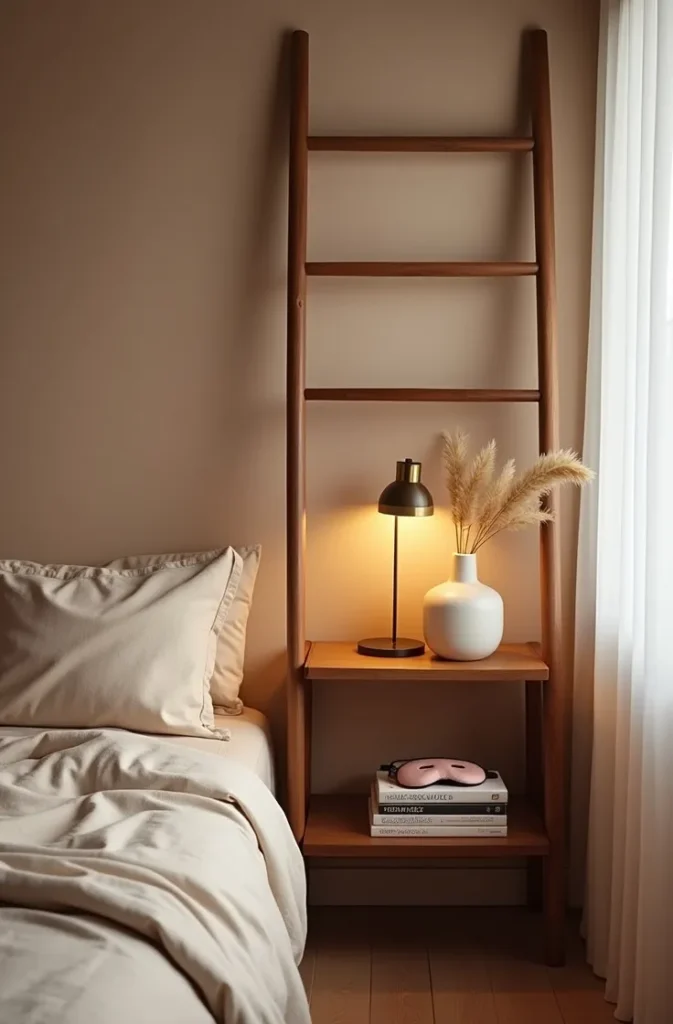
This is ideal for tiny bedroom furniture arrangement situations where a second chair simply will not fit, and for anyone who genuinely reads in bed most nights anyway rather than in a separate chair. The mistake most people make is treating the ladder shelf as extra storage and stacking it with unrelated items. Reserve it for reading-only objects, books, a lamp, a candle, so it functions as a nook rather than a catch-all.
The moment you reach over and everything you need is already within arm’s reach, you realize you never needed the extra chair to begin with.
Why a Bay Window Alcove Should Never Hold a Full Chair
Bedrooms lucky enough to have a bay window alcove often make the mistake of filling it with an oversized armchair that blocks half the window and makes the alcove feel like storage rather than a feature. Instead, a single fitted cushion cut to the exact width of the alcove, paired with two slim bolster pillows rather than a chair, keeps the window fully visible from anywhere in the room and turns the alcove into the room’s clear focal point. The mechanic is that an unobstructed window sightline makes the entire bedroom feel larger, even from the doorway, far more than the alcove’s actual square footage would suggest.
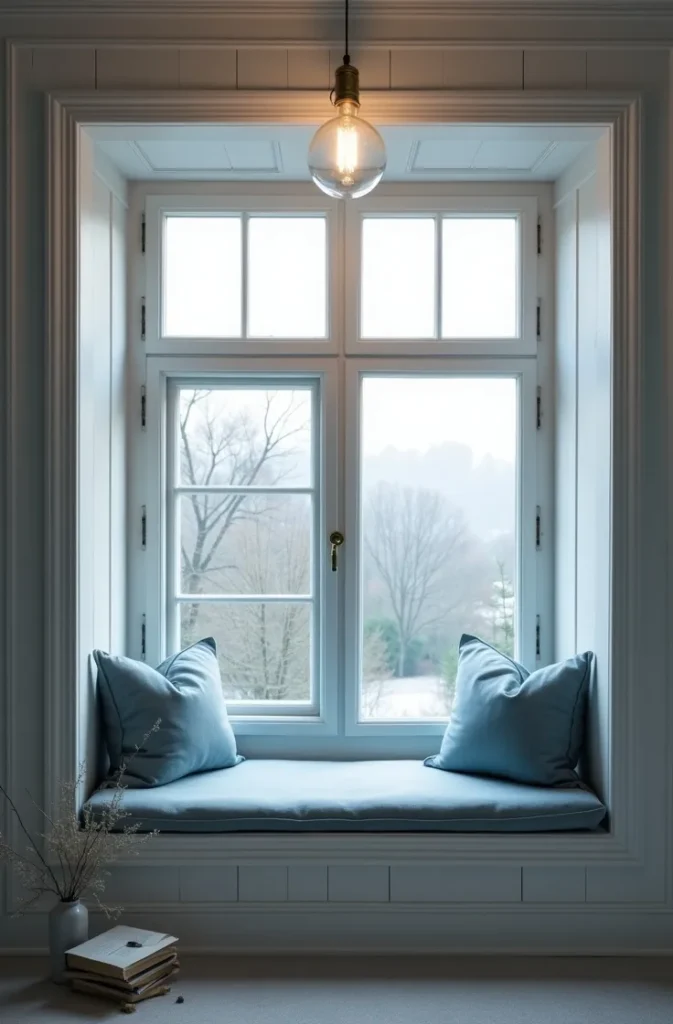
This works specifically for bedroom layout ideas for small rooms with a window where that window is the room’s best asset and deserves to stay visible rather than hidden behind furniture. The mistake to avoid is choosing bolsters in a busy pattern, which competes with the window view instead of framing it. Keep them in a single solid tone that matches the wall.
From the doorway, that window becomes the first thing you notice about the entire room, exactly as it should.
The Mirror Trick That Makes a Reading Nook Feel Like It Has Its Own Window
Not every reading corner gets natural light, and rather than skipping the idea altogether, positioning a tall arched mirror directly across from the seat, angled to reflect whatever light source exists in the room, gives the nook a sense of brightness and depth it would not otherwise have. The mechanic is genuinely optical: the mirror doubles the perceived light source and pushes the visual boundary of the room outward, which matters most in interior bedrooms with only one small window on the opposite wall.
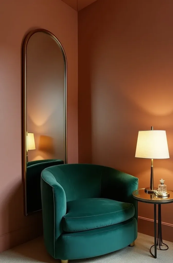
This is a strong solution for cozy small bedroom design ideas where the reading spot has to go on a windowless wall out of necessity, not preference. The mistake most people make is hanging the mirror too small or too high to actually reflect the seating area. It needs to be large enough, and hung low enough, that the chair itself appears within the reflection.
Sit in that chair and the room behind you appears to keep going, which is exactly the illusion a tight bedroom needs.
Why a Rug Alone Can Define a Reading Nook With Zero Furniture Changes
If you cannot add or move a single piece of furniture, a small area rug placed only beneath the existing chair and side table, distinct from the rug or flooring in the rest of the room, is enough to visually separate a reading zone from the sleeping zone. The mechanic is that a change in ground texture signals a change in function to the eye, the same principle that makes an open-plan kitchen and living room feel like two rooms instead of one. This is the lowest-effort, highest-impact layout adjustment on this entire list.

This works for renters facing move-in restrictions and for small master bedroom layout ideas where the existing furniture arrangement already works and only needs definition, not replacement. The mistake to avoid is choosing a rug too small for the chair to sit on. If only the front two chair legs touch the rug, it reads as an accident rather than a decision. Size it so the full chair footprint sits on the rug with a few inches to spare.
You will notice the shift in how the corner reads within a day, and you will not have moved a single other item in the room.
The Vertical Layering Rule for Reading Nooks in Rooms With Low Ceilings
Rooms with ceilings under eight feet, common in older attic conversions and some Midwest starter homes, make any seated corner feel more cramped than the floor plan suggests, because the eye reads the low ceiling as pressing down on the whole zone. Hanging a single pendant light lower than usual, paired with a floor lamp instead of a table lamp, actually corrects this by creating layered light at two different heights rather than one flat wash, which tricks the eye into reading vertical depth that the ceiling height does not actually offer. The mechanic is about layered light height, not brightness.
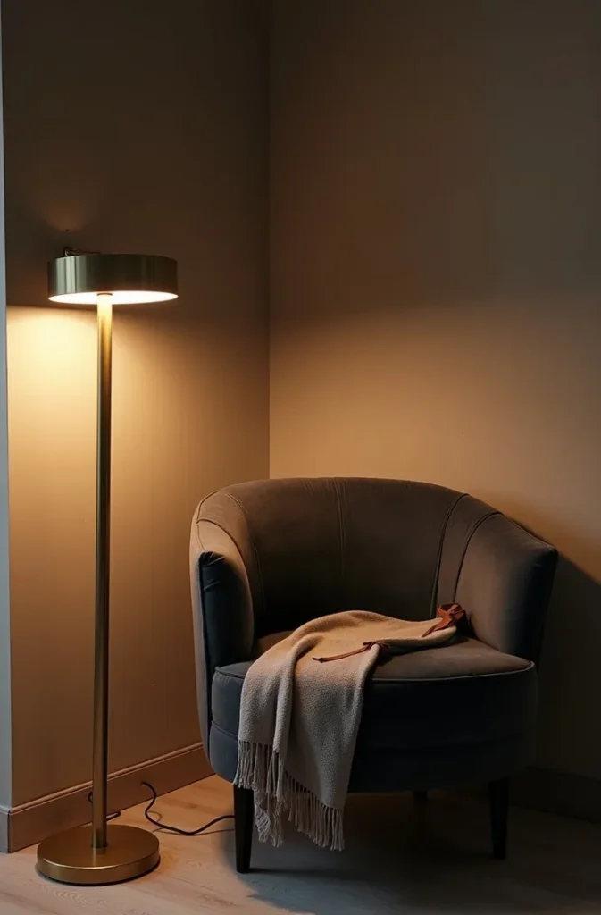
This is a specific fix within minimalist small bedroom layout thinking, useful anywhere the ceiling itself is the limiting factor rather than the floor space. The mistake most people make is adding a bright overhead fixture to compensate for the low ceiling, which only emphasizes how close it is. Warm, layered, lower-set light does the opposite.
Sitting beneath that layered light, you stop noticing the ceiling at all, which is the entire point.
Why a Corner Desk Doubles as the Best Reading Nook You Already Own
If your bedroom has a small desk wedged into a corner for work, you likely already have the bones of a reading nook and do not need a separate chair at all. Swapping a hard desk chair for a slim upholstered one, and adding a small reading lamp beside the desk lamp, turns that same corner into a dual-purpose spot without adding a single new piece of furniture to the floor plan. The mechanic is that seating comfort, not desk presence, is what determines whether a corner reads as a workspace or a retreat, and an upholstered chair shifts that read entirely.
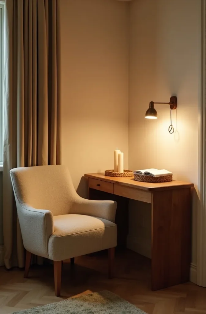
This is the most practical option for functional small bedroom floor plans USA situations where the room genuinely has no space for two separate zones. The mistake to avoid is leaving work materials visible on the desk when you want the reading version of the corner to feel calm. A small tray or drawer to clear the surface makes the switch between functions feel intentional rather than half-finished.
The same six square feet becomes two different rooms depending only on what is sitting on the desk and who is sitting in the chair.
The Under-Shelf Nook That Makes Use of Otherwise Wasted Vertical Space
Many small bedrooms have a stretch of wall above a dresser or low bookshelf that goes entirely unused, when in fact a slim wall-mounted seat or a built-in bench cushion fitted along the top of a low shelf can turn that same footprint into functional seating without taking any additional floor space at all. The mechanic is repurposing furniture you already have vertically, rather than adding new furniture horizontally, which matters most in bedrooms where every square foot of floor is already accounted for.
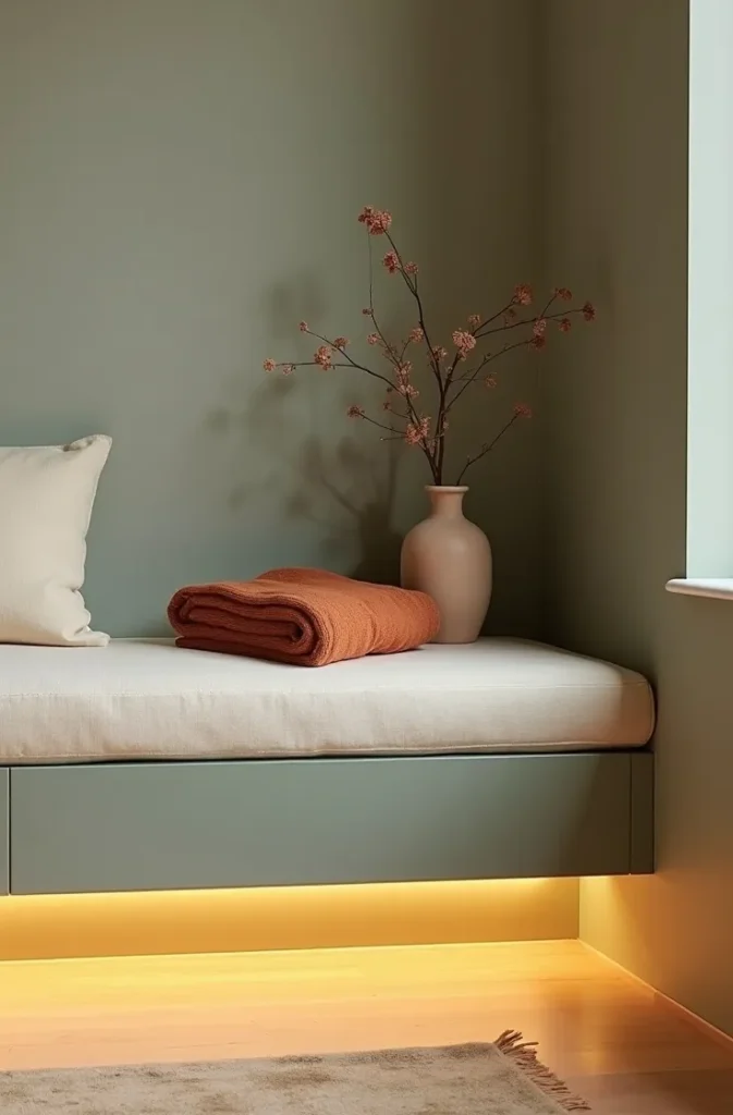
This works well for studio bedroom layout for small spaces where a dresser already sits along one wall and simply needs a cushion and under-shelf lighting to become dual-purpose. The mistake most people make is choosing a cushion too thick for the shelf height, which makes sitting down feel awkward rather than natural. A slim two-inch cushion, not a thick mattress topper, keeps the proportions right.
That dresser you walk past every day becomes the one place in the room you actually want to sit.
Why an Egg Chair or Cocoon Seat Works Best in Rooms With Awkward Angles
Attic bedrooms, converted lofts, and rooms with a sloped ceiling on one side often have an awkward triangular pocket of space that a standard rectangular chair cannot sit in comfortably. A rounded egg-shaped or cocoon chair, because it has no hard corners of its own, fits into these angled pockets in a way rectangular furniture simply cannot, following the room’s odd geometry instead of fighting it. The mechanic is shape-matching: a curved chair in a curved or sloped space reads as designed for that spot, while a rectangular chair in the same spot reads as a compromise.
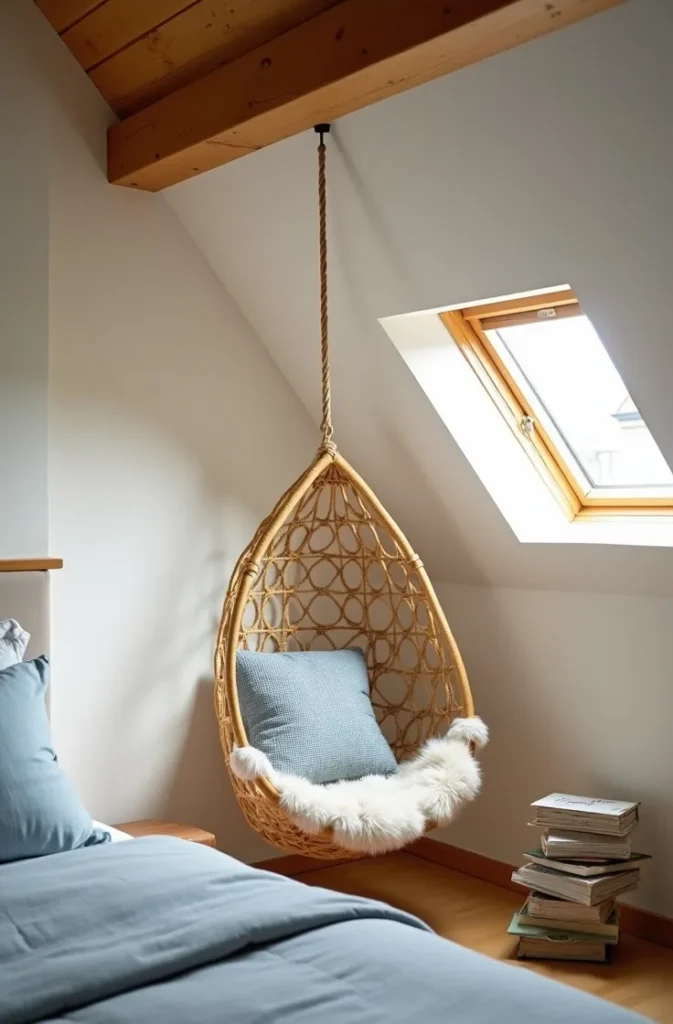
This is a strong pick within layouts for very small bedrooms 2026 that specifically have architectural quirks rather than a standard rectangular footprint. The mistake to avoid is placing the chair at the lowest point of a sloped ceiling, where headroom disappears entirely. Anchor it where the ceiling is still at least five and a half feet high so the seat remains comfortable to sit in and rise from.
That oddly shaped corner nobody knew what to do with becomes the coziest seat in the entire house.
The Layered Lighting Formula That Makes Any Reading Nook Feel Finished
No matter which layout you choose, the difference between a reading corner that looks staged and one that looks lived-in almost always comes down to lighting layers, not furniture. A single overhead fixture flattens the whole room into one even wash, while combining a low table or floor lamp with one additional small light source, a wall sconce, a clip lamp, or under-shelf LEDs, creates the kind of shadow and warmth that makes a corner feel like a destination rather than an afterthought. The mechanic is contrast: light and shadow together read as intentional, while flat even light reads as functional but forgettable.
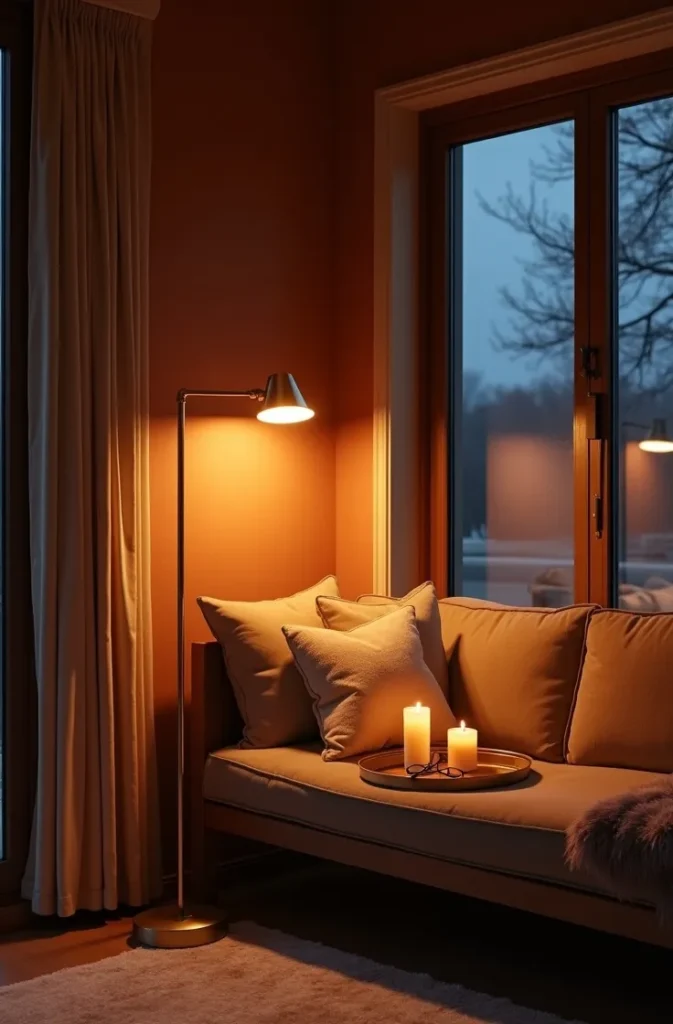
This closing principle applies across every layout already covered, whether it is a window seat, a floor cushion, or a corner desk, which is why it belongs last. The mistake almost everyone makes, in an otherwise well-designed nook, is relying on the room’s main ceiling light instead of a dedicated secondary source. Turn the overhead light off entirely when you sit down to read, and let the smaller, warmer light source do the work instead.
Once the lighting is layered correctly, even the simplest chair in the plainest corner starts to look like something worth saving to your Pinterest board.
A small bedroom does not need more square footage to earn a reading nook, it needs one layout decision made on purpose instead of by accident. Save this post before you rearrange anything, because the right corner for your room is probably one you have been walking past for months. Come back to it when you are ready, and build the one that actually fits your window, your walls, and the way you really read, not the version that only works in a photograph.