Pulling a room together is harder than it looks — most people end up with a collection of things they like rather than a space that feels intentional. Aesthetic room decor is not about buying more; it is about placing the right elements in the right way so the room functions beautifully and looks like it was designed on purpose. This guide gives you 15 specific, practical ideas — each with real guidance on layout, materials, lighting, and what to avoid — so you can make confident decisions for your space.
1. Build a Focal Point Wall That Anchors the Entire Room
Every well-designed room needs one wall that does the visual heavy lifting. Without a focal point, the eye has nowhere to land, and the room feels scattered no matter how good the individual pieces are.
A focal point wall works best when it sits directly across from the room’s entry point. Use a combination of one large-format element — a wide art print, a panel of limewash paint, or a grid of thin-frame mirrors — and layer in a piece of furniture that reinforces it, like a low credenza or a bed with a tall upholstered headboard. The key is contrast: the wall should be visually heavier than the three walls around it.
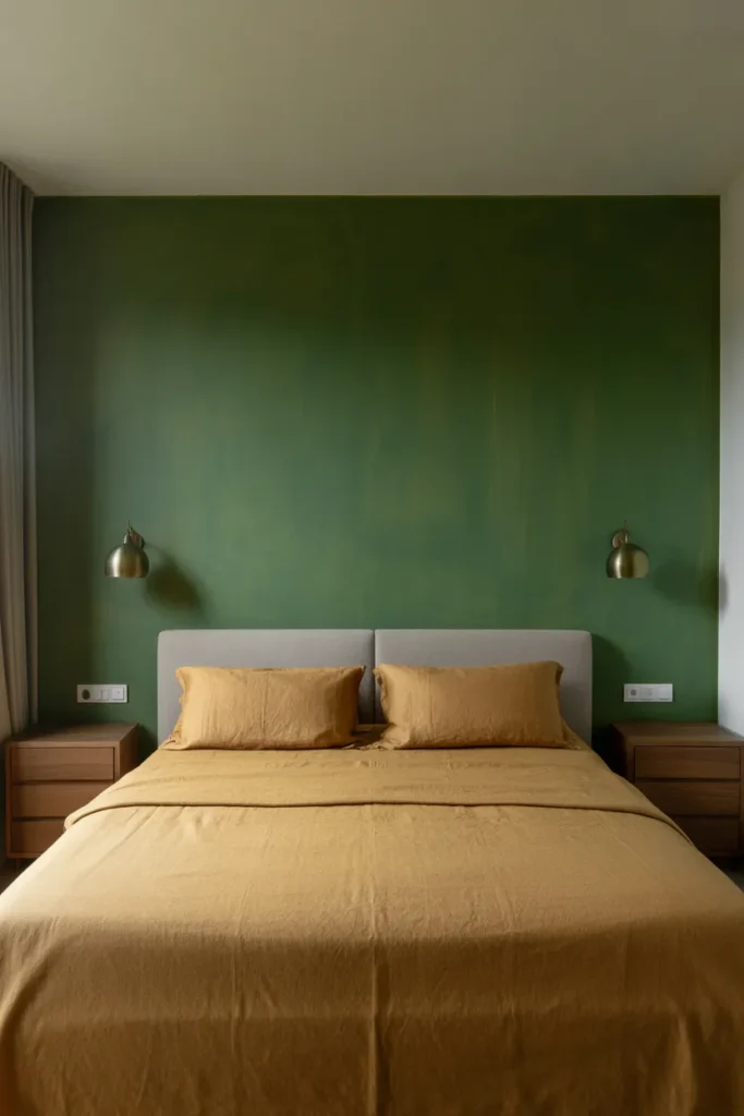
Where most people go wrong is treating all four walls equally. Spreading decor evenly around a room dilutes every wall’s impact. Choose one wall and commit to it. The other three stay quieter — neutral paint, minimal art, or none at all.
This approach is especially effective in small rooms where you want to create the illusion of depth. A dark, statement wall with a single large element reads as intentional and sophisticated rather than cramped.
2. Layer Lighting in Three Tiers to Eliminate Flat, Boring Rooms
Overhead lighting alone is one of the most common reasons a well-furnished room still feels wrong. A single ceiling fixture creates flat, even light that flattens textures, removes warmth, and makes everything look the same.
Effective aesthetic room decor depends on three lighting layers working together: ambient (overhead), task (functional, directed), and accent (decorative, low-level). In a living room, this could mean a flush-mount ceiling light, a floor lamp beside the sofa, and a small table lamp on a side table. Each layer activates a different zone of the room at different hours.
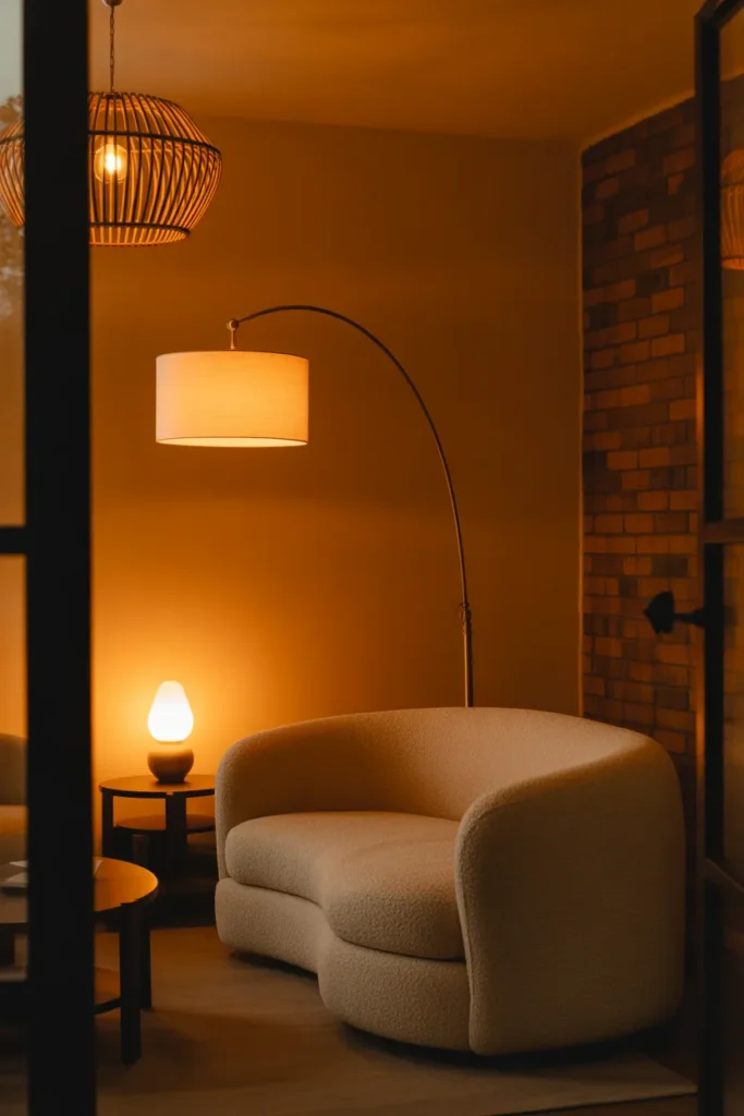
The material of your fixtures matters as much as their placement. Rattan shades produce warm dappled light. Frosted glass diffuses evenly. Exposed filament bulbs create visible warmth but can feel dated if overused. Match your fixture material to the room’s overall texture palette — mixing materials from the same warmth family keeps the room cohesive.
Avoid relying on smart bulbs alone as your solution. Changing color temperature on a single ceiling light still produces flat light. Layer first, then adjust temperature.
3. Use a Rug to Define Zones in Open-Plan Spaces
Open-plan rooms look beautiful in photos but are genuinely difficult to furnish because there are no walls to anchor furniture against. A rug is the single most effective tool for solving this — it acts as a visual floor, creating the feeling of a contained, purposeful zone.
In an open-plan living and dining area, two separate rugs create two distinct zones without any physical barrier. The living area rug should be large enough that all front legs of the sofa and chairs sit on it — if the rug is too small, furniture floats and the zone collapses. A common sizing mistake is choosing an 8×10 when a 9×12 is what the space actually needs.
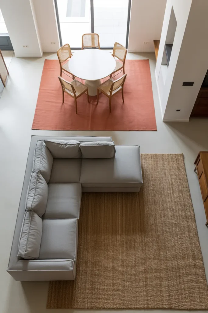
For rooms with a single function — a bedroom or a home office — the rug should extend at least 18 to 24 inches beyond the sides of the bed or the desk. This framing effect makes the furniture feel placed rather than dropped in.
Pattern choice matters here. A large geometric pattern in a small room competes with furniture rather than supporting it. Solid rugs, tone-on-tone textures, or low-contrast abstract patterns almost always perform better as room anchors.
4. Choose a Neutral Base with One Intentional Color Accent
A common mistake in aesthetic room decor is choosing too many accent colors. Three accent colors in one room produce a visual argument. The room has no clear identity and feels restless rather than designed.
The most reliable approach is a neutral base — warm white, greige, soft linen, or muted sage — covering walls, large furniture, and soft furnishings. Then introduce one intentional accent color in three to five places: a throw pillow, a ceramic vase, a lamp shade, and perhaps a single piece of art with that color present. The repetition of one color across multiple elements is what makes a room feel considered.
Warm neutrals (cream, off-white, warm gray) pair well with terracotta, rust, or dusty blue accents. Cool neutrals (true white, light stone) work with navy, sage green, or charcoal. Mixing warm and cool neutrals in the base layer is where most rooms lose coherence.
This single-accent approach is especially powerful in small aesthetic room decor ideas for apartments where overcrowding with color quickly makes the space feel smaller and noisier.
5. Position Furniture Away from Walls in Medium to Large Rooms
Pushing all furniture against the walls is one of the most persistent layout mistakes in American homes. It makes a room feel hollow — like a waiting room — with an empty void in the middle and no invitation to settle in.
In a room larger than 12 by 14 feet, pulling the sofa at least 12 to 18 inches away from the wall and placing chairs to face it creates a conversation zone that feels finished. An area rug under the grouping visually holds everything together. The walls behind the furniture can then hold art or shelving without the pieces looking tacked on.
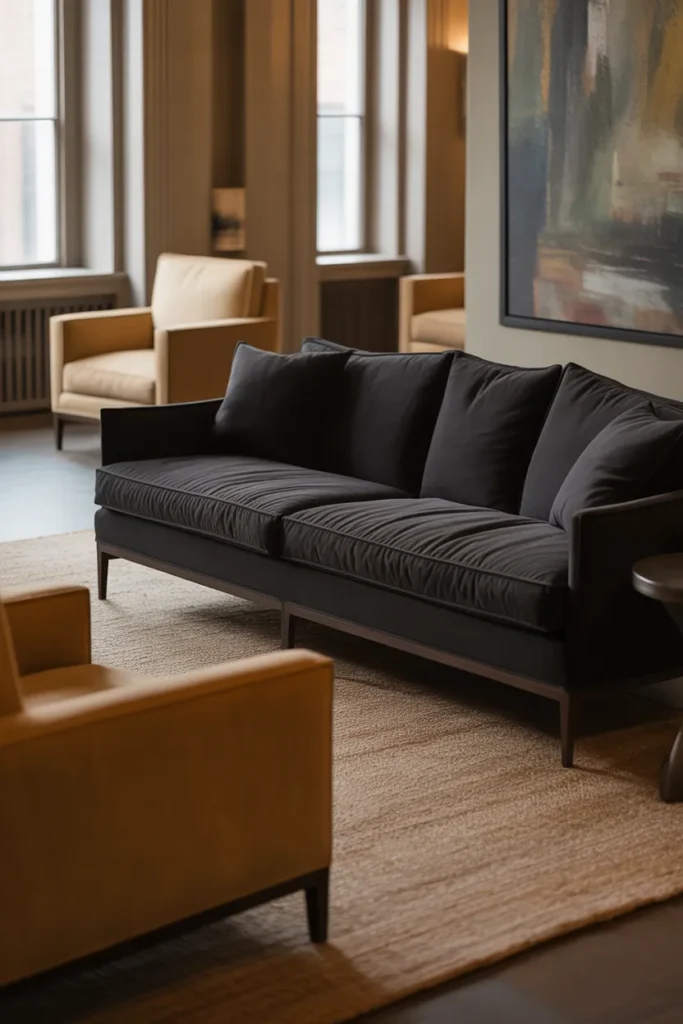
This layout also improves how the room handles foot traffic. With furniture pulled in from the walls, there is a clear circulation path around the outside of the seating group — something a wall-hugging layout never achieves naturally.
In smaller rooms, this rule applies in a modified form: even 6 to 8 inches of space between the sofa back and the wall creates enough visual relief to change the feel of the room.
6. Style Shelves Using the Rule of Odd Numbers and Negative Space
Styled shelves are one of the most pinned elements in aesthetic room decor, yet most people over-fill them. A shelf that is 80 percent empty reads as unfinished. A shelf that is 90 percent full reads as cluttered. The goal is approximately 60 to 70 percent filled, with the remaining space acting as breathing room.
Group objects in threes or fives — odd numbers feel natural and organic, while even-numbered groupings feel static. Within each grouping, vary the height of objects so the eye moves up and down rather than traveling in a flat horizontal line. A tall vase, a medium book stack, and a small sculptural object is a classic and effective trio.
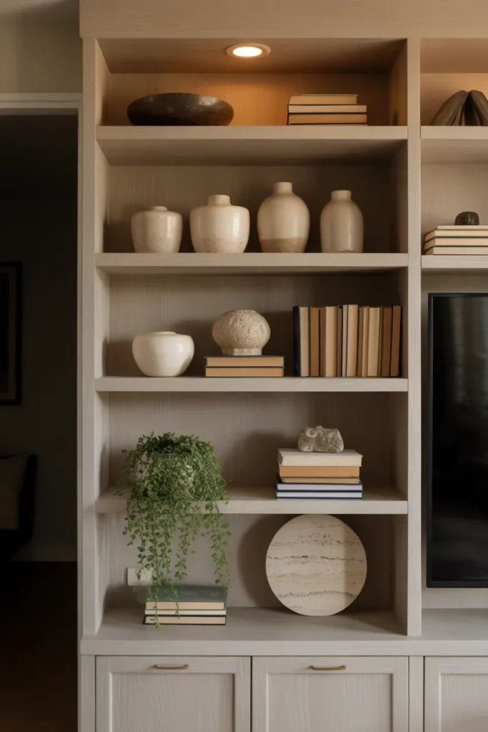
Texture and material variety within a neutral color palette is what elevates a shelf from decorative to designed. Combine matte ceramics, a glass object, a natural wood piece, and perhaps one woven element. All in similar tones, but with different surfaces.
The mistake to avoid: mixing too many colors on a single shelf. Even beautiful individual objects will fight each other if the color palette is inconsistent. Edit to two or three tones maximum per shelf section.
7. Use Curtains Hung High and Wide to Make Any Window Look Larger
The way curtains are hung transforms a window — and a room — more than most people expect. The standard practice of mounting a curtain rod just above the window frame produces curtains that look small, boxed in, and residential in the worst sense.
The correct approach for aesthetic room decor is to mount the rod 4 to 6 inches below the ceiling line — regardless of where the actual window ends — and extend the rod 10 to 14 inches beyond the window frame on each side. This creates the impression of a much larger window, draws the eye upward, and makes ceiling height feel greater.
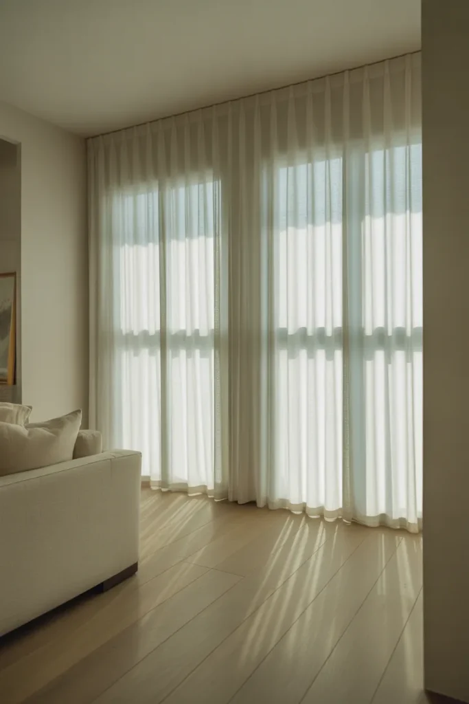
Curtain length should reach the floor, ideally with a slight break or pool. Curtains that end at the sill or hover at the ankle are a common design mistake that shortens the visual height of a room.
For fabric choice: sheer linen or cotton voile allows soft natural light to diffuse through during the day. Heavier velvet or blackout-lined curtains work in bedrooms where light control matters. In either case, stick to one color — patterns on curtains compete with everything else in the room.
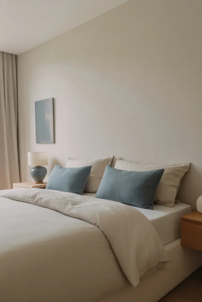
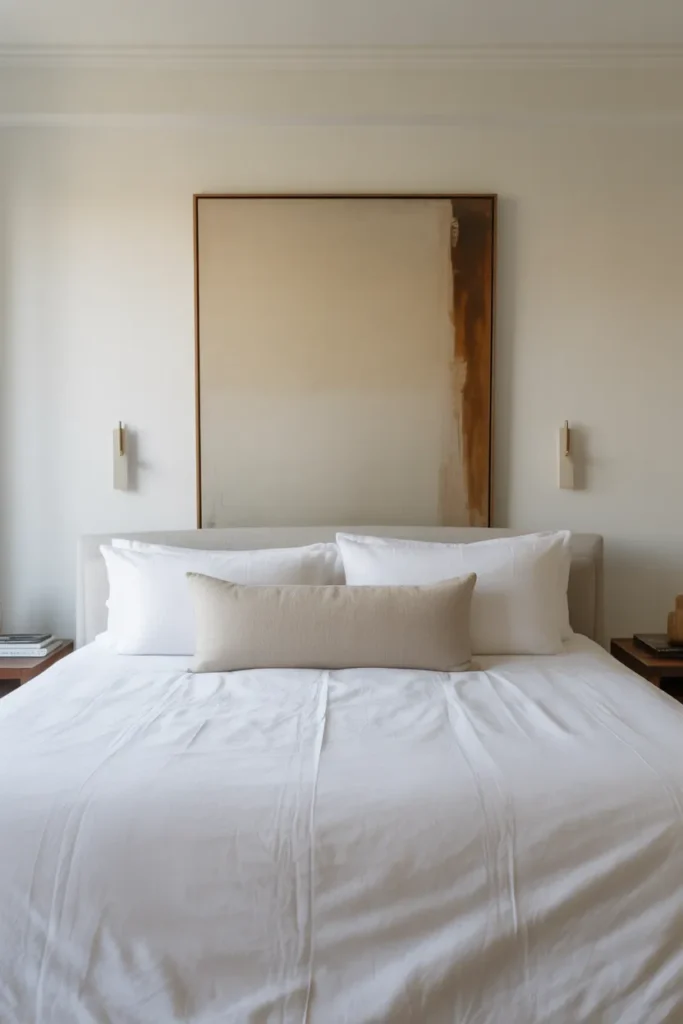
8. Build a Functional Bedside Setup That Is Aesthetic and Practical
The area immediately beside the bed is one of the highest-use zones in any bedroom, yet it is frequently treated as an afterthought. A cluttered or undersized nightstand disrupts both the visual balance of the room and the actual usability of the space.
A well-designed bedside setup has three layers: surface, storage, and light. The surface should sit level with the top of the mattress — typically 24 to 28 inches from the floor — so it is accessible without reaching. The storage layer, whether a drawer or a lower shelf, handles items that would otherwise live on the surface. The light source, ideally a sconce mounted to the wall or a slim column lamp, keeps the surface free.
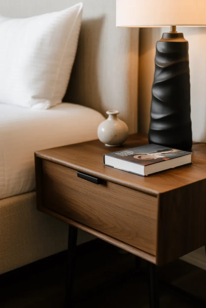
On the surface itself, limit items to three: a lamp or alarm, one small object of personal meaning, and a current book. This restraint is what separates an editorial-looking bedroom from a functional one that has simply accumulated items.
Matching nightstands on both sides of a king or queen bed is the conventional choice and works in most rooms. Intentionally mismatched nightstands — different shapes, same finish — is a more current approach that adds visual interest without creating chaos.
9. Incorporate Natural Materials to Add Warmth Without Adding Color
One of the clearest signals of a well-designed room is the presence of natural materials. Stone, raw wood, rattan, linen, jute, and clay all bring texture and warmth that manufactured materials cannot replicate — and they do it without introducing additional color that would complicate the palette.
In a room with a neutral color scheme, natural materials do the heavy lifting that pattern or color would otherwise need to do. A raw edge oak coffee table, a jute rug, a terracotta pot, and a linen throw represent four distinct textures within the same warm tonal range. The result feels layered and rich without being busy.
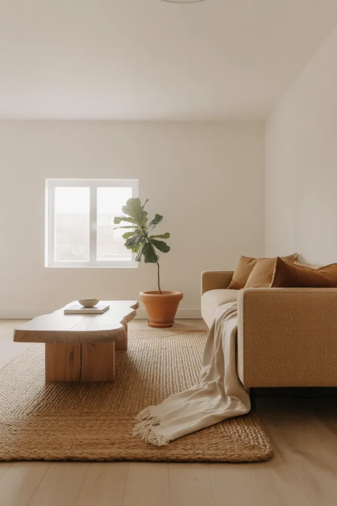
The placement rule for natural materials is to distribute them evenly across the room rather than clustering them in one corner. One natural element per zone — seating area, surface, wall, floor — creates balance and prevents the room from feeling like a concept rather than a home.
Be deliberate about mixing material weights. Chunky jute and rough-sawn wood feel grounded and casual. Fine-grain marble and smooth linen feel more elevated. Decide on a mood first — relaxed or refined — and let that guide which natural materials you bring in.
10. Design a Reading Corner That Functions as a Destination in the Room
A dedicated reading corner is both one of the most practical and most pinned elements of aesthetic room decor because it solves a real problem — most rooms have no clearly defined secondary zone. A reading corner gives the room a second purpose and a second visual anchor.
The essentials are simple: one comfortable armchair or chaise, one side table at the right height, one focused light source, and some form of visual framing. The framing — a floor-to-ceiling bookshelf, a curtain behind the chair, or even a large plant — is what transforms a chair in a corner into an intentional zone.
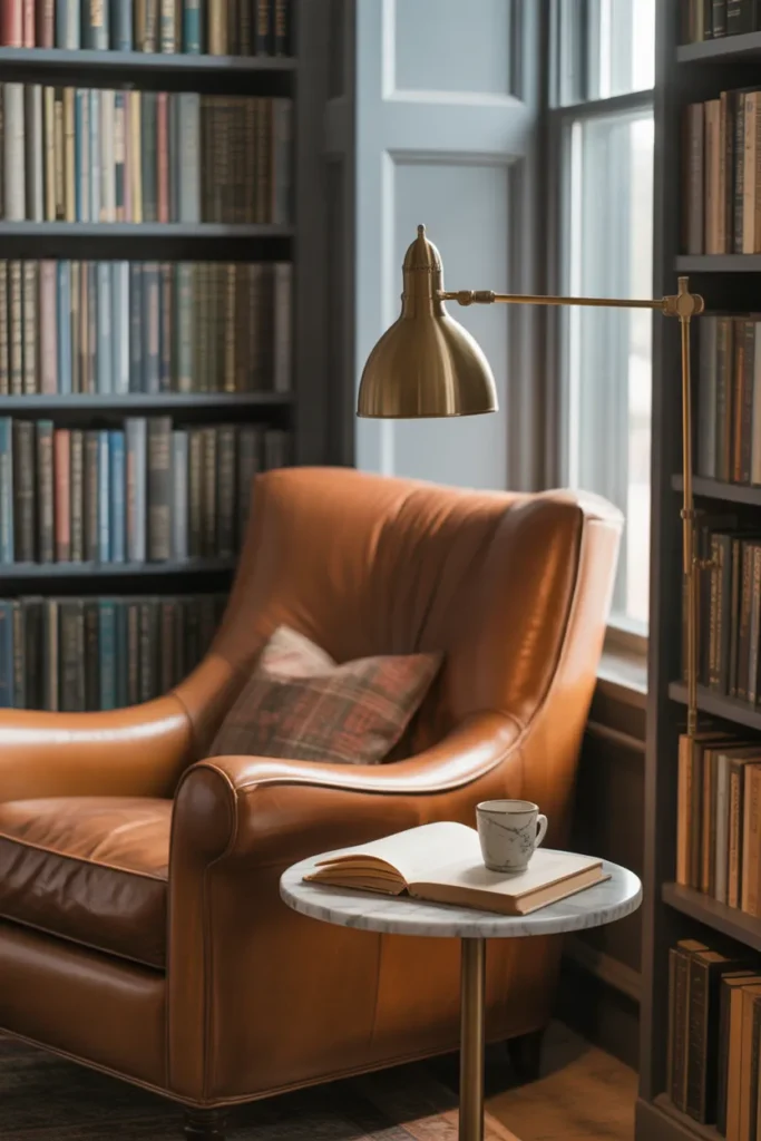
Placement is critical. A reading corner works best in a natural light zone during the day — near a window — but also needs a task light for evenings. A swing-arm wall sconce keeps the side table surface free and positions the light exactly where it is needed.
The mistake most people make is choosing a chair that looks beautiful but is not comfortable enough to actually read in. A chair with proper lumbar support, armrests at the right height, and a seat deep enough to tuck legs up will get used. One that does not will become a clothes hanger.
11. Apply the 60-30-10 Color Rule to Create a Balanced, Cohesive Room
The 60-30-10 rule is a professional interior design principle that solves the most common color problem in home decorating: rooms that feel uncertain because no color is truly in charge.
The formula works as follows: 60 percent of the room’s color comes from the dominant tone — usually walls, large upholstery, and flooring. Thirty percent comes from a secondary color in furniture, curtains, and rugs. Ten percent comes from the accent color in cushions, throws, art, and small objects.
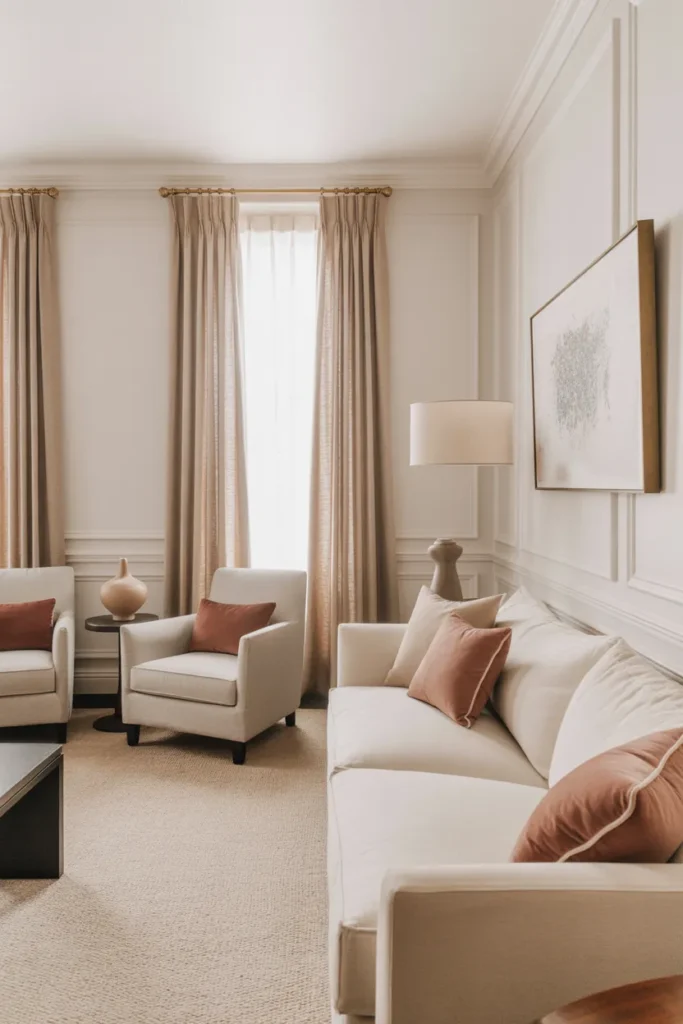
In practice, this might look like a room with warm white walls and a beige sofa (60 percent), warm gray upholstered chairs and a natural linen rug (30 percent), and dusty rose accents in cushions and a ceramic vase (10 percent). The relationships between the three tones matter more than the tones themselves.
This rule is especially useful for modern aesthetic room decor ideas in 2026 because it creates a strong visual identity without requiring bold choices. A room that follows this structure feels professional even when all the colors are quiet and neutral.
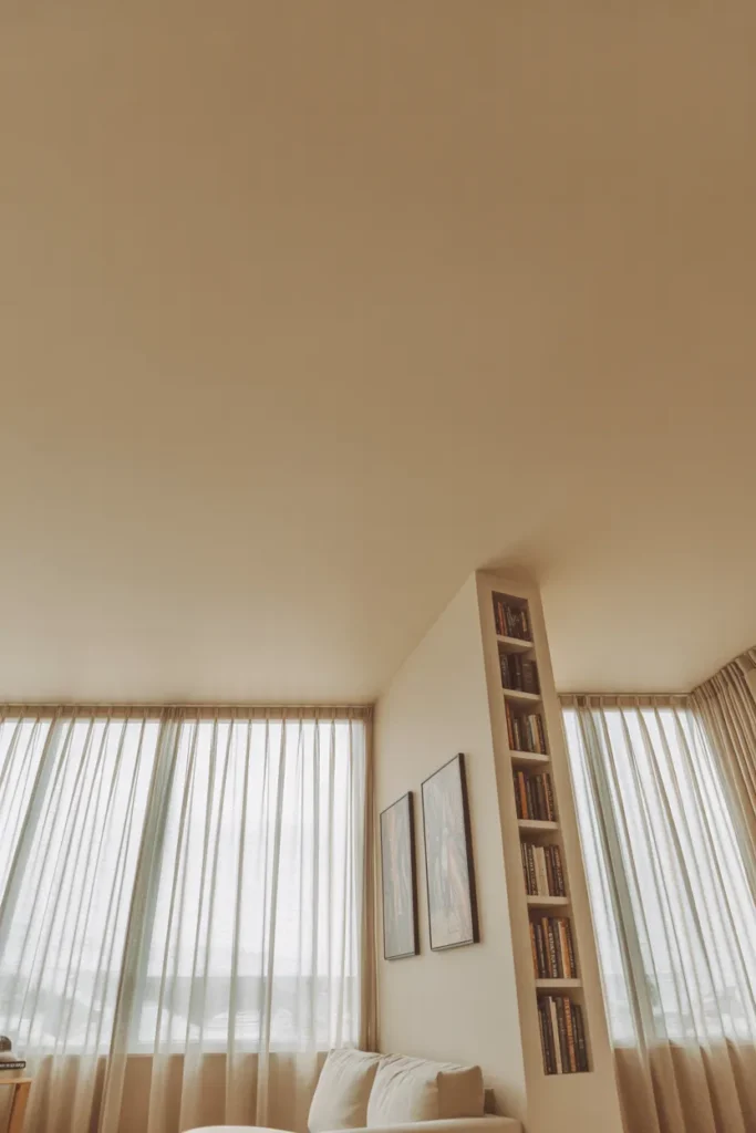
12. Create Visual Height in Low-Ceiling Rooms Using Vertical Elements
Low ceilings are one of the most common complaints in American apartments and ranch-style homes. The fix is not structural — it is visual, and it relies on directing the eye upward using vertical lines and tall elements.
The most effective vertical elements are floor-to-ceiling curtains (as covered in section 7), tall bookcases or shelving units that reach the ceiling, vertically oriented art in narrow portrait format, and wall-mounted lighting that draws attention upward. Each of these creates an upward visual path that the eye naturally follows, making the ceiling feel further away than it is.
Avoid wide, horizontal artwork in low-ceiling rooms. A long horizontal canvas anchors the eye to the wall rather than lifting it. Similarly, avoid low, sprawling furniture arrangements that keep everything at floor level.
Paint the ceiling the same color as the walls — or even a shade lighter — to blur the visual boundary between wall and ceiling. This is a counterintuitive move that works reliably in rooms under 8 feet.
13. Style a Functional Home Office Corner That Looks as Good as It Works
Home offices that are folded into a bedroom or living area are now a permanent feature of American homes, and the design challenge is real: the space needs to function without looking like an office intruded on the room.
The key is visual containment. Use a desk with clean lines that reads more as a piece of furniture than as office equipment. Wall-mount the monitor if possible to eliminate the visual bulk of a stand. Add a desk lamp that doubles as a decorative object — a cone-shade in brass or a sculptural ceramic base makes the space look considered. Keep cable management invisible.
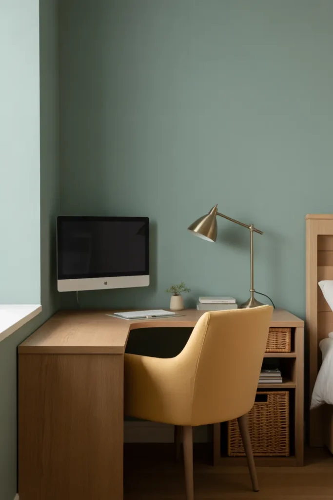
The chair is the most important and most overlooked element. An ergonomic chair with visible mechanical elements looks industrial and out of place in a bedroom. A comfortable upholstered task chair in a natural fabric bridges both worlds.
Storage behind or beside the desk should be closed-front — baskets, fabric bins, or closed cabinets. Open shelves beside a desk tend to accumulate visual noise that defeats the purpose of the design effort.
14. Use Mirrors Strategically to Expand Light and Perceived Space
Mirrors are one of the most effective tools in aesthetic room decor for small spaces — but only when placed correctly. A mirror positioned randomly on a wall does nothing useful. A mirror positioned to reflect a light source or a desirable view doubles both.
The most productive mirror placement is directly opposite or at a 90-degree angle to a window. This bounces natural light across the room and creates the impression of a second window. In a narrow hallway or entry, a tall floor mirror leaning against the wall at the far end extends the perceived depth of the space.
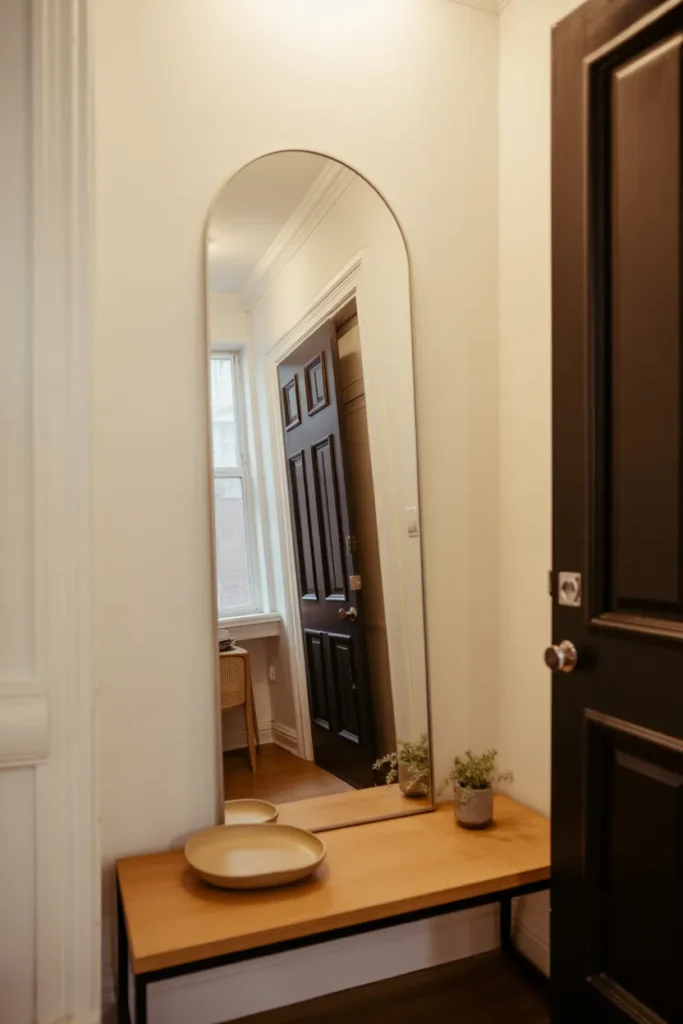
Scale matters. A small mirror on a large wall looks decorative but does almost nothing for light or space perception. A mirror that takes up a significant portion of the wall — especially in bedrooms and living rooms — amplifies the effect dramatically.
Gallery walls of small mirrors are a popular Pinterest aesthetic but are difficult to execute well. They look best when the frames share one finish (all brass, all black, all unlacquered metal) and when the grouping forms a clearly intentional shape rather than a random scatter.
15. Edit Ruthlessly — The Negative Space Is Part of the Design
This is the idea most people resist and the one that separates rooms that look designed from rooms that look decorated. Negative space — the empty areas on a shelf, wall, or surface — is not absence. It is an active design element that gives the objects around it room to breathe and be seen.
In practical terms, editing means removing approximately one-third of the objects currently in any given room and observing what remains. Most rooms become significantly better. Items that had no visual space around them suddenly have presence. The remaining pieces look intentional rather than accumulated.
The hardest edit is usually sentimental objects. A room can hold meaningful things, but not all of them at once. Rotating seasonal or rotating themed objects — displaying some and storing others — lets you keep meaningful pieces without visual overwhelm.
Negative space also applies to walls. A wall that holds too many pieces of art at varying scales feels unsettled. One strong piece with generous wall space around it is almost always stronger than five pieces competing for attention.
Final thought on aesthetic room decor ideas for 2026: the most beautiful rooms are almost always the most edited ones. More space between things, not more things in the space.
Final Thoughts
Aesthetic room decor comes down to a small number of well-applied principles — not a large number of purchased pieces. A strong focal wall, layered lighting, a room-anchoring rug, a controlled color palette, and the discipline to leave space between things will transform any room more reliably than any individual product will.
Do check this detail discussion about small room decors!
If you found this guide useful, save it to your Pinterest boards so you can come back to specific ideas as you work through your space. Each section here stands alone, so you do not have to apply all fifteen at once — start with one idea, execute it well, and build from there. For more practical layout and styling guidance, explore our related posts on small space room design ideas and functional floor plan planning for everyday American homes.