If your small living room feels cramped, cluttered, or just never quite right, the problem is almost always layout and proportion — not size. This guide covers 18 practical tiny living room design 2026 ideas that help you make real decisions about furniture placement, color, lighting, and storage so your space works better every single day.
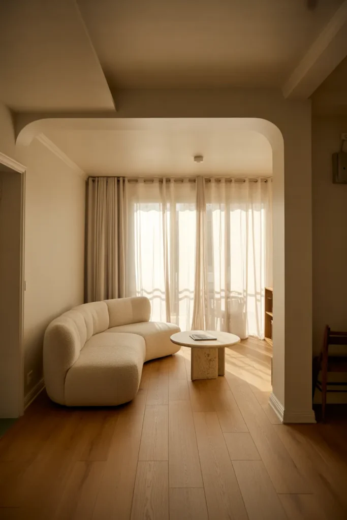
1. Low-Profile Sofa Placement That Opens Up Vertical Space Instantly
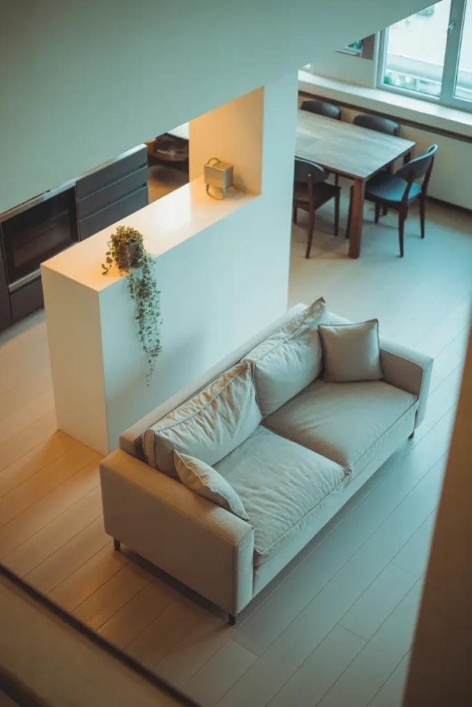
In a tiny living room, the height of your furniture matters as much as its footprint. A low-profile sofa — one that sits close to the floor with a back height under 30 inches — keeps sightlines open across the room and makes ceilings feel significantly taller than they are.
This works because the human eye reads a room’s spaciousness largely based on how much wall is visible above the furniture line. When a sofa back rises to 36 or 38 inches, it cuts the room visually in half. Drop that to 28 inches and the same wall reads as open, airy, and larger.
This approach works best in rooms with 8 to 9-foot ceilings where you want to maximize the sense of height. It is less effective in rooms with already-low ceilings where the proportions can start to feel too horizontal.

Avoid pairing a low sofa with a tall coffee table. Keep table heights proportional — 14 to 16 inches is the sweet spot for a low-profile seating arrangement.
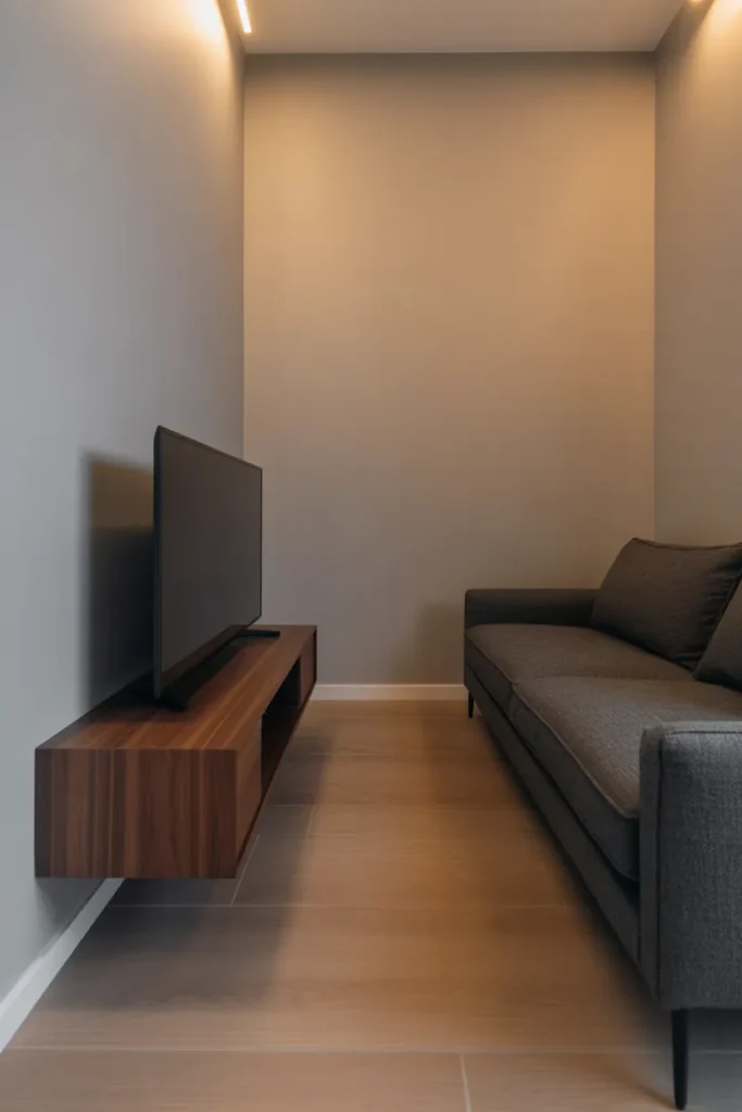
2. Floating Wall-Mounted Media Console to Free Up Floor Space
Every inch of visible floor space in a small living room signals openness to the eye. A wall-mounted media console — floating at 18 to 24 inches off the ground — eliminates the visual weight of a traditional entertainment unit and allows flooring to run continuously beneath it.
This is one of the highest-impact changes you can make in a small living room layout without altering the room’s structure. The floor beneath the console remains unobstructed, which makes the room feel wider and easier to clean. It also forces a cleaner, more minimal approach to media storage since wall-mounted units tend to offer less depth than floor-standing alternatives.
This solution works in almost any small living room but is particularly effective in apartments and condos where the living room and dining area share an open plan. The floating console keeps the wall active without crowding the floor.
The mistake to avoid is mounting it too high. Eye level when seated — roughly 40 to 44 inches from floor to screen center — is the functional standard. Mounting the console too low creates the same visual weight problem you were trying to solve.
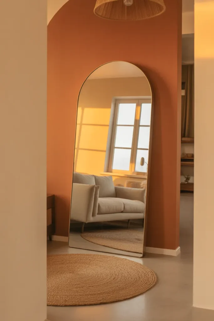
3. Mirror Wall Panel Placement That Doubles Perceived Room Depth
A well-placed mirror in a tiny living room is one of the most effective small space design tools available — but only when it is positioned to reflect something worth doubling. A large mirror or a panel of mirrors placed on the wall opposite a window reflects natural light and the outdoor view, which genuinely makes the room feel twice as deep.
The science behind this is simple. The brain reads the reflection as additional space rather than a flat surface, especially when the mirror is large enough to register as a full architectural element rather than a decorative accessory.
A single large mirror — at least 36 by 48 inches — works better than a collection of smaller mirrors for spatial expansion. Smaller mirrors read as decor. Large mirrors read as space.
Avoid placing a mirror where it reflects a cluttered area, a blank wall, or the inside of a closet door. The reflection should always be something visually appealing — natural light, a plant, or an interesting furniture arrangement.
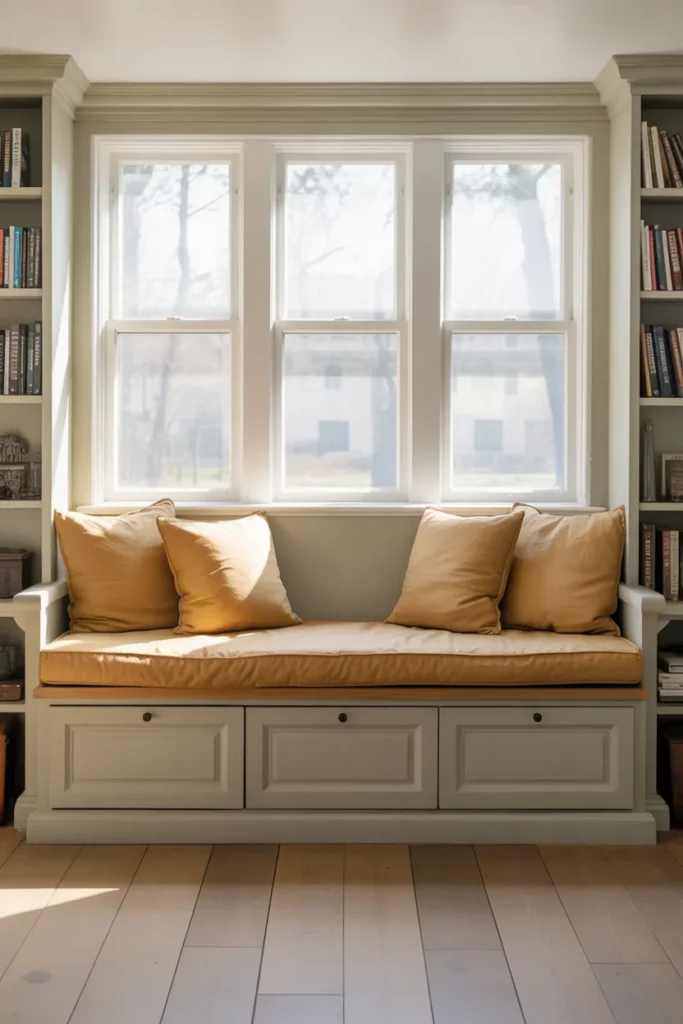
4. Built-In Window Seat With Hidden Storage Below the Sill
A window seat built across the width of a living room window converts an underused architectural feature into a multi-function zone — seating, storage, and a natural focal point, all in one. The bench lift reveals storage for blankets, books, and items that would otherwise need a separate piece of furniture.
This is particularly effective in small living rooms where a second sofa or accent chair is not practical. The window seat provides additional seating for guests without occupying permanent floor space the way a chair would.
In terms of layout, a window seat works best when it spans the full width of the window bay or alcove. A seat that stops short of the window frame looks unfinished and loses the built-in visual weight that makes it feel like part of the architecture.
Plan the seat depth at a minimum of 18 inches for comfortable sitting. Anything shallower becomes a display ledge rather than functional seating.
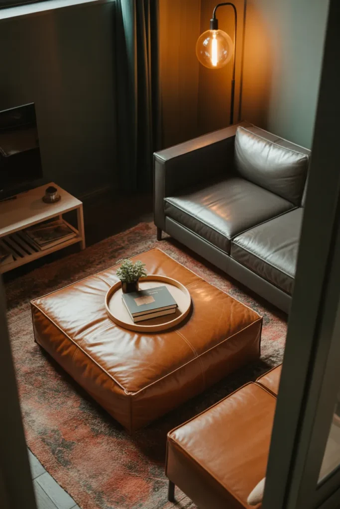
5. Dual-Purpose Ottoman That Replaces Both Coffee Table and Extra Seating
A large upholstered ottoman in the center of a tiny living room can serve as a coffee table, a footrest, an extra seat for guests, and a storage unit — all at once. This single swap can eliminate the need for two or three separate pieces of furniture.
The key is choosing an ottoman with a firm top surface so it functions as a stable coffee table. A purely soft ottoman without a tray becomes impractical as a table surface. A large tray placed on top solves this and creates a defined surface for drinks, books, and remotes.
This strategy works especially well in small living rooms used for both daily relaxing and occasional entertaining. When guests arrive, the ottoman moves easily, and it provides flexible overflow seating without requiring permanent chairs that crowd the space.
Avoid oversized ottomans that reduce floor clearance below 18 inches on all sides. Circulation through the room must remain easy even with the ottoman in its central position.
6. Vertical Shelving Gallery Wall That Draws the Eye Upward
In small living room layout design, drawing the eye upward creates the perception of a taller, more generous space. A floor-to-ceiling vertical shelving unit or a gallery wall arrangement that stacks artwork from low to high achieves this by giving the eye a clear vertical path to follow.
This works differently from horizontal gallery walls, which spread the eye sideways and can make a narrow room feel even more compressed. A vertical arrangement — tall bookcase, stacked frames, or a column of wall sconces — adds a strong upward line that visually stretches the room.
This is most effective on the wall you see first when entering the room. That first visual impression sets the perceived scale of the entire space. A tall, well-composed vertical element on that wall registers the room as larger before anything else is assessed.
Keep the vertical element anchored. A floating column of frames with no relationship to furniture below it looks accidental. Align the bottom of the vertical grouping with a piece of furniture — the back of a sofa, a console table, or a low bookcase — to give it visual grounding.
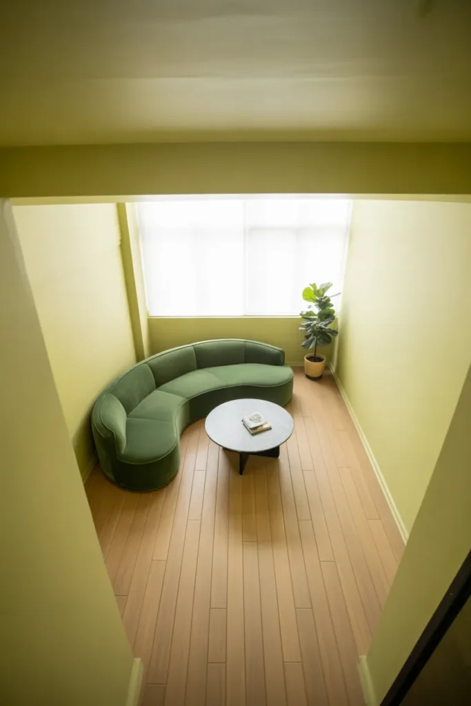
7. Curved Furniture Layout That Improves Flow in Rectangular Rooms
Most tiny living rooms are rectangular, and most furniture is rectangular — which creates a boxy, rigid feeling that makes the space feel smaller than it is. Introducing one curved element — a rounded sofa, an oval coffee table, or a curved accent chair — immediately softens the geometry and improves how the room flows.
Curved furniture works in small rooms because it reduces sharp corners that catch the eye and interrupt visual movement around the space. A round or oval coffee table, in particular, is one of the most practical upgrades for a small living room because it eliminates the corner hazard of a square table and makes the center of the room feel more open.
This is a particularly strong approach for studio apartments where the living room shares space with a sleeping or dining area. The curved elements create soft visual boundaries between zones without requiring walls or dividers.
The mistake to avoid is using too many curved pieces at once. One or two rounded elements among otherwise clean-lined furniture creates balance. A room full of curves starts to feel unstructured and harder to arrange efficiently.
8. Monochromatic Color Scheme That Erases Visual Boundaries
A monochromatic living room — where walls, upholstery, rugs, and curtains all exist within the same color family — removes the visual breaks that make a small room feel choppy and defined by its actual dimensions. When everything reads as one continuous tone, the eye cannot easily detect where surfaces begin and end.
This is one of the most effective strategies in tiny living room design 2026 because it works with the room’s existing architecture rather than against it. You do not need to move walls or add architectural features. You simply unify what is already there.
All-white and all-cream schemes are the most commonly used for this purpose because they also reflect light. But warm taupes, soft warm grays, and even dusty blues work equally well. The key is staying within a two to three shade range of the same base tone throughout the room.
The practical caution here is texture. A monochromatic room without textural variation — different fabrics, matte versus glossy surfaces, smooth versus woven — reads as flat and unfinished. Texture is what gives a tonal room its depth and visual interest.
9. Slim Console Table Behind the Sofa as a Room Divider and Surface
Placing a narrow console table directly behind a floating sofa — rather than against a wall — solves two problems at once in an open-plan small living area. It defines the back edge of the living zone, creating a clear visual boundary between the living and dining or entry areas, and it adds a surface for lamps, plants, and everyday items without requiring a side table.
This layout only works when the sofa is floated away from the wall, which is a common approach in open-plan spaces where the living room needs to be defined within a larger room. A console placed against the wall instead would serve as storage but would not perform the spatial division function.
The console should be no more than 12 to 14 inches deep to avoid interrupting movement between zones. Height should match or be slightly above the sofa back — typically 28 to 34 inches — so it reads as a connected element rather than a separate piece.
This is one of the most underused furniture strategies in small apartment living room design. It works in spaces as small as 200 square feet when the furniture is scaled correctly.
10. Corner Sofa Configuration That Maximizes Seating Without Crowding
A corner or L-shaped sofa in a tiny living room seems counterintuitive but often works better than a standard two-piece arrangement. By running along two walls, it anchors the room’s corner — the most spatially efficient seating configuration possible — and leaves the center of the room completely open.
The mistake most people make is avoiding L-shaped sofas in small rooms because they assume they take up more space. In reality, a properly scaled L-shape in a corner uses less usable floor area than a sofa plus two accent chairs arranged facing each other.
The critical sizing factor is the total length of each arm. In a small living room, each arm of the L should not exceed 80 to 90 inches. Anything longer pushes into the walking clearance on the open sides of the room and creates the boxed-in feeling you are trying to avoid.
This configuration also works particularly well in rooms that serve multiple functions — a living-dining combination or a studio layout — because the L-shape naturally faces one direction, leaving the opposite side of the room open for other uses.
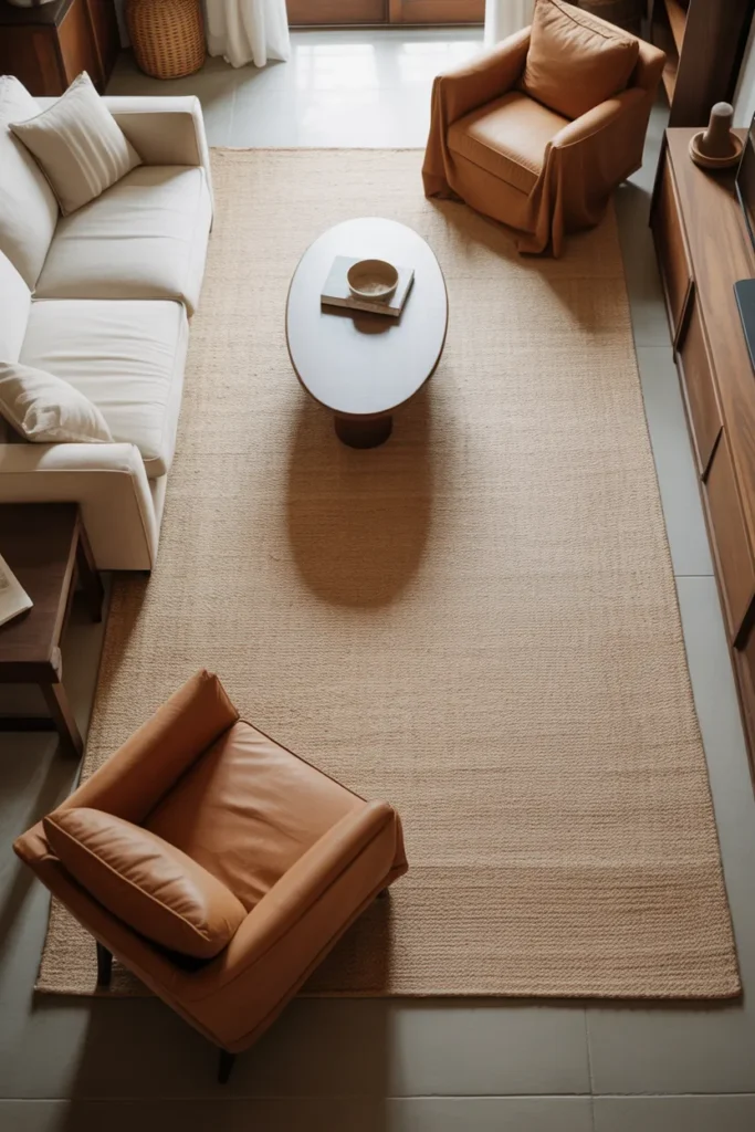
11. Strategic Rug Sizing That Anchors the Space Without Shrinking It
Rug size is one of the most common mistakes in small living room layout design. An undersized rug — one that only fits under the coffee table — makes a small room feel disjointed and even smaller. The correct approach is to size the rug so that at least the front legs of every main seating piece sit on it.
A rug that grounds the entire seating arrangement unifies the space visually and signals that the living area is a deliberate, complete zone. This is especially important in open-plan spaces where the living room needs to establish its own footprint within a larger floor area.
In a tiny living room, a 6 by 9-foot rug is usually the minimum effective size. An 8 by 10 is better if the room dimensions allow it. When in doubt, go larger rather than smaller — an oversized rug is rarely a problem, but an undersized one almost always is.
Light-toned rugs expand the floor visually. Dark rugs define the zone more strongly but can make the room feel more enclosed. In very small rooms, a light rug with some texture — a low-pile wool or a woven natural fiber — tends to perform best on both fronts.
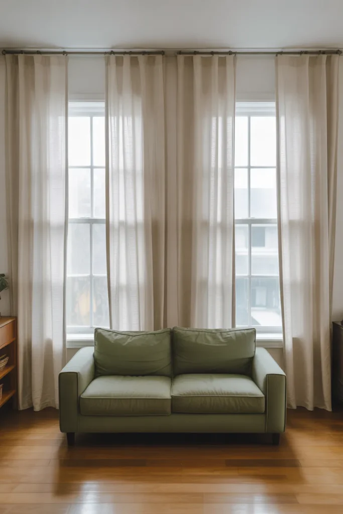
12. Curtains Hung High and Wide to Make Windows Look Larger
Hanging curtains at ceiling height rather than at the window frame — and extending the rod 8 to 12 inches beyond the window on each side — is one of the oldest and most reliable tricks in small room design. It makes the window appear dramatically larger, draws the ceiling upward visually, and floods the room with more perceived light even when the curtains are closed.
This works because the curtain panel, when open, sits mostly beside the window rather than over it. The glass remains fully uncovered during the day for maximum natural light, and the vertical drop of fabric from ceiling to floor creates a strong upward line that makes the room feel taller.
This applies equally in small living rooms with functional windows and those with awkward, undersized window placements — a common issue in older American homes and apartments. The curtain treatment corrects the proportions without any structural change.
The fabric choice matters. Light, airy fabrics in linen or cotton voile maintain the open feeling. Heavy velvet or thick blackout curtains work well in bedrooms but can feel visually heavy in a small living room where lightness is the goal.
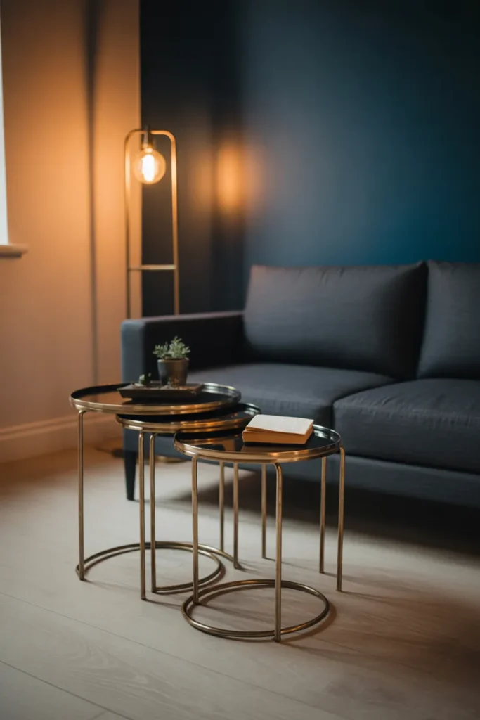
13. Nesting Tables as a Flexible Alternative to a Fixed Coffee Table
In a tiny living room where floor space is at a premium, a fixed coffee table can feel like a permanent obstacle. Nesting tables — a set of two or three tables that tuck under each other when not in use — offer the same surface functionality with none of the committed footprint.
When company arrives, all three surfaces pull out. During daily use, they nest together and occupy roughly the same space as a single side table. This flexibility is one of the most practical upgrades in small living room space planning because it adapts to how the room is actually used rather than holding space for a worst-case scenario.
Nesting tables also work well alongside a large ottoman when you need a defined table surface on one side and flexible surface area on the other. The two approaches complement each other and together can replace three separate pieces of furniture.
Choose nesting tables with a low profile — 16 to 18 inches tall — to maintain proportion with low-seated sofas. Taller accent tables at 22 to 24 inches shift function toward side table rather than coffee table and change the seating dynamic.
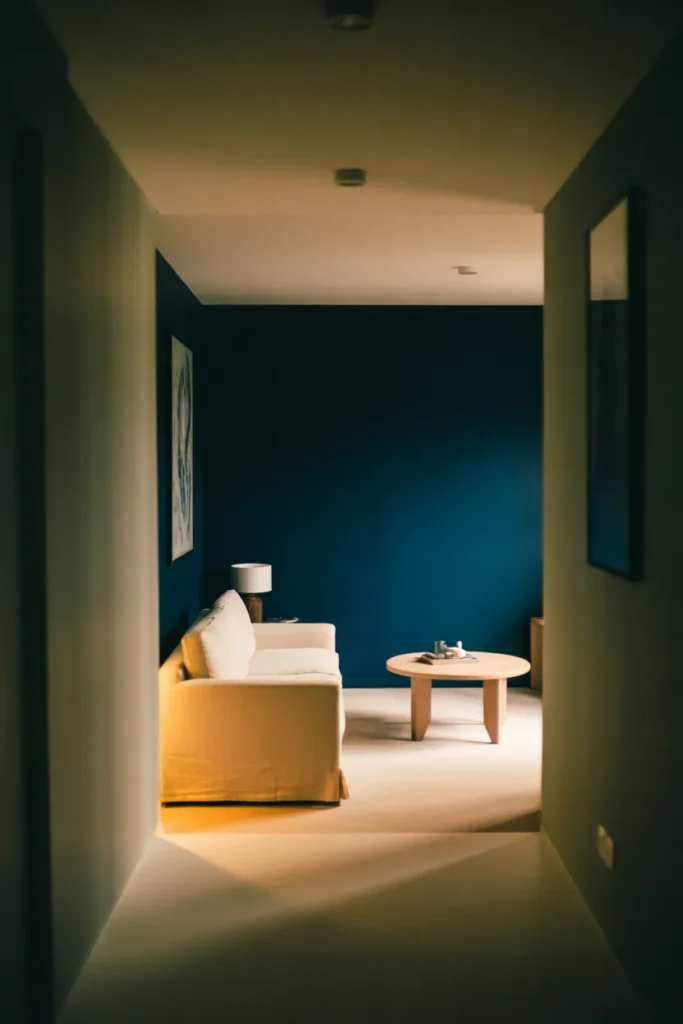
14. Painted Accent Wall in a Deep Tone to Create Depth on a Flat Room
A deep-toned accent wall — charcoal, navy, forest green, or terracotta — on the far wall of a tiny living room creates an illusion of depth by visually receding away from the viewer. Counterintuitively, this makes the room feel longer rather than more enclosed.
This works because darker tones on a far wall mimic how distance actually looks in real environments — things farther away appear slightly darker and less defined. The eye reads the dark wall as being farther back than it actually is, stretching the perceived length of the room.
The technique is most effective when the remaining three walls stay light. Full dark rooms in small spaces tend to feel cave-like unless there is significant artificial lighting compensation. A single deeply toned far wall paired with three light walls is the balanced version that achieves depth without sacrificing brightness.
This is one of the most impactful approaches in modern small living room design because it costs little but changes the entire spatial reading of the room. Paint is the lowest-effort, highest-return investment in a small space.
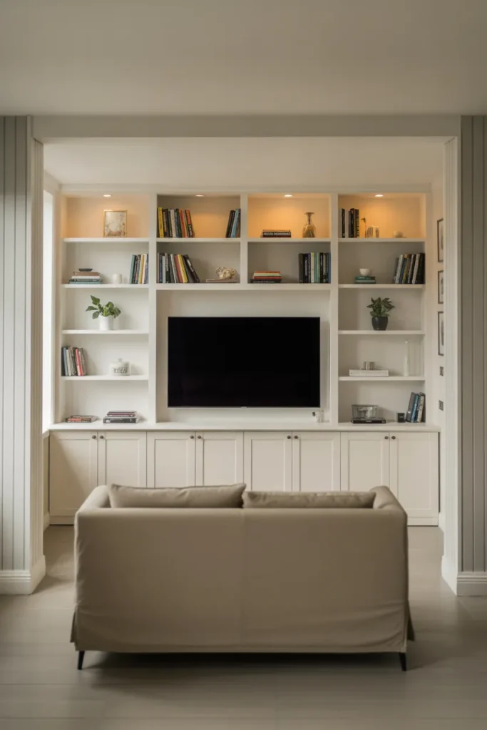
15. Multi-Function Media Wall With Built-In Storage Around the TV
A media wall that integrates the television into a full built-in surround — shelving, cabinetry, and display niches on all sides — consolidates multiple storage needs into a single wall and eliminates the need for separate bookshelves, side tables, and media furniture elsewhere in the room.
This is one of the most efficient uses of a single wall in a tiny living room design 2026 context. Instead of having the TV on a stand, a bookcase nearby, and a side cabinet elsewhere, everything merges into one architectural feature that reads as intentional and custom.
The built-in surround also solves the problem of proportional mismatch that happens when a flat screen television floats on a bare wall with nothing to anchor it. A well-designed media wall frames the screen and makes it feel like a designed element rather than an afterthought.
The practical planning note is depth. Built-in cabinetry at full depth — 12 to 16 inches — works for closed storage. Open display shelving can be shallower at 8 to 10 inches, which reduces the visual weight and keeps the wall from feeling like it is encroaching into the room.
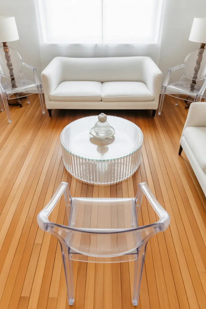
16. Transparent Furniture Pieces That Visually Disappear in a Small Room
Acrylic, glass, and lucite furniture pieces occupy physical space but not visual space. In a tiny living room, swapping one or two solid furniture pieces for transparent alternatives — a clear acrylic coffee table, ghost-style accent chairs, or a glass side table — keeps the floor readable and the room feeling open even when fully furnished.
This works because the eye processes transparent surfaces differently from opaque ones. A glass coffee table does not interrupt the view of the rug and floor beneath it, which makes the center of the room feel more open than it would with a solid wood or upholstered table in the same position.
This approach works in rooms that tend to feel crowded regardless of how little furniture is actually present. The issue in those rooms is usually visual density, not physical crowding. Replacing one solid-mass piece with a transparent one can resolve this without removing any actual seating or function.
Transparent furniture shows fingerprints, dust, and smudges more readily than solid alternatives. This is the honest maintenance trade-off for the spatial benefit. In high-traffic households with children, this may outweigh the visual advantages.
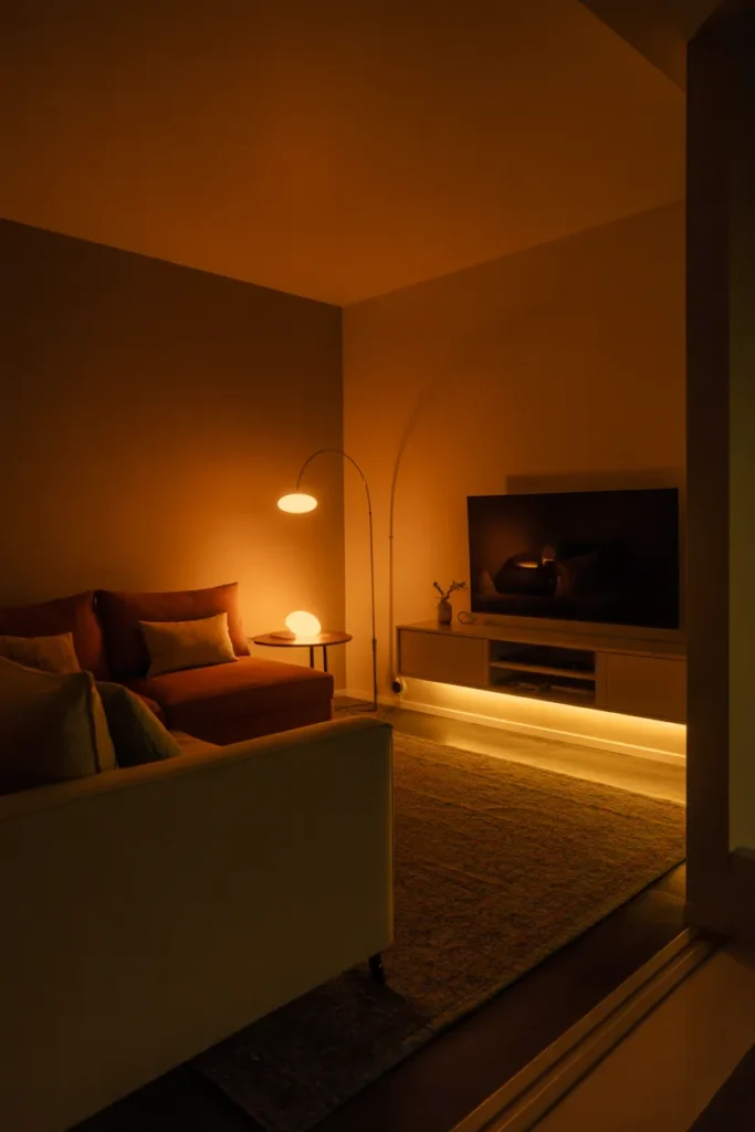
17. Zone Lighting With Multiple Light Sources Instead of One Overhead Light
A single overhead ceiling light in a small living room flattens everything. It eliminates shadow, removes depth, and makes the room feel like a hotel corridor rather than a living space. Replacing or supplementing it with three to four strategically placed light sources at different heights transforms how the room reads spatially.
In small living room space planning, the formula is simple: one ambient source, one task source, and one accent source at minimum. A floor lamp in a corner, a table lamp on a side surface, and a wall sconce or shelf light overhead creates layered light that makes the room feel larger, warmer, and more dimensional.
This matters particularly in the evening when natural light is gone. A small room lit only from above collapses into a single flat zone. The same room lit from multiple points at varied heights creates visual pockets and perceived depth that make the space feel more generous.
Dimmer switches on all light sources allow the same room to function as a bright daytime workspace, a soft evening relaxation zone, and everything in between — without changing any furniture or layout.
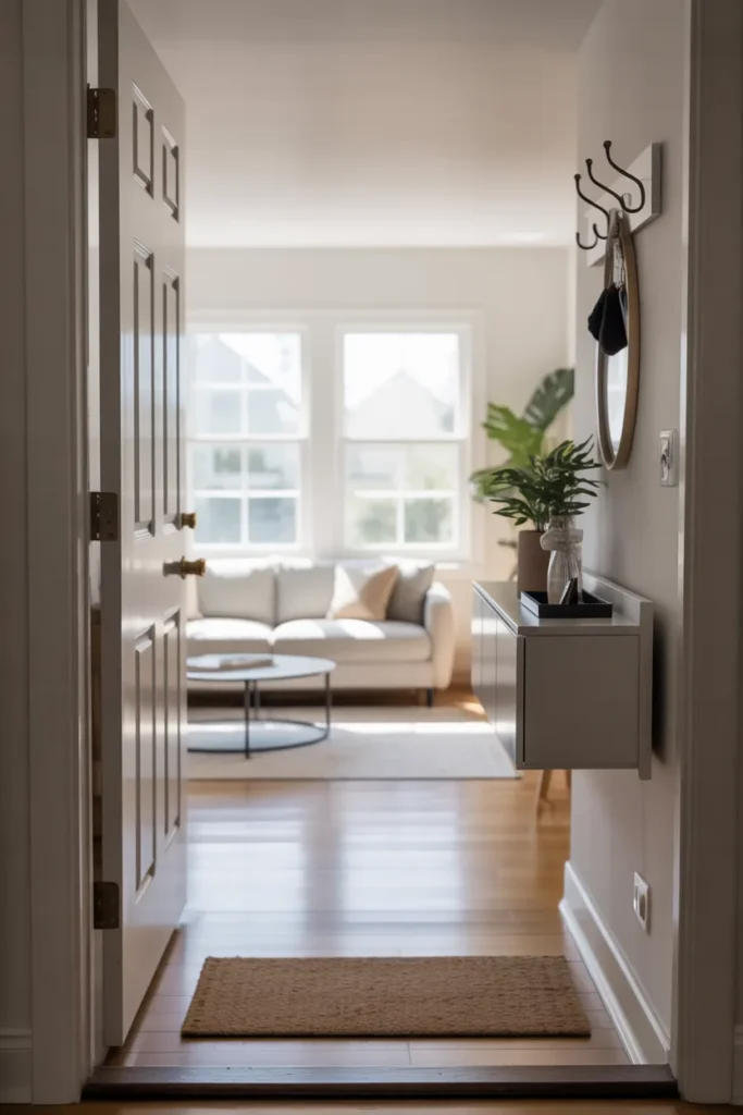
18. Decluttered Entryway Connection That Sets the Spatial Tone Immediately
In many small American homes and apartments, the living room is the first room visible from the front door. What greets the eye at the entry point sets the perceived size of the entire home. A cluttered, visually busy threshold makes a small living room feel immediately smaller before anyone has even stepped fully inside.
Addressing the entry-to-living-room transition is one of the most overlooked strategies in small living room design. A slim entry console, a defined mat zone, hooks mounted flush to the wall for coats and bags, and a clear sight line through to the living area all signal spaciousness at first glance.
In layouts where the entry opens directly into the living room with no separation, a light-toned area rug at the entry zone — separate from the living room rug — defines the transition without a wall. The two rugs work as zone markers that the eye reads as distinct areas, which makes the overall space feel larger than it is.
The principle here is that perceived size begins before someone enters a room. Managing the visual approach is as important as managing what is inside it.
Final Thoughts
The best tiny living room design 2026 strategies share one thing in common — they work with how the eye and mind perceive space, not just how many square feet a room actually has. Each of the 18 ideas here is designed to help you make a specific decision, whether that is about furniture placement, color, lighting, or storage, rather than simply inspire you.
Save this post to your Pinterest boards so you can return to it during your planning process. Whether you are designing a studio apartment, a small townhouse living room, or an open-plan space that needs better definition, there is a layout strategy here that applies directly to your situation. For your next step, explore small living room layout design and functional living room floor plans to carry these ideas into a full room plan.