
Cabin in the woods ideas tend to fall into two camps online, the ones that look like a hunting lodge from the 1980s and the ones that look like a sterile Scandinavian showroom with zero warmth, and neither one is what you actually picture when you dream about your own place in the trees. You want somewhere that smells like cedar in the morning, holds the quiet without feeling empty, and looks as good in photographs as it feels when you are curled up inside it during a storm. After this, you will know exactly which layout choices, material pairings, and small details turn a basic cabin structure into the kind of retreat people request to visit again.
The Sunken Living Room That Makes a Tiny Cabin Feel Like It Has Two Stories
Most small cabins keep every room at the same floor height out of necessity, but dropping the living area by even eight to twelve inches, using the original foundation step most builders already frame in, creates a sense of separation between spaces without adding a single square foot. The mechanic is that a change in elevation reads to the eye as a change in room, the same trick large open-plan homes use, except here it costs nothing beyond a different floor finish on the lower level. Sitting down in that sunken pocket, surrounded slightly above by the rest of the cabin, feels intentional rather than cramped.
This works best for A-frame cabins and small footprint builds where a hallway or separate room simply is not possible. The mistake most builders make is adding a step without a handrail or clear visual cue, which turns a design feature into a tripping hazard after dark. A thick wood threshold beam across the step solves this and looks deliberate rather than accidental.

Picture stepping down into that lower seating area with a fire already going above eye level in the main hearth, and the whole cabin suddenly reads as two distinct rooms instead of one open box.
Why a Wall of Windows Facing North Beats a Wall Facing South in the Woods
It sounds backward, but a north-facing window wall in a forest cabin produces the soft, even, shadow-free light that makes wood interiors photograph and live beautifully all day, while south-facing glass in dense tree cover creates harsh dappled patches that shift constantly and make a small room feel restless. The mechanic is about consistency of light, not quantity, and dense woods already filter out most direct southern exposure anyway, so orienting the main glazing north captures the steady canopy-filtered glow instead of fighting for direct sun that rarely reaches the forest floor.
This is one of the more overlooked cabin in the woods ideas 2026 builders are starting to plan around deliberately rather than by accident. The mistake most first-time cabin owners make is orienting the biggest windows toward whatever view looks best from the road, without checking how the light actually moves through that opening across a full day. Walk the site at three different times of day before finalizing window placement.
Standing in that steady, even light for a full afternoon is the difference between a cabin that feels serene and one that feels like it is constantly adjusting to the sun.
The Loft Ladder Detail That Turns Storage Access Into a Design Statement
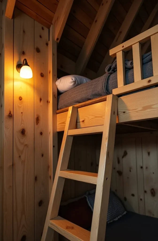
A loft in a small cabin almost always needs a ladder, and most builders default to a plain aluminum or hardware-store wood version that looks like an afterthought bolted onto a beautiful room. Building a fixed wood ladder at a steeper-than-standard 68-degree angle, finished in the same wood species as the loft railing, turns that necessary access point into one of the room’s strongest visual lines instead of its weakest one. The mechanic is material continuity: when the ladder matches the railing and the beams, the eye reads it as part of the architecture rather than an add-on.
This works for small cabin interior design situations where the loft serves as a guest sleeping space or reading nook and gets used often enough that a pull-down or rope ladder would be impractical. The mistake to avoid is painting the ladder a contrasting color to “make it pop.” In a small cabin, contrast draws the eye to the smallest room feature in the space, which is rarely what you want it resting on.
Looking up from the main floor, that ladder becomes a piece of the room’s architecture rather than a chore you have to climb.
Why a Single Statement Fireplace Wall Works Better Than Scattered Rustic Details
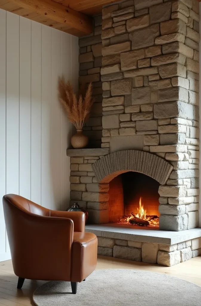
The instinct in a lot of cabin decorating is to add rustic touches everywhere, antlers here, a plaid throw there, a wagon wheel somewhere else, until the room feels like a theme rather than a home. Concentrating all of the textural weight, stone, reclaimed wood, or blackened steel, onto a single fireplace wall and keeping every other surface deliberately calm lets that one wall carry the cabin’s entire personality without the room feeling costume-like. The mechanic is contrast through restraint: one rich, textured surface reads as luxurious when everything around it is quiet, but the same surface disappears into noise when five other elements are competing for attention.
This is the strongest move within rustic modern cabin ideas for anyone worried their cabin will end up looking like a themed restaurant instead of a real home. The mistake most people make is adding a second textured accent wall in the same room, which splits the eye’s attention and cancels out the impact of both walls. Choose one wall and let the rest of the room go quiet around it.
Walking into that room, your eye goes straight to the fireplace and stays there, which is exactly the kind of focus a small space needs.
The Screened Porch Layout That Extends Living Space Without a Permit Fight
In most rural counties, a screened porch requires far less permitting than a fully enclosed addition, which makes it one of the most efficient ways to add usable square footage to a small cabin. Positioning that porch off the kitchen or main living area, rather than off a bedroom, keeps it in daily rotation as an extension of the main gathering space instead of a rarely used side room. The mechanic is proximity to daily traffic: a porch attached to a bedroom gets used occasionally, while one attached to the kitchen becomes part of how you actually live in the cabin every day.
This works especially well for functional small bedroom floor plans USA thinking applied to a cabin footprint, where the interior stays tight but outdoor-adjacent space does the heavy lifting for entertaining and relaxing. The mistake to avoid is furnishing the porch identically to the indoor living room. Choose weather-resistant materials in the same color family instead, so the porch feels like a natural extension rather than a mismatched second attempt.
Stepping out through that screen door with your coffee, still close enough to hear the kitchen but fully surrounded by trees, is the whole reason to build in the woods in the first place.
Why a Galley Kitchen Outperforms an Open Kitchen in a Truly Small Cabin
Open-concept kitchens photograph well in large homes, but in a cabin under 600 square feet, an open kitchen means cooking smells, clutter, and noise bleed into every other room with no buffer at all. A galley layout, two parallel counters with a walkway between them, tucked along one wall or into its own narrow zone, keeps the kitchen fully functional while containing its mess to a defined footprint the rest of the cabin does not have to absorb. The mechanic is containment, not concealment, and a well-lit galley kitchen can still feel open even with a partial wall separating it from the living area.
This is a core principle within tiny bedroom furniture arrangement logic applied at a whole-cabin scale, where every zone has to justify its footprint. The mistake most cabin owners make is skipping upper cabinets entirely to keep the galley feeling open, which sounds airy in theory but leaves nowhere for daily dishware, forcing counters to become permanent storage instead of workspace. Keep at least one run of upper cabinets, even a shallow one, and let open shelving handle the rest.
Cooking dinner in that contained galley while the rest of the cabin stays quiet and smoke-free is a small daily comfort most open kitchens never deliver.
The Daybed-Under-the-Window Trick for Cabins With Only One Bedroom
A single-bedroom cabin still needs to sleep guests occasionally, and rather than sacrificing a full second bedroom’s worth of square footage, a daybed built directly beneath the largest window in the main living area solves this without permanently dedicating space to a rarely used guest room. The mechanic mirrors the small bedroom window seat idea: proximity to the window makes the daybed feel like a considered design feature during the day, while its width and depth make it fully functional as a bed at night.
This works best for cozy cabin decor ideas where the cabin functions primarily as a couple’s retreat with occasional guests, rather than a full-time multi-bedroom home. The mistake to avoid is choosing bedding that only works in “daybed mode.” Select linens in a single durable color that look intentional whether the daybed is styled with bolsters for daytime or made up simply for a guest at night.
That window seat that looks like pure decoration by day quietly becomes someone’s bed by nightfall, and neither use feels like a compromise.
Why Exposed Ceiling Beams Should Never Match the Floor Exactly
Cabin builders often default to using the same wood species and stain for both the ceiling beams and the floor, assuming consistency reads as cohesive, but when both surfaces match too closely, the eye loses the sense of vertical height entirely and the room feels flatter and lower than it actually is. Choosing a slightly darker or more weathered tone for the beams than the floor creates just enough contrast for the eye to register the ceiling as a distinct plane, which makes the room feel taller even when the actual ceiling height has not changed. The mechanic is tonal separation, not matching, despite what most builders assume by default.
This is a critical detail within modern rustic cabin interior planning that gets overlooked because matching wood tones feels like the safe choice. The mistake most people make is discovering this after the beams are already installed and stained to match, which is a costly fix. Test stain samples on both surfaces side by side before either is finished.
Standing in a room where the beams read as clearly darker than the floor beneath them, the ceiling suddenly feels like it is exactly where it should be, high and deliberate, not low and heavy.
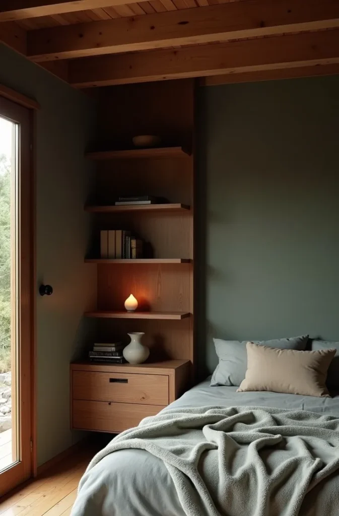
The Half-Wall Bookshelf That Separates Sleeping and Living Zones Without a Door
In studio-style cabins where the bed and living area share one open room, a waist-height bookshelf running perpendicular to the longest wall creates a physical and visual boundary between the two zones without blocking light or airflow the way a full wall or door would. The mechanic is that a half-wall still allows the eye and the light to travel over it, so the room reads as one connected space with two distinct functions, rather than one room chopped into two smaller ones. This solves the same problem a curtain divider solves, but with the added benefit of built-in storage.
This is ideal for studio bedroom layout for small spaces principles applied to an open-plan cabin, where a full bedroom simply is not part of the floor plan. The mistake most people make is filling the shelf edge to edge with books facing the sleeping side, which creates visual clutter from the bed’s sightline. Style the sleeping-facing side of the shelf more sparsely than the living-room-facing side.
Waking up and seeing a calm, half-empty shelf rather than a wall of spines is a small choice that changes how restful the whole zone feels.
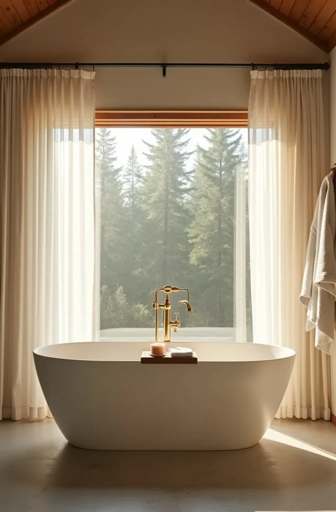
Why a Freestanding Soaking Tub Near a Window Beats a Built-In Bathroom Layout
Small cabin bathrooms rarely have room for a full built-in tub surround, but a freestanding soaking tub angled toward the cabin’s best window view uses less actual floor space than a boxed-in tub and shower combination while delivering a far more memorable experience. The mechanic is that a freestanding tub only needs clearance on the sides you actually use, whereas a built-in surround requires framing and tile on all sides regardless of whether anyone ever sees them, wasting both material and space in a room that has little of either to spare.
This works for small master bedroom layout ideas extended into an ensuite cabin bathroom, where the tub itself becomes a quiet focal point rather than a purely functional fixture. The mistake to avoid is placing the tub in the room’s only true dead corner just because it fits there. Position it, even if it means minor plumbing rerouting, so it faces the window, because the view is half of what makes a soaking tub feel worth the square footage it uses.
Sinking into that tub with the trees visible just past the glass is the kind of detail that makes people remember your cabin specifically, not cabins in general.
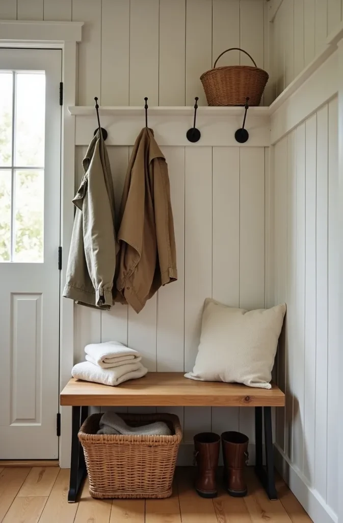
The Mudroom Bench That Solves the Boots-and-Coats Chaos Every Cabin Faces
Cabins in the woods generate more boots, wet coats, and firewood-carrying gear than any other type of home, and skipping a dedicated entry zone means all of that ends up piled by the front door in the main living space. A simple built-in bench with hooks above and a boot tray below, placed in even a two-foot-deep entry nook, contains that chaos before it ever reaches the rest of the cabin. The mechanic is interception: catching gear at the door prevents it from migrating to the living room floor, which is where it ends up in almost every cabin without one.
This is a functional small bedroom floor plans USA principle borrowed for entry design, prioritizing containment over square footage. The mistake most cabin owners make is treating the mudroom bench as optional in a small footprint, cutting it first when space gets tight. It is one of the few features that actively prevents daily clutter rather than just hiding it, and it earns its square footage back within the first muddy week.
Walking in from a hike and setting everything down in one contained spot, rather than trailing it through the whole cabin, is a small relief you will feel every single day.
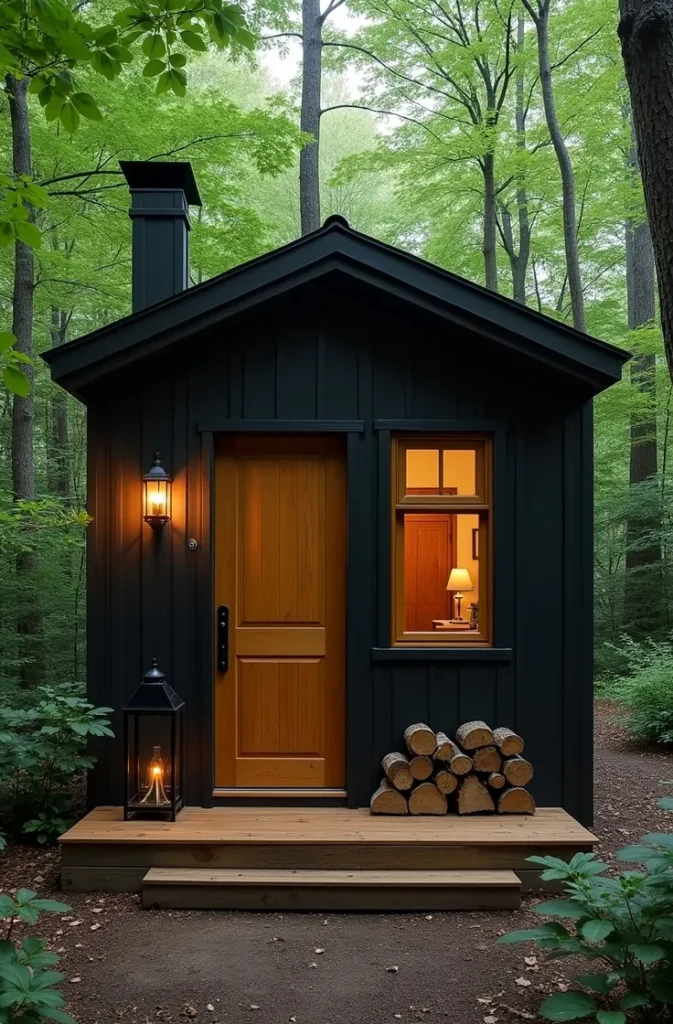
Why a Dark Exterior Stain Makes a Cabin Disappear Into the Woods, and That Is the Point
Light-colored cabin exteriors stand out sharply against dense tree cover, which can feel jarring rather than harmonious once the surrounding trees fill in for the season. A deep charcoal, black, or dark forest-green exterior stain allows the structure to recede into the tree line rather than compete with it, which is a deliberate design choice favored by architects working on true forest builds rather than an accident of budget or trend. The mechanic is visual camouflage: dark tones absorb light rather than reflect it, so the cabin’s silhouette softens against the trees instead of standing in stark contrast to them.
This is one of the more architecturally informed cabin in the woods ideas, distinct from the whitewashed farmhouse cabin trend that dominates most inspiration boards. The mistake to avoid is pairing a dark exterior with equally dark window trim, which can make the structure look flat and two-dimensional from a distance. A lighter trim color, even a warm cream or raw cedar, keeps the architectural lines visible against the dark field.
Approaching that cabin down a wooded path and watching it emerge gradually from the trees, rather than announcing itself from a distance, is the entire atmosphere a forest retreat should have.
The Woodstove Placement Rule Most Small Cabins Get Wrong
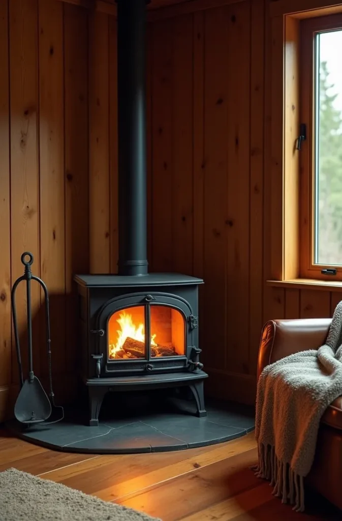
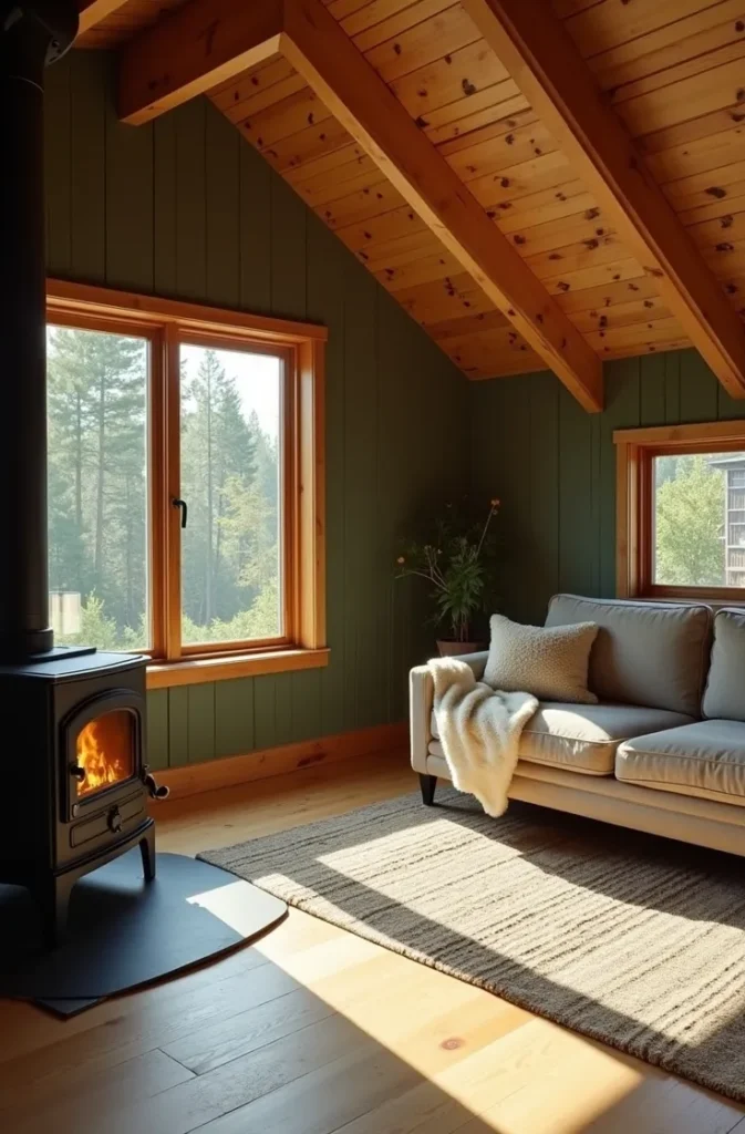
Placing a woodstove against the shortest wall of a small cabin seems like the obvious choice, but it actually blocks the wall most likely needed for a couch, bed, or storage in a tight footprint. Positioning the stove instead in a true corner, angled diagonally rather than flush against either wall, frees up both adjacent walls for furniture while still radiating heat evenly across the entire room. The mechanic is that a corner-angled stove has a shorter footprint against each individual wall than a flush-mounted stove has against one long wall, freeing up more usable linear footage overall.
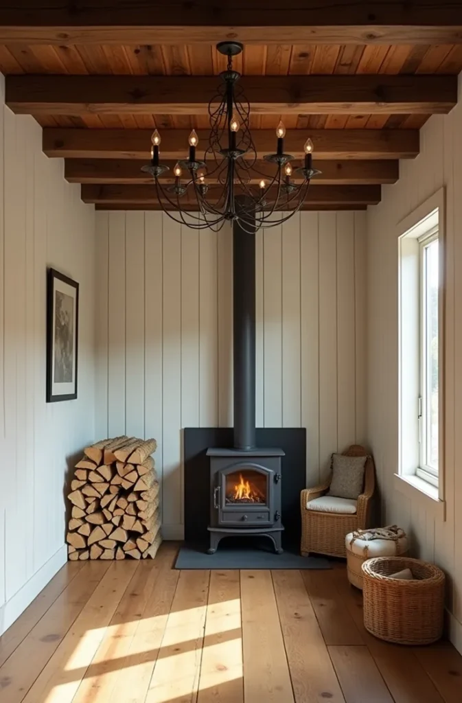
This matters enormously in functional small bedroom floor plans USA logic applied to a cabin’s main heat source, where every wall has to do double duty. The mistake most people make is under-sizing the required hearth pad clearance to save space, which is both a code violation in most counties and a genuine fire risk. Confirm your local clearance requirements before finalizing the stove’s exact position.
Once that stove sits diagonally in the corner, both walls it used to block open up for the furniture the room actually needed.
Why a Single Oversized Pendant Light Beats Multiple Small Fixtures in an Open Cabin
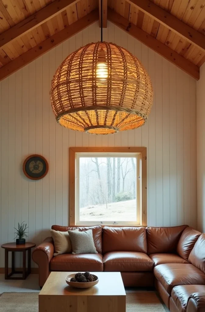
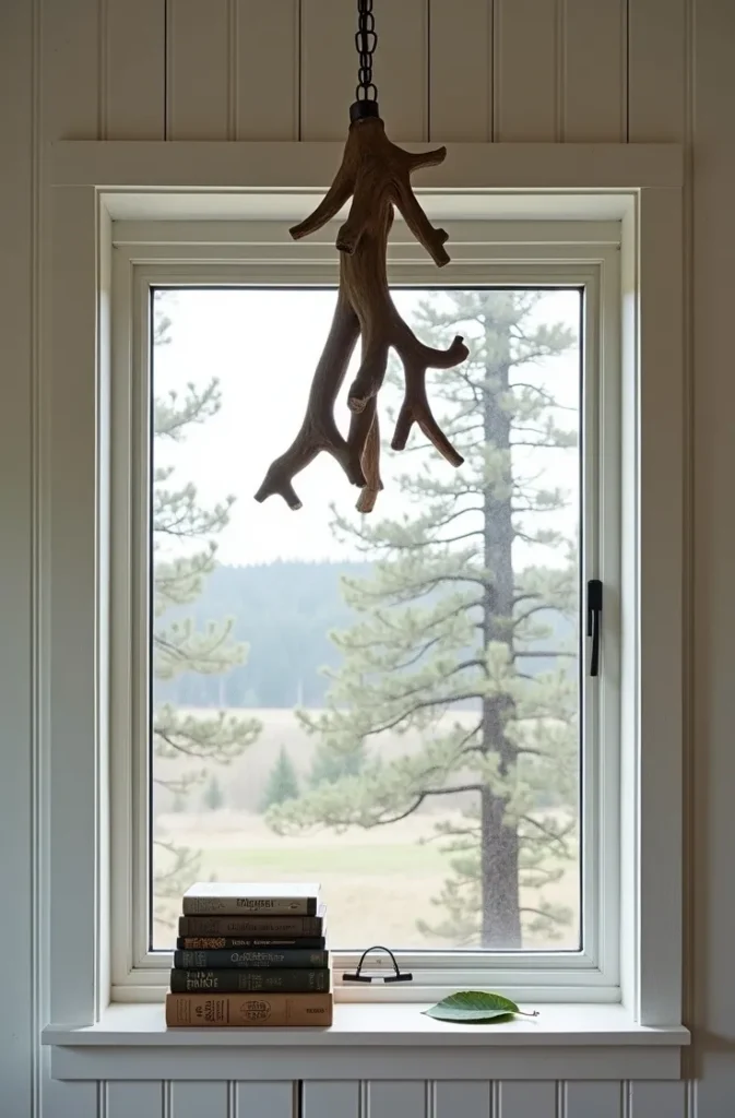
Small cabins with open, vaulted ceilings often get filled with several small pendant lights scattered across the space in an attempt to provide even coverage, but this scatters the eye and makes the ceiling feel busy in a room that is already visually complex with beams and angles. A single oversized pendant, hung at the room’s true center point rather than symmetrically between furniture groupings, gives the eye one clear anchor point in a ceiling that otherwise has a lot going on. The mechanic is that one large, deliberate fixture reads as a design statement, while several small ones read as an attempt to solve a lighting problem, even when the actual lumens delivered are similar.
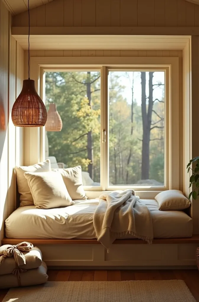
This works within minimalist small bedroom layout thinking scaled up to a cabin’s main living space, prioritizing one confident choice over several safe ones. The mistake to avoid is choosing a pendant so large it overwhelms the actual ceiling height. Measure the room’s vertical clearance carefully and leave at least seven feet from the floor to the bottom of the fixture.
Standing beneath that single fixture at night, the room reads as calm and considered instead of scattered with light in a dozen different directions.
The Reading Corner That Makes a Cabin Loft Feel Finished Instead of Half-Used
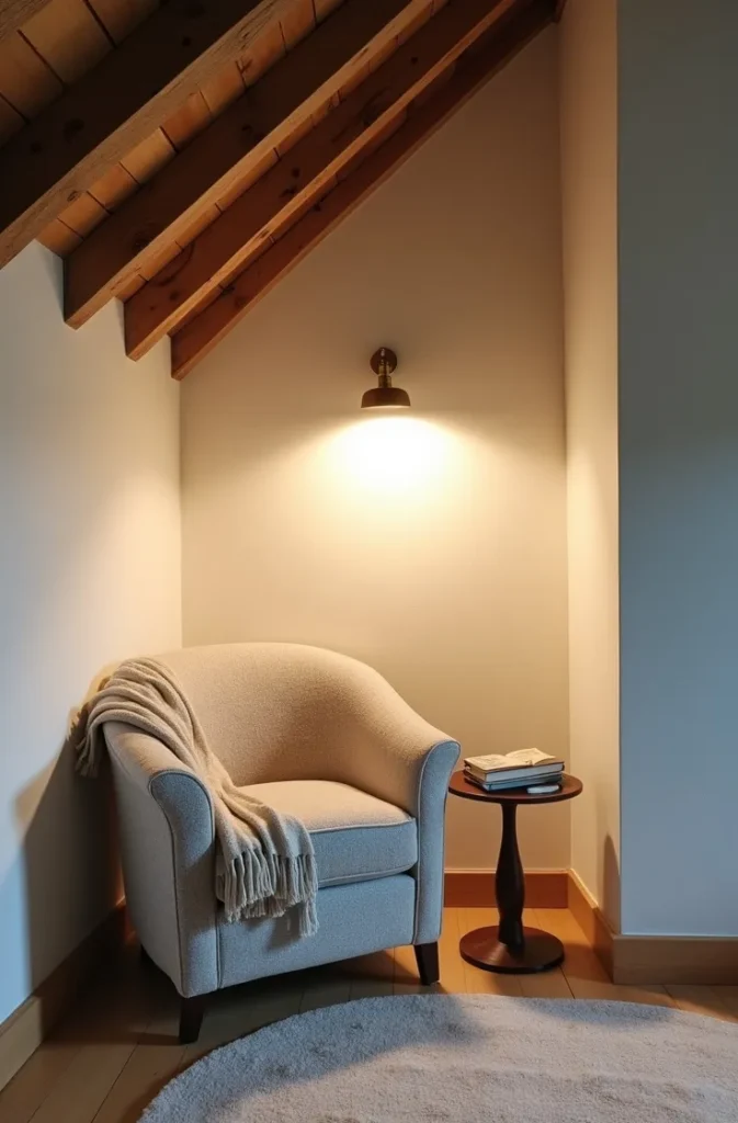
A cabin loft often ends up as pure storage or an afterthought sleeping space, when a single low chair and a small reading lamp tucked beneath the loft’s lowest ceiling slope can turn that same footprint into the coziest spot in the entire structure. The mechanic mirrors the sloped-ceiling reading nook principle from small bedroom design: a rounded, low-profile chair fits comfortably where a standard chair cannot, following the roofline instead of fighting it. This gives the loft a second function beyond sleeping, which matters in cabins where floor space downstairs is already fully committed.
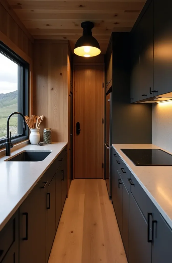
This is a strong extension of small bedroom layout ideas for women who want a quiet reading spot that exists purely for them, separate from any shared living space below. The mistake most people make is skipping a light source up there entirely, assuming the loft window provides enough. Add one small warm lamp regardless of window placement, because evening light in a forest loft disappears earlier than expected.
Climbing up to that corner with a book after everyone else has gone quiet downstairs is the kind of small luxury a cabin loft was always meant to hold.
Why Board-and-Batten Siding Indoors Adds Texture Without Shrinking the Room
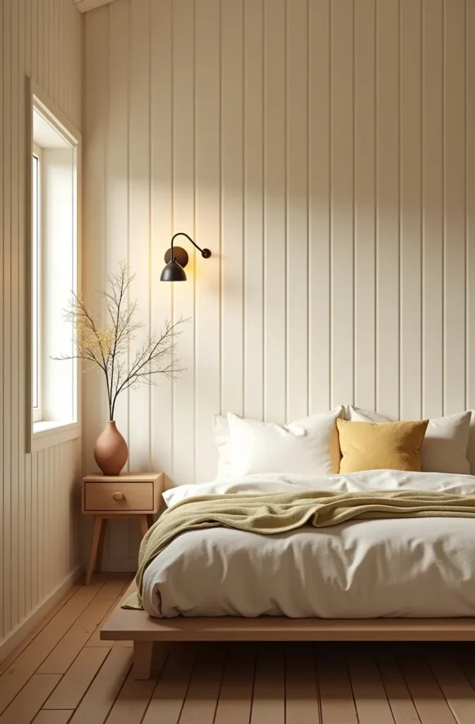
Shiplap has become the default cabin wall treatment, but its strong horizontal lines can visually shrink a small room by drawing the eye sideways rather than up. Board-and-batten paneling, with its vertical strips of trim over flat boards, does the opposite, drawing the eye upward and making ceilings feel taller in the process, while still delivering the textured, cabin-appropriate wall interest people are looking for. The mechanic is directional: horizontal lines widen a room visually but can compress height, while vertical lines do the reverse, which matters more in a cabin with low ceilings than in a large open home.
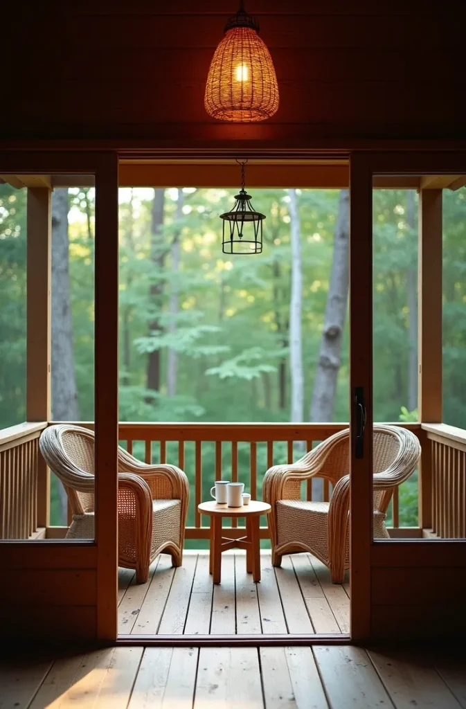
This is a specific material choice within modern rustic cabin interior planning that solves a problem most people do not realize shiplap is causing until they compare the two side by side. The mistake to avoid is painting board-and-batten a stark white in a room with warm wood tones elsewhere, which creates a jarring color break. A soft warm white or a matching wood tone keeps the wall treatment cohesive with the rest of the cabin.
Standing in a board-and-batten room with a lower-than-average ceiling, you register height before you register anything else, which is exactly the trick a small cabin needs.
The Outdoor Shower Layout That Turns a Practical Necessity Into the Cabin’s Best Feature
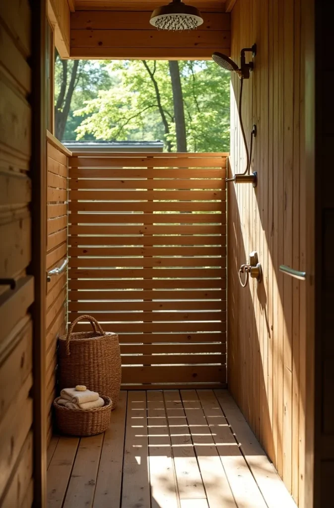
Many small cabins skip a full second bathroom entirely and rely on a single indoor bath, but adding a simple outdoor shower, screened with horizontal wood slats rather than a solid enclosure, gives the cabin a second washing option that also becomes one of its most requested features by guests. The mechanic is partial privacy through slatted screening: full sightlines are blocked while dappled light and forest air still filter through, creating an experience indoor bathrooms cannot replicate. This also reduces daily wear on the cabin’s single indoor bathroom during high-use weekends.
This is a strong addition to cozy cabin decor ideas for cabin owners who want the retreat to feel elevated beyond its indoor square footage. The mistake most people make is positioning the outdoor shower too close to a main window or walking path, undermining the privacy the slatted screen is meant to provide. Site it against the cabin’s most secluded exterior wall, ideally backing onto dense tree cover rather than an open yard.
Rinsing off outdoors with the forest fully visible through the slats is the kind of detail that makes a cabin feel genuinely different from a house, not just a smaller version of one.
Why a Warm Dimmable Kitchen Light Matters More Than a Bright Overhead Fixture
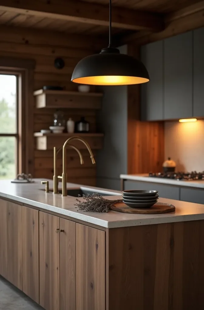
Cabin kitchens often get outfitted with the same bright, even overhead lighting found in a standard home kitchen, which feels clinical against the warm wood tones surrounding it and breaks the cabin’s atmosphere the moment it is switched on. A dimmable warm-toned fixture, paired with under-cabinet task lighting for actual food prep, lets the kitchen shift between fully functional during cooking and softly ambient during evening gatherings, without needing two separate light sources installed. The mechanic is flexibility: a dimmer changes the room’s entire mood without changing a single piece of furniture or decor.
This detail belongs within cozy small bedroom design ideas thinking extended to a cabin kitchen, where warmth matters as much in a functional room as it does in a bedroom. The mistake most people make is choosing a cool white bulb temperature to make food prep easier to see, which flattens the warmth of the wood and stone surfaces surrounding it. A warm 2700K bulb on a dimmer solves both problems at once.
Dimming that light down after dinner and watching the whole kitchen shift from workspace to gathering spot is the kind of transition a bright fixed overhead light can never offer.
The Porch Swing Placement That Actually Gets Used Instead of Just Photographed
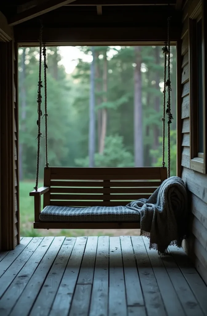
A porch swing hung at the center of a long porch looks balanced in photographs but often goes unused because it faces the yard or driveway rather than anything worth looking at for an extended period. Hanging the swing instead at one end of the porch, angled toward the densest tree view or a specific landscape feature, gives it an actual destination to face, which is what determines whether people sit there for twenty minutes or walk past it entirely. The mechanic is that a swing needs a view to justify sitting still, the same principle that makes a window seat work, applied to an outdoor structure.
This is a practical extension of bedroom layout ideas for small rooms with a window logic applied outdoors, where the view, not the symmetry, should drive placement. The mistake most people make is prioritizing a swing’s visual balance on the porch facade over its actual sightline once someone sits down in it. Stand where the swing will hang before installing it and confirm the view is one you would actually want to face for twenty minutes.
Sitting in that swing angled toward the thickest part of the woods, rather than centered for the sake of symmetry, is the difference between a swing you use daily and one that just hangs there.
Why Layered Rugs Work Better Than One Large Rug in a Cabin’s Main Room
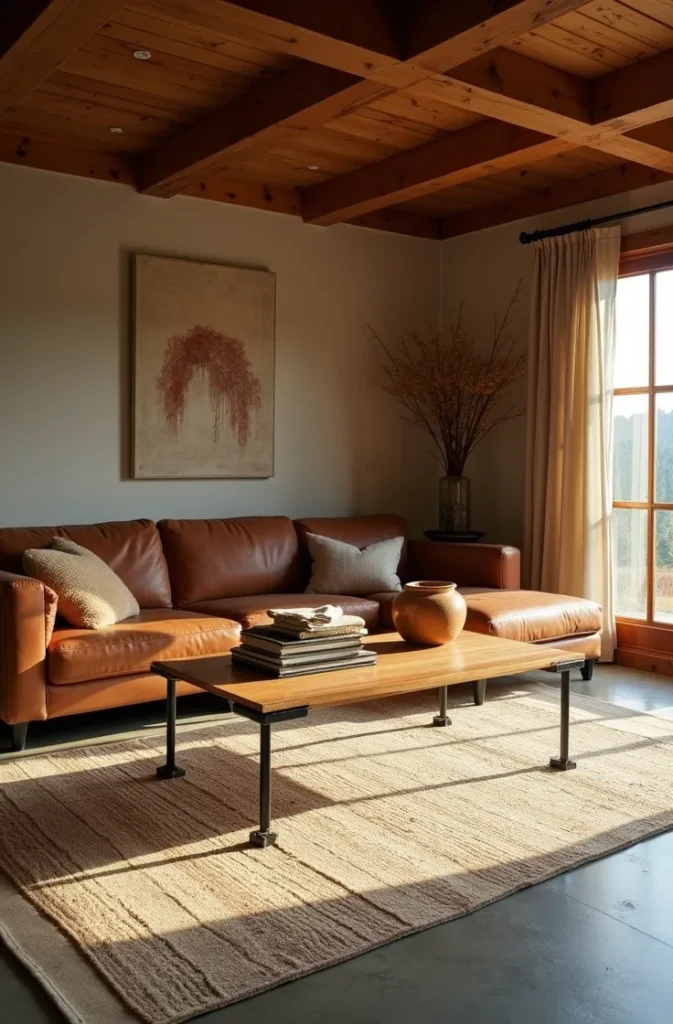
A single large area rug can feel like it is trying too hard to cover every inch of a cabin’s main floor, especially when the floor itself, whether reclaimed wood or polished concrete, is a feature worth showing. Layering a smaller vintage-style rug over a portion of exposed flooring, rather than covering wall to wall, lets the floor material remain visible while still softening the specific zones where people actually sit or stand. The mechanic is selective softness: warmth is added exactly where feet and furniture legs need it, while the rest of the floor stays visible as a material in its own right.
This is a refined version of small bedroom layout ideas for women who want texture without hiding a floor they chose deliberately. The mistake to avoid is choosing a rug pattern too busy for a room already rich with wood grain and stone texture. A simple, worn-in pattern in muted tones lets the rug add warmth without competing with everything else in the room.
Walking across that mix of exposed floor and layered rug, rather than one flat expanse of carpet, is what makes a cabin’s main room feel collected over time instead of furnished all at once.
A cabin in the woods does not need more square footage or a bigger budget to feel finished, it needs twenty small decisions made on purpose instead of by default. Save this post before your next build meeting or weekend project, because the details that make a cabin unforgettable are rarely the expensive ones. Come back to it room by room, and build the retreat people remember specifically, not the version that only works in a photograph.