
Decorating a rental on a tight budget means solving two problems at once — no permanent changes allowed, and no money to waste on things that will not move with you. This guide covers 12 cheap renter friendly decor ideas that are damage-free, reusable, and chosen specifically because they deliver the most visible impact for the least amount of money in USA apartments and rentals.
1. Thrifted Frames Turned Into a Gallery Wall That Looks Custom
Mismatched thrift store frames unified by a single spray paint color is one of the most cost-effective wall decor moves available to renters. The frames themselves can be completely different shapes, sizes, and styles — the shared paint color is what makes them read as a cohesive, intentional collection rather than a random assortment.
The most effective color choices for unifying thrifted frames are matte black, warm white, and antique gold. Matte black works against light walls and creates a bold, modern gallery effect. Warm white works in softer, more minimal interiors. Antique gold adds warmth and works especially well in maximalist or eclectic spaces.
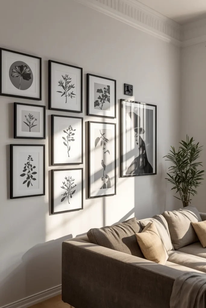

For the prints inside the frames, free downloadable art from public domain archives gives you high-quality botanical illustrations, vintage maps, and abstract works that print well at home on standard paper. You do not need to buy art to fill a gallery wall that looks designed.
Hang using adhesive strips rated for the frame weight. Lay the entire arrangement on the floor before committing to placement on the wall. Photograph it, measure the spacing, then transfer it up. This prevents the most expensive mistake in gallery wall building: adhesive strips that lose holding strength from repeated repositioning.
2. Dollar Store Vases Grouped in Odd Numbers to Fake a Styled Shelf
Single cheap vases look cheap. Three cheap vases grouped together at different heights look like a styled interior. This is one of the most reliable cheap renter friendly decor principles: grouping transforms the perceived value of inexpensive items more than the items themselves ever could.
The rule is odd numbers and varied heights. Three vases — one tall and narrow, one medium and rounded, one small — create visual movement that the eye travels across. Two vases of the same height just look like a pair. Four feels symmetrical and static. Three or five is the design standard for a reason.
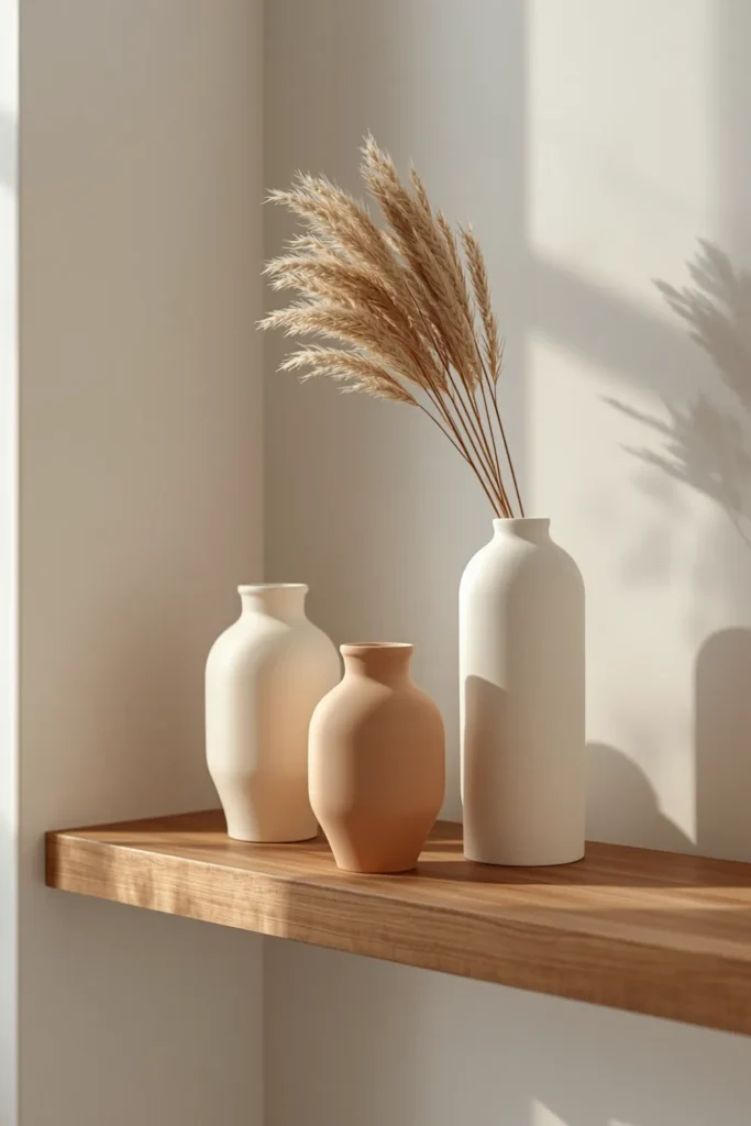
Stick to a single color family across the grouped vases rather than mixing colors. Three vases in cream, off-white, and warm beige read as a curated collection. Three vases in red, blue, and green read as mismatched. The restraint in color is what elevates the budget items.
Add a single stem or dried branch to one or two of the vases. A dried pampas stem, a eucalyptus branch, or even a branch from outside cuts the artificiality of an empty vase grouping. Dried stems do not require water, never die, and stay in place when you move.
3. Washi Tape Wall Patterns That Add Color Without Painting
Washi tape is the most affordable wall treatment available for renters — it applies cleanly, removes without residue on most painted surfaces, and can create patterns that genuinely look like a design decision rather than a budget workaround.
The patterns that work best with washi tape are geometric: vertical stripes from floor to ceiling, a large diamond grid, a herringbone pattern, or a simple border around a doorframe or window. These feel architectural rather than crafty when executed cleanly with a level and consistent spacing.
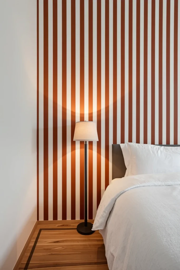
A single accent wall with evenly spaced vertical stripes in a deep color washi tape against a white wall is the highest-impact, lowest-effort version of this idea. Use a level and mark light pencil guides before applying. Uneven stripes that drift sideways immediately reveal the DIY nature of the technique — precision is what makes it look designed.
Choose a tape width that matches your intended scale. Thin 0.5-inch tape works for fine geometric patterns. Wider 1-inch or 1.5-inch tape reads better for bold stripes or architectural framing effects. Using thin tape for a bold stripe pattern or wide tape for a fine geometric both fail for the same reason: the scale is wrong for the pattern.
4. Curtain Panels From Discount Stores Hung at Ceiling Height to Fake Luxury
The single curtain installation mistake that makes a rental look cheap is hanging the rod at window frame height. Ceiling-height curtain installation — using the same budget curtain panels — completely changes the perceived scale and quality of the window treatment and the room.
Mount the curtain rod as close to the ceiling as possible, and extend it 8 to 12 inches beyond the window frame on each side. This makes a standard window look floor-to-ceiling and wall-to-wall. The curtain panels themselves can come from any discount retailer — the installation height does the work, not the fabric price.
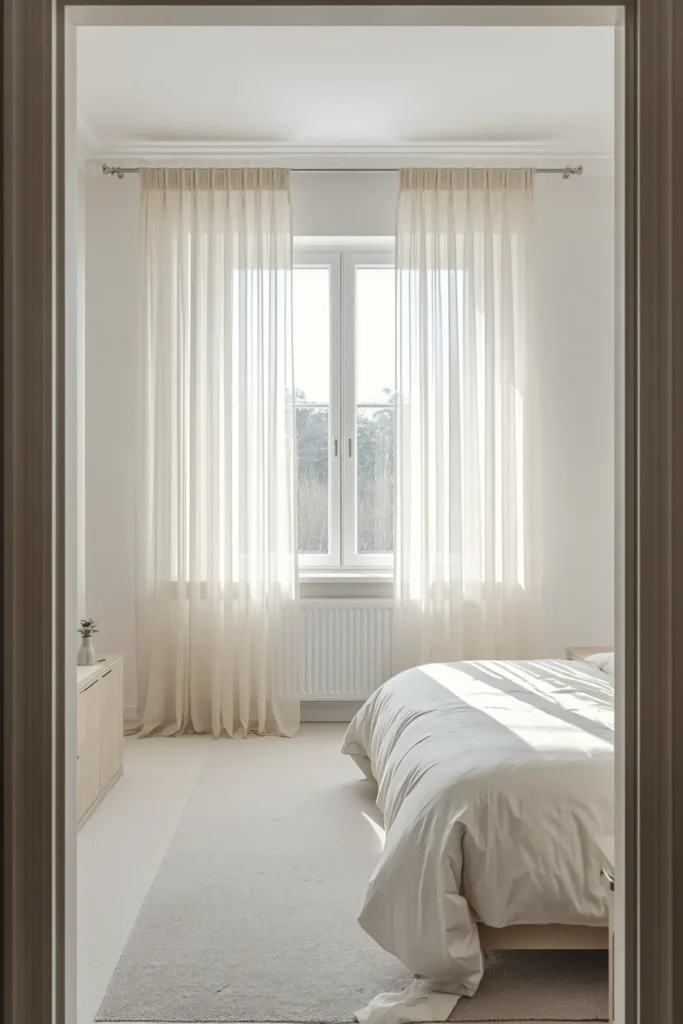
For rental-safe mounting, no-drill curtain rod brackets that grip the window frame or use adhesive mounting are the practical solution. Check the weight rating before choosing fabric — heavier linen-look panels need a higher-rated bracket than sheer lightweight fabric.
Off-white, warm ivory, and soft sage are the most universally flattering curtain colors for rental apartments because they add warmth without competing with existing wall colors. Pure bright white often clashes with the slightly off-white tones of most rental apartment walls.
5. Removable Wallpaper on a Single Accent Wall for Maximum Budget Impact
Full-room peel-and-stick wallpaper is expensive even in the budget category. A single accent wall is where the value calculation works in favor of renters — one wall requires a fraction of the material, installs in a single afternoon, and creates the same design impact as papering all four walls.
The bedroom wall behind the bed is the highest-return wall in any rental for removable wallpaper application. It is the first thing visible when entering the room, it frames the bed as the room’s focal point, and it requires the least cutting around obstacles like windows or outlets.
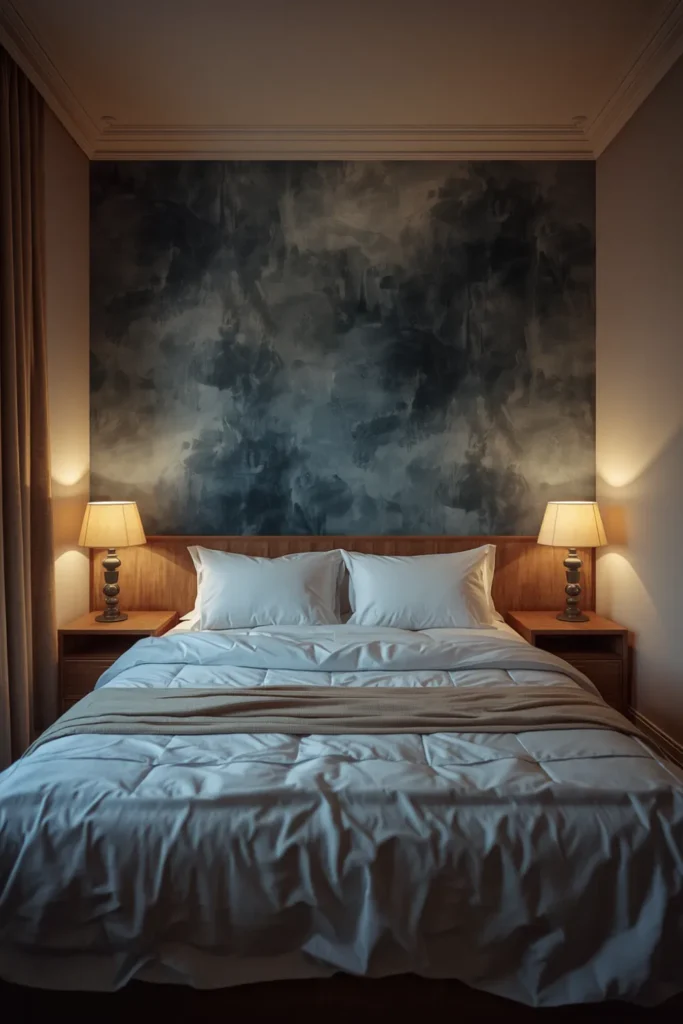
For the living room, the wall behind the sofa or the wall opposite the entry point are the two strongest candidates. The entry-facing wall is what you and every guest sees first — a strong pattern or textured print on that wall sets the tone for the entire space immediately.
When budgeting for a single accent wall, measure the wall height and width carefully and add 10 percent to your panel count for trimming and pattern matching. Buying exactly enough with no margin leads to visible pattern breaks or short panels that require an extra order at full shipping cost — which eliminates the budget savings immediately.
6. Secondhand Rugs That Define Spaces and Cover Damaged Rental Flooring
A large area rug is typically the most expensive item in a living room, but secondhand rugs — from estate sales, Facebook Marketplace, and thrift stores — routinely sell for a fraction of retail because sellers rarely know the value of what they have. A genuine wool or cotton flat-weave rug in good condition found secondhand outperforms a new synthetic rug at the same budget level in both appearance and durability.
Before buying a secondhand rug, check for odor, moth damage (look for thinning areas in the pile), and backing integrity. A rug that smells musty in a closed car trunk after 10 minutes will smell worse in a heated apartment. Most odor issues are not fixable without professional cleaning that costs more than the rug’s value.
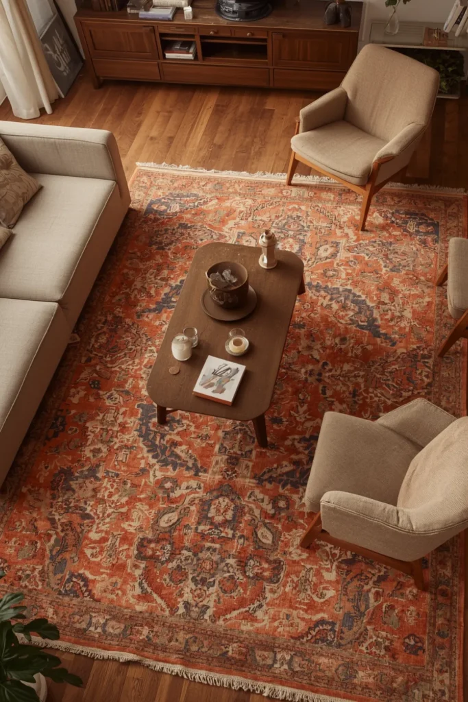
Size is the most important decision regardless of source. In a living room, the rug must be large enough for all major furniture pieces to have at least their front legs on the rug. A 5×8 foot rug in a standard apartment living room is almost always too small. An 8×10 or 9×12 is typically the correct size for a defined seating area.
Layering two rugs — a flat-weave base rug topped with a smaller textured rug — is a legitimate design technique that also stretches a rug budget. A large inexpensive jute or sisal rug as the base with a smaller vintage-style rug centered on top costs less than one large premium rug and creates more visual interest.
7. Peel-and-Stick Tile Stickers That Fix the Worst Rental Bathrooms
Rental bathrooms across USA apartments share a near-universal problem: dated or plain tiles in beige, cream, or white that are clean but deeply unattractive. Peel-and-stick tile stickers apply directly over existing ceramic or porcelain tiles, require no tools, and remove without damage on smooth tile surfaces.
The designs that deliver the strongest visual change are high-contrast patterns — black and white Moroccan, navy and white geometric, or deep green with gold accents applied over plain white or beige tile. These create the feel of a boutique or renovated bathroom rather than a standard rental unit.
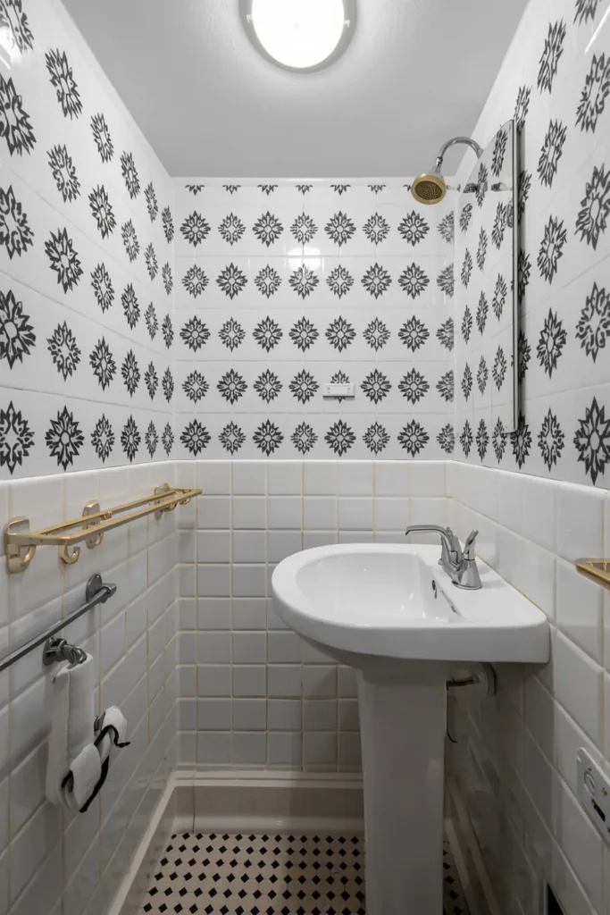
Apply on a dry surface at room temperature. Cold tiles — common in ground-floor or north-facing bathrooms in winter — cause the adhesive to bond poorly and lift at edges within weeks. Wait until the bathroom has been at normal room temperature for several hours before applying, or use a hair dryer to gently warm the tile surface first.
This is a surface-only solution. Tiles that have deep grout lines, chips, or textured surfaces will not give the sticker a flat bonding area, and edges will lift repeatedly. On flat, smooth tiles with standard grout lines, the bond holds reliably for the duration of a typical lease.
8. Thrifted Books Arranged by Color to Style Shelves for Free
Color-coordinated book arrangements on shelves are one of the most frequently saved interior design images on Pinterest for a simple reason: they look expensive and curated, and they cost nothing if you already own books or buy them secondhand by the bag at thrift stores.
Sort books by spine color and arrange them in gradients or color blocks across shelf sections. A gradient from white through cream, tan, terracotta, and rust reads as intentional and warm. A section of all-black spines next to all-white spines creates a graphic, high-contrast moment on a shelf that photographs extremely well.
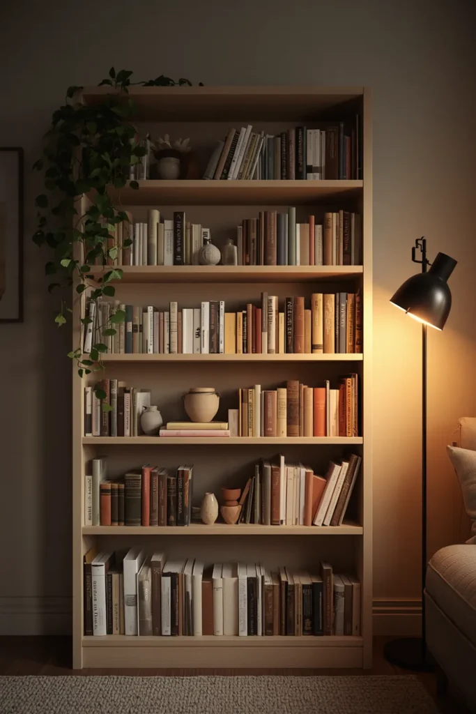
Remove dust jackets from hardcover books. The cloth or board covers underneath are almost always more attractive — typically in solid colors or simple typography — and removing jackets instantly elevates the appearance of a standard book collection.
Intersperse the books with small objects at regular intervals: a small plant, a single ceramic piece, a framed print leaning against the back of the shelf. The rhythm of books, object, books, object across the shelf length creates a styled look rather than a storage look. This is cheap renter friendly decor at its most effective — existing items rearranged into a design decision.
9. Plug-In Pendant Lights That Replace Ugly Overhead Fixtures Without Wiring
The overhead ceiling light in a rental is almost never the right fixture. It is almost always a basic flush-mount with a flat bulb that casts institutional, shadow-less light across the entire room. A plug-in pendant light hangs from the ceiling hook using a cord that runs along the ceiling and down the wall to a standard outlet — no electrician, no wiring, no landlord permission needed.
Position a plug-in pendant over the dining table, above a reading chair, or as a bedside alternative to a table lamp. These are the three locations where pendant lighting makes the most sense functionally and where the cord management from ceiling to outlet is the least visually disruptive.
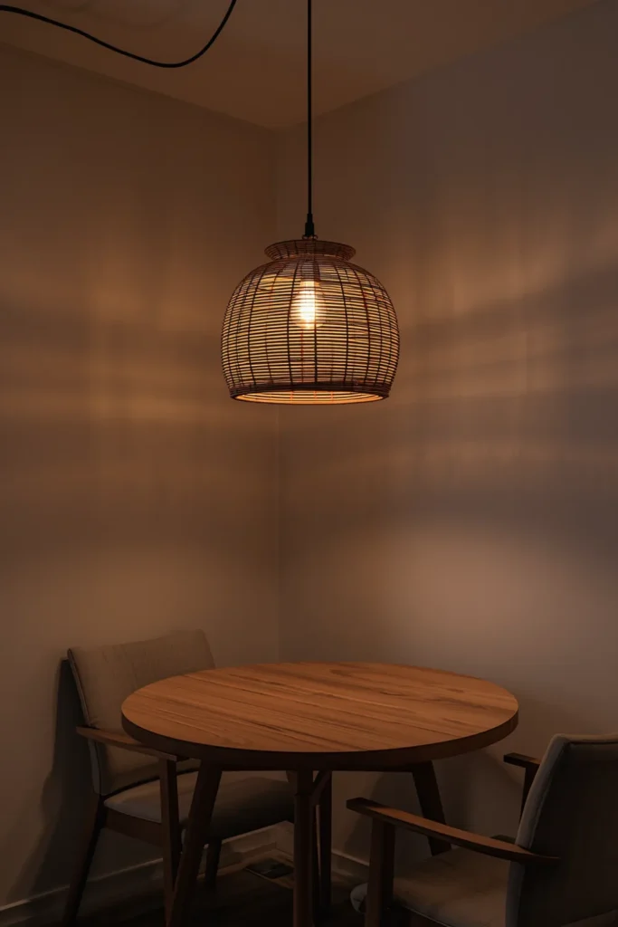
Cord management matters. Run the cord along the ceiling using clear adhesive cord clips or small ceiling-mounted cable guides spaced every 12 to 18 inches. A cord that hangs loosely from a ceiling hook and drapes down a wall looks unfinished. A cord routed neatly along the ceiling edge and down the corner of a wall looks like a deliberate installation.
Choose a shade style that contrasts with the existing ceiling fixture. If the rental has a plain white flush-mount, a woven rattan shade, a black metal cone, or a pleated fabric pendant all create immediate visual contrast that draws the eye upward and shifts the room’s atmosphere at minimal cost.
10. Contact Paper on Rental Kitchen Countertops to Hide Stained Laminate
Rental kitchen countertops — typically laminate in dated colors like almond, tan, or gray-fleck patterns — are one of the most visually limiting features in an apartment kitchen. Contact paper in marble, concrete, butcher block, or solid matte finishes applies directly over existing laminate and transforms the surface appearance in a single afternoon.
The application technique determines whether this looks professional or patched. Cut sections larger than needed, apply from one end, and use a credit card or squeegee to press out bubbles as you go — working from the center of each section outward to the edges. Trim the excess with a sharp utility knife along the counter edge using a metal ruler as a guide. A clean edge is the detail that separates a professional-looking result from a DIY-looking one.
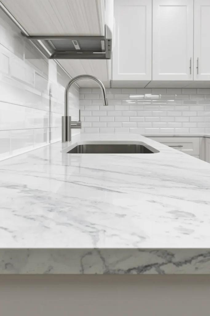
Pay particular attention to seams. Visible seams are the most common giveaway of contact paper countertops. Align seams at the back of the counter near the wall where they are least visible, and press them firmly with a seam roller or the back of a spoon. On a marble or veined pattern, align the pattern across the seam before pressing down.
Remove at the end of the lease using a heat gun or hair dryer on medium setting to warm the adhesive and peel slowly. Contact paper that is removed cold risks taking paint or laminate finish with it, particularly on older countertop surfaces.
11. Mirrors Positioned to Double Natural Light in Dark Rental Rooms
A large mirror placed on the wall directly opposite a window reflects the entire window and its light back into the room, effectively doubling the perceived brightness without any electrical work. This is one of the most practical cheap renter friendly decor moves for north-facing apartments, basement units, or any rental room that feels dim during the day.
The mirror needs to be positioned so the window is fully visible in its reflection when you stand at the center of the room. Even a slight angle shift — the mirror mounted too high or too far to one side — reduces the light-doubling effect significantly. The optimal placement is directly across the room from the window at the same height as the window center.
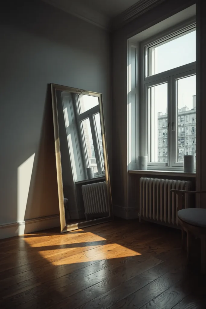
Leaning a large mirror against the wall rather than mounting it is the most renter-friendly approach. A mirror that leans slightly forward reflects the ceiling less and the room more, which is the correct orientation for light and space amplification. Use furniture or a thin gap between the mirror base and the wall to control the lean angle.
Secondhand floor mirrors and large leaning mirrors are among the highest-value thrift finds for renters. A full-length mirror in a simple frame found secondhand and leaned against a dark wall is an immediate spatial and lighting upgrade that costs a fraction of new retail.
12. Textile Layering on a Rental Sofa to Hide Wear and Add Visual Warmth
A rental-furnished apartment sofa — or a sofa that has seen better days — can be completely transformed through textile layering without slipcovers. The layering approach uses a combination of a large throw blanket, two or three cushions in varied textures, and a small lumbar pillow to redefine the sofa’s look from the surface level.
The key is texture contrast rather than pattern matching. A linen throw paired with a boucle cushion and a velvet lumbar pillow creates depth and tactile variety that reads as intentionally styled. Three cushions in the same fabric and texture, even if the colors coordinate, look flat and uniform — the opposite of styled.
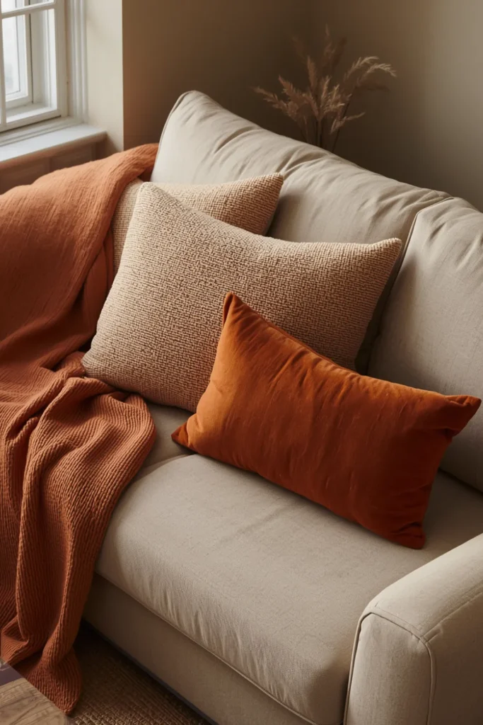
Drape the throw rather than fold it. A folded throw placed squarely on a sofa arm looks like a store display. A casually draped throw with one end pulled onto the seat cushion looks lived in and designed simultaneously. Pull one corner slightly forward and let it fall naturally — the asymmetry is the point.
This approach works regardless of sofa color or condition. A worn beige sofa under a warm terracotta throw with cream and rust cushions becomes a warm, collected seating arrangement. A dark grey sofa under a cream chunky-knit throw with sage and ivory cushions becomes a calm, Scandinavian-influenced reading corner. The sofa underneath becomes almost irrelevant.
Final Thoughts
Every idea in this guide is built around the same principle: maximum visual impact at minimum cost, with zero permanent changes to the rental. Cheap renter friendly decor does not mean settling for a space that looks budget — it means making smarter decisions about where inexpensive materials, secondhand finds, and no-tool solutions create results that are genuinely indistinguishable from more expensive approaches.
Save this post before you start your next rental decorating project. The specific guidance on sizing, placement, and common mistakes throughout each section is what determines whether a budget idea looks polished or improvised — and that detail is worth coming back to.
For more rental decorating guidance, look into ideas organized by specific room type or apartment size to find the combination of solutions that fits your exact layout and budget.