
Cozy minimalist living room ideas only work when the room is edited, not empty — a distinction most people miss the first time they try to simplify a space. If your living room feels either too bare to relax in or too full to breathe in, the problem usually isn’t your furniture, it’s how it’s arranged. What follows are fifteen layout and styling decisions that turn a minimal room into a warm one, without sliding back into clutter.
1. The Corner-Anchored Sofa That Makes a Small Living Room Feel Held, Not Boxed In
Most living rooms default to pushing the sofa flat against the longest wall, which feels efficient but actually flattens the room into a rectangle your eye reads instantly and stops exploring. Anchoring the sofa into a corner instead — angled slightly, or simply pulled in from both walls — gives the room a diagonal sightline that makes it feel deeper than it is. The empty space this creates near the entry becomes breathing room instead of dead space.
This works best in apartment living rooms and open-plan spaces where the sofa has to do double duty as both seating and a soft room divider. It’s especially useful in New York and Chicago rental layouts where the living room shares its footprint with a dining or entry zone.
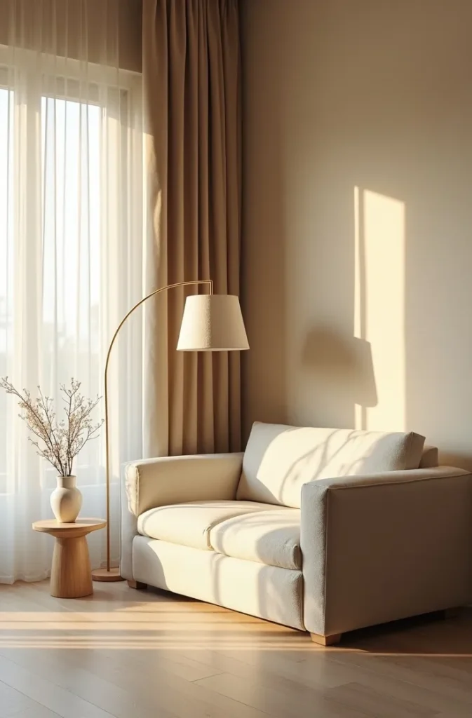

The mistake most people make here is filling that new corner gap with a plant, a lamp, and a side table all at once. Pick one. A single sculptural floor lamp in that corner does more for the room’s calm than three smaller objects competing for attention. Picture the sofa pulled just eighteen inches off the wall — that’s the whole move.
This is one of the simplest cozy minimalist living room ideas 2026 designers keep returning to, because it costs nothing and changes the entire feel of the room.
2. The Low-Profile Furniture Rule That Makes Ceilings Feel Higher
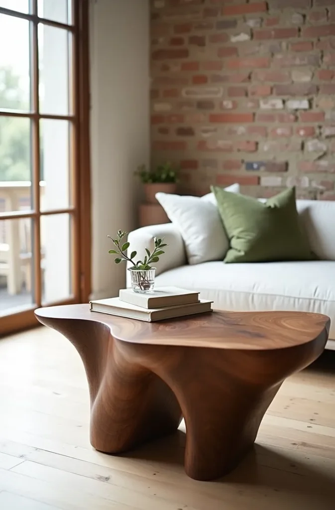
Furniture height matters more than furniture size when a room needs to feel calm rather than crowded. Swapping a tall-backed sofa or bulky armchair for low-profile pieces — seat height around sixteen to eighteen inches, arms kept slim — opens up the visual space above the furniture line, which is what actually makes a ceiling read as taller. The eye travels upward instead of stopping at shoulder height.
This matters most in older homes with standard eight-foot ceilings, common in Midwest starter homes and California bungalows, where every inch of vertical space counts. Studio and one-bedroom apartments benefit the same way, since low furniture keeps sightlines open across the whole room.
Where people go wrong is pairing low furniture with a tall, bulky coffee table, which cancels out the effect entirely. Keep the coffee table low too, ideally slightly lower than the sofa seat. Imagine sitting down and being able to see clean across the room to the window — that unbroken sightline is the payoff.
3. Why Layering Three Shades of the Same Neutral Beats Adding More Color
A common misread of minimalism is that a neutral room needs to be one flat color, which is exactly what makes some minimal living rooms feel cold and unfinished. The trick is layering three tonal shades of the same neutral family — say, a warm white wall, an oatmeal sofa, and a deeper taupe throw — so the room has depth without introducing a competing hue.
This approach works especially well for renters who can’t paint but want the room to feel intentional rather than default-white. It’s also the fastest fix for a living room that photographs flat and gray under overhead light.
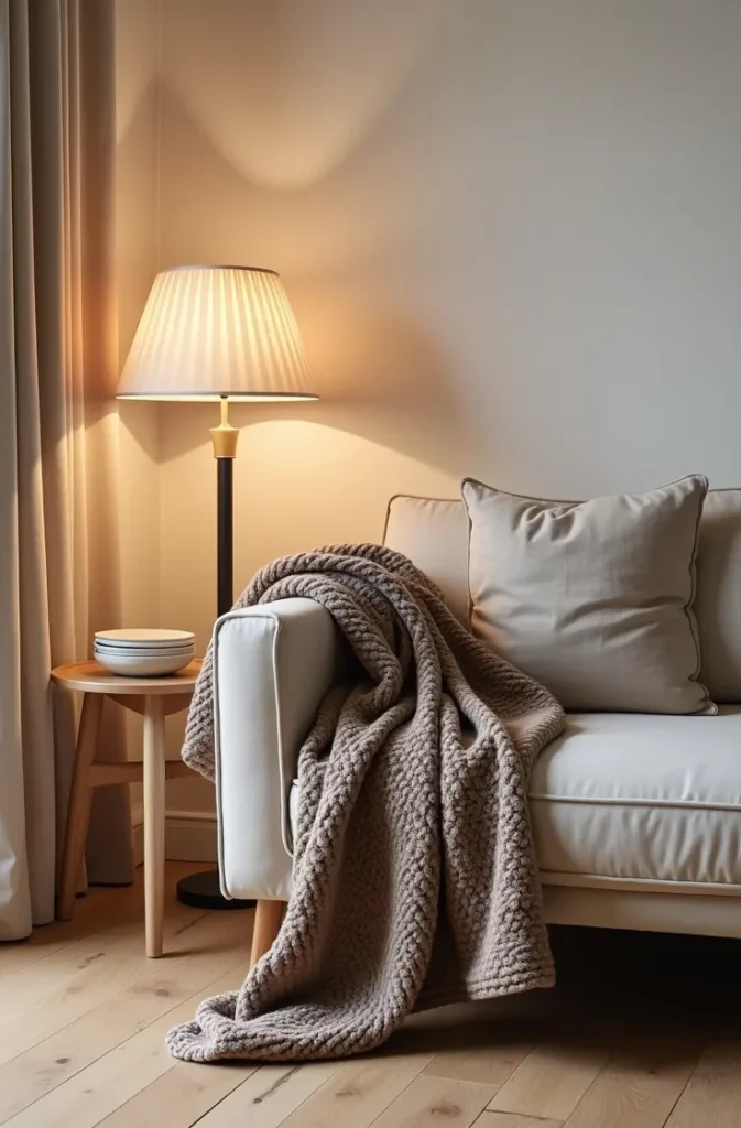
The mistake is treating “neutral” as permission to skip texture. Three shades of the same flat, smooth beige will still look unfinished. Bring in one nubby or woven texture — a chunky knit throw, a boucle pillow — so the tonal layering has something to catch the light. Picture draping that throw over just one arm of the sofa, loosely, rather than folded.
This kind of tonal layering is one of the more reliable small living room ideas for making a rental feel finished without a single paint can.
4. The One-Statement-Piece Trick for a Room That Feels Curated, Not Empty
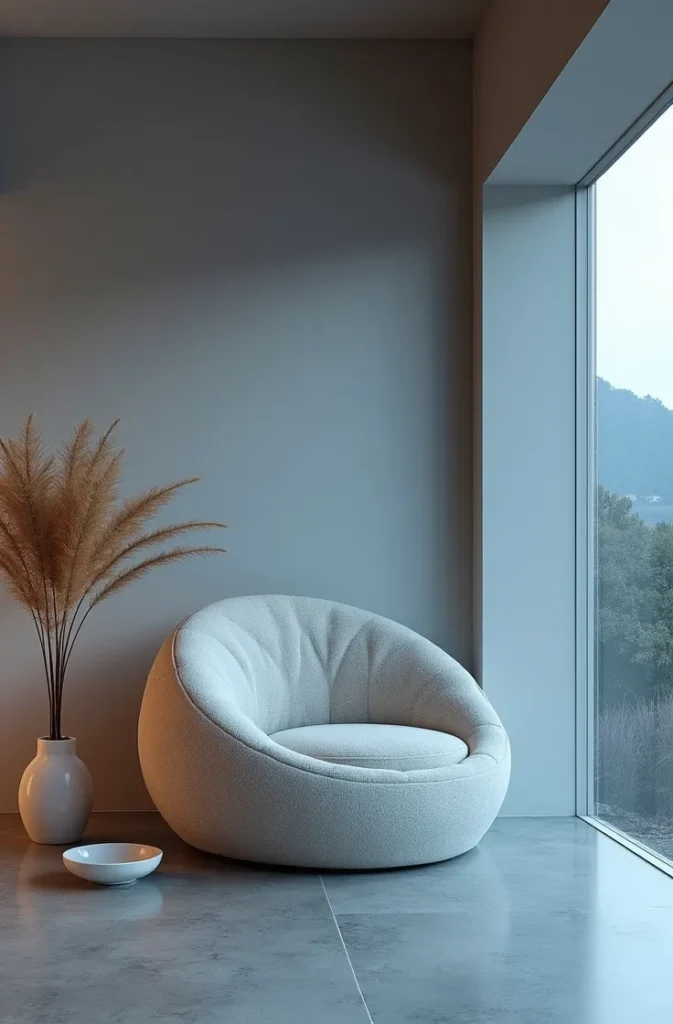
Minimalist living rooms often fail not because they have too little in them, but because everything in them is equally quiet, leaving nothing for the eye to land on. Choosing one statement piece — a curved-back accent chair, a sculptural mirror, an oversized ceramic vessel — gives the room a focal point, which paradoxically makes the surrounding simplicity read as intentional rather than unfinished.
This works particularly well in living rooms that serve double duty as a work-from-home space, since one striking piece anchors the room’s identity even when a laptop and papers are sitting out. It’s a favorite move in Texas ranch-style homes with open-concept living areas, where the statement piece also helps define the living zone within a larger open floor.
The mistake is choosing a statement piece that’s loud in color rather than loud in shape. A neon accent chair breaks minimalism; a curved, sculptural chair in a neutral tone doesn’t. Picture walking into the room and your eye going straight to one beautiful shape before it registers anything else — that’s the effect you’re building toward.
5. Why Leaving One Wall Completely Empty Makes the Whole Room Feel Calmer
The instinct in a small living room is to fill every wall, since bare walls can feel unfinished. But leaving one wall completely empty — no shelf, no art, no mirror — gives the eye a place to rest, which is what actually creates the sense of calm minimalist rooms are known for. It works like a pause in a sentence.
This is most effective on the wall directly across from the seating area, since that’s the wall you look at most while sitting down. It’s a particularly useful move in open-concept apartments where every other surface is already doing visual work — a kitchen island, a media console, a window.
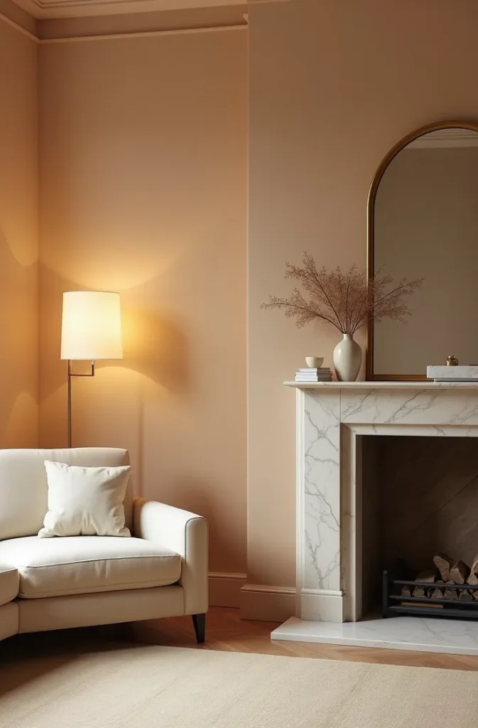
The mistake is choosing the wrong wall to leave bare. Leaving the entry wall empty does nothing; leaving the wall you face while relaxing does everything. Picture sitting on the sofa and looking straight ahead at a soft, quiet plane instead of a gallery wall competing for attention.
This is one of those minimalist living room layout ideas that costs nothing and is purely a decision, not a purchase.
6. The Layered Rug Trick That Grounds an Open-Plan Living Room
In open-plan homes, a living room without walls to define it can feel like it’s floating inside a bigger space. Layering two rugs — a larger jute or flatweave base under a smaller, softer rug beneath the coffee table — draws a visual boundary around the seating area without needing furniture to do it. The room reads as its own zone even with no walls around it.
This is especially useful for studio apartments and loft-style living rooms, where the living, dining, and sometimes sleeping areas share one continuous floor. It gives each zone its own footprint using texture instead of dividers.
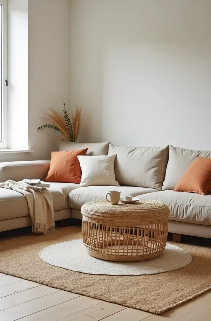
The mistake is choosing two rugs in competing patterns, which undoes the calming effect entirely. Keep the base rug texturally interesting but visually quiet — a natural jute weave — and let the top rug be the soft, solid layer. Picture standing at the edge of the room and being able to tell exactly where the living area starts, just from the floor.
This is one of the more practical studio bedroom layout for small spaces techniques borrowed into living room design, since the zoning problem is nearly identical.
7. Why Turning Your Seating Toward the Window Changes How the Whole Room Feels
Seating arrangements built around a television often ignore the room’s best asset: its natural light. Turning even one chair or one end of the sofa to face the window instead of the screen changes the room’s mood entirely — it becomes a space you want to sit in during the day, not just at night. The light itself becomes part of the room’s decor.
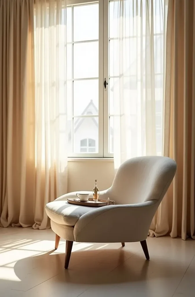
This works especially well in living rooms with a single strong window source, common in Midwest and Northeastern homes with one primary window wall. It also solves the problem of glare on a television screen, which is often the real reason people avoid daytime seating near a window in the first place.
The mistake is centering the whole layout around the window and losing the conversational closeness that makes a living room feel warm. Keep one seat facing the window and the rest angled toward each other. Picture reading in that window seat in the late afternoon, sun on your shoulder, without needing a lamp on at all.
8. The Three-Object Rule for Floating Shelves That Doesn’t Look Sparse or Cluttered
Floating shelves in a minimalist living room tend to go one of two wrong directions: completely bare, which feels unfinished, or fully loaded, which undoes the minimalism entirely. The fix is a hard rule of three objects per shelf, varied in height and shape — one taller piece, one low horizontal piece, one small accent — so the eye has rhythm without clutter.
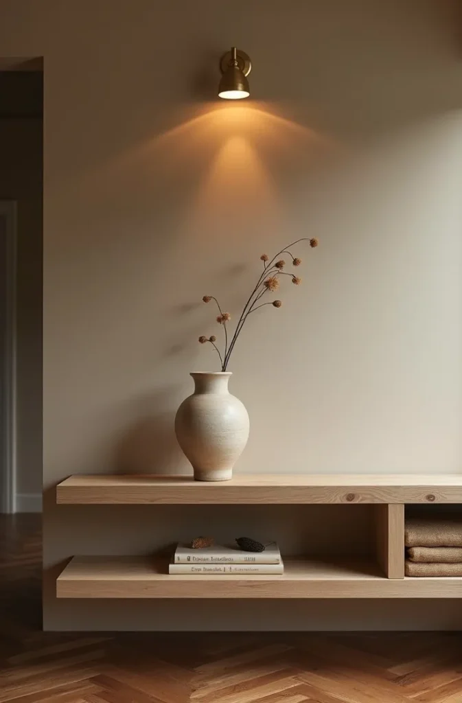
This works well in any living room using open shelving instead of a media console, which has become common in smaller apartments where a bulky cabinet eats too much floor space. Shelving keeps the storage function while keeping the floor plan open.
The mistake is choosing three objects that are all the same height and material, which reads as a display case rather than a lived-in room. Mix a ceramic vessel, a small stack of books, and one organic object like a dried branch. Picture glancing at that shelf from across the room and being able to name each object instead of seeing a blur of stuff.
9. Why Mixing Matte and Nubby Textures Is What Makes Minimalism Feel Warm Instead of Cold
The most common complaint about minimalist rooms is that they feel sterile, and it’s almost never about color — it’s about texture. A room built entirely from smooth, matte surfaces (painted walls, flat-weave fabric, glass) reads as cold no matter how warm the color palette is. Introducing one nubby, tactile texture, like a bouclé pillow or a chunky wool throw, is what makes the eye register the room as soft and touchable.
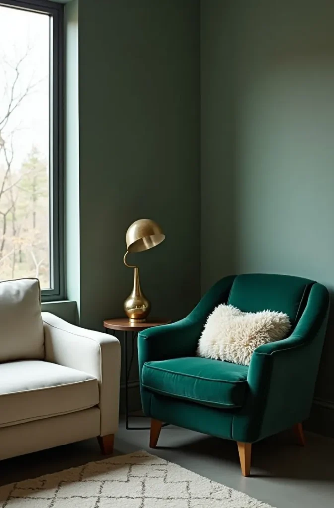
This matters most in living rooms with a lot of hard surfaces already — polished floors, glass coffee tables, painted brick — where warmth has to be introduced deliberately rather than assumed. It’s a frequent fix needed in newer apartment builds with concrete or engineered flooring.
The mistake is adding texture through pattern instead of touch, like a patterned rug, which adds visual noise without adding warmth. Choose texture you can feel, not just see. Picture running your hand across the sofa and feeling something soft and irregular rather than flat and smooth — that’s the sensation the room should deliver.
10. The Floating Furniture Layout That Makes a Small Living Room Feel Larger Than It Is
Pushing every piece of furniture against the walls is the instinctive move in a small room, but it actually makes the space feel smaller by leaving one large, empty void in the center. Floating the sofa and chairs a few inches off the walls, even slightly, and letting a rug define the seating zone instead, makes the room feel considered rather than merely fitted.
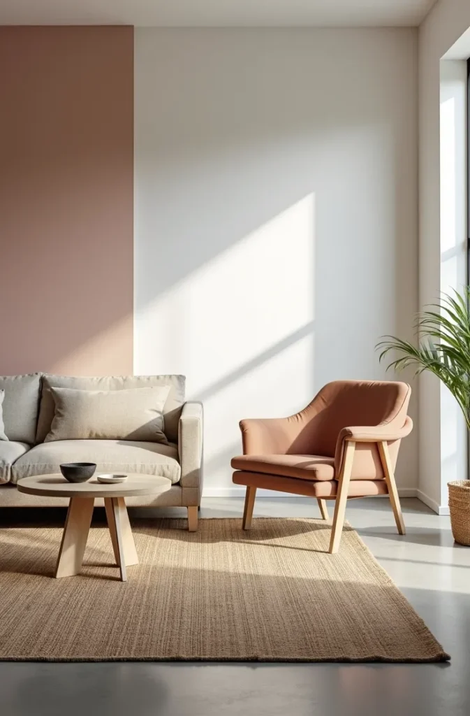
This works especially well in square or near-square living rooms, common in older California bungalows and converted rowhouse living rooms, where wall-hugging furniture leaves an awkward dead center. Floating the layout gives the room a sense of flow you can walk through rather than around.
The mistake is floating the furniture without anchoring it to a rug, which makes the arrangement look accidental rather than deliberate. The rug should extend at least under the front legs of every seating piece. Picture walking into the room and having a clear path around the furniture instead of squeezing past it.
11. Why Three Light Sources Beat One Overhead Fixture in Every Small Living Room
A single overhead light flattens a room, casting even light across every surface and erasing the shadows that give a space depth and mood. Replacing that instinct with three separate light sources at different heights — a floor lamp, a table lamp, and one accent light — creates layers of warm and dim that make even a small room feel like it has dimension after dark.
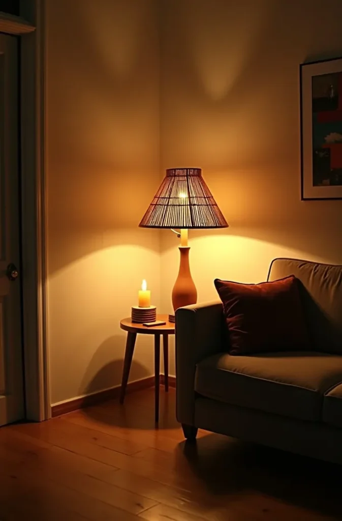
This is one of the most overlooked functional small bedroom floor plans USA principles that carries over directly into living rooms: light placement changes how a room is used, not just how it looks. It matters most in evening-heavy households, where the living room becomes the primary gathering space after dark.
The mistake is relying on cool white bulbs instead of warm-toned ones, which undoes all the mood layered lighting is meant to create. Keep every bulb in the warm 2700K range. Picture the room at eight in the evening, lit entirely by these three sources, with the overhead light off completely — that’s the test.
12. The Hidden Storage Trick That Keeps a Minimalist Living Room Looking Empty on Purpose
Minimalist rooms only stay minimalist if the clutter has somewhere to go, which is why storage strategy matters as much as furniture choice. Choosing pieces with hidden storage — a coffee table with a closed base, an ottoman that opens, a media console with solid doors instead of open cubbies — lets the visible room stay quiet while everyday items disappear out of sight.
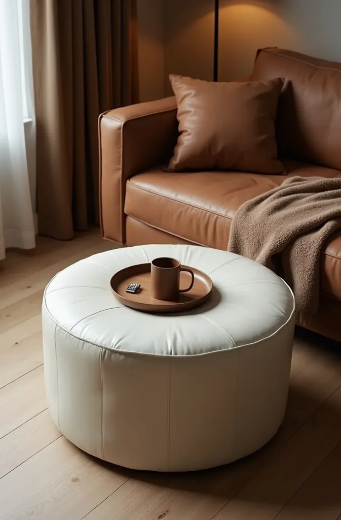
This is essential in small living rooms with no separate storage room, which describes most studio apartments and many starter homes with no basement or hall closet. The living room often has to absorb blankets, remotes, chargers, and mail with nowhere else to put them.
The mistake is choosing storage pieces that are visually heavy to compensate for their function, like a bulky wood cabinet that dominates the room. Choose one piece with a slim, curved silhouette so the storage function stays quiet too. Picture guests never realizing the ottoman they’re resting their feet on is holding every remote and charger in the house.
13. Why a Symmetrical Layout Makes a Small, Awkward Room Feel Instantly More Peaceful
Odd-shaped living rooms, especially ones with an off-center window or an awkward alcove, can feel chaotic no matter how minimal the furniture is. Introducing symmetry somewhere in the room, even just two matching chairs flanking a window or console, gives the eye an anchor point that overrides the room’s odd geometry and reads as calm.
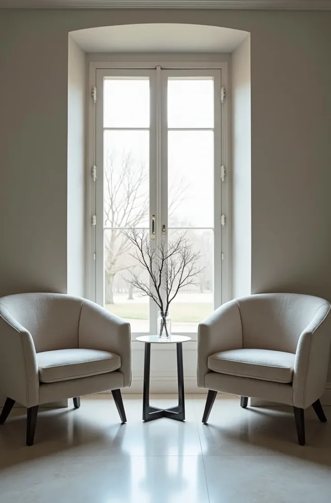
This works especially well in older homes with non-standard room shapes, common in converted rowhouses and older Midwest starter homes where living rooms were sometimes carved out of larger original spaces. Symmetry doesn’t fix the shape, but it gives the eye something orderly to focus on despite it.
The mistake is trying to force symmetry across the entire room, which only highlights the parts that can’t match. Pick one symmetrical moment — usually flanking the window or the fireplace — and let the rest of the room stay asymmetrical and relaxed. Picture standing in the doorway and having your eye land immediately on that one balanced, matching pair before it notices anything else.
14. The Single Sculptural Plant Rule for a Room That Feels Alive Without Feeling Busy
A minimalist living room with no plants at all can feel unfinished, but a room with too many small plants scattered across every surface starts to feel busy instead of calm. The fix is choosing one larger, sculptural plant — something with an interesting branch structure, like a fiddle leaf fig or an olive tree — rather than several small potted plants competing for attention.
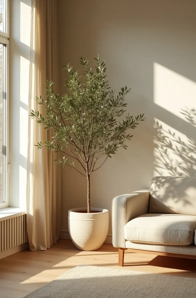
This works in nearly any living room, but it’s particularly effective in rooms with a lot of straight lines and hard edges, since a single plant’s organic shape softens the geometry without adding visual clutter the way a cluster of smaller plants would.
The mistake is placing the plant symmetrically in the center of the room, which makes it feel staged rather than natural. Push it slightly into a corner instead, where it can lean into the light. Picture that one plant catching the late afternoon sun and casting a soft, irregular shadow across the floor — that’s the moment the room comes alive.
15. The Editorial Coffee Table Formula That Makes a Minimalist Room Feel Finished
An empty coffee table can make a minimalist living room feel unfinished, but an over-styled one undoes the calm entirely. The formula that works: one stack of books, one small tray with two or three objects, and one organic element like a stem or a small bowl of something natural. Nothing more. This gives the table a sense of daily use without visual noise.
This matters most as the final layer in any minimalist living room, since the coffee table sits at the center of every sightline in the room and is the first thing most people notice after the furniture itself. It’s the detail that signals whether a room is lived in or just staged for a listing photo.
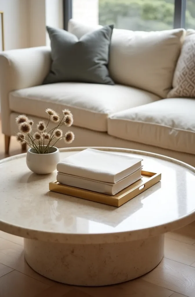
The mistake is styling the coffee table with objects that don’t relate to each other in tone or material, which reads as clutter even if there are only three items. Keep every object within the same warm material family — wood, ceramic, linen — so the small vignette feels considered rather than random. Picture a guest setting a coffee cup down and there still being a clear, obvious place to put it.
This final styling layer is what elevates simple minimalist small bedroom layout logic — restraint, repetition, one focal point — into a finished, photograph-ready living room.
Final Thoughts
You now have a real system for building a cozy minimalist living room, not just a folder of inspiration photos you’ll never quite recreate. Save this post before you start rearranging, because you’ll want to come back to it section by section as the room comes together. Consider this your working reference for every cozy minimalist living room idea worth keeping.