Most painted pots fail not because of skill level but because of poor surface prep, the wrong paint type, or a design that looks rushed rather than considered. These flower pot painting ideas solve that problem by covering the what, why, and how behind each approach — so whether you are working with terracotta, plastic, or concrete, you can choose the technique that fits your space, your materials, and your actual ability level. Every idea here is practical, not just pretty.
1. Geometric Color Block Painting That Works on Any Pot Shape
Color blocking — dividing a pot surface into two or three solid geometric sections — is one of the most forgiving flower pot painting techniques for beginners because it requires no freehand drawing skill. The design is created entirely with painter’s tape, which does the hard work of producing clean lines while you fill in flat color sections.
The reason this technique succeeds visually is contrast. A terracotta pot painted with a wide band of matte black across the lower two-thirds and left natural at the rim reads as a deliberate, modern choice. The geometric division creates structure that makes even a plain cylindrical pot look designed rather than decorated.

To get sharp lines, press the painter’s tape firmly along all edges before painting and pull it off while the paint is still slightly wet — not after it has fully dried. Waiting for full dryness causes paint to lift along the tape edge and creates a ragged line. This is the single most common mistake in geometric pot painting.
This style suits modern, minimalist, and Scandinavian-influenced interiors. It looks best in groupings of three pots at different heights using the same two-color palette, which creates a cohesive set from mismatched thrift store or nursery finds.
2. Ombre Gradient Painting for Pots That Catch Light on a Windowsill
An ombre gradient — one color fading smoothly into another — works exceptionally well on cylindrical and tapered pots because the curved surface naturally helps blend the transition zone. On a flat surface, blending requires skill; on a rounded pot, the eye accepts slight unevenness as part of the organic look.
The most functional approach for a beginner is a two-color ombre using analogous colors: colors that sit next to each other on the color wheel, such as dusty blue into sage green, or terracotta orange into coral pink. These combinations blend easily because the pigments are already close in value. Complementary color ombres (opposite colors like blue and orange) require more precise blending to avoid a muddy middle zone.
Apply the base color first across the entire pot and let it dry. Then apply the second color from the bottom up while the first color is still tacky at the midpoint — this is the zone where they meet. Use a dry brush in quick vertical strokes to pull both colors into each other. Work fast. Once either layer dries fully, smooth blending becomes very difficult.
Ombre pots are most effective in bright rooms with window light. The gradient catches and reflects directional light in a way that makes the transition appear to shift slightly as the light angle changes through the day, which adds a subtle living quality to a painted surface.
3. Terracotta Dot Painting With a Pencil Eraser for Precise Pattern Repetition
Dot painting using the eraser end of a pencil or the tip of a wooden skewer is one of the most accessible flower pot decorating approaches because the tool itself controls the dot size — no brushwork required. The pattern is created through repetition rather than artistic skill, which makes it reliably consistent even for first-time painters.
A well-executed dot design relies on planning the grid before touching paint to pot. Lightly mark horizontal rows around the pot circumference with a pencil and ruler at 1-inch intervals. Each dot placement follows the grid, which keeps the pattern even as it wraps around a curved surface. Skipping this step is why most free-hand dot attempts look uneven from the front.
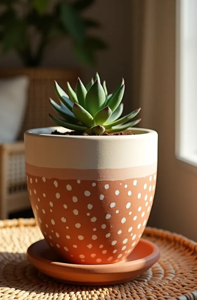
Acrylic craft paint works well for this technique. Load the pencil eraser with a small amount of paint, press straight down onto the surface, and lift straight up. Do not drag or twist — both movements distort the dot shape. Reload paint for each dot or every two dots to maintain consistent size and opacity.
This technique suits bohemian, global, and eclectic interior styles. It also works well on outdoor pots sealed with a clear exterior varnish after completion. The finished look reads as artisanal and handmade — which is exactly the aesthetic many USA homeowners are moving toward as a counterpoint to mass-produced decor.
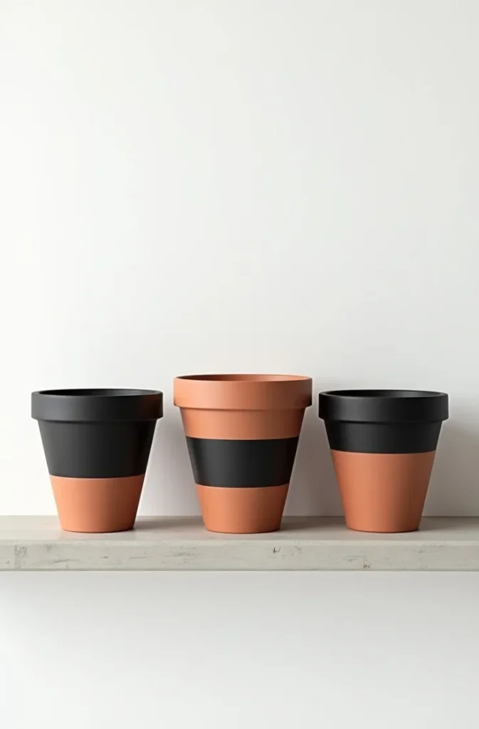
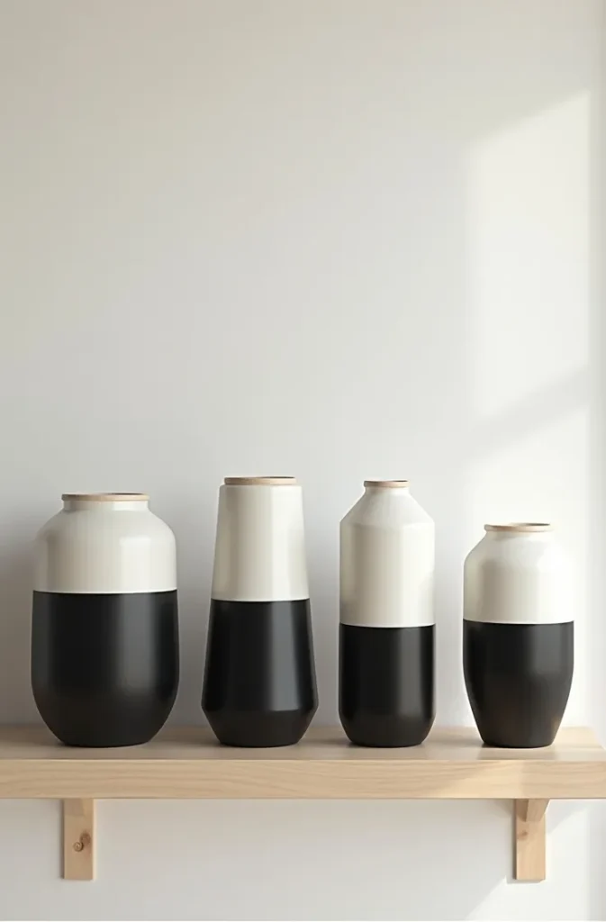
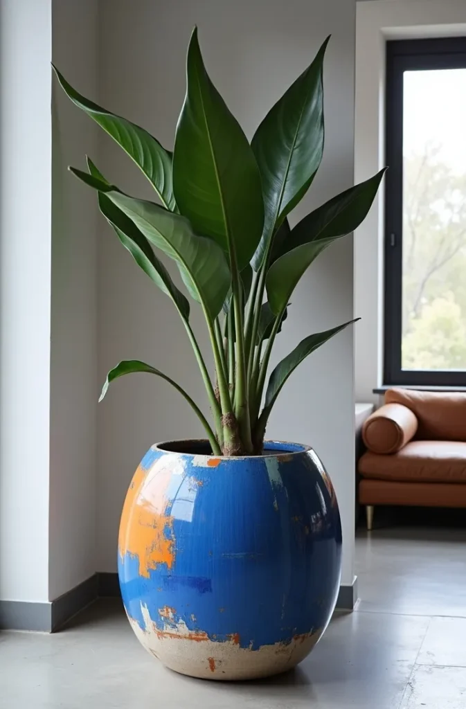
4. Matte Black Dipped Pot Painting for a High-End Look at Low Cost
A partially dipped look — where the lower portion of the pot is painted solid matte black and the upper portion is left in the original material — mimics the aesthetic of premium designer ceramics at a fraction of the cost. The technique requires no artistic skill whatsoever. It is masking tape, paint, and patience.
The proportion of the dip determines the final feel. Painting the bottom quarter looks delicate and subtle. Painting the bottom two-thirds looks bold and modern. The most versatile proportion for most USA interiors is the bottom half, which creates a balanced split that works from multiple viewing angles and does not look unintentional at any height.
Use a matte spray paint for this technique rather than brush-applied paint. Spray application produces a more uniform surface on curved pot walls than brushwork, which tends to leave visible strokes in dark colors. Apply two thin coats rather than one thick coat to avoid drips at the painted edge.
This is one of the strongest flower pot painting ideas for pots that will be grouped together because the consistent black base unifies mismatched pot shapes, sizes, and original surface textures. A grouping of five pots — round, tapered, tall, squat, and hexagonal — all with a matte black dip reads as a curated collection, not a random assortment.
5. Floral Freehand Painting on Pots for Statement Indoor Plants
Painted botanical motifs — single stems, leaf sprays, or simplified flower outlines — work well on larger statement pots because the design scale matches the pot surface area. On small pots, freehand floral painting tends to feel cramped; on pots above 8 inches in diameter, the same design reads as confident and intentional.
The key to making freehand floral painting look polished without advanced skill is simplicity of form. A single elongated leaf painted in one or two tones, or a three-petal abstract flower, communicates botanical without demanding botanical accuracy. The style that performs best is loose and gestural — similar to the lino print or block print aesthetic — rather than detailed illustration.
Use a fine liner brush for stems and vein details and a medium flat brush for filling in leaf or petal shapes. Work with a limited palette of two or three colors maximum. Backgrounds painted in a solid matte tone before adding florals are far more forgiving of brush wobble than painting directly onto the raw pot surface, which absorbs paint unevenly and makes corrections difficult.
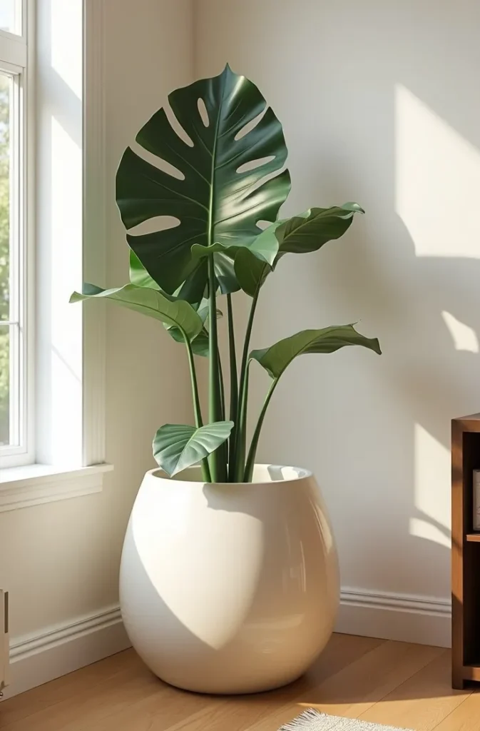
This style suits maximalist, tropical, and organic modern interior aesthetics common in USA design trends heading into 2026. It works especially well on the large floor pots used for fiddle leaf figs, bird of paradise, and monstera — plants that are already statement pieces and benefit from a pot that carries equal visual weight.
6. Striped Pot Painting in Vertical Bands for Visual Height on Short Pots
Vertical stripes elongate the visual proportions of a squat or wide pot in the same way that vertical lines in fabric make a silhouette appear taller. This is one of the few flower pot painting ideas that is fundamentally practical in its purpose — it solves a proportion problem — rather than being purely decorative.
Painting vertical stripes on a curved surface requires a different approach than horizontal stripes. Rather than wrapping tape around the pot circumference (which follows the curve), you run tape from the rim straight down to the base in parallel vertical lines. The curved surface means stripes will appear to converge slightly at the bottom on rounded pots — this is expected and reads as natural.
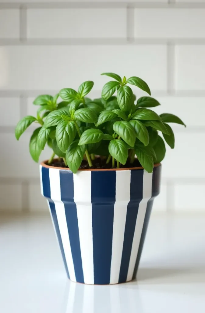
Choose stripe widths relative to pot size. On a pot under 6 inches in height, stripes narrower than half an inch become visually busy and lose their elongating effect. On a pot over 10 inches, wider stripes of 1 to 2 inches have more visual impact. Odd-numbered stripe counts — three, five, seven — distribute more naturally around a circular circumference than even numbers.
Two-tone stripe combinations work better than multicolor for this particular effect. Navy and white, sage and cream, or terracotta and black all deliver clean results that translate well to a variety of indoor settings. Multicolor stripes on a vertical format begin to read as festive or casual rather than considered.
7. Concrete Effect Painting Technique for Pots That Look Expensive
A faux concrete finish on a basic plastic or cheap ceramic pot convincingly mimics the look of cast concrete at almost zero cost. This works because concrete’s visual character — its matte surface, slight tonal variation, and fine texture — can be replicated with layered gray acrylic paint applied with a natural sea sponge.
Start with a mid-gray base coat applied with a brush. While the base is still wet, lightly dab a sea sponge loaded with a slightly lighter gray in a random, non-directional pattern across the surface. Follow with a very light touch of near-white in sparse areas only — this represents the natural surface variation of real concrete. The total paint used across all three applications should be thin. Thick application obscures the texture and reads as flat gray paint rather than concrete.
Avoid adding too much variation. Real concrete has subtle tonal movement, not dramatic patches of light and dark. The most common mistake in faux concrete painting is overworking the sponge stage — going back over areas that are already dried creates hard demarcation lines that break the illusion. Work in a single pass and leave it.
A faux concrete finished pot reads as architectural and intentional in any setting. It pairs particularly well with the industrial, raw, and Japandi-influenced interiors that have become prevalent in USA interior design, and it disguises low-cost pots so effectively that guests rarely question the material.
8. Watercolor-Style Wash Painting on Unglazed Ceramic Pots
Unglazed ceramic and raw terracotta surfaces are naturally porous, which makes them behave similarly to watercolor paper when thin, water-diluted acrylic paint is applied. This creates soft, diffused washes of color that cannot be replicated on sealed or glazed surfaces — the material itself produces the effect.
Dampen the pot surface lightly with a clean wet sponge before applying paint. Mix acrylic paint with water at a 1:3 ratio — one part paint to three parts water. Apply in large, loose brushstrokes that overlap slightly. The wet surface will cause the paint to spread softly at the edges, creating natural variation and soft color blooms without any technique required.
This approach is best for soft, muted color palettes: blush pink, dusty lavender, faded sage, and pale peach. Saturated or dark colors applied at this dilution ratio often look uneven or patchy rather than soft. Stick to light to mid-toned pigments for predictable watercolor results.
Note that pots painted this way are best kept as indoor planters unless sealed with a matte exterior varnish. The diluted paint is not weather-resistant, and direct rain will cause streaking within one season. For outdoor use, seal with two coats of matte acrylic varnish after the paint has fully cured for 48 hours.
9. Boho-Inspired Rope and Paint Combination for Textured Pot Design
Combining painted surfaces with natural rope wrapping creates a tactile, layered pot design that reads as intentional craft rather than simple painting. The rope adds a three-dimensional texture element that painted surfaces alone cannot achieve, and the interaction between the rope and paint — where paint is applied over rope sections — creates tonal variation that gives the finish depth.
The method: paint the pot fully in a base color and let it dry completely. Wrap a section of the pot — the upper rim, the lower third, or a middle band — with natural jute or cotton rope secured with adhesive at the start and end points. Then apply a light dry-brush of a contrasting or lighter paint color over the rope-wrapped section so the paint settles into the rope texture’s raised and recessed areas.
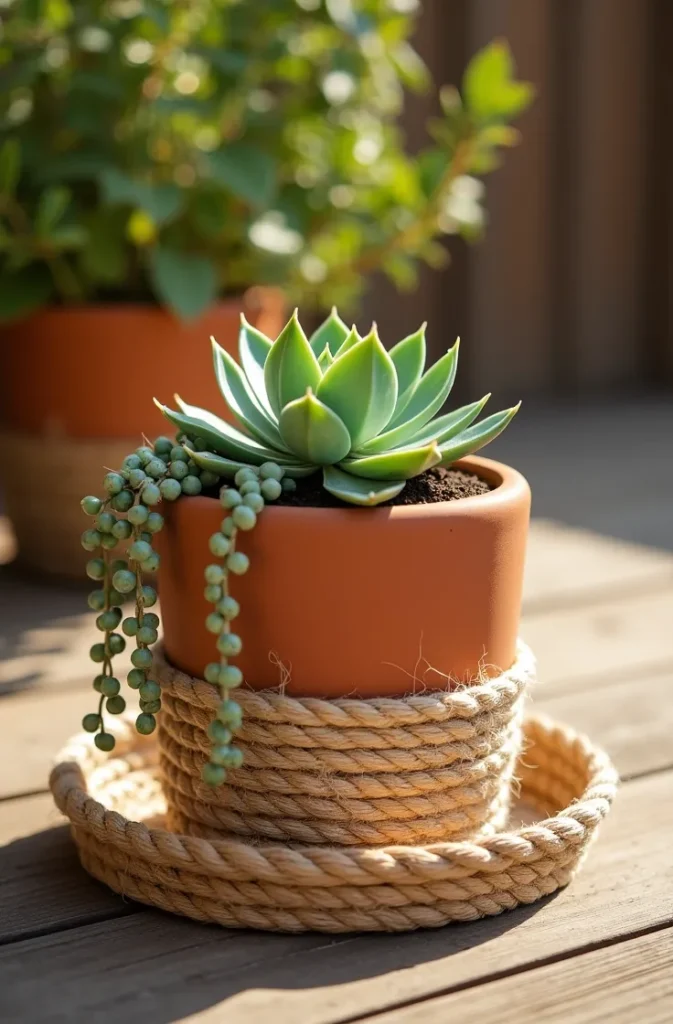
This dry-brush step is what creates the visual cohesion between the painted surface and the rope section. Without it, the rope and paint read as two separate materials simply placed together. With it, the rope appears to be part of the same designed surface.
This style works in bohemian, coastal, and organic modern settings. It is particularly effective in outdoor patio and garden spaces where the natural jute material connects the pot visually to the surrounding landscape. Use outdoor-rated rope and exterior paint if the pot will be placed outside.
10. Scandinavian Folk Art Motifs Painted on White-Based Pots
Folk art motifs — stylized leaves, berries, simple tulip forms, and geometric rosettes — are enjoying a resurgence in USA interior design as a counterpoint to ultra-minimal decor. On a painted pot, these motifs work best when kept to one or two simplified forms rather than attempting a full traditional composition, which requires considerably more skill to execute well.
Start with a solid white or off-white matte base coat as the background. Folk motifs read most clearly against light backgrounds — the simplified shapes and limited color palette of traditional Scandinavian folk painting are designed to stand out against neutral grounds, not compete with a colored background.
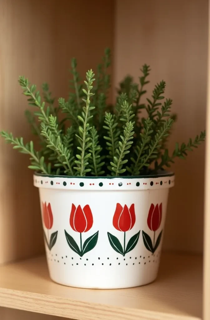
Use two or three colors only: deep red, dark green, and a small amount of black for outline details are the classic combination. Each motif element — a leaf, a dot, a curved petal — is painted as a simple flat shape with no shading or gradient. This flatness is what makes the style charming rather than amateurish. The simplified form is intentional, not a limitation.
This approach is appropriate for seasonal decorating — folk-painted pots are particularly effective as holiday and winter decor elements — but also work as year-round pieces in farmhouse, Hygge-inspired, and traditional American cottage interiors. They photograph exceptionally well against natural wood and linen backgrounds.
11. Marble Effect Pot Painting Using a Feather for Realistic Vein Lines
A faux marble finish is achievable on any smooth pot surface using a basic feather — a standard craft feather, not a specialty tool — to drag thin, irregular paint lines that mimic natural marble veining. The feather’s irregular edge produces the slight wobble and variation that makes marble veining look organic rather than ruled.
Start with a solid white or pale gray base coat. While the base is still slightly tacky, load a feather tip with thin dark gray or gold paint and drag it diagonally across the pot surface in a single continuous motion, rotating the feather slightly as you go to create variation in line width. Marble veins are never perfectly straight — rotate the pot and add secondary veins at different angles that intersect the first.
After the veins are complete, very lightly blend their edges with a clean dry brush using barely-there strokes that feather the vein edges into the background. This step is optional but significantly elevates the realism. Untouched veins have too-hard edges; lightly feathered edges look more like real stone.
Seal with a high-gloss or satin varnish. This is non-optional for a marble effect — the gloss finish is a core part of the visual illusion. A matte-sealed faux marble reads as painted rather than stone-like. Gloss varnish applied over the completed design immediately elevates the sense of depth and luxury.
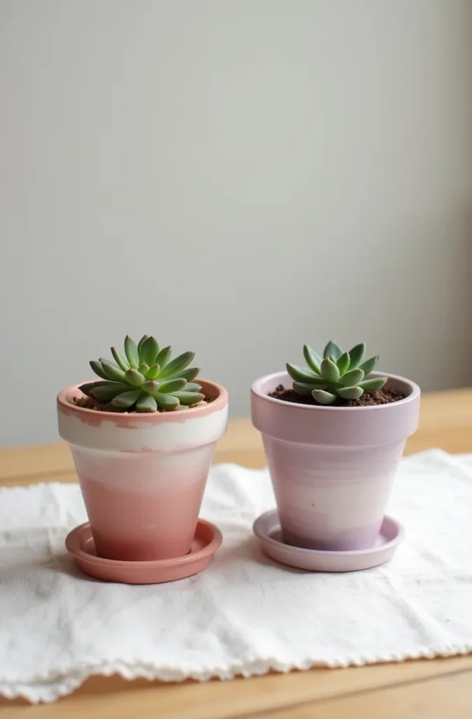
12. Two-Tone Color Wash Painting for an Aged, Mediterranean-Style Finish
A color wash technique — applying a thin, semi-transparent coat of paint over a different colored base — creates a layered, aged quality that reads as though the pot has accumulated character over years rather than hours. This approach is ideal for gardeners and homeowners who want painted pots that blend into a lived-in setting rather than looking freshly decorated.
Apply a solid base coat — terracotta orange, warm ochre, or deep rust — and allow it to dry fully. Mix the second wash color (typically white, cream, or a lighter version of the base) with water at roughly a 1:4 ratio. Apply the thin wash quickly over the entire pot surface with a wide brush, then immediately wipe back with a slightly damp cloth or paper towel before it dries. The wiped areas reveal the base color beneath; the remaining wash settles into surface texture and recesses.
On rough or textured pot surfaces, this technique is especially effective because the wash naturally settles into low areas and wipes cleanly from raised sections, emphasizing texture. On smooth surfaces, the effect is subtler but still produces a convincing aged quality.
This style is particularly suited to Mediterranean, Tuscan, Provencal, and Spanish colonial interior and outdoor settings — all of which have strong representation in USA home design, particularly in southwestern states, California, and Florida. Outdoor pots finished in this technique look naturally at home in garden settings without appearing overly decorated.
13. Abstract Brush Stroke Painting for a Gallery-Art Look on Larger Pots
Abstract gestural brushstrokes — bold, loose marks in two or three colors applied without any planned composition — produce a gallery-art quality on large pots when the color palette is controlled. The abstraction reads as artistic confidence; the limited palette keeps it cohesive. This is one of the more advanced-looking flower pot decorating ideas that is actually simple to execute.
The key is palette discipline. Choose one dominant color, one secondary accent, and one neutral (usually white or natural pot color showing through). Apply the dominant color in large confident strokes that cover roughly 50 to 60 percent of the surface. Add the accent color in smaller marks that respond to and intersect with the dominant strokes. Leave areas of the neutral background visible — negative space is what makes each stroke read as a mark rather than mud.
Use a wide flat or fan brush for the main strokes and a palette knife for sharp-edged accent marks. Both tools produce distinct stroke textures that add visual variety without requiring multiple color mixes. Load the brush or knife fully and apply in a single decisive pass — going back over wet paint with the same tool smears rather than adds.
This technique works on pots that will be placed at floor level or on large surfaces where the design can be read from a viewing distance of at least 3 feet. Up close, abstract painting on a pot can look chaotic. At a distance, it resolves into composition. Scale the stroke size to the viewing distance — larger marks for floor pots seen from across a room, tighter marks for table-height pots viewed up close.
14. Color-Coded Plant Label Painting for Practical and Beautiful Herb Pot Sets
Painting a coordinated set of pots in a color-coded system — one color per herb or plant type — solves both a practical garden organization problem and a visual design problem simultaneously. This is one of the most functional flower pot painting ideas for kitchen herb gardens, balcony container gardens, and organized outdoor spaces.
The system works by assigning each plant or plant category a specific color, then painting each pot consistently in that color using the same finish and application method. When grouped together, the set reads as a designed collection rather than a random assembly. The color-coding also makes identification quick when plants are at a similar growth stage and foliage alone is not enough to distinguish one herb from another.
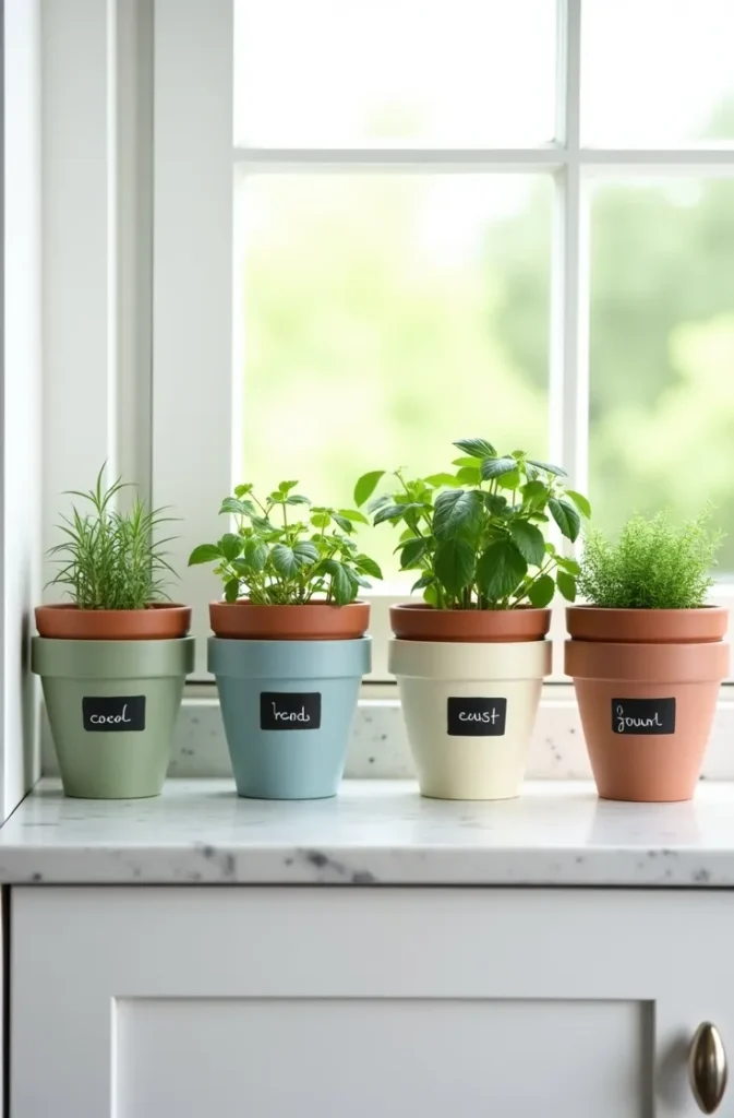
For indoor kitchen herb sets, use matte paint in a palette of muted, nature-adjacent tones — soft sage, dusty blue, pale terracotta, warm cream, and muted olive. Avoid saturated or primary colors for kitchen herb pots; muted tones read as intentional and complement food-adjacent spaces without clashing with kitchen materials and finishes.
Add a simple plant label to each pot by painting a small rectangle or circle of chalk paint on one side of the pot as a writing surface. Chalk paint accepts chalk marker or regular chalk writing, which can be erased and updated as plants change through the season. This functional detail is practical enough to justify saving this idea for anyone managing a kitchen or patio herb garden.
Save This Before Your Next Painting Project
The difference between a painted pot that looks intentional and one that looks like a craft project gone wrong almost always comes down to one decision made early: the right technique for the right surface. Every idea in this list matches a specific pot material, skill level, and interior context — which means returning to this post when you are standing in front of your actual pot with paint in hand will give you a faster, better result than starting from scratch.
If any of these flower pot painting ideas fit what you are working on, save this post now so you can come back to it at the right moment. Share it with anyone tackling a container garden refresh or a quick home decor update this season.
For more DIY home decor content, explore related guides on painted planter arrangements, outdoor container garden design, and seasonal pot grouping ideas for patios and porches.