The iconic 2000s teen bedroom decor era had a specific visual language — layered, maximalist, personalized — and that language is being rediscovered by a new generation of interior enthusiasts who want personality back in their spaces. This guide breaks down 12 of the most defining decor elements from that decade, explaining exactly what made each one work, how to revive it without it feeling dated, and when it belongs in a modern room. Whether you are recreating nostalgia or encountering these ideas fresh, every section here is built to help you make a real design decision.
1. The Sheer Canopy Bed Drape That Turned a Basic Bed Into a Personal Sanctuary
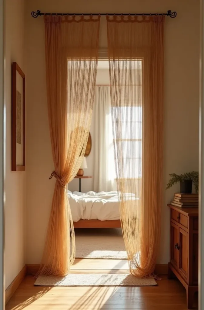
Nothing defined the 2000s teen bedroom aesthetic more immediately than sheer fabric draped from the ceiling over the bed. A single ceiling hook centered above the headboard, a length of iridescent or white sheer fabric gathered at the top and falling in soft columns on either side — it was one of the most affordable ways a teenager could make a bed feel like it belonged in a different world entirely.
The reason it worked is spatial psychology. Fabric that frames the bed creates a visual enclosure around the sleeping zone without adding walls or furniture. The bed becomes a room within a room. In a shared bedroom or a small space with no architectural detail, the canopy gave the sleeping area instant definition and intimacy.
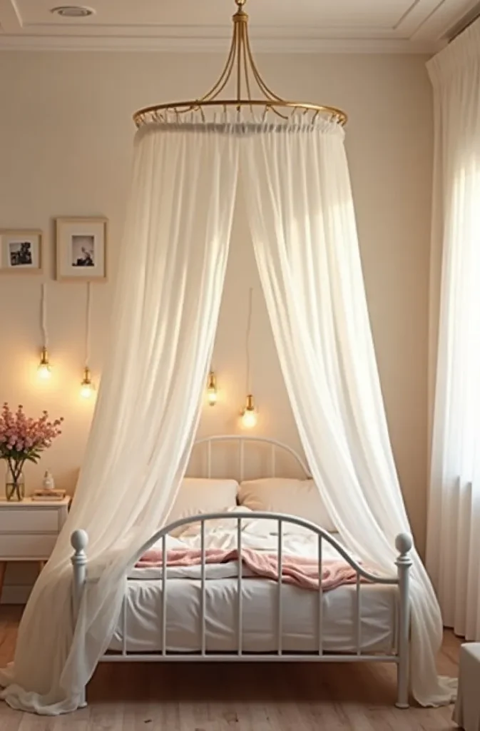

To bring this back without the dated execution, replace iridescent or tulle fabric with a natural-fiber alternative — linen, cotton voile, or a loosely woven cotton gauze. Mount from a ceiling-fixed circular frame (available at most home goods stores) rather than a single central hook for a cleaner silhouette. Keep the fabric in one color only: white, ivory, or a very pale blush.
The mistake to avoid is using too much volume. The 2000s version often used excessive yardage that pooled heavily on the floor. A cleaner contemporary take uses fabric that just grazes the mattress level on each side — enough to frame the bed without overwhelming the room.
2. The Collage Wall of Magazine Cutouts That Was the Original Pinterest Board
Before Pinterest existed as a platform, the teen bedroom wall served the same function. Magazine cutouts, printed photographs, postcards, ticket stubs, and handwritten quotes covered entire walls in dense, overlapping arrangements that documented taste, aspiration, and identity in physical form. This was 2000s teen bedroom decor functioning as genuine self-expression.
The collage wall worked because it was democratic — there was no wrong way to do it, no minimum budget, and the result was always specific to the person who made it. That specificity is what gave it visual power. Even from across the room, a collage wall communicated who lived in that space.
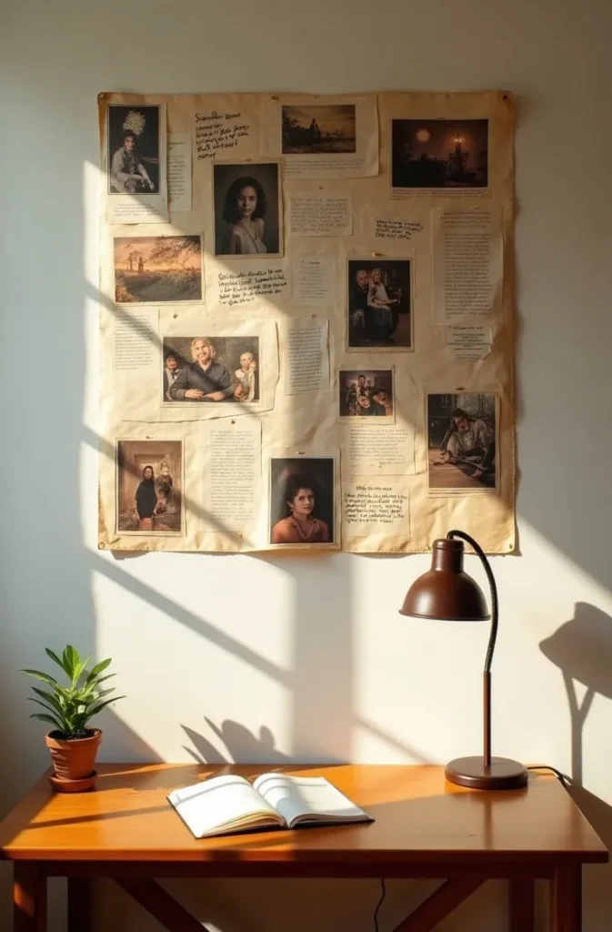
The modern revival of this approach differs primarily in curation. The 2000s version was often comprehensive to the point of saturation. A contemporary take is more selective: a defined section of wall — perhaps a four-foot-wide panel beside the desk or above a low dresser — with images arranged in a loose grid rather than chaotic overlap. The palette of the images should be loosely consistent. All warm tones, or all black-and-white, or a mix anchored by one recurring color.
Print images at a consistent size for a more cohesive version, or vary sizes deliberately for a layered effect. Washi tape or removable adhesive strips are the correct mounting method — both allow rearrangement without wall damage, which the original pushpin version did not permit.
3. The String Light Ceiling Installation That Made a Bedroom Feel Like Permanent Golden Hour
String lights strung across a bedroom ceiling — not just along one wall but draped in parallel rows from one wall to the other, covering the full ceiling plane — was one of the defining visual signatures of 2000s teen bedroom aesthetics. When every other light in the room was turned off, a ceiling covered in warm mini bulbs produced a light quality that no other affordable fixture could replicate.
This worked because of the quality of light it produced: warm, omnidirectional, and extremely low-intensity. It was the opposite of harsh overhead lighting, and in a room used for socializing, creative work, and rest, that softness was a genuine functional benefit.
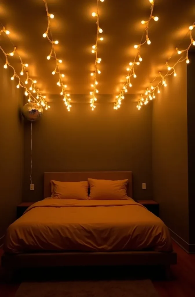
The contemporary version upgrades the execution in two ways. First, use warm-white LED string lights rather than incandescent mini lights — the color temperature should be 2700K or warmer to maintain the golden quality. Second, mount the strings on small ceiling hooks in clean parallel rows rather than tacking them randomly. Rows should be spaced approximately twelve inches apart for even coverage without visible gaps.
This approach works best in rooms with eight-foot or lower ceilings — the light effect is most pronounced and intimate at that height. In taller rooms, the strings feel disconnected from the living space below.
4. The Bulletin Board Gallery Wall That Made Organization Look Like Decoration
The oversized cork bulletin board — or a cluster of smaller boards arranged in a grid — was a fixture of 2000s teen bedroom decor that served genuine dual function. It held schedules, phone numbers, school papers, and concert tickets while simultaneously acting as a dynamic, ever-changing wall display. Unlike a static gallery wall, a bulletin board arrangement was always in flux.
The reason this approach held up aesthetically was the layering effect. Items overlapped, were pinned at angles, and accumulated over time into a composition that no deliberate arrangement could replicate. The board was a record of time passing, not a styled moment.
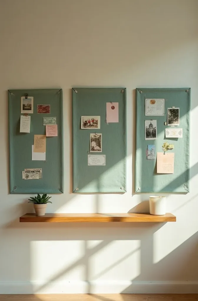
The modern version improves the execution without losing the function. A linen-covered bulletin board panel — fabric stretched over a standard cork board — reads as far more refined than bare cork. Dark linen, sage green, or a terracotta linen cover transforms the board from utilitarian to intentional. A collection of three matching-size boards in a horizontal row creates a more architectural arrangement than a single oversized board in most room configurations.
Mount boards at eye level for the specific user. A teenager using the board at a standing desk will want it higher than someone primarily seated. The functionality collapses if the board is mounted too high to interact with comfortably.
5. The Layered Rug Over Carpet Trick That Added Texture Without Replacing the Floor
In most American homes, teenage bedrooms had wall-to-wall carpet — typically a builder-grade neutral that offered no design input. The 2000s solution was layering a printed or textured rug directly on top of the carpet, usually centered in the room or positioned beside the bed, to introduce color and pattern without touching the underlying floor.
This was practical design problem-solving. Carpet cannot be replaced in a rental or a family home without significant cost and permission. A layered rug costs a fraction of flooring replacement and can be rolled up and taken to the next room.
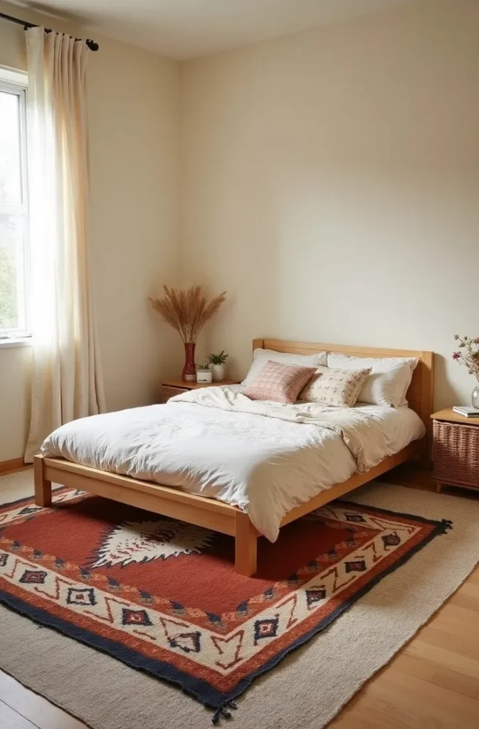
The contemporary version of this approach is more considered in rug scale. The 2000s execution often used rugs that were too small — a three-by-five rug on a room-sized carpet looked like a bath mat. For a layered rug to read as a design decision rather than an afterthought, it needs to be large enough to extend beyond the bed frame on at least two sides, or large enough to define a distinct zone in the room.
A woven cotton rug, a jute natural fiber rug, or a flat-weave kilim-style rug all layer well over carpet without creating a tripping hazard at the edges. Avoid high-pile rugs on carpet — the instability and edge curl are both functional and visual problems.
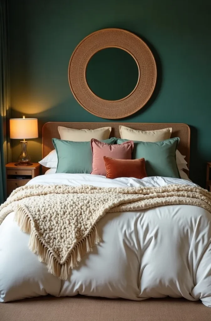
6. The Painted Accent Wall in a Bold Color That Made One Surface the Entire Room’s Personality
At a time when the rest of the house was painted in builder beige and safe neutrals, painting one bedroom wall in a saturated, unapologetic color — hot pink, electric blue, deep plum, lime green — was an act of genuine spatial autonomy. The accent wall in iconic 2000s teen bedroom decor was not a subtle design choice. It was a declaration.
The logic behind the single accent wall is sound regardless of era: introduce significant color on one surface, keep the other three neutral, and the room gains visual energy without feeling enclosed. The color on a single wall advances toward the viewer, creating a sense of depth that an all-neutral room lacks.
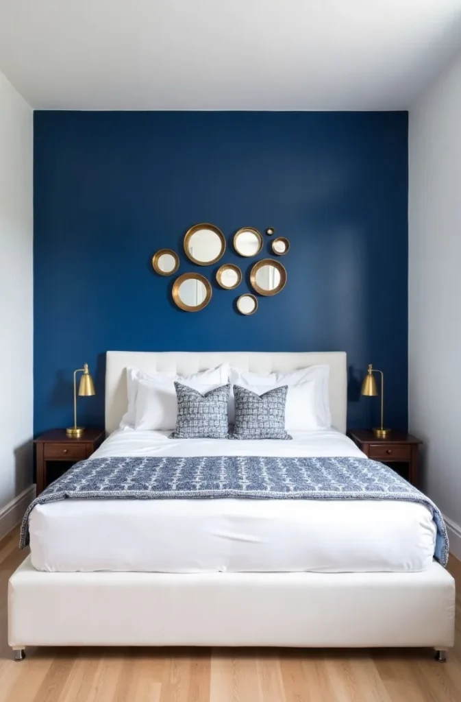
The contemporary take updates the color palette while keeping the principle. Instead of high-saturation primaries, consider deep jewel tones — burgundy, forest green, cobalt, ochre — that have more complexity and age better over time. The accent wall should be the wall the bed or the desk faces — the surface that creates the backdrop for the room’s primary activity.
The most common mistake with accent walls in small rooms is choosing a color that is so high in saturation it cannot be balanced by anything else in the space. Test the color on a two-foot square section first and view it at different times of day before committing to the full wall.
7. The Vanity Mirror With Surrounding Bulbs That Brought the Backstage Dressing Room Into the Bedroom
The Hollywood-style vanity mirror — a large mirror surrounded by exposed globe bulbs — was one of the most recognizable pieces of 2000s teen bedroom decor. It brought a specific aspirational quality into the bedroom: the aesthetic of a performer’s dressing room, translated into a space where getting ready for school became a ritual.
The bulb-surrounded mirror worked because the lighting it produced was genuinely functional for makeup application and styling — frontal, even illumination without shadows. Every other light source in a standard bedroom creates asymmetric shadowing. The vanity mirror solved a real grooming problem while looking visually distinctive doing it.
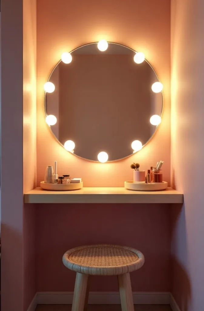
The modern version of this setup has improved significantly in light quality. LED globe bulbs at 3000K produce a warm, flattering light quality equivalent to traditional incandescent bulbs at a fraction of the energy cost. The mirror itself should be large — at minimum 24 inches wide for practical use — and mounted at a height where the center of the mirror aligns with the user’s face while seated.
Position the vanity against a wall with no window directly beside it. Side windows create competing light sources that cancel the even-illumination advantage of the bulb surround. A windowless wall or a wall where a blackout curtain can be closed during use is the correct placement.
8. The Floor Cushion and Pouf Seating Zone That Replaced the Chair Nobody Actually Sat In
The 2000s teen bedroom frequently had a zone on the floor — a large floor cushion, a round pouf, a stack of oversized pillows, sometimes a small loveseat pushed against a wall — that served as the social hub of the room. Friends gathered there, not on the bed. Homework happened there. This was the predecessor of the floor seating arrangements that later defined the hygge aesthetic.
It worked because it was proportioned correctly for the scale of the room and the age of the user. A teenage bedroom is not a formal living room. Low-to-the-ground seating that can be moved, stacked, or pushed aside is more appropriate to how that space is actually used than a desk chair or an armchair that cannot be rearranged without effort.
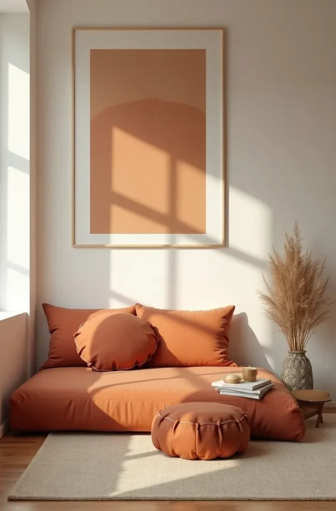
The modern take on this zone starts with one large floor cushion in a durable, spot-cleanable fabric — a canvas, a cotton-canvas blend, or a performance fabric — filled firmly enough to hold its shape rather than collapsing under use. Add a second smaller round pouf as a footrest or secondary seat. A flat-weave rug beneath the zone defines it as a deliberate seating area rather than an accidental floor pile.
Keep the zone against a wall, not in the center of the room. Floor seating in the middle of a small bedroom creates a navigation obstacle. Against the wall, with cushions stacked when not in use, it occupies minimal footprint and reads as intentional.
9. The Over-Door Shoe and Accessory Organizer That Turned Wasted Space Into a Functional Display
The over-door hanging organizer was one of the most practically influential pieces of 2000s teen bedroom decor. Originally designed for shoes, its clear-pocket format proved equally effective for hair accessories, jewelry, craft supplies, and the accumulation of small items that otherwise colonized every horizontal surface in the room.
It worked because it exploited a consistently overlooked storage plane: the back of the door. In a small bedroom where wall space was at a premium and floor space was fully occupied, the door back offered 15 to 20 square feet of usable storage surface that required no installation hardware beyond the door frame.
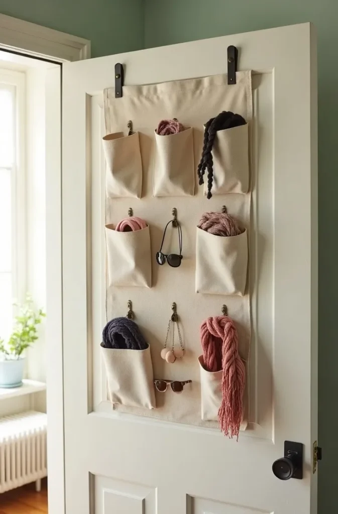
The contemporary version upgrades the material. The original execution used a clear vinyl pocket organizer — functional but visually utilitarian. A linen or cotton canvas version with individual pockets reads as a considered textile rather than a storage product. Some versions now include a small mirror panel, making the over-door organizer into a combined storage and grooming station.
Reserve this solution for items used frequently — daily accessories, current-season shoes, items that need to be visible and accessible. If the pockets fill with items rarely used, the organizer becomes visual clutter that the door half-conceals. Edit regularly to maintain the functional benefit.
10. The Beaded Curtain Room Divider That Gave a Shared Space Its Own Identity
The beaded curtain hanging in a doorway or across an open closet was a near-universal element of the 2000s teen bedroom decor toolkit. Hanging in doorways, closet openings, or as a room divider in a shared bedroom, the beaded curtain created a sense of threshold — a boundary that was permeable but present.
The function was more spatial than physical. A beaded curtain does not block sound or provide meaningful privacy. What it does is create a visual boundary that signals a transition between zones. In a shared bedroom, this signal matters considerably — it establishes that the space has distinct territories even when no wall separates them.
The material of the beads determines the final aesthetic entirely. Shell or natural wood beads read as bohemian and organic. Faceted crystal or acrylic beads read as the maximalist 2000s original. Black rubber or matte metal beads read as industrial and contemporary. The bead material is the most important decision in determining whether the result feels dated or current.
Hang the curtain from a tension rod for installation-free placement, or from a ceiling-mounted curtain track for a more architectural finish. Length should reach the floor — short beaded curtains that end at mid-wall look unfinished and fail to create the threshold effect.
11. The Personalized Initial and Word Wall Art That Made Typography a Bedroom Fixture
Large-scale letter and word wall art — metal initials, wooden block letters, framed typographic prints, vinyl wall decals with quotes — was one of the most visually recognizable categories of 2000s teen bedroom decor. An oversized initial above the bed, a word like “DREAM” or “CREATE” spelled out in individual wooden letters on a shelf, a vinyl quote spanning the full width of a wall — these were the decade’s equivalent of putting your name on your belongings, scaled to architecture.
It worked as a design decision because it solved the blank wall problem directly and personally. Generic art says nothing specific about the person in the room. A first initial or a word with personal resonance says everything immediately. In a space defined by identity-formation, that specificity had real emotional value.
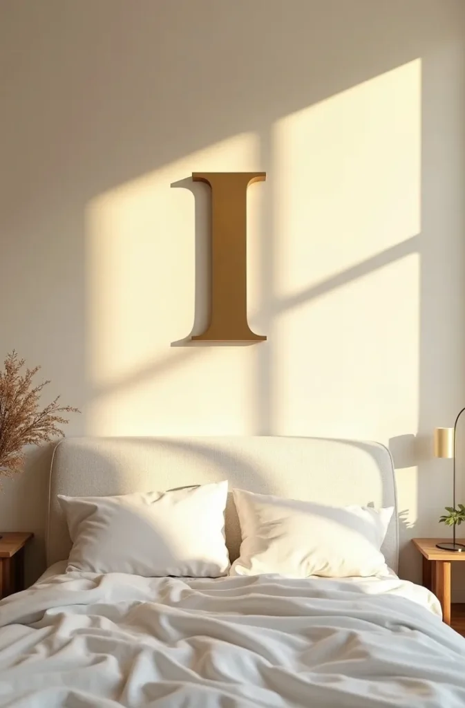
The contemporary version of this approach narrows the execution considerably. One typographic element per room is sufficient — more than one creates redundancy. The format that ages best is a single high-quality framed typographic print in a classic serif or clean sans-serif typeface, rather than dimensional wooden or metal letters. The print can be swapped easily as taste changes; wooden letters leave nail holes and commitment.
If dimensional letters are preferred, use a single letter in a material that contributes texture — raw brass, painted plaster, concrete — rather than painted MDF or plastic. Scale it correctly: a single letter above the bed should be at least twelve to fourteen inches tall to register as a design element rather than a small accent.
12. The Maximalist Throw Pillow and Textile Stack That Made the Bed the Room’s Centerpiece
The 2000s teen bedroom bed was rarely just a bed — it was a layered, cushion-covered platform that functioned as sofa, study surface, and social seating. Multiple throws in different textures, eight or more decorative pillows in varying sizes, a mix of patterned and solid fabrics piled together — the bed was the room’s most expressive surface and its primary design statement.
This worked because it made a low-investment, renter-friendly statement. Every element on the bed was removable and replaceable. The result could be updated seasonally with no cost to the wall or floor. In a room where permanent changes were limited, the bed surface was the one design zone with total freedom.
The contemporary application of this principle tightens the execution without eliminating the abundance. Start with a base layer — a high-quality duvet cover in a solid or subtle texture — then add a folded throw in a contrasting texture across the foot of the bed. Build the pillow arrangement in three layers: sleeping pillows in white cases at the back, two Euro squares in front of those in a coordinating fabric, and two or three decorative cushions in varied sizes at the front. This three-layer structure creates the appearance of abundance while remaining manageable enough to actually sleep in.
The mistake to avoid in the layered textile bed is mixing too many contrasting patterns at the same scale. One large-pattern element — a quilt, a heavily printed duvet — paired with solid or subtle-texture everything else produces a rich result. Two competing bold patterns at the same scale produce visual noise.
Final Thoughts
The iconic 2000s teen bedroom decor era produced specific, recognizable design moves that worked because they were personal, layered, and low-commitment. The best elements of that era were never about buying a particular product — they were about using what was accessible to make a space feel like it belonged to someone specific.
Save this post before you start planning a room refresh. Whether you are recreating full nostalgia or borrowing just one or two elements to bring personality into a modern space, every idea here is grounded in why it works — not just that it does. When you are ready to go further, explore 2000s-inspired color palette ideas and small bedroom layout strategies that bring these decor elements together into a complete, cohesive room design.