
Modern minimalist living room ideas so often promise calm but deliver something closer to sterile — a room that looks good in photos and feels strangely uninviting to actually sit in. You have decluttered, chosen neutral colors, kept things simple, and still your living room feels more like a waiting room than a space you want to spend your evenings in. By the end of this guide, you will know exactly which layout, material, and lighting decisions separate a minimalist room that feels warm and intentional from one that just feels empty.
The Low-Profile Furniture Trick That Makes a Minimalist Living Room Feel Larger
Most minimalist living rooms feel cramped for one simple reason — the furniture sits too high off the ground, cutting the room’s sightlines into small, boxy segments. Swapping a standard-height sofa and coffee table for low-profile pieces, typically 28 to 30 inches or shorter, opens up the visual field above the furniture line and lets the eye travel all the way to the far wall uninterrupted. This is one of the most reliable modern minimalist living room ideas for apartments with lower ceilings or a single dominant window, because it keeps the ceiling and wall space feeling tall and open rather than compressed.
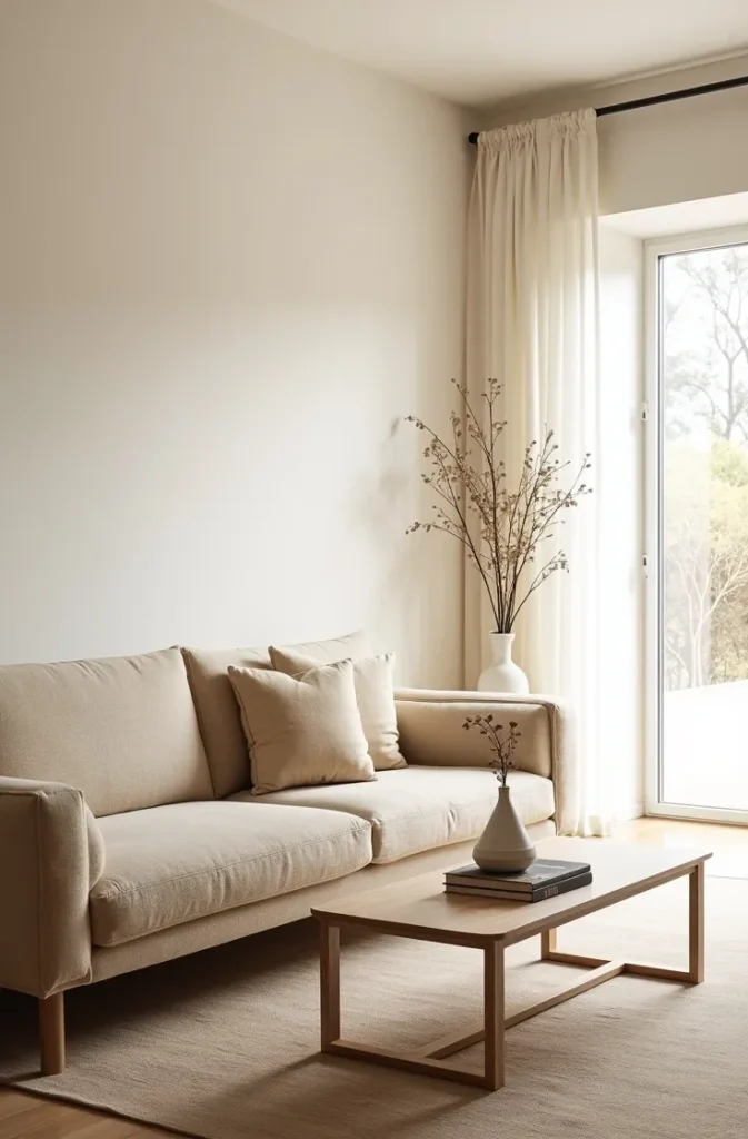
This works especially well in New York and Chicago apartment living rooms where ceiling height is limited and every visual inch matters. It also suits open-concept layouts in newer builds, where a low sofa doesn’t block the sightline into the kitchen or dining area. The mistake to avoid is pairing low furniture with a tall, bulky media console — the mismatch in scale undoes the effect entirely. Picture your current sofa a few inches lower and notice how much more ceiling you suddenly have.

Why a Single Statement Piece Beats a Room Full of Decor
The instinct in a minimalist room is to remove everything, but a room with nothing to look at reads as unfinished, not intentional. One well-chosen statement piece — a sculptural floor lamp, a curved-arm accent chair, an oversized abstract piece of art — gives the eye a place to rest and signals that every other decision in the room was deliberate. This is the difference between minimalist living room decor ideas that feel curated and ones that feel like a room mid-move.
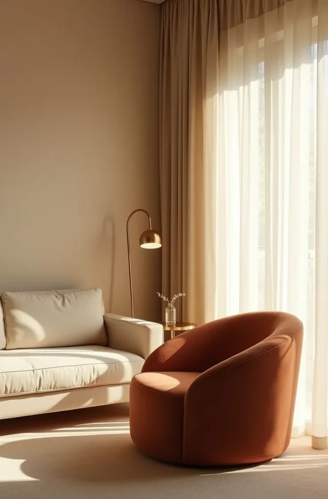
This approach works best for people who already own too much and are trying to edit down, rather than people furnishing from scratch. Choose the one piece with the most interesting shape or texture in the room, then let everything else go quiet around it. The mistake most people make is choosing a statement piece that’s purely decorative and forgettable — a plain vase, a generic print — instead of something with real sculptural presence. Think about which single object in your living room, if it were the only interesting thing left, would still make guests pause.
The Warm Neutral Palette That Keeps Minimalism From Feeling Cold
Cool grays and stark whites photograph well in showroom lighting but turn flat and clinical the moment ordinary daylight hits them. A warm neutral palette — built from oatmeal, greige, soft terracotta, and warm white — holds its richness in every kind of light, from morning sun to evening lamp glow, which is exactly why it’s one of the more dependable modern minimalist living room ideas for rooms that get uneven natural light throughout the day. Warm undertones also make a room feel lived-in rather than staged, which matters more than most people expect once the room is actually being used daily.
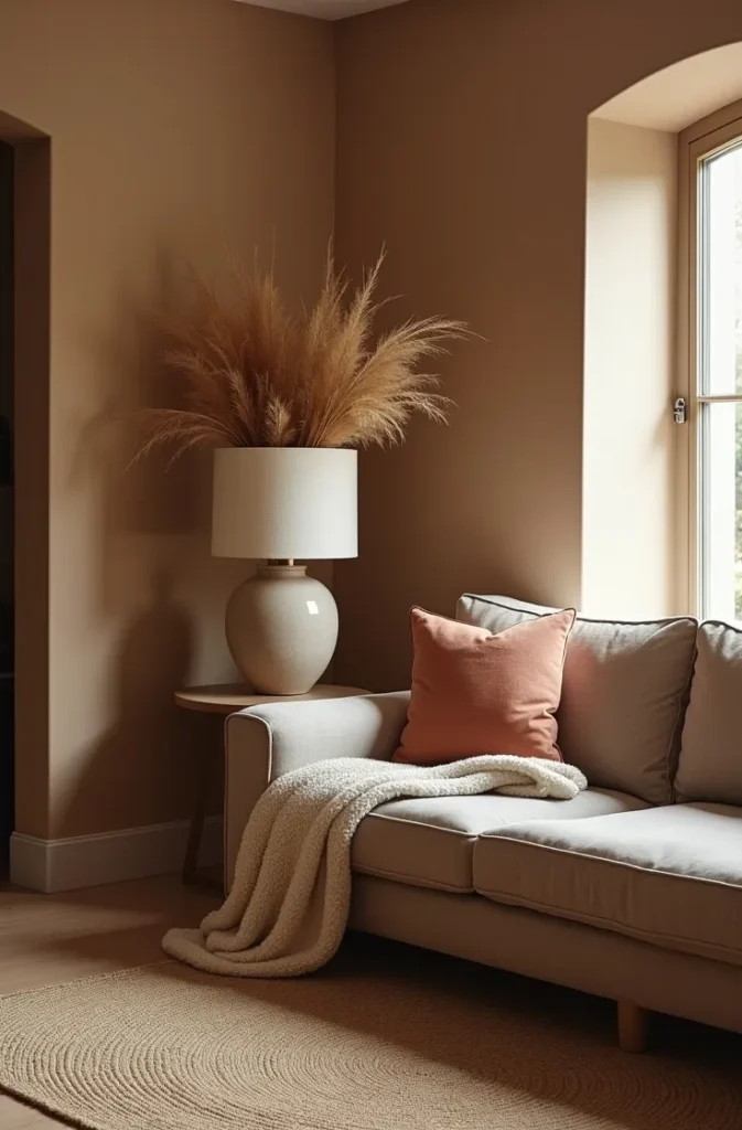
This palette works particularly well in California bungalows and Texas ranch-style homes, where natural light tends to run warm and cool grays can look muddy or gray-green by comparison. It’s also a smart fix for basement or north-facing living rooms that get mostly indirect, cooler daylight. The mistake to avoid is mixing warm neutrals with cool-toned metals like chrome or brushed nickel — the clash reads as unresolved rather than intentional. Stick to warm metals like brass or bronze and the whole palette locks into place.
How a Curved Sofa Softens a Sharp-Edged Minimalist Space
Minimalist rooms lean heavily on straight lines — square sofas, rectangular rugs, boxy shelving — and after a while that much geometry starts to feel rigid instead of restful. A curved or gently rounded sofa breaks that grid without adding visual clutter, because the softness comes from shape rather than pattern or color. It also changes how people move through the room, since a curved silhouette naturally opens the seating area toward a conversation rather than lining everyone up shoulder to shoulder.
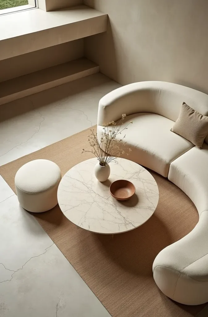
This is one of the small living room layout ideas that works especially well in open-concept spaces where the sofa needs to define the living area without a wall to anchor it. It’s also a strong choice for shared living rooms in multi-generational homes, where the curved shape invites a more social seating arrangement. The mistake to avoid is placing a curved sofa against a perfectly straight wall with nothing to echo its shape — pair it with one other rounded element, like an arched mirror or round coffee table, so the softness feels considered rather than accidental. Imagine the difference in how a room feels when the seating itself seems to welcome you in.
The Hidden Storage Layout That Keeps Minimalist Rooms Clutter-Free
A minimalist living room only stays minimalist if there’s somewhere for everyday clutter to actually go — remotes, chargers, mail, throw blankets. Building storage into furniture you’d already have, like an ottoman with a lift-off lid or a console with closed cabinet doors instead of open shelving, means the clutter disappears the moment it’s no longer in use, rather than requiring a separate storage solution that competes for visual space. This is the quiet mechanic behind minimalist living room ideas for apartments that actually hold up under daily life instead of just looking good for one photo.
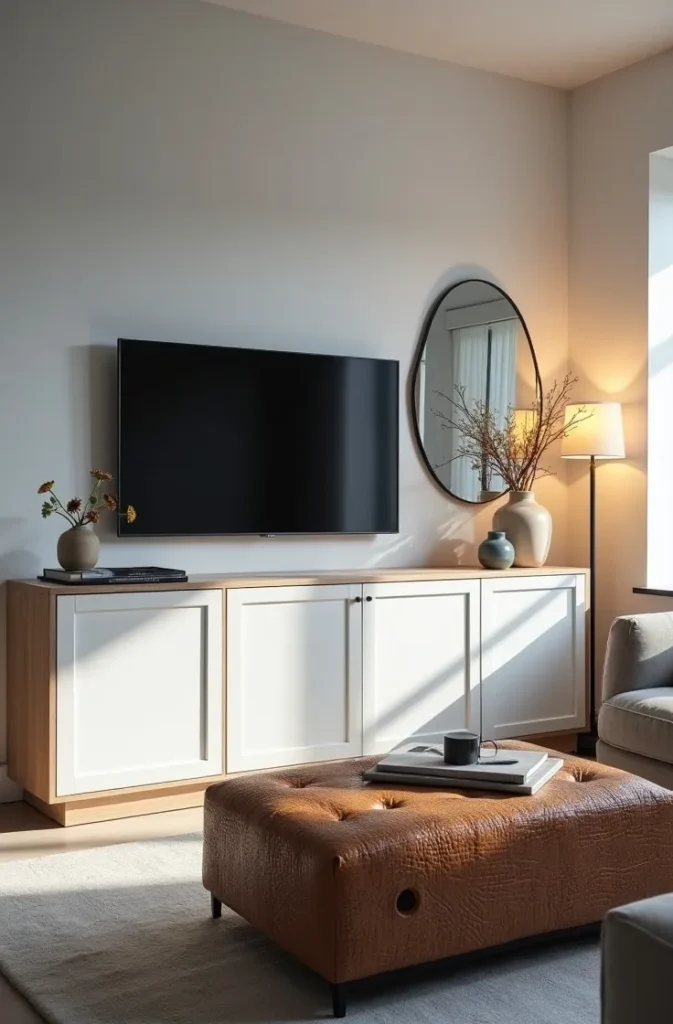
This layout works best for smaller living rooms doubling as a catch-all space, especially in studio apartments where the living room absorbs overflow from the rest of the home. It’s also useful for households with kids, where toys and school supplies need a fast, invisible landing spot. The mistake to avoid is choosing open shelving as your only storage — open shelving displays everything, which means it has to be styled perfectly at all times or the whole room reads as messy. Picture the fifteen seconds it takes to lift a lid and drop something inside, compared to the daily effort of keeping open shelves photo-ready.
Why Negative Space Is the Most Underrated Design Tool in a Small Living Room
Negative space — the empty wall, the bare corner, the untouched stretch of floor — is not a gap to be filled, it’s what makes the furniture and decor you do have feel deliberate instead of crowded. In a small living room, leaving one wall completely empty, or one corner free of furniture entirely, gives the eye a place to pause and makes the rest of the room read as more spacious by contrast. This is a core principle behind minimalist living room ideas on a budget, since the cheapest way to make a room feel more expensive is often to simply add less.
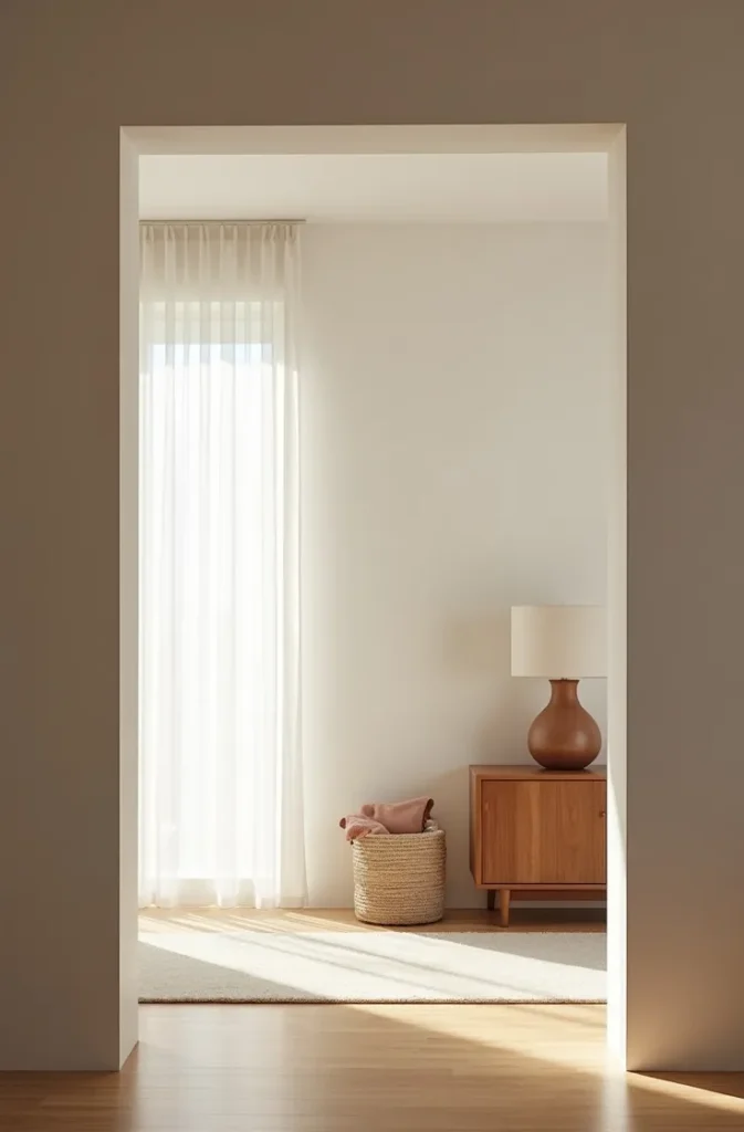
This works particularly well in small rectangular rooms common in Midwest starter homes, where every wall tends to get filled out of habit rather than necessity. It’s also useful in rental living rooms where you’re working with a fixed, awkward layout and want to avoid it feeling boxed in. The mistake to avoid is treating negative space as unfinished and rushing to fill it with a plant, a lamp, or a small shelf — give it at least a few weeks before deciding it needs something. Try standing in your living room doorway and picking the one wall that could stay completely bare.
The Layered Lighting Formula That Makes Minimalist Rooms Feel Inviting, Not Empty
A single overhead ceiling light is the fastest way to make a minimalist living room feel like a hallway rather than a place to unwind. Layering three light sources at different heights — a floor lamp, a table lamp, and one accent source like a picture light or LED strip — creates pools of warm light throughout the room instead of one flat wash, which is what actually reads as cozy rather than the color of the walls or the softness of the sofa. This is one of the modern minimalist living room ideas that costs the least to implement and changes the feeling of the room the most.
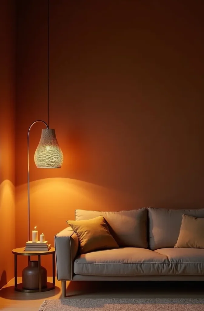
This matters most in the evening, when a minimalist room with only overhead lighting can feel closer to an office than a living space. It’s especially worth prioritizing in living rooms that double as a work-from-home space during the day, since the transition from work mode to rest mode often depends more on lighting than anything else in the room. The mistake to avoid is choosing lamps with cool white bulbs — even a beautifully designed room will feel sterile under the wrong color temperature. Picture switching off the overhead light entirely one evening and see how the room changes with just the lamps on.
How to Anchor a Minimalist Living Room Without a Rug That Disappears
A rug that’s too small or too pale simply vanishes into a minimalist room, leaving the furniture looking like it’s floating without any grounding. Choosing a rug with texture rather than pattern — a chunky wool weave, a subtle herringbone, a slightly nubby wool-blend — anchors the seating area visually without breaking the minimalist palette, since the texture reads as depth rather than decoration. This is one of the small master bedroom and living room layout ideas people underestimate, because the rug is often the last thing chosen and the first thing that makes or breaks the room’s sense of scale.
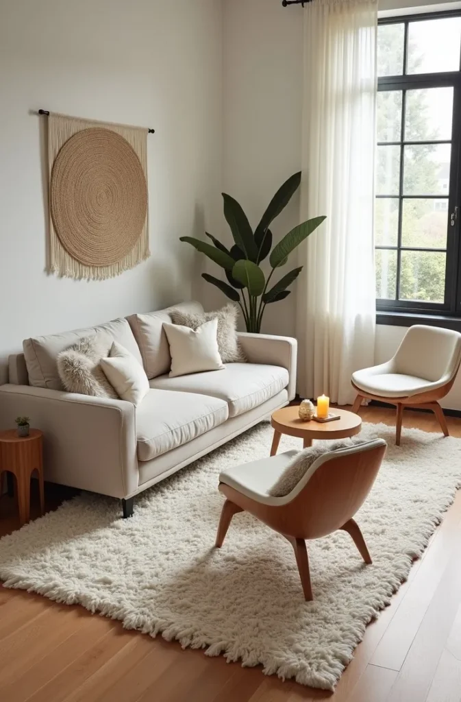
The general rule that works in most American living rooms is sizing the rug so the front legs of every seating piece sit on it — anything smaller makes the furniture look untethered. This matters most in open-concept homes where the rug is doing the job a wall would normally do, defining where the living area starts and ends. The mistake to avoid is choosing a rug that matches the sofa color too closely — with no contrast in texture or tone, the whole seating area blurs into one indistinct shape. Picture the rug as the one piece of “furniture” in the room that never has to be tidied, and choose it with that kind of permanence in mind.
The Texture Rule That Keeps an All-Neutral Room From Looking Flat
When every surface in a room is the same color family, texture becomes the only thing doing the work of visual interest — and most minimalist rooms fail here by choosing every material in the same smoothness, which reads as flat under any lighting. Mixing at least three distinct textures in one sightline — something nubby like bouclé, something smooth like marble or glass, something soft like linen or wool — gives a neutral palette the depth that color alone can’t provide. This is the mechanic behind cozy small minimalist living room ideas that still photograph as sophisticated rather than plain.
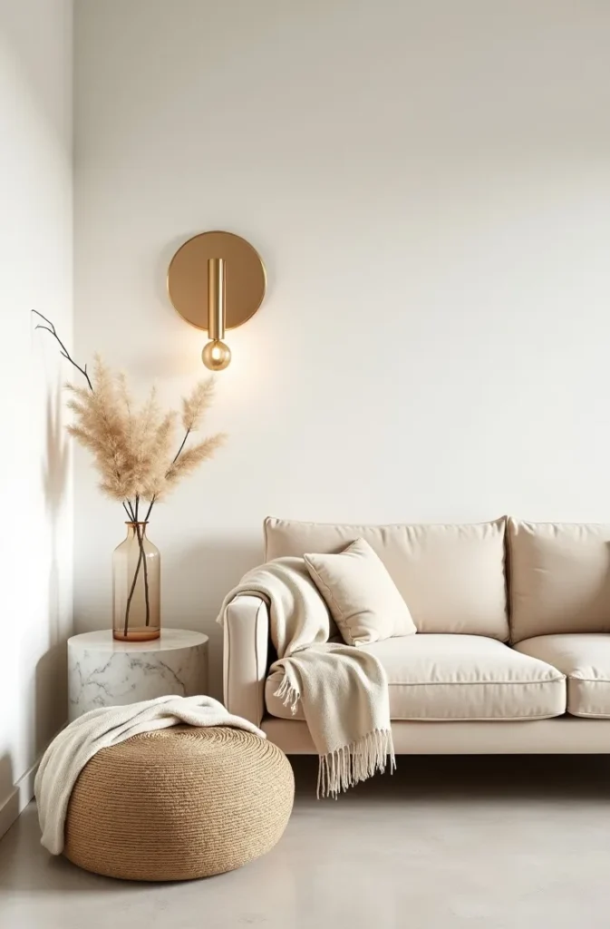
This rule matters most in all-white or all-beige living rooms, where the lack of color contrast means texture has to carry the entire visual load. It’s especially useful for renters who can’t paint but want the room to feel finished through furniture and textiles alone. The mistake to avoid is defaulting to the same texture for every soft surface — an all-linen sofa, all-linen curtains, and an all-linen rug will still look flat even though technically nothing matches perfectly. Run your hand mentally across the room and notice whether every surface you’d touch feels the same.
Why a Gallery Wall Has No Place in a True Minimalist Living Room (And What to Do Instead)
A gallery wall, no matter how carefully curated, works against the core mechanic of minimalism, which relies on the eye having very few places to land. One oversized piece of art, or two pieces hung with generous space between them, gives the wall the same personal, curated feeling a gallery wall aims for, without fragmenting the eye’s attention across a dozen small frames. This is one of the modern minimalist living room ideas that people resist at first because it feels like “less,” but it’s actually what makes a minimalist wall read as intentional rather than unfinished.
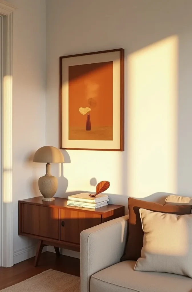
This approach works particularly well above a low sofa or console, where there’s enough clear wall space for one piece to have real presence. It also suits smaller living rooms where a gallery wall would visually compete with an already limited amount of open wall. The mistake to avoid is choosing artwork that’s too small for the wall — undersized art on a large wall reads as an afterthought, so when in doubt, size up. Picture one striking piece with the whole wall as its frame, rather than a dozen smaller pieces fighting for the same attention.
The Furniture Placement Mistake That Makes Minimalist Rooms Feel Unfinished
Pushing every piece of furniture flat against the walls is the single most common reason a minimalist living room feels like a waiting room instead of a place to gather. Floating the sofa a few inches off the wall, or angling a chair slightly toward the center of the room instead of squarely facing it, creates a sense of a considered layout rather than furniture parked wherever there was space. This is one of the functional minimalist living room floor plan choices that costs nothing to test, since it only requires moving what you already own.
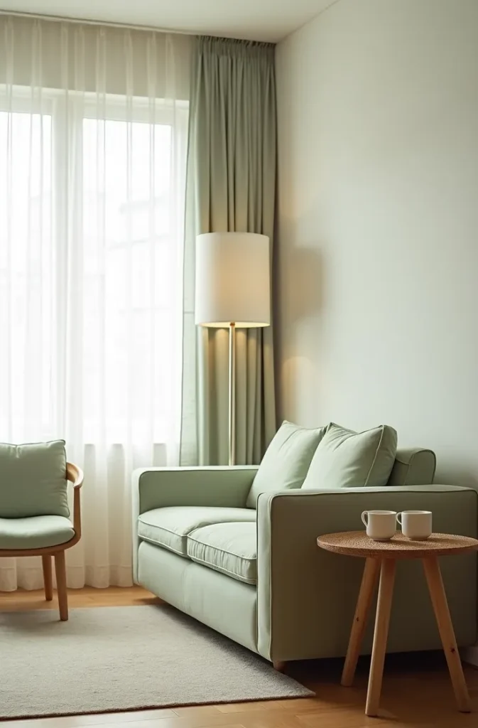
This works especially well in square or near-square living rooms, where a perimeter layout leaves a large, dead, unused space in the middle of the room. It’s also useful in shared living rooms where the seating needs to genuinely face a conversation rather than a television across the widest possible gap. The mistake to avoid is floating furniture without enough of a walkway behind it — leave at least two and a half feet of clearance so the space still functions. Picture pulling your sofa forward by even six inches and see whether the room suddenly feels like it has a center.
How to Style Open Shelving So It Reads as Curated, Not Empty
Open shelving in a minimalist living room is one of the hardest things to get right, because too little on the shelves reads as bare, and too much reads as cluttered — the difference usually comes down to grouping objects in threes and leaving visible breathing room between each grouping. Mixing heights, one or two books stacked flat, and a single sculptural object per shelf keeps the eye moving without ever feeling crowded, which is what separates styled shelving from a shelf that just happens to have things on it. This is one of the more overlooked studio bedroom and living room layout ideas for small spaces where floor space for furniture is limited and shelving has to do double duty as both storage and decor.
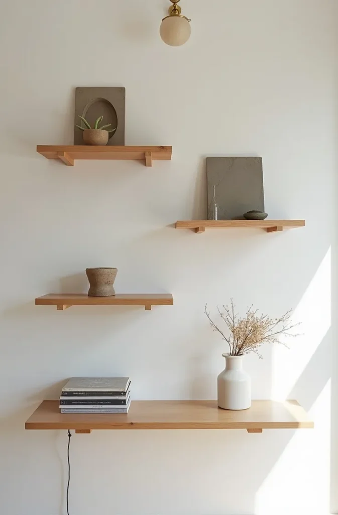
This approach works best in studio apartments and smaller living rooms where floating shelves replace a bulkier bookshelf or media console entirely. It’s also a smart option for renters, since shelving can be removed without leaving behind the footprint of built-in furniture. The mistake to avoid is filling every shelf evenly — leave at least one shelf mostly empty so the eye has somewhere to rest between the styled sections. Picture your shelves with half of what’s currently on them, grouped a little more deliberately, rather than spread out to fill every inch.
Final Thoughts
You now have twelve real, tested decisions to make in your own living room — not just a mood board of pretty rooms to feel inspired by and then forget. Save this post for the next time you’re rearranging, repainting, or simply staring at your living room wondering why it doesn’t feel finished yet, because each of these ideas works on its own or layered together as your room evolves. Come back to this list before you buy anything new, not after — that’s where a good minimalist room is actually built.