INTRO
The printable 4th of July poster ideas flooding Pinterest every June look almost identical — clipart stars, loud red and blue gradients, and fonts that belong on a carnival ride. If you have spent time searching for a Fourth of July printable that actually looks beautiful in a real home, you already know how hard that is to find. This post gives you 10 specific, fully developed poster concepts — with design direction detailed enough that you can create them yourself, brief a designer, or use them as AI image generation prompts — and every single one is designed to look like something worth framing, not just taping to a window.
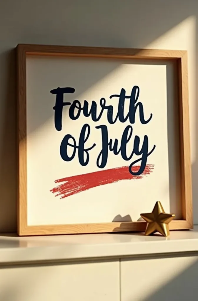
The One-Word Typography Poster That Says More About July 4th Than Any Flag Graphic Ever Could
A single word set at maximum scale on a clean background communicates patriotism more powerfully than any clipart collection, because it forces the viewer to feel the meaning rather than just recognize the symbol. The words that work at this scale for a Fourth of July printable are the ones already loaded with American resonance: LIBERTY, FREEDOM, UNION, BRAVE, GLORY. One word. One font. One color on one background. Nothing else.
The execution that makes this look elevated rather than empty: choose a classical American serif — the kind used on original historical documents, with bracketed serifs and high stroke contrast — set at a size that fills 80 percent of the vertical height of the poster with generous breathing room on all four sides. Print on warm cream or aged ivory cardstock rather than bright white paper, and the poster immediately reads as considered rather than printed. The typeface does all the work; the designer’s job is to not interfere with it.
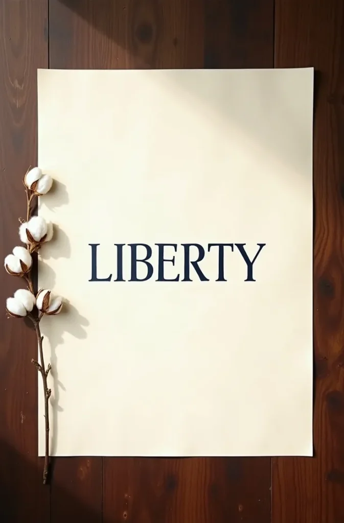
This works framed on a mantle, leaned on a shelf, or displayed on a console table beside a small flag and a vase of white flowers. It reads as art in July and stores as art in August — which is the highest standard any seasonal printable can meet. Women decorating a Texas dining room for a family gathering or a New York apartment for a small July 4th dinner will find that this poster earns compliments that busy graphic designs never do.
The mistake: adding a secondary line of text below the word — a date, a tagline, a decorative flourish. The power is in the singularity. One word. Trust it completely.
How to Design a Vintage Letterpress-Style Fourth of July Poster That Looks Like It Was Printed in 1890
The vintage letterpress aesthetic is the most consistently saved category of Fourth of July printable design on Pinterest, and the reason is not nostalgia — it is authority. A poster that looks like it was set in wood type and hand-pressed in 1890 carries the visual weight of American history in a way that modern flat design simply cannot manufacture. When the design looks genuinely old, it feels genuinely meaningful.
The elements that create authentic letterpress quality in a digital printable: a condensed slab serif headline set in all caps with tight letter spacing, a secondary line in a lighter weight condensed font, and a third accent line in an inline or outlined variant of the same family. The color palette must be restricted to what period printing could achieve — two ink colors maximum, typically a warm red and a deep navy on cream or aged paper stock. Any more colors and the period illusion collapses immediately.
The three-band structure that makes vintage American posters read as genuine: a bold headline band at the top establishing the primary message, a central band containing either a decorative rule, a period ornament, or a small vignette engraving, and a date or location band at the bottom. This vertical hierarchy is how every American event poster from the 1870s through the 1920s was laid out, and it is why the format feels instinctively correct to the eye.
The mistake most digital designers make with vintage-style posters is using a clean, unaged file with perfect edges and zero texture. A letterpress poster has ink impression, paper texture, and slight ink spread at the letter edges. A distressed texture overlay applied at 20 to 30 percent opacity across the finished design introduces this quality without looking artificially aged.
The Watercolor American Flag Printable That Stays on the Wall After July 5th Because It Is Actually Beautiful
A printable Fourth of July poster built around a watercolor flag treatment occupies the rare design space where seasonal decor and year-round art overlap. The version that earns its place on the wall permanently is not a clean, vector reproduction of the flag washed in watercolor filter — it is a genuinely painterly interpretation where the flag is suggested rather than reproduced, where the edges dissolve into the white of the paper, and where the brushwork has visible spontaneity and direction.
The specific watercolor technique that achieves this at a printable level: loose horizontal washes of dusty, slightly grayed red alternating with bare white paper for the stripes, creating color rather than filling spaces with it. The canton — the blue field of stars — rendered as a soft wash with the stars left as unpainted white paper reserves rather than stamped shapes. The flag bleeds beyond its own borders in at least two places, suggesting wind or light rather than a static object. The overall impression is of a flag dissolving into summer rather than a flag displayed in a frame.
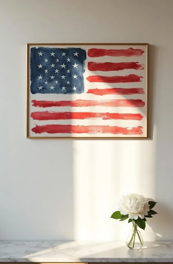
Printed at 8×10 or 11×14 on cold press watercolor paper or a matte fine art stock, this poster reads as an original painting rather than a downloaded file. Framed in a thin natural wood or aged brass frame and displayed on a gallery wall, kitchen shelf, or entry console, it holds its visual authority well past the holiday. In California coastal homes where the aesthetic runs toward organic and natural, this printable fits without any adjustment. In a Midwest farmhouse entry, it reads as warmly American without any rural cliché.
The mistake is rendering the watercolor digitally with too much precision — clean edges, evenly spaced brush strokes, mechanically consistent color. True watercolor quality comes from variation, accident, and incompleteness. If it looks too controlled, it looks like a filter, not a painting.
Why Printing the Declaration of Independence in One Powerful Typographic Format Is the Most Meaningful Fourth of July Poster You Will Ever Display
The second paragraph of the Declaration of Independence contains some of the most beautiful and consequential sentences in the English language, and almost no one uses them in Fourth of July decor with the typographic intelligence they deserve. A printable poster built around a carefully chosen excerpt — not the entire document, but the opening lines of that second paragraph set with the hierarchy and intentionality of genuine editorial design — is the Fourth of July printable idea that will be remembered by every guest who sees it.
The typographic layout that gives this poster its authority: the key clause WE HOLD THESE TRUTHS TO BE SELF-EVIDENT set in a large classical serif at the top of the poster, functioning as a headline, with the remainder of the sentence continuing below in a significantly smaller size — maintaining the same font but dropping to a weight and scale that reads as body text. This size contrast between the headline clause and the continuation creates drama and legibility simultaneously. The date JULY 4, 1776 set in small capitals at the bottom of the poster closes the composition with the precision of a document rather than a decoration.
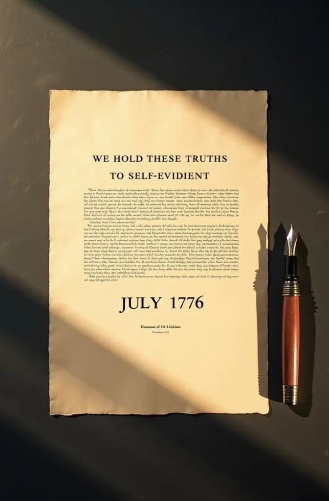
Printed on warm cream or aged ivory paper, this poster reads as a historical artifact in the best sense — not a reproduction of an existing document, but a designed engagement with its words. It works in a home library, a dining room, a study, or an entry. It works in homes that would never display a flag banner or a star-spangled garland, because it earns its July 4th identity through the power of the words themselves.
The mistake is using a decorative script font for any part of this poster. These words are declarative and strong. They require typography that matches their authority — a serif with historical character, not a font that turns a declaration into a wedding invitation.
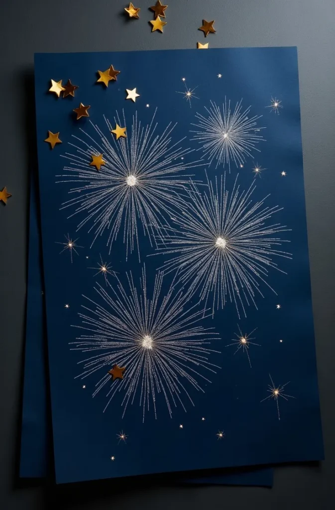
The Astronomical Star Map Printable That Turns July 4th Into the Most Personal Poster in Your Home
A star map showing the exact position of the night sky over Philadelphia on July 4th, 1776 — the night the Declaration was adopted — is a Fourth of July printable that bridges patriotism and genuine beauty in a way no flag graphic can approach. It is specific, it is scientifically grounded, and it is visually stunning in the way that accurate astronomical rendering always is. When displayed in a simple frame, it prompts the kind of conversation that decorative holiday posters never do.
The design anatomy of a star map poster that looks serious rather than sentimental: a circular star field on a deep navy or near-black background, showing the actual constellation positions for that date and location with star points rendered at varying sizes that reflect true stellar magnitude — the brightest stars large and clear, the faintest barely visible. No constellation line drawings, no illustrated zodiac figures, no decorative clouds. Just stars, rendered with the precision of a scientific instrument and the beauty of a clear summer night. Below the circle, in a refined light-weight serif: JULY 4, 1776 — PHILADELPHIA, PENNSYLVANIA.
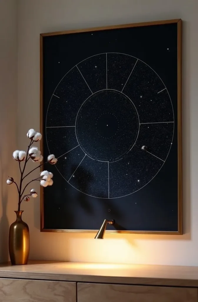
The circle format is essential — a rectangular star field reads as a screen capture; a circular one reads as a lens, a porthole, a moment of careful observation. The distinction in visual quality between the two formats is significant. Printed at 12×16 or 16×20 and framed in a thin brass or dark steel frame, this poster reads as gallery-quality art that happens to be perfectly timed for Independence Day.
The mistake is adding patriotic graphic elements — flag corners, star borders, red and white stripes — around the star map. These additions undermine the scientific authority that makes the design powerful. The astronomy and the date do all the work. Nothing else is needed.
How Botanical Illustration in Patriotic Colors Creates a Fourth of July Printable That Never Looks Like Holiday Decor
July 4th falls at the height of American wildflower season, and the flowers that bloom in patriotic color during that week — red poppies, white Queen Anne’s lace, blue bachelor buttons, white yarrow, deep red coneflowers — offer a design language that is simultaneously patriotic and completely free of any holiday cliché. A botanical illustration poster featuring these flowers rendered in the precise, detailed style of 19th-century natural history printing achieves patriotic color without a single star, stripe, or eagle.
The illustration approach that makes this printable feel like archival art: each flower rendered in fine line with anatomically accurate detail — the individual petals, the visible stamens, the leaf structures, the stem textures. The species name written beneath each plant in italic — Papaver rhoeas, Daucus carota, Centaurea cyanus — in the manner of genuine botanical plates. The composition arranged as a loose cluster rather than a symmetrical bouquet, with some flowers overlapping and some stems extending beyond the cluster edge. No headline. No HAPPY 4TH OF JULY text. The botanical subject carries the design.
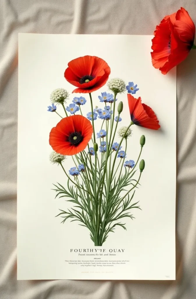
This is the printable Fourth of July poster idea for the woman who loves her home too much to fill it with seasonal decorations that will embarrass her in a photograph. It is patriotic to anyone who recognizes the color family and simply beautiful to anyone who does not. In a California kitchen, a Texas sunroom, or a New York dining room, it reads as a considered botanical art print — which is exactly what it is.
The mistake is using cartoon-style or simplified floral graphics instead of genuine botanical illustration quality. The fine line detail and scientific accuracy are what give this poster its authority. A simplified version looks like a pattern, not a plate.
The Oversized Number Poster That Works as Outdoor Party Signage and Still Looks Designed From Ten Feet Away
Outdoor Fourth of July party signage has a completely different design requirement from framed interior art — it must communicate instantly at distance, in direct sunlight, competing visually with flowers, food, guests, and the general visual noise of a summer outdoor gathering. The design principles that apply are the opposite of those for intimate interior posters: maximum contrast, minimal information, and one dominant visual element at a scale large enough to anchor the display from across a yard.
The concept that satisfies all three requirements and photographs beautifully: a deep navy background, a single white numeral 4 set at near full bleed — meaning the number fills the poster from edge to edge with only minimal margin — with the words JULY and INDEPENDENCE DAY set in a small all-caps condensed serif above and below the numeral respectively. The 4 becomes architectural at this scale. It is no longer a number; it is a shape, a form, a design element that earns its space by becoming something larger than its literal meaning.
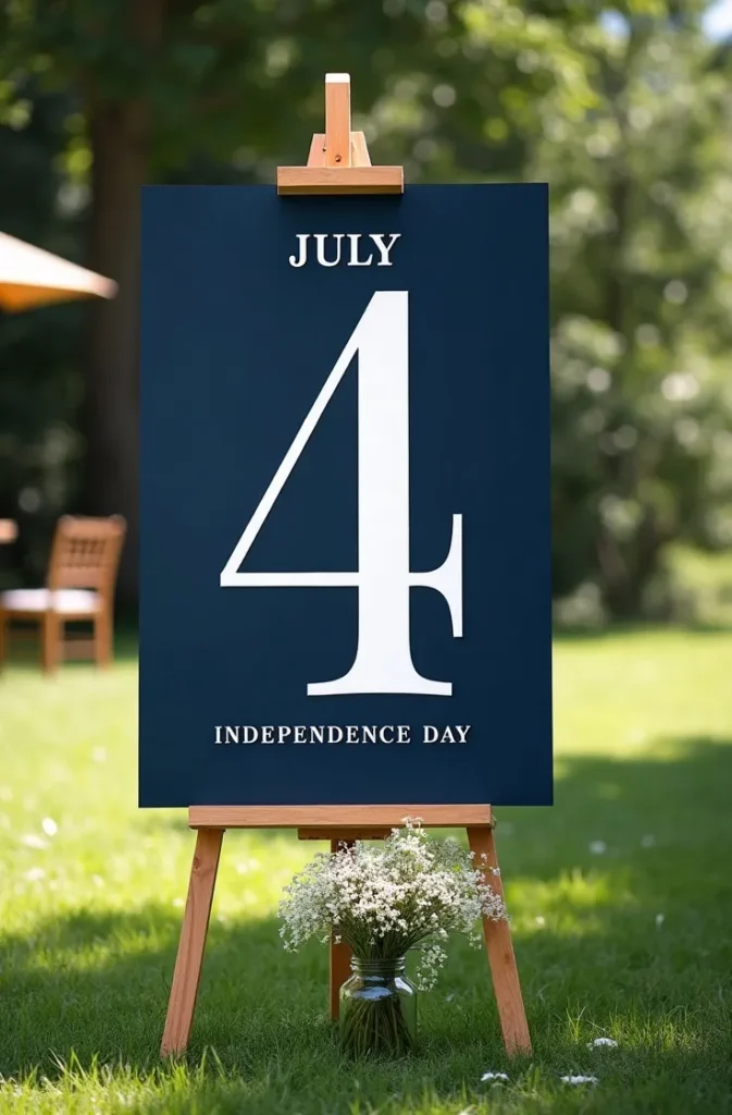
Printed at 18×24 or 24×36 on a matte poster stock with no lamination — glossy surfaces create glare in outdoor sunlight that destroys legibility — and displayed on a wooden easel beside the food table or at the entry to an outdoor entertaining space, this poster reads as a designed installation rather than party signage. It photographs well in every photo taken at the gathering, which is its secondary function and not an insignificant one.
The mistake is adding decorative elements to fill the space around the numeral — stars, stripes, borders, banner graphics. The power of this poster is in what is not there. Every addition reduces the visual authority of the numeral. Remove everything until only what is absolutely necessary remains.
Why a Hand-Lettered Style Fourth of July Printable Feels More Personal Than Any Digital Design Template
The appeal of hand-lettered design in a digital printable is the same appeal that handwriting has in a typed world — it signals that a human being made a considered, imperfect, personal mark. A Fourth of July printable that faithfully replicates the quality of genuine hand lettering — the slight variation in stroke weight, the imperfect baseline, the organic letter spacing — reads as warm and personal in a way that mechanically perfect typography, however beautifully chosen, cannot fully achieve.
The specific hand-lettered style that works for a patriotic printable: a large flourished script headline for the primary phrase — something like The Land of the Free or Born on the Fourth — with a contrasting all-caps block letter secondary line in a chunky, slightly irregular sans-serif. The contrast between the flowing script and the solid block letters creates visual tension that keeps the eye moving across the poster. A horizontal decorative underline beneath the script headline, rendered as if drawn with a wide brush, grounds the composition.
The color palette for a hand-lettered Fourth of July poster that reads as artisanal rather than rustic: deep navy and warm red on a cream background, with the ink appearing slightly irregular in density — darker at the beginning of strokes, lighter at the ends — in the way genuine brush lettering behaves. This color-within-stroke variation is the detail that distinguishes authentic hand-lettered quality from a font applied in a design program.
The mistake is choosing a commercially available hand-lettering font and leaving it unmodified. Commercial lettering fonts are too consistent to read as genuinely hand-done. Either choose a font with genuine irregularity built in, or introduce subtle variations in baseline, rotation, and spacing to break the mechanical uniformity.
The Fireworks Line-Art Poster That Captures the Feeling of July 4th Night Without a Single Patriotic Cliché
Fireworks are the emotional center of the Fourth of July for almost everyone who celebrates it — not the flag, not the eagle, not the parade. They are the part of the day that makes adults feel like children and that creates the specific sensory memory most people carry from every July 4th of their lives. A poster that captures the visual language of fireworks — not photographically, but as precise, beautiful line art — speaks to that emotional memory directly and does not need any other patriotic symbol to carry its meaning.
The design concept that achieves this: a deep midnight navy or near-black background, multiple overlapping firework burst shapes rendered entirely in fine radiating lines rather than filled color shapes. Each burst composed of dozens of thin lines emanating from a central point at slightly irregular angles, with some lines longer than others, some ending in a small dot or star point, some curving slightly outward as real fireworks trails do under gravity. The lines in warm white, very pale gold, and soft silver — no red or blue fill, no solid color areas anywhere. The result reads simultaneously as fireworks and as abstract graphic art.
At large format — 16×20 or 18×24 — the fine line density creates a complexity and depth that demands close looking, which is exactly what makes a poster worth framing. Each burst is slightly different from the others in density, scale, and line length, giving the composition the organic variation of a real fireworks display rather than the mechanical repetition of stamped shapes.
The mistake is using solid filled color shapes to represent the firework bursts — opaque red, white, and blue circles or star shapes. Solid filled shapes read as graphic design; fine radiating lines read as light. The distinction is the difference between illustrating fireworks and evoking them.
How to Style a Coordinated Set of Three Fourth of July Printables as a Display That Stops Scrolling on Pinterest
A single Fourth of July printable, however beautiful, is a decoration. A coordinated set of three printables displayed together as a styled vignette is an editorial moment — and it is the category of printable 4th of July poster ideas that generates the most saves on Pinterest because it shows exactly how to display what you print, not just what to print. The difference between a beautiful individual poster and a display that earns a thousand saves is the system of scale, frame, and surface that holds the set together.
The three-piece formula that works consistently: one large anchor poster at 16×20 or 18×24 — a typography piece or watercolor flag — leaning against the wall in a thin brass or natural wood frame, establishing the primary visual statement. One medium complementary poster at 8×10 or 11×14 — a botanical print or star map — in a matching frame beside or slightly in front of the large piece. One or two small accent pieces at 4×6 or 5×7 — a date card, a single patriotic word, a minimal graphic — propped against books or in small matching frames at the front of the arrangement. The graduated depth and height of the three tiers creates the layered editorial quality that flat, same-size displays never achieve.
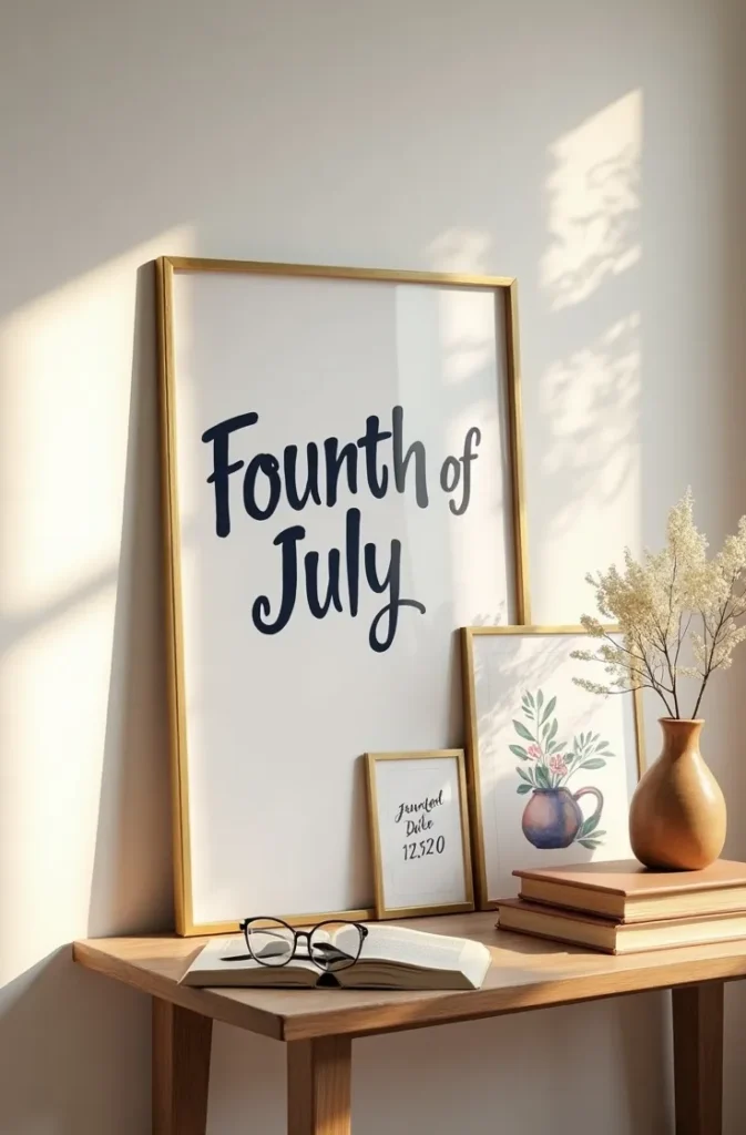
The color and typographic cohesion that makes a set read as designed rather than assembled: all three posters must share the same two or three fonts and the same three-color palette, even if their design styles differ. A vintage letterpress poster and a minimal typography poster and a botanical illustration can coexist in one display if they share navy, cream, and deep red as their color language. The eye reads color cohesion as intentionality, every time.
The mistake is choosing all three posters in the same design style — three typography posters, or three watercolor pieces. Variety in style within a unified color and type system creates the impression of a collection gathered with taste over time. Uniformity creates the impression of a product set purchased as a bundle.
CONCLUSION
You now have ten fully developed printable 4th of July poster concepts — each one designed with enough specific direction that you can create them yourself, brief a designer, or use them directly as AI image generation prompts without any additional translation. Save this post to your Pinterest board now so the design directions are there when you sit down to build your Fourth of July display. Your home deserves holiday decor that is worth keeping.
Design the Fourth like it means something. Because it does.