
Small modern living room ideas usually fall into two categories: the ones that look stunning on Pinterest and fall apart the moment you try to live in the room, and the ones that quietly solve the problem for good. You already own the furniture, the light, and the square footage — what’s missing is a plan built for how the room actually behaves. By the end of this, you’ll know exactly where the sofa goes, what to skip, and why your current layout has been working against you the whole time.
The Off-the-Wall Sofa Placement That Makes a Small Living Room Feel Larger
Pushing every piece of furniture against the perimeter is the instinct in a tight room, but it’s usually the wrong move. Pulling the sofa even six to ten inches off the wall creates a shadow line and a sense of depth that reads as “room” instead of “hallway with a couch in it.” The eye registers negative space behind furniture as square footage, even when the actual floor area hasn’t changed.
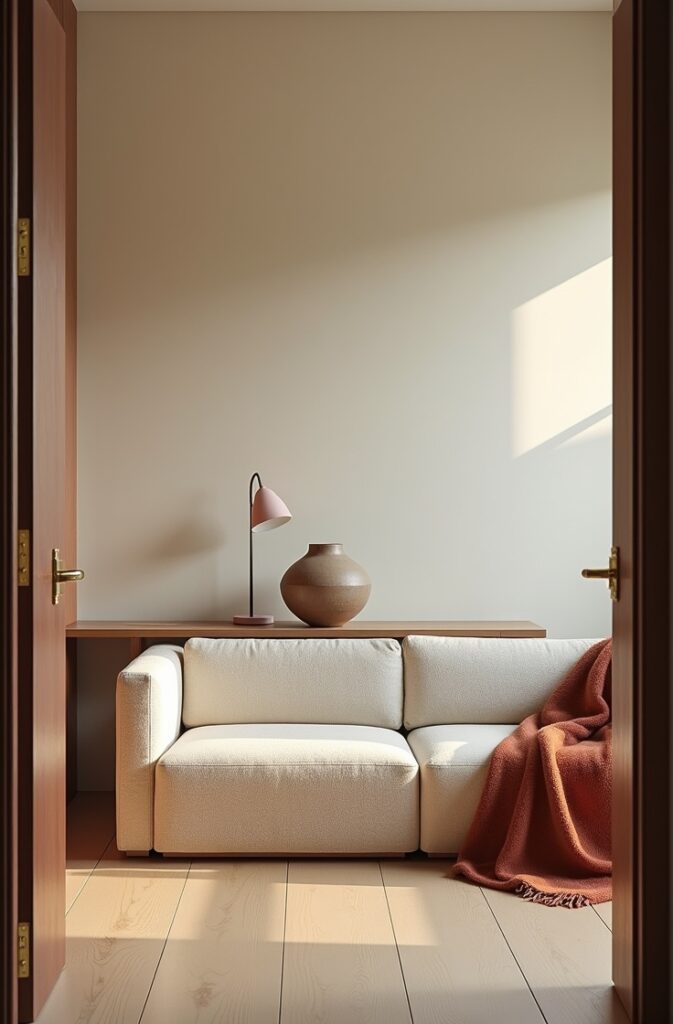
This works best in rectangular living rooms where the sofa currently sits flush against the longest wall, especially in New York studio apartments and older Midwest starter homes where living rooms were never meant to double as everything else. If you’re working with a genuinely narrow room — anything under nine feet wide — pull the sofa forward only a few inches and compensate with a slim console behind it instead of leaving the gap empty and unfinished.

The mistake most people make is doing this with a deep, oversized sectional that eats the reclaimed space anyway. Keep the depth under 34 inches and the trick actually earns its square footage back. Picture the walk from your front door to the window — that clear sightline is what you’re building toward.
Why Low-Slung Furniture Is the Secret to a Bigger-Feeling Modern Living Room
Ceiling height is fixed, but the amount of visible wall above your furniture is not — and that gap is what your brain uses to judge whether a room feels tall or cramped. Swapping a standard 34-inch-high sofa for a low-slung modern silhouette around 28 to 30 inches adds visible wall space instantly, without moving a single wall.
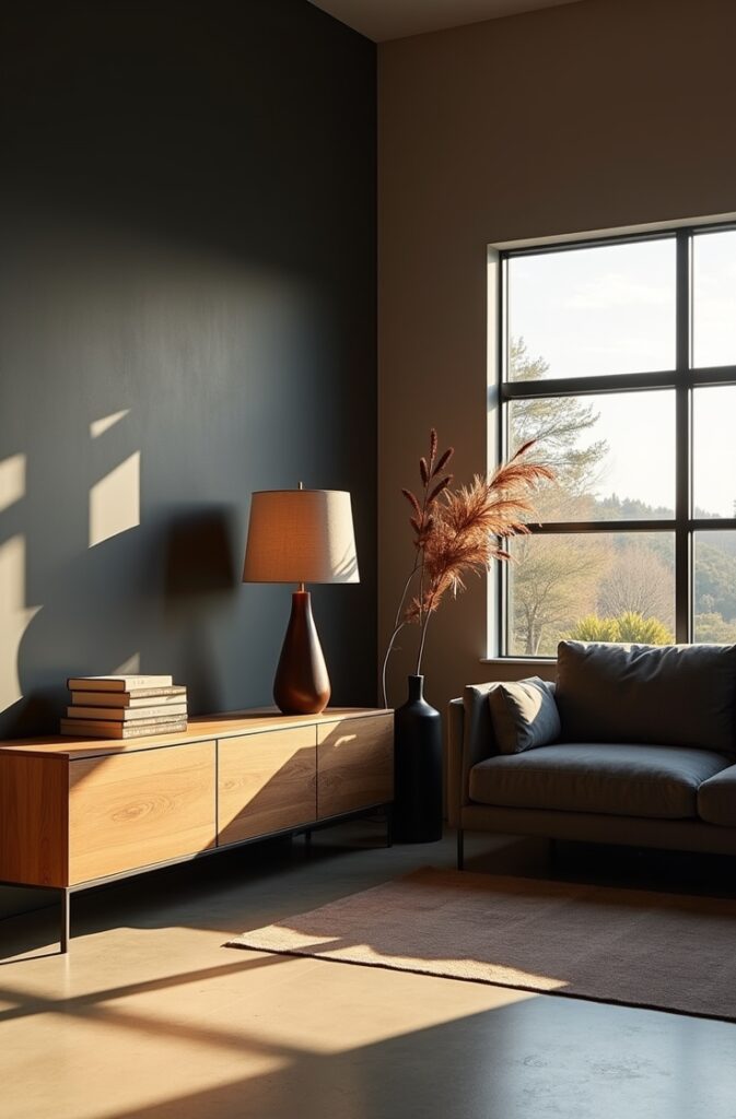
This is one of the most effective small modern living room ideas for apartments with 8-foot ceilings, which describes the majority of rental units built in the last three decades. It works less well in rooms with unusually low ceilings under 7.5 feet, where a low sofa can make the space feel squat rather than airy — in that case, keep the seating height standard and lower the coffee table instead.
The mistake is pairing low furniture with tall, boxy storage pieces that cancel out the effect. Keep case goods — bookshelves, media consoles, cabinets — under 30 inches wherever the sofa is low, so the eye reads one continuous, open horizon line across the room.
The Single Rug Trick That Defines a Modern Living Room Without Adding Walls
A small living room often has to double as an entryway, a home office corner, or a dining nook, and the instinct is to divide it with furniture. A large rug does the same job without blocking sightlines or eating floor space. The rug’s edge becomes an invisible boundary — everyone in the room registers “seating area” the moment their feet cross onto it, even though nothing physically changed.
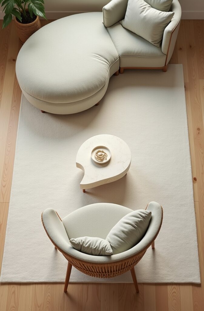
This is one of the more overlooked small modern living room ideas for open-concept apartments and studio bedroom layout for small spaces where the living zone bleeds into the kitchen or sleeping area. The rug should be large enough that at least the front legs of every seating piece sit on it — a rug too small floats in the middle of the room and does the opposite of what you want, visually shrinking the space instead of anchoring it.
Skip busy patterns here. A low-pile rug in a single tone or a subtle tonal weave keeps the zoning effect strong without adding visual noise to a room that’s already working hard. Picture the rug as the quiet frame that makes everything on top of it look intentional.
Floor-to-Ceiling Shelving That Turns a Small Wall Into Real Storage
Small living rooms rarely lack storage because of square footage — they lack it because most shelving stops at eye level and wastes everything above it. Building storage all the way to the ceiling, even on a narrow eight-inch-deep run, uses vertical space that would otherwise sit empty, and it draws the eye upward, which makes the ceiling feel higher in the process.
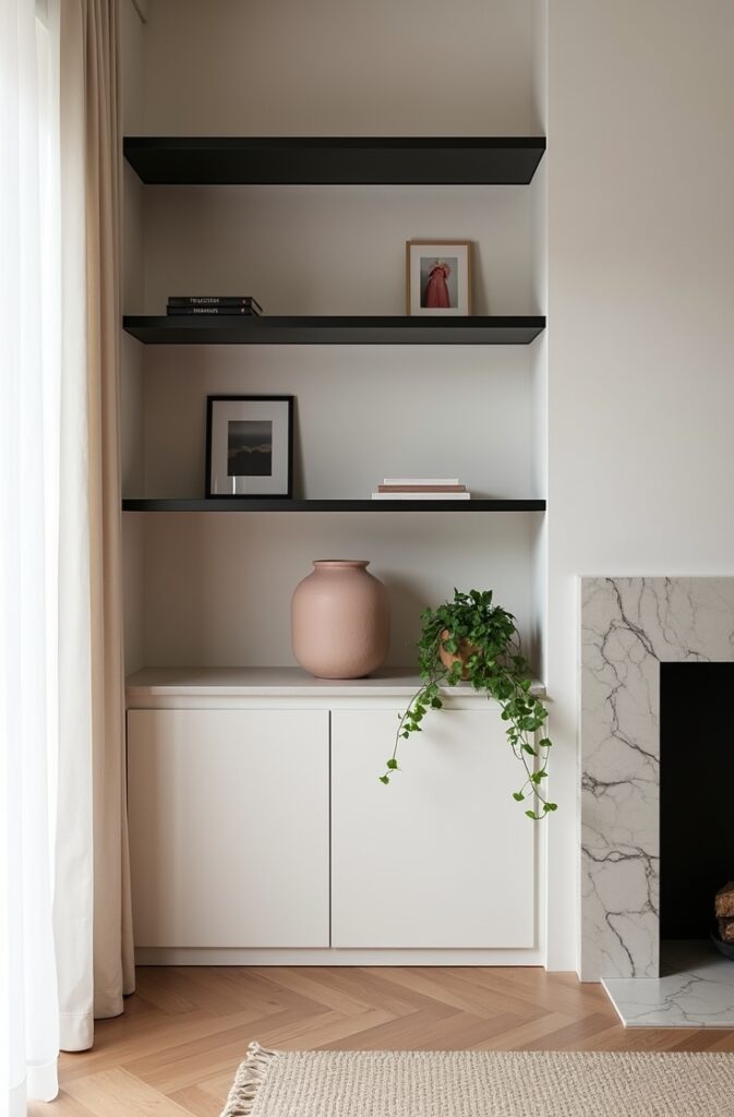
This is especially useful in Texas ranch-style homes and Midwest starter homes with one dedicated living room and no separate den, where books, media, and display pieces all compete for the same wall. It also solves functional small living room floor plans in older buildings where closet space is minimal and the living room absorbs the overflow.
The mistake is filling every shelf edge to edge. Dense, uniform shelving reads as clutter no matter how tall it goes. Leave roughly a third of the shelf space open or styled with only one or two objects per shelf, so the height you gained still feels calm instead of stacked.
The Curved Sofa Layout That Softens a Boxy Small Living Room
Most small living rooms are literal rectangles, and filling a rectangle with only straight-edged, right-angled furniture reinforces every hard corner in the room. A curved sofa or a rounded accent chair breaks that grid. It doesn’t just look softer — it changes how you move through the space, because your body naturally curves around it rather than walking a straight, boxed-in path.
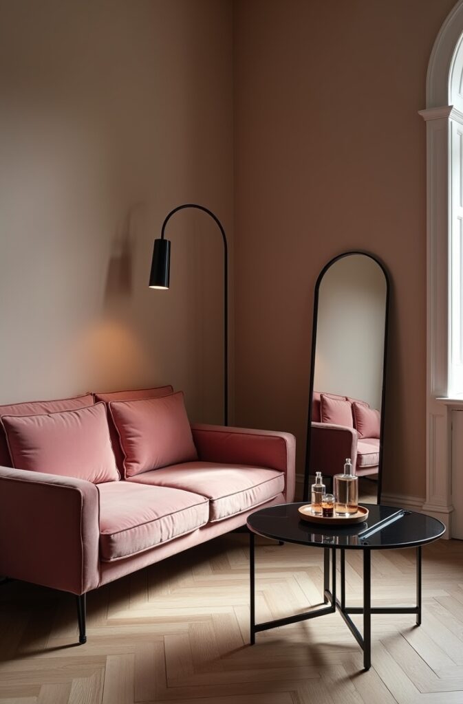
This is one of the small modern living room ideas that performs especially well in California bungalows and converted studio apartments, where the living room often has an awkward, non-rectangular footprint to begin with. A curved piece can visually “fix” an odd angle better than a straight sofa ever will, because it doesn’t try to align with walls that aren’t parallel.
The mistake is choosing a curve that’s too dramatic for the room’s actual size — an aggressively rounded sofa in a 10-by-10 room can eat more floor space than a straight one. Look for a gentle curve, not a full crescent, and keep the rest of the furniture in the room straight-edged so the curve reads as a deliberate accent rather than a competing shape.
The Mirror Placement Trick That Doubles the Light in a Small Modern Living Room
A mirror placed opposite a window doesn’t just make a room look bigger in photographs — it physically bounces daylight back across the space, which matters most in small rooms that only have one light source to begin with. The key is placement, not size. A mirror hung where it reflects the window directly, rather than a wall or a piece of furniture, doubles the usable daylight in the room for free.
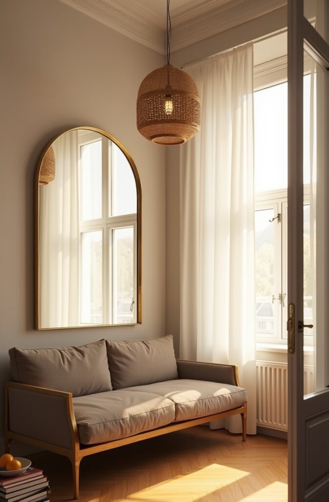
This is one of the small modern living room ideas worth prioritizing in ground-floor apartments and north-facing rooms, where natural light is already limited and every extra hour of brightness matters. It also works well for minimalist small living room layouts, since a single large mirror does more visual work than several small decorative pieces combined.
The mistake is hanging the mirror too high, angled toward the ceiling instead of the room. Position the bottom edge roughly console height, tilted very slightly forward if needed, so it reflects the actual living space and the window light — not just a strip of ceiling.
Why Nesting and Stacking Furniture Belongs in Every Small Modern Living Room
The furniture that looks most impressive in a small room is often the furniture you can’t see all the time. Nesting tables, stacking stools, and a storage ottoman that hides everything from blankets to remotes let you scale the room up for guests and back down for daily life without ever adding permanent floor clutter.
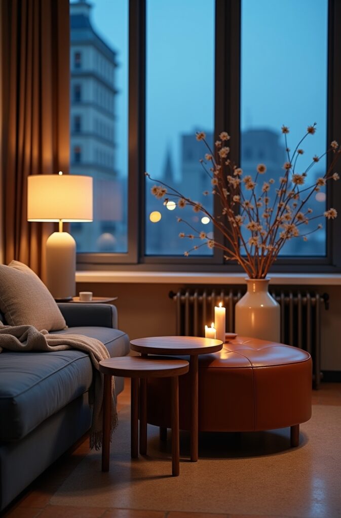
This matters most in shared living rooms — roommates, small families, or anyone hosting regularly in under 150 square feet — where the number of people using the room changes night to night but the floor plan can’t. Tiny bedroom furniture arrangement principles apply here too: flexibility is what makes a small footprint feel generous instead of restrictive.
The mistake is treating these pieces as an afterthought instead of choosing them with the same care as the sofa. A mismatched nesting table set undercuts the whole effect. Choose pieces in the same material family as your other furniture so that even when they’re pulled out and in use, the room still looks cohesive rather than assembled from spare parts.
The Window-Facing Seating Layout That Makes a Small Living Room Feel Open
In a small living room, the window is often the only source of visual depth you have — it’s the one place the eye can travel past the walls. Orienting the main seating piece to face the window, rather than a television or blank wall, uses that depth instead of ignoring it, and it makes the room feel like it extends beyond its actual footprint.
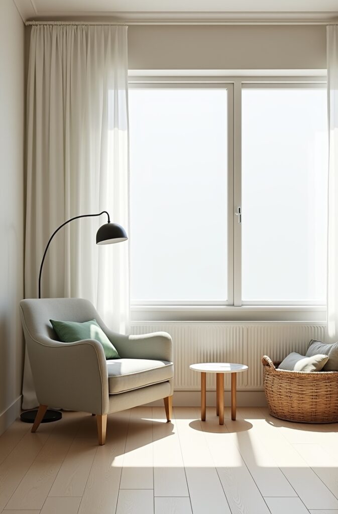
This is one of the small modern living room ideas that works especially well for bedroom layout ideas for small rooms with a window carried into the living space, and for ground-floor units where the window is the room’s only real “view.” It’s less effective in rooms with a small or high window that doesn’t offer much of an outlook — in that case, orient seating toward the longest sightline in the room instead, which is usually the diagonal.
The mistake is centering the television as the room’s only focal point out of habit. A TV can still be present, but mount it to the side or on a swivel bracket so the primary seating arrangement can face the window during the day and pivot toward the screen only when needed.
The Monochrome-with-Texture Formula That Makes Small Rooms Look Intentional
A small room filled with too many colors reads as busy no matter how nice each individual piece is, because the eye has to work to sort everything out. Staying within one or two tones — but varying the texture heavily, from bouclé to linen to raw wood to matte ceramic — gives you visual interest without the chaos, and it’s the single easiest formula for making a small space photograph like it was professionally styled.
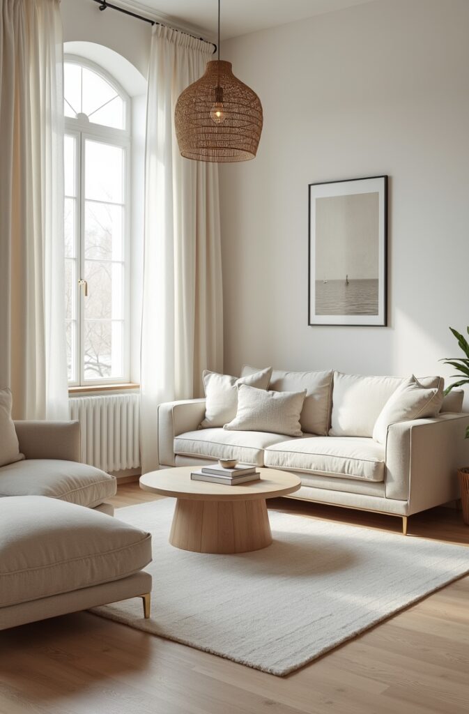
This is one of the most searched small modern living room ideas for a reason: it’s forgiving. It works in nearly any small living room, from a Texas ranch-style secondary living space to a New York studio, because you’re not relying on the room’s proportions to carry a bold color statement.
The mistake is going monochrome and also flat — same tone, same texture, everywhere. That reads as unfinished, not intentional. The formula only works when at least four distinct textures are present within the same one or two colors.
Why an Anchored Corner Layout Solves the Awkward Small Living Room
Every small living room has one dead corner — the spot furniture never quite fits, so it becomes a dumping ground for whatever doesn’t have a home. Anchoring the entire seating arrangement into that corner, rather than trying to center it in the room, turns the weakest point into the room’s structural anchor and frees up the rest of the floor for movement.
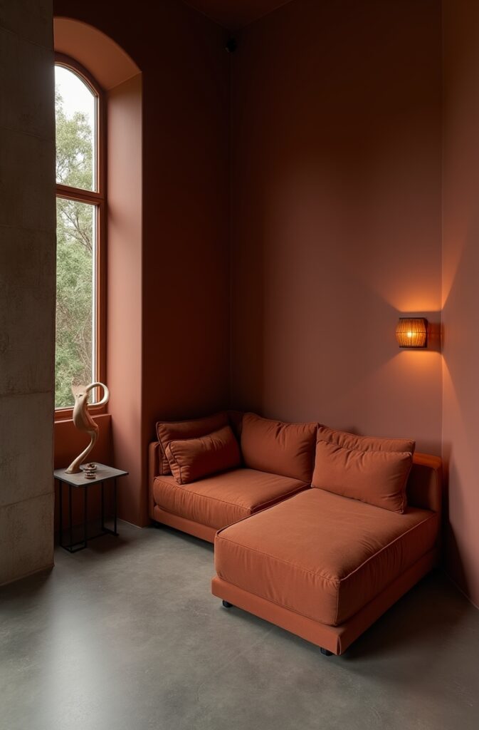
This works especially well in irregularly shaped small living rooms and studio apartments where a radiator, support column, or awkward door swing eliminates one full wall from consideration. It’s one of the more practical functional small living room floor plans because it works with the room’s real constraints instead of fighting them.
The mistake is centering the layout on the room and leaving the corner empty anyway, which just relocates the dead space instead of eliminating it. Pull the sofa and one accent chair fully into the corner at an L-shape or slight angle, and let the open diagonal across the room become your main walking path.
The Layered Lighting Rule That Makes a Small Modern Living Room Feel Designed
A single overhead ceiling light is the fastest way to make any room, especially a small one, feel flat and clinical. Layering at least three light sources at three different heights — a floor lamp, a table lamp, and one accent source like a picture light or under-shelf strip — creates depth after dark the same way a window creates depth during the day.
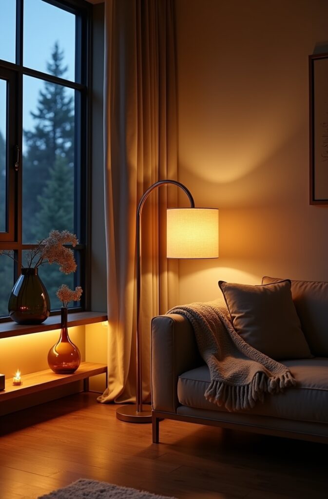
This is one of the small modern living room ideas that has almost nothing to do with furniture and everything to do with atmosphere, which is why it’s so often skipped. It matters most in evening-heavy households, apartments without much natural light, and any small living room used for both work and relaxing, since the right lighting layer can shift the mood of the exact same furniture arrangement.
The mistake is relying entirely on bright, even, white light because it feels “cleaner.” In a small space, warm and slightly uneven light actually reads as more expensive and more intentional than a uniformly bright room. Turn the overhead off entirely some evenings and let the lamps do the work — that’s the layout upgrade most people never think to make.
The Floating Media Wall That Frees Up Floor Space in a Small Living Room
A traditional TV console sitting on the floor claims prime real estate in a room that can’t afford to give any up. Mounting the television and floating a slim shelf or console beneath it, rather than setting a bulky unit on the floor, reclaims that entire footprint for actual living — a reading chair, a plant, a clear walking path.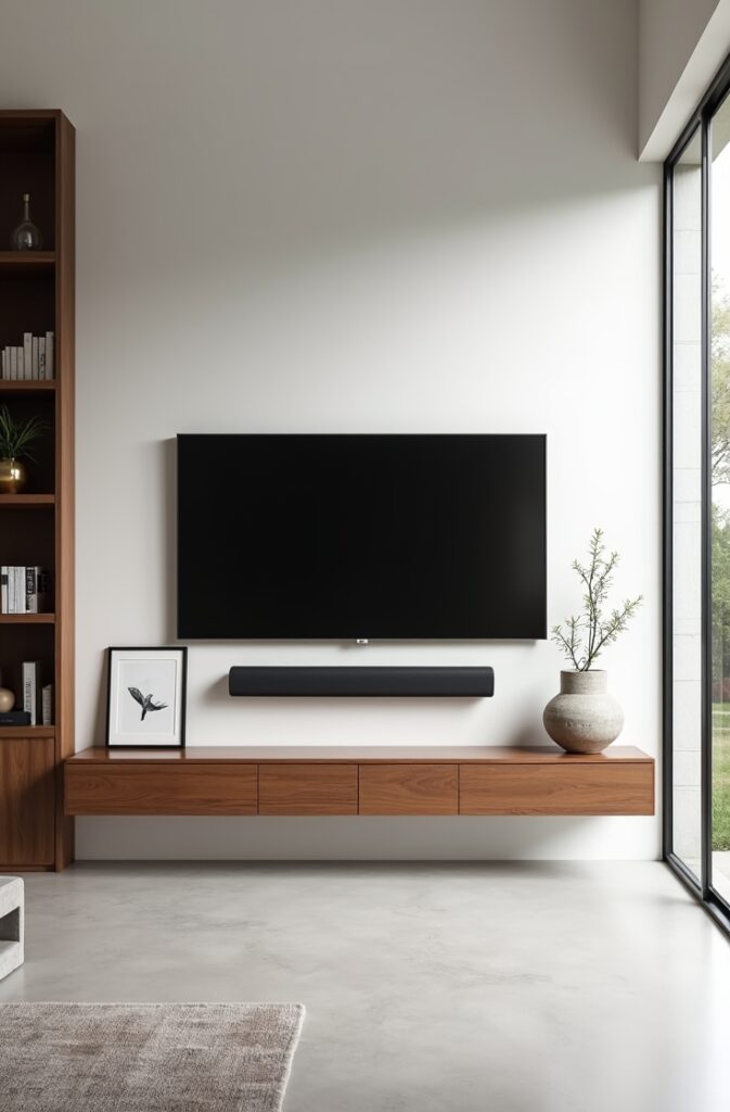
This is one of the small modern living room ideas that renters underuse because they assume mounting requires permanent wall damage, when most modern mounts and floating shelves use minimal, patchable hardware. It’s especially valuable in narrow rooms where floor space near the media wall is the only stretch long enough for a walking path.
The mistake is floating the shelf but keeping every cable and component visible underneath, which cancels out the clean effect you just created. Route cables through a cord channel or a slim cable box, and keep whatever sits on the floating shelf itself to two or three objects at most.
The Symmetrical Layout That Makes a Small Living Room Feel Calm Instead of Cramped
Asymmetry can look effortless in a large room, but in a small one it often reads as unfinished or accidental, because there isn’t enough space to make an off-balance layout feel deliberate. A symmetrical arrangement — matching chairs flanking a sofa, or two identical lamps on either side of a console — gives the eye a resting point, and a room the eye can rest in feels calmer even when the square footage hasn’t changed.
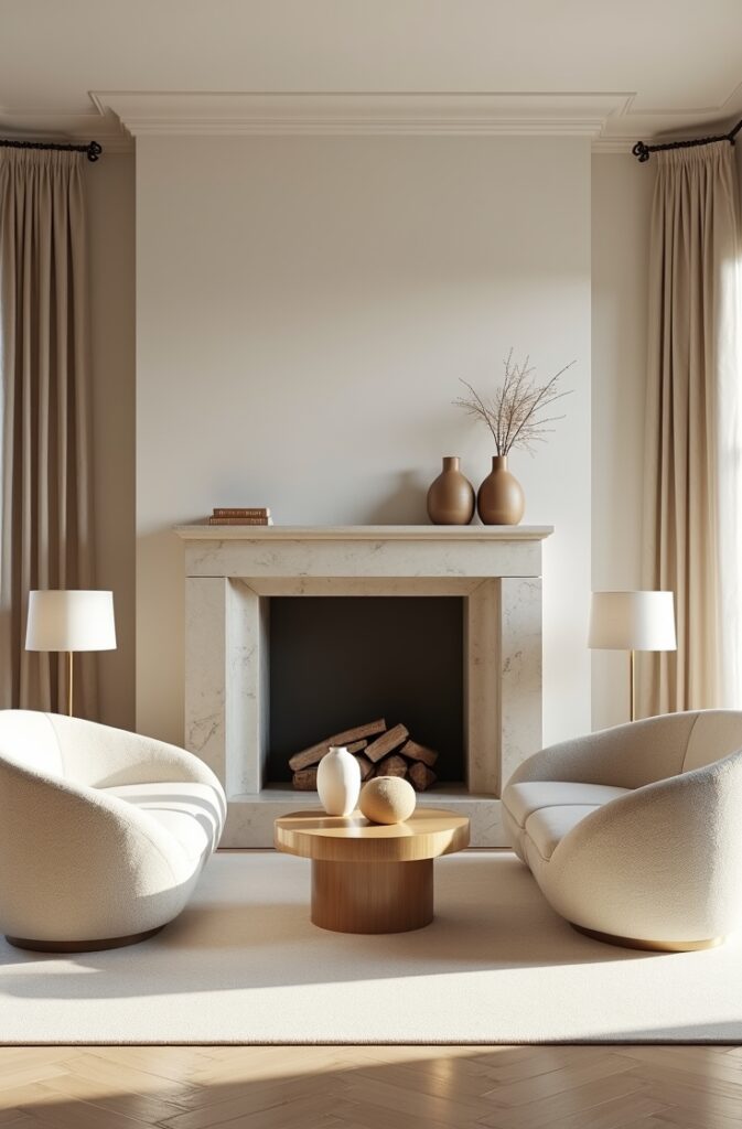
This is one of the small modern living room ideas particularly suited to small master bedroom layout ideas carried into an adjoining sitting area, and to any room where you want a formal, settled feeling rather than a casual, lived-in one. It’s the layout to reach for when the room has felt chaotic no matter how many times you’ve rearranged it.
The mistake is forcing symmetry onto a room with an off-center architectural feature, like a fireplace that isn’t centered on its wall. In that case, build your symmetry around the feature itself rather than the wall, even if that means the arrangement sits slightly off-center in the room overall — it will still read as balanced.
You now have thirteen ways to actually solve your small living room, not just thirteen pictures to admire and forget. Save this post before you start moving furniture, because you’ll want to come back to the specific layout that matches your room once you’re standing in it with a tape measure. Consider this your reference for every small living room you’ll ever furnish — the ideas here work whether you’re renting your first studio or rearranging a room you’ve lived in for years.