Choosing the right living room decor color is one of the most consequential design decisions you will make in your home — and one of the most commonly mishandled. This guide gives you ten distinct color directions with honest, practical guidance on when each works, what it pairs with, and what mistakes to avoid so you can make a confident decision for your specific space.
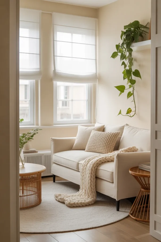
1. Warm Greige Walls With Cream and Caramel Accents for a Living Room That Always Feels Right
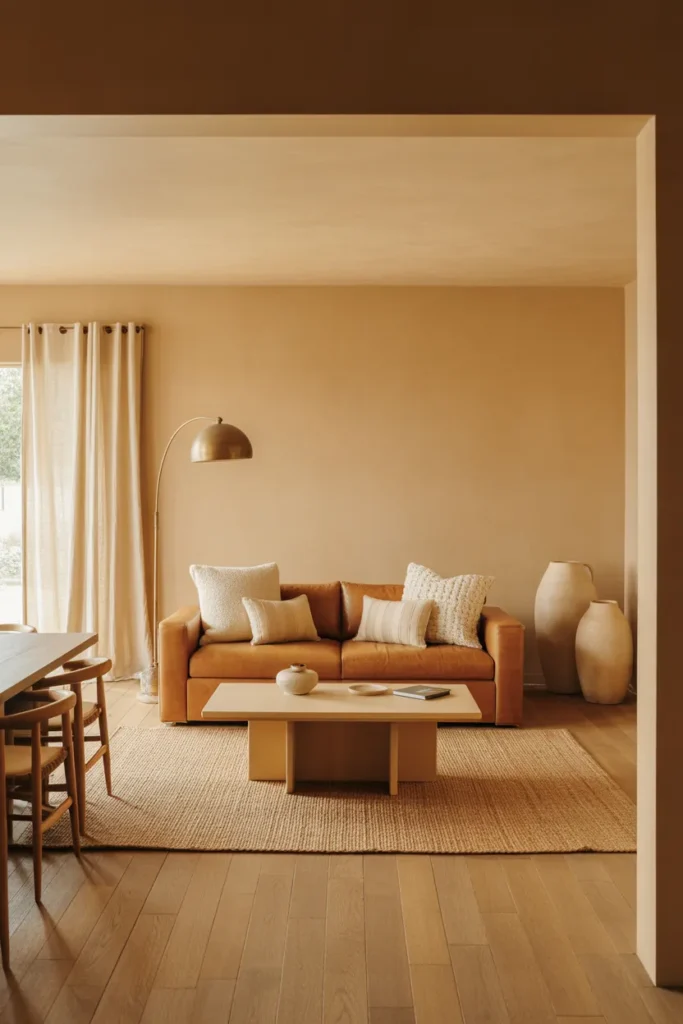
Warm greige — a brown-gray hybrid with a distinctly warm undertone — is the most reliably successful living room decor color for American homes across a wide range of architectural styles. It reads as neutral without feeling flat, connects naturally to wood tones, warm whites, and natural textiles, and holds up consistently across morning daylight, afternoon sun, and warm evening lamp light. It is the color that professional stagers reach for when they need a room to feel expensive and universally appealing.
The key to making greige work is pairing it with warm, not cool, accent colors. Cream upholstery, caramel leather, warm oak furniture, and honey-toned textiles all reinforce the warmth in the greige and create a layered, cohesive palette. Introducing cool accents — steel blue throw pillows, cool gray furniture, chrome fixtures — pulls the greige toward muddy and undermines its warmth.
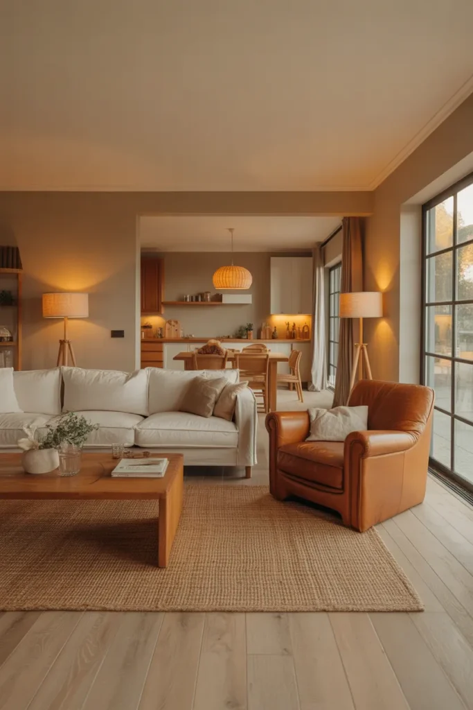

This direction is specifically well-suited to open-plan living rooms where the walls need to connect visually to the kitchen or dining area. Greige is one of the few wall colors that reads consistently across multiple connected zones without clashing with cabinetry, tile, or flooring in an adjacent room. It is the correct choice when you want the open plan to feel unified rather than like two rooms that happen to share a wall.
The most common greige mistake is choosing one with too much purple or pink undertone. Under warm artificial light, these undertones amplify significantly. Always test a large paint sample in your specific room under both daylight and evening lamp light before committing to the full room.
2. Deep Forest Green Walls in a Cozy Living Room That Feels Like a Luxury Hotel Suite
Deep forest green is the most impactful single living room decor color decision available for homeowners who want a room with genuine atmosphere and design confidence. It envelops the space in a way that no neutral can, creates an intimate quality that is specifically suited to living rooms used for evening relaxation, and pairs naturally with gold, brass, warm wood, and cream in a way that reads as genuinely luxurious.
Forest green works best in living rooms that receive good natural light during the day or have high ceilings that can absorb the depth of the color without feeling compressed. In a north-facing room with limited natural light, full forest green on all four walls can feel heavy by midday. In that situation, use forest green on three walls or the accent wall only, keeping the wall with the most natural light in a warm cream or off-white.
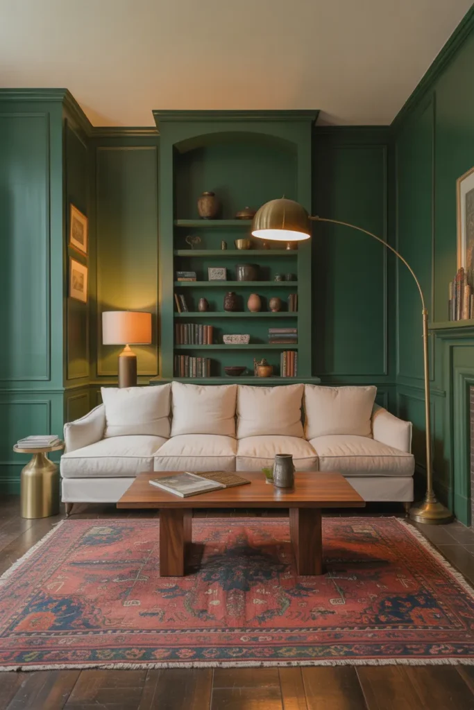
The furniture palette in a forest green living room should lean warm and contrast clearly with the wall. A cream or oatmeal sofa, a warm walnut or oak coffee table, and brass or aged gold light fixtures create the contrast the wall needs to read as intentional rather than dark. A sofa in a similarly deep tone — navy, charcoal, dark brown — will be consumed by the green and lose its own presence.
This color direction is appropriate for any living room layout — small apartments, large open plans, formal sitting rooms — but it performs especially well in rooms with traditional architectural details: crown molding, picture rails, built-in shelving, or fireplace surrounds. The green amplifies those details in a way that white or neutral walls do not.
3. Soft Terracotta Living Room Color That Creates Warmth Without Feeling Heavy
Terracotta is the most important warm color direction in living room decor color for 2026. It occupies a specific position between orange and brown that reads as earthy, grounded, and warm without the intensity of a saturated orange or the darkness of a rust. In a living room with natural light, terracotta walls shift through several beautiful tonal states across the day — appearing pale and sandy in the morning and deepening into a rich clay tone by late afternoon.
Terracotta is one of the few warm colors that works in a living room without requiring careful management of adjacent neutrals. It connects naturally to jute, linen, rattan, natural wood, cream plaster, and aged leather — all of which are organic materials that share terracotta’s earthy reference. This makes it one of the most cohesion-friendly colors available for decorating decisions that are made over time rather than all at once.
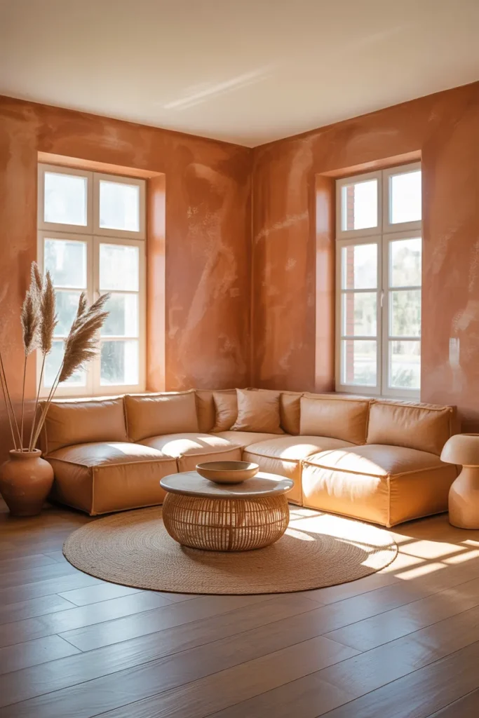
This direction is particularly well-suited to living rooms in homes with warm-toned flooring — terracotta tile, warm wood, or red brick — where a cool wall color would create a temperature conflict. The terracotta wall reads as a color family with the floor rather than competing with it, which gives the room a natural, unified quality from ground to ceiling.
The mistake to avoid is choosing a terracotta that is too orange. Test it in your room: a terracotta that reads orange in natural light will read fluorescent orange under warm evening lighting, which is difficult to live with daily. A terracotta with more brown and less orange in its base performs reliably across all lighting conditions and does not require constant management.
4. Navy Blue Living Room With White Trim and Natural Wood for a Timeless Contrast
Navy blue is the most versatile deep color in the living room decor color palette because it reads differently in different lighting conditions and different room contexts. In morning daylight it reads as crisp and clear. In the evening under warm lamps it reads as rich, deep, and enveloping. This range of reading is what makes it so livable — it never locks the room into a single mood the way brighter or more saturated colors do.
Navy on all four walls works best in rooms with strong natural light, white or cream trim details, and furniture in warm wood tones or light neutrals. The white trim is the essential counterbalance — it gives the navy a sharp edge that keeps the room from feeling dark, and it reinforces the classic, considered quality of the color combination. Navy with no trim contrast reads as heavy and unresolved.
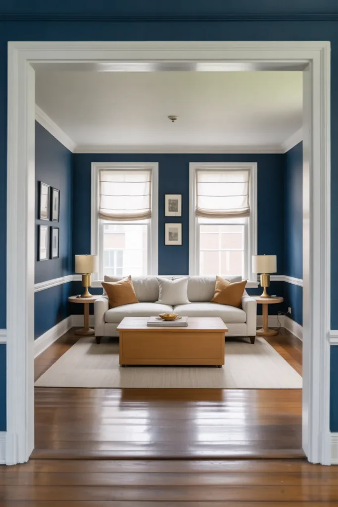
Natural wood furniture — a light oak or warm walnut coffee table, a wood-frame sofa, wood-legged side tables — introduces the organic warmth that navy needs to feel livable rather than cold. Navy is a cool color, and without a warm counterbalance in the furniture or textiles, it can feel more like a study or office than a comfortable living room.
For small living rooms with navy walls, the most important compensating decision is lighting. A small navy room with only one or two light sources will feel cave-like in the evening. Layer the lighting with a floor lamp, table lamps, and overhead fixtures, and use warm white bulbs throughout. Properly layered warm lighting in a navy room creates an intimate, cozy quality that is genuinely appealing in a small space.
5. All-White Living Room With Warm Texture Layers That Avoids the Cold and Clinical Trap
An all-white living room done correctly is one of the most sophisticated and enduring living room decor color approaches available — but it is also the most frequently executed incorrectly. An all-white room that uses only one shade of white, no texture variation, and no warm accent material reads as cold, clinical, and empty rather than clean and refined. The difference between a white living room that feels luxurious and one that feels sterile is entirely in the texture and material decisions made within the white palette.
True all-white decorating uses multiple shades and temperatures of white simultaneously. Warm white walls in a cream-white tone, an off-white linen sofa in a slightly different white, white boucle throw pillows in yet another texture and white tone, a white wool rug — each element is technically white but each reads differently from the others. This tonal layering within a single color family is what creates depth and interest in a monochromatic room.
The warm texture layer is what prevents the all-white room from reading as cold. Natural linen, chunky wool knits, raw cotton canvas, woven rattan, and unfinished or lightly oiled wood all introduce warmth within a white palette without introducing a contrasting color. These materials absorb and reflect light differently than smooth white surfaces, which is what creates the dimensional quality a successful all-white room depends on.
This color direction is one of the best small living room layout ideas for apartments and compact homes because white visually expands the space in a way no other color can. In a small room, the all-white approach with warm texture layering creates a room that feels generous and deliberate rather than cramped and defaulted to.
6. Warm Charcoal Living Room Color That Works as a Dark Neutral Without Feeling Heavy
Warm charcoal — a dark gray with a brown or warm taupe undertone rather than a cool blue-gray — occupies a unique position in the living room decor color spectrum. It reads as dark and dramatic from across the room but up close reveals a warmth that prevents it from feeling cold or oppressive. This warmth is what makes charcoal a livable dark color in a way that cool gray, black, or cool slate cannot match for most homeowners.
The warm undertone in charcoal is what determines whether the color succeeds in a living room. A charcoal with a green or blue undertone will shift cool and feel industrial or cold. A charcoal with a brown or red undertone will hold warmth even in rooms with limited natural light. Always identify the undertone before purchasing — hold a sample against a white surface in your room under both natural and artificial light.
Warm charcoal works as a functional living room color in open-plan layouts where it needs to read across a large space. It holds its presence at a distance in a way that medium-toned neutrals do not, which gives a large open-plan living room the visual weight and definition it needs. In a smaller, more enclosed living room, charcoal creates an intimate, enveloping quality similar to darker colors but with a gray-neutral quality that is easier to furnish around.
Furniture in a charcoal living room should lean either very light — cream, white, oatmeal — or very warm — cognac leather, warm wood, deep camel. The strong contrast between charcoal and cream creates a sophisticated graphic quality. The tonal harmony between charcoal and warm cognac or camel creates a rich, layered quality. Both work. The mistake to avoid is medium-toned gray or medium brown furniture, which gets visually consumed by charcoal walls and loses its presence in the room.
7. Dusty Sage Green Living Room That Reads as a Sophisticated Neutral With Color
Dusty sage green is the interior design world’s best answer to the question of how to have color in a living room without the commitment or risk of a saturated hue. It reads as a neutral in most lighting conditions — particularly in rooms with warm artificial light, where it shifts toward a warm gray-green that is almost indistinguishable from a standard warm neutral. In bright natural light, its green quality becomes more apparent, adding color and character to the room without dominating.
This duality — neutral in one light, colorful in another — is what makes dusty sage one of the most intelligent living room decor color choices for homeowners who want personality in their walls but are concerned about color commitment. It pairs with virtually every furniture and textile color available: cream, white, warm wood, rattan, terracotta, blush, navy, black, and brass all work naturally alongside a dusty sage wall.
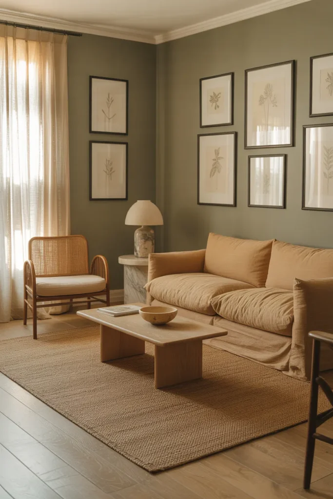
Dusty sage performs particularly well in rooms with natural wood floors and natural material furniture — rattan chairs, jute rugs, linen upholstery. These organic materials share sage’s earthy, natural register and create a room that feels cohesive without looking designed to a formula. This is one of the most popular living room color directions in the current American interior design landscape precisely because it works across so many different decorating styles simultaneously.
One important technical note: sage paint colors vary significantly in undertone. Some lean yellow-green, some lean blue-green, and some lean gray-green. In a room with warm wood floors and warm lamp light, a sage with too much blue will shift toward an unpleasant cool tone in the evening. A sage with a gray or yellow-green base performs more reliably across varied lighting conditions.
8. Two-Tone Living Room Color With a Dark Lower Half and Light Upper Half for Visual Architecture
The two-tone wall approach — painting the lower portion of the living room wall in a deeper, richer color and the upper portion in a lighter tone — is one of the most architectural and least utilized living room decor color strategies available. It creates the visual impression of paneling or wainscoting without the carpentry, adds vertical definition that single-color walls cannot deliver, and gives the room a designed, layered quality that reads as custom even when it is simply paint.
The dividing line between the two tones — called the chair rail line whether or not there is an actual rail present — typically sits between 32 and 36 inches from the floor, which is the height of the back of a dining chair and approximately one-third of the wall height in a standard eight-foot ceiling room. This proportion is not arbitrary: it places the darker, heavier color in the lower zone where visual weight belongs and the lighter color in the upper zone where visual lightness is more appropriate.
Color selection for the two zones should use tones from the same color family rather than contrasting color families. A deep terracotta lower half with a pale blush upper half reads as cohesive because both are in the same warm pink-red family. A deep charcoal lower half with a warm white upper half reads as classic and architectural. A forest green lower half with a sage green upper half creates a tonal depth that is sophisticated and unexpected.
This approach is one of the most effective small living room decor ideas because the visual division of the wall into two zones creates a sense of architectural complexity that makes the room feel more intentional and more generously proportioned than a single flat color on all surfaces.
9. Warm Camel and Cream Living Room Color Palette That Feels Expensive Without Being Loud
The camel and cream living room — where the primary palette is built from warm beige, camel, and ivory tones without any strong contrasting color — is one of the most refined and broadly livable living room approaches available. It is not a neutral room in the boring sense: camel has genuine warmth and depth that generic beige does not. But it is calm enough to work with almost any artwork, textile, or accent object without creating visual conflict.
The success of this palette depends on material variation rather than color variation. Because the colors are close in tone, the room’s interest comes from the textural difference between a smooth camel leather sofa, a nubby cream boucle throw, a woven camel wool rug, a glossy ceramic vase, and a matte plaster wall. Each surface reflects light differently and reads as a distinct material even within the same color family.
This is one of the most appropriate living room decor color strategies for open-plan homes where the living area connects to a kitchen with wood cabinetry or a dining room with warm wood furniture. The camel and cream palette shares a color family with warm woods, natural stone, and aged brass, which makes the open plan feel unified across zones.
The critical decision in a camel and cream living room is the rug. Because the palette is so tonal, the rug needs to anchor the seating arrangement with either a texture-rich natural fiber — a thick jute or sisal — or a subtle pattern in the same warm family. A rug with any significant cool tone — gray, blue, or cool white — will immediately conflict with the warmth of the surrounding palette and undermine the entire approach.
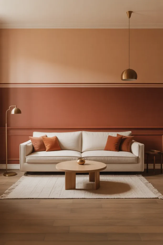
10. Bold Rust and Warm Black Living Room Color for a High-Contrast Maximalist Statement
The rust and warm black combination is the most confident and high-contrast direction in this living room decor color guide — and the one that requires the most deliberate decision-making to execute correctly. Rust — a deep orange-red with brown undertones — paired with a warm black that has a slight brown base creates a palette that is simultaneously bold and warm, dramatic and organic. It is the color combination that reads most dramatically in photographs and makes the strongest impression in person.
Rust as the dominant wall color and warm black as an accent — in furniture legs, lamp bases, curtain rods, or a single upholstered chair — is the most balanced distribution of these two colors. Reversing this — black walls with rust accents — creates a room that is significantly darker and requires more deliberate lighting management to feel comfortable rather than oppressive. The rust wall absorbs and reflects warm light in a way that black does not.
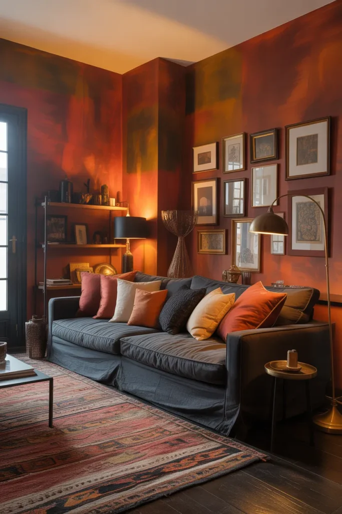
This combination is specifically suited to maximalist living rooms with layered textiles, mixed patterns, and a collected aesthetic. The rust and black palette has enough visual strength to anchor a room full of pattern and texture without looking chaotic. In a minimalist room with spare furniture and few accessories, the same palette may feel bare — the color combination needs material layering to reach its full potential.
For homeowners considering this direction in a small apartment living room, the key adjustment is scale. Use rust on a single accent wall rather than all four, and introduce warm black through smaller elements — lamp bases, hardware, a single black-framed mirror — rather than through large furniture pieces. This delivers the palette’s character and drama in a compressed space without the weight that full four-wall rust and dominant black furniture would create.
Final Thoughts
The right living room decor color is not the one that looks best on a screen — it is the one that works with your specific room’s natural light, your flooring, your furniture, and the way you use the space. The ten directions above cover the full range from barely-there warm neutrals to bold maximalist statements precisely because no single color approach works for every home and every lifestyle. The decision that matters most is not which color is most beautiful in isolation — it is which color is most livable in your specific room across every hour of the day.
Save this post before you move on. Whether you are choosing your first real wall color or reconsidering a room that has never felt quite right, having a concrete reference of well-considered color directions — with honest guidance on what each requires and what mistakes to avoid — will make your decision faster and more confident. If you are still working through furniture arrangement and layout decisions alongside your color choices, explore small living room layout planning guides and open-plan living room design resources to make sure your space functions as well as it looks.