Most sage green living room inspiration online looks beautiful in photos but skips the part that actually matters: which combinations work with your light, your furniture, and your room size. This post gives you 15 specific, decision-ready ideas with clear guidance on what to pair with sage green, when each approach works best, and what mistakes consistently ruin the look. Whether you are painting this weekend or planning a full refresh, you will leave with a clear direction.
1. Sage Green Sofa on White Walls: The Cleanest Entry Point Into the Color
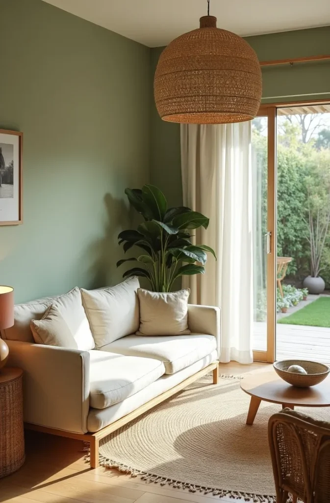
A sage green sofa against white walls is the lowest-commitment way to bring the color into a living room without touching a single wall. The sofa becomes the color anchor, and the white walls amplify it by providing a clean, neutral surround. This approach is ideal for renters, for rooms with strong existing architecture you want to preserve, and for anyone who wants to test the color before committing to paint.
The reason this works so reliably is proportion. In a standard living room, the sofa occupies roughly 30 to 40 percent of the visual field when you are seated across from it. That is enough color to establish a palette without saturating the space. White walls keep the room feeling open and allow you to change the surrounding accessories in future without repainting.
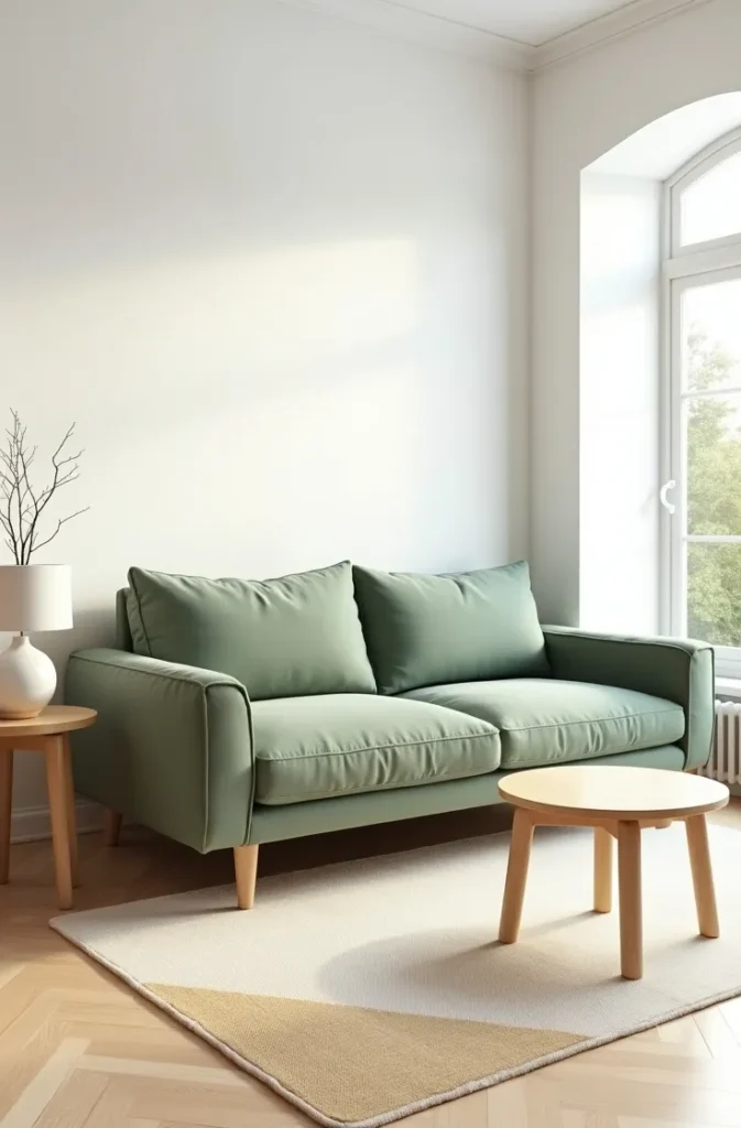

Choose a sage green sofa in linen, bouclé, or a woven performance fabric rather than leather. Leather in sage reads as cool and slightly clinical in a living room context. Fabric in the same color reads as warm and inviting because it absorbs light rather than reflecting it.
The most common mistake with this approach is leaving the remaining room too cold and bare. A sage sofa on white walls needs warmth introduced through a wood coffee table, warm-toned rug, or natural fiber throw to prevent the room from feeling like a showroom rather than a lived-in space.
2. Sage Green Walls With a Warm Cream Sectional: A Full-Room Commitment That Stays Livable
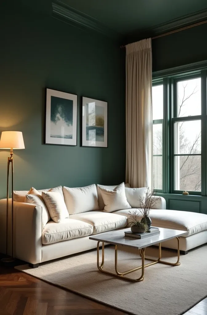
Painting all four living room walls in sage green and anchoring the room with a large cream or warm ivory sectional is one of the most cohesive sage green living room ideas for homeowners who want an immersive, enveloping space. The cream sectional provides the visual relief the room needs to avoid feeling heavy, and its size ensures the sofa holds its own against the fully colored walls.
This combination works because both colors sit in the same warm-neutral family. Sage green with warm gray-green undertones and cream with yellow undertones share a soft warmth that makes them feel naturally paired rather than deliberately matched. The result is a living room that feels considered and settled without looking designed to within an inch of its life.
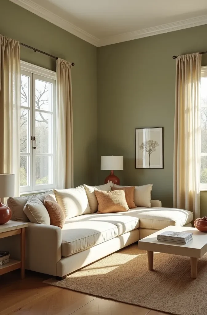
Use this approach in living rooms with good natural light, at least two windows or a south-facing exposure. Full sage green walls in a dim room will read as olive or khaki rather than the clear, restful sage you see in photos. If your living room is north-facing or has limited windows, use this combination on three walls only and keep the fourth wall, typically the one facing the main window, in a lighter off-white to bounce light back into the room.
Avoid choosing a cream sectional with stark cool-white upholstery. The contrast between a blue-white sofa and warm sage walls will look mismatched in person even if both colors appear neutral in isolation. Always test fabric swatches against your paint chip in the actual room before purchasing.
3. Sage Green Accent Wall With a Gallery: Turning One Wall Into a Full Design Moment
A sage green accent wall combined with a curated gallery arrangement is one of the most photographed sage green living room ideas because it solves two problems at once: it delivers color and it fills a large blank wall with purpose. The gallery adds detail and personalization that a plain painted wall cannot provide on its own, and the sage green background unifies the varied frame sizes and artwork into a single cohesive composition.
Position the gallery wall behind the primary sofa or on the wall the sofa faces, not on a side wall that is only visible from one seat in the room. The focal wall should be the one your eye travels to first when entering the space. Placing the gallery on a secondary wall reduces its impact significantly.
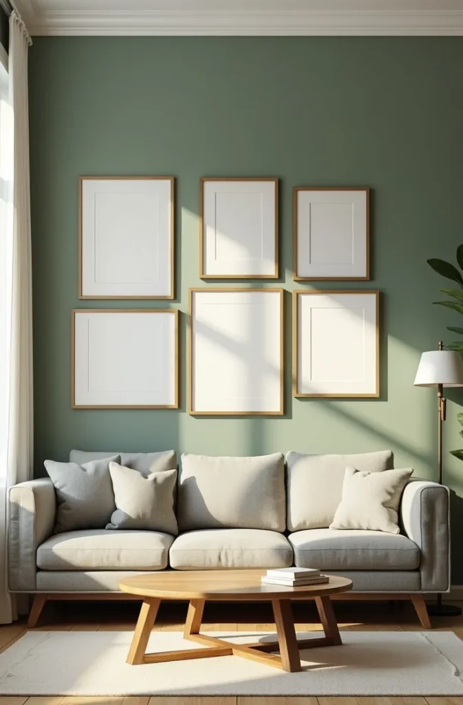
Use frames in warm metals such as brushed gold or antique brass, or in natural wood tones, against the sage green. Black frames also work but create a sharper, more graphic contrast that suits modern and industrial interiors rather than warm or transitional ones. Mix frame sizes but keep the mat color consistent across all pieces. Consistent matting is what makes a mixed gallery look intentional rather than random.
The most common mistake is hanging the gallery too high. Art and gallery arrangements should be centered at approximately 57 to 60 inches from the floor, which is standard gallery height and corresponds to the average human eye level. Many homeowners hang things a full 6 to 8 inches too high, which disconnects the art from the furniture below and makes the ceiling feel lower.
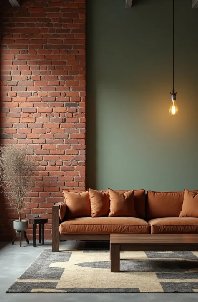
4. Sage Green and Terracotta Living Room: The Earthy Duo That Always Photographs Well
Sage green and terracotta is one of the most consistently successful sage green living room color combinations because both colors originate from the natural landscape and share the same warm, matte, earthy register. They do not compete. They coexist in the same visual family, which means the combination feels effortless in a way that contrived complementary pairings rarely do.
In a living room, apply this combination with sage on the walls and terracotta introduced through ceramics, throw pillows, a clay pot planter, or a textured terracotta-toned area rug. Keep the terracotta as an accent at no more than 15 to 20 percent of the overall color in the room. When terracotta and sage appear in equal measure, neither color functions as a restful backdrop. One must lead and the other must support.
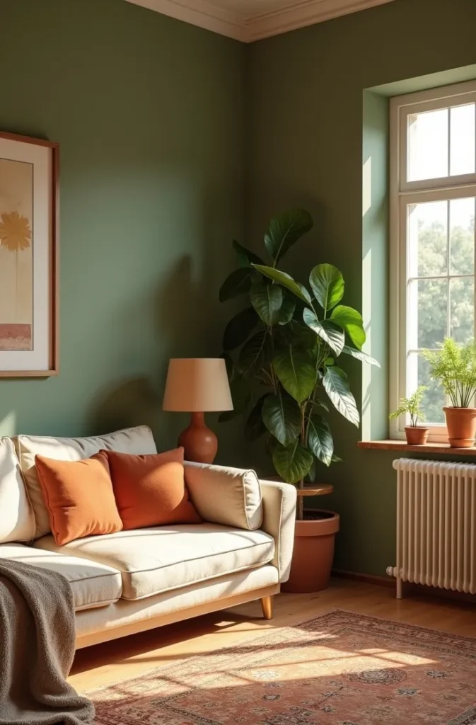
This pairing is especially strong in living rooms with warm afternoon light from west-facing windows. The golden-hour quality of late afternoon light deepens the terracotta accents and softens the sage walls into a warmer, more amber-influenced tone that makes the room feel genuinely inviting rather than designed.
Avoid using bright orange alongside this combination. True terracotta is a muted, dusty red-orange with significant brown or clay content. Bright orange reads as primary and energetic, which is the opposite of what this palette is designed to create. If you are unsure whether a terracotta is the right tone, hold it next to an unglazed clay pot. If it matches, you have the right color.
5. Sage Green With Natural Rattan and Wicker: A Textural Combination for Organic Modern Rooms
Pairing sage green walls or upholstery with natural rattan and wicker furniture introduces texture and material warmth that transforms the color from a flat wall choice into a full material story. Rattan and wicker share the same organic, handcrafted quality that makes sage green feel grounded rather than decorative. Together they create what designers describe as an organic modern interior, one that prioritizes natural materials over sleek finishes.
Use rattan in the supporting furniture pieces rather than the primary sofa. A rattan armchair, a woven wicker side table, or a rattan pendant light all introduce the material without making the room feel too casual or beach-adjacent. The sofa should remain upholstered in a solid neutral, cream, white, or warm oat, to provide a clean visual anchor.
This combination works particularly well in living rooms that connect to outdoor spaces such as a patio, a sunroom, or a garden. The natural material palette bridges indoor and outdoor in a way that painted walls alone cannot, creating a sense of continuity from inside to outside that makes both spaces feel larger.
Avoid using rattan and wicker furniture that is bleached or painted. Painted rattan in white or gray loses the material warmth that makes it work in this palette. Natural, unfinished, or lightly honey-toned rattan is always the right choice alongside sage green.
6. Dark Sage Green Living Room: How to Use the Deep Version Without Losing Light
Dark sage green, sometimes described as deep sage, eucalyptus, or forest sage, is a richer, more saturated version of the color that creates a dramatically different atmosphere than lighter sage. In a living room, dark sage walls produce a cocooning, library-like quality that is genuinely restful for evening use but requires careful management to avoid feeling dim or heavy during the day.
The key to making dark sage work in a living room is contrast. Pair it with very light furnishings, cream or white upholstery, pale natural wood, and warm metal hardware in brass or gold. The contrast between the deep wall color and the light furniture prevents the room from closing in visually. Without sufficient light-toned furniture, dark sage walls will absorb the available light and the room will feel like a basement regardless of the time of day.
This approach is best suited to living rooms with large windows, high ceilings, or both. A small, low-ceilinged living room with dark sage on all four walls will feel oppressive rather than cozy. In that scenario, limit the dark sage to one wall and keep the remaining walls in a lighter tone that reads as coordinating rather than contrasting.
Deep sage green living rooms photograph exceptionally well in evening light with warm lamp tones. If the primary use of your living room is evening entertaining or relaxed evening viewing, dark sage walls may actually improve the experience of the space during the hours you use it most.
7. Sage Green Living Room With White Shiplap: A Modern Farmhouse Combination That Holds Up
Sage green paint combined with white shiplap paneling on one or more walls is one of the most enduring sage green living room ideas in the modern farmhouse and transitional categories. The shiplap introduces texture and architectural interest that flat drywall cannot provide, and the white of the shiplap against sage green paint creates a natural, built-in contrast that prevents the room from reading as monotone.
Apply shiplap horizontally on the primary focal wall and paint the remaining walls in the same sage green. This creates a feature wall that is textural rather than colorful, which is a more subtle and long-lasting approach than using a different paint color on the accent wall. The room reads as a unified sage palette with one wall that has added dimension.
This combination works in open-plan living areas, ranch-style homes, and any space with exposed wood beams or other natural material details. The shiplap reinforces the farmhouse or organic aesthetic that those architectural elements suggest. It is a less suitable choice for formal, traditional, or European-inspired interiors where the casual quality of shiplap would read as a stylistic mismatch.
Install shiplap boards with a consistent gap of one quarter inch between each plank. Gaps that are too wide start to look like exterior siding. Gaps that are too narrow eliminate the shadow line that gives shiplap its distinctive texture. The quarter-inch gap is the standard that produces the intended interior effect.
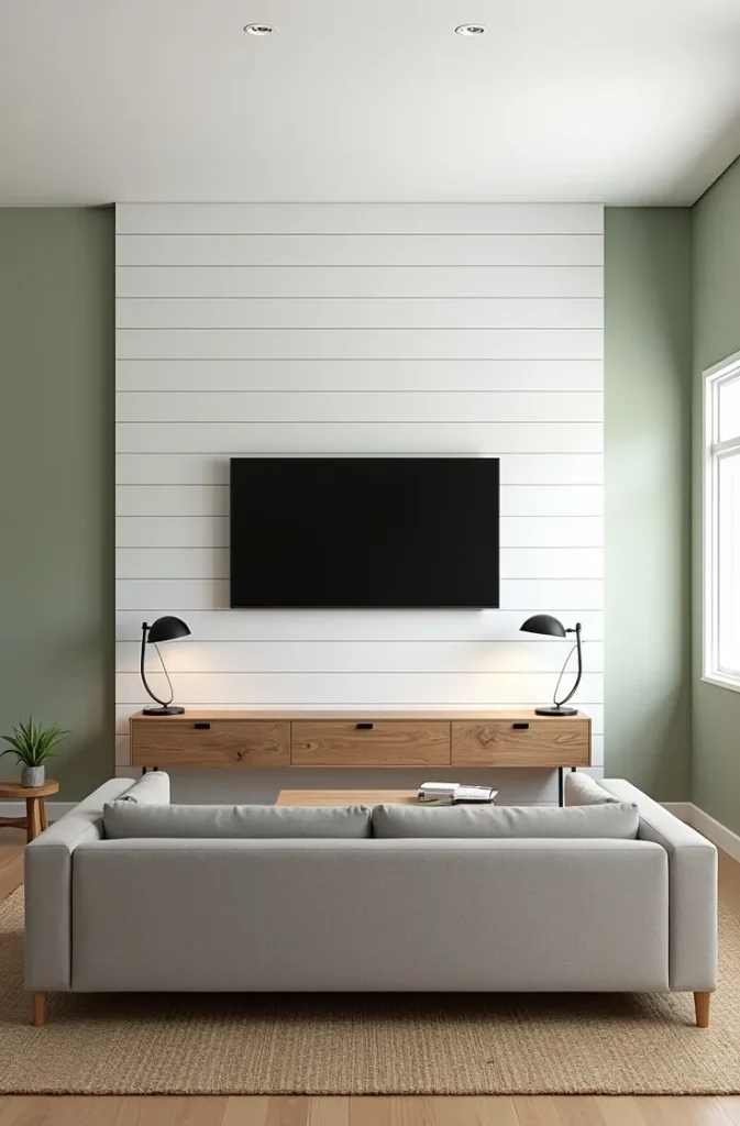
8. Sage Green Living Room in a Small Apartment: Making the Color Work in Compact Spaces
Sage green in a small apartment living room requires a different approach than sage in a large open-plan space. The goal is to use the color in a way that adds personality and warmth without reducing the perceived size of the room. This means keeping sage green primarily in furnishings and soft goods rather than on all four walls, and maintaining light, reflective surfaces elsewhere to compensate.
The most effective approach for a small sage green living room is a sage green sofa or loveseat against a white or off-white wall, paired with a large light-toned rug that anchors the seating area. The rug should be large enough to sit under all front legs of the sofa and chairs, at minimum 8 by 10 feet in a standard apartment living room. An undersized rug is the single most common mistake in small living rooms and it makes the space feel fragmented rather than cohesive.
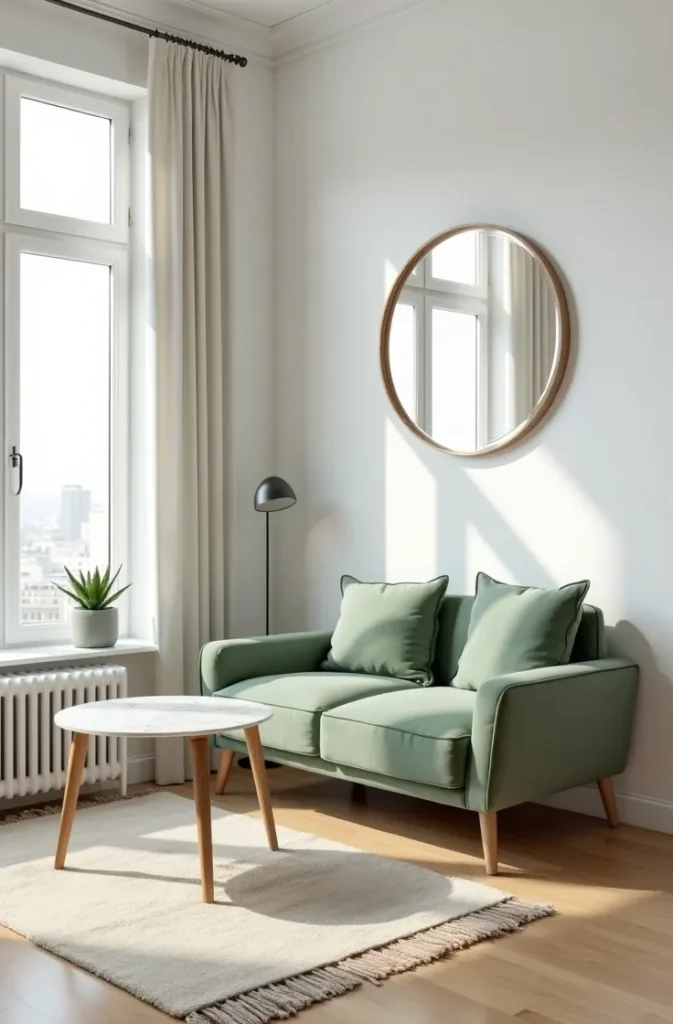
Add one sage green throw pillow or small ceramic object to connect the sofa color to the rest of the room, but resist the urge to add more green beyond that. In a small space, a single color used in two or three places is enough to establish a palette. More repetitions start to feel forced.
Mirrors are a practical addition in this scenario. A large mirror on the wall opposite the main window reflects both natural light and the sage tones in the room, which deepens the color presence without adding more painted surface area.
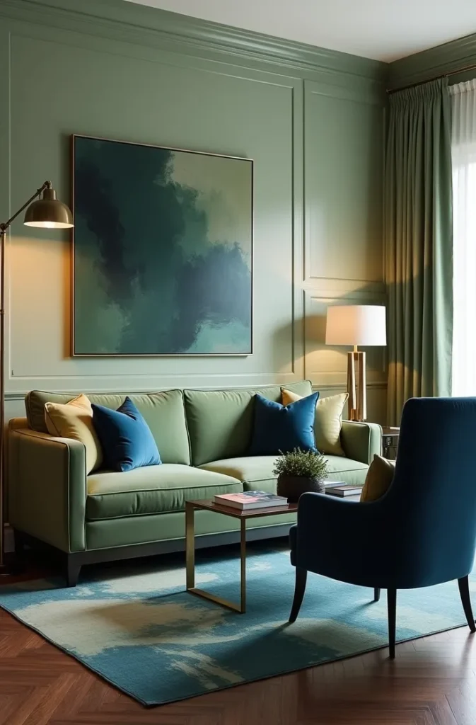
9. Sage Green With Navy Blue Accents: A Sophisticated Two-Tone Palette for Confident Rooms
Combining sage green with navy blue is one of the more sophisticated sage green living room color combinations because it moves the palette from neutral and restful into something with genuine visual authority. Both colors share a cool, recessive quality that makes them work in the same space without competing, and navy provides the depth and contrast that sage alone can sometimes lack.
Use sage as the dominant wall color and introduce navy through one or two upholstered pieces, throw pillows, or a large area rug with navy as a primary color. A navy blue velvet armchair in a sage green living room is one of the cleanest expressions of this combination. The two colors reinforce each other without either overwhelming the space.
This pairing suits formal living rooms, home offices that double as sitting rooms, and any space with a traditional or transitional design sensibility. It is a less suitable choice for casual, family-use living rooms where the formality of the palette can feel at odds with the function of the space.
Keep metallics warm. Brushed brass, antique gold, and warm bronze all work in this palette. Chrome and cool silver introduce a third cool tone that destabilizes the combination. The warm metal acts as a bridge between the two dominant colors and prevents the room from reading as too cool overall.
10. Sage Green Living Room With Exposed Brick: Urban and Organic in Equal Measure
Sage green paint on the walls of a living room with an exposed brick wall creates one of the most naturally balanced compositions in residential interior design. The two surfaces share the same organic, imperfect quality: brick is rough and warm, sage is muted and natural. Together they produce a room that feels genuinely layered rather than decorated, which is particularly appealing in loft apartments, converted industrial spaces, and older urban homes.
In this scenario, leave the brick wall unpainted and apply sage to all other walls. The brick functions as the accent wall not through color contrast but through material contrast, which is a more sophisticated and architecturally authentic approach. Paint on the surrounding walls in sage green will actually warm the brick by reflecting a slightly green-tinted light back onto its red tones, producing a subtle olive quality in the brick that deepens the overall palette.
Pair the brick and sage with natural wood furniture in warm walnut or dark oak tones to reinforce the organic material story. Avoid modern lacquered or high-gloss furniture in this context. The combination of brick and sage green calls for furniture with visible grain, weight, and material honesty.
This is one of the most effective open-concept living room ideas for urban apartments and city homes where the existing architecture is a defining feature. Working with the brick rather than covering it is always the stronger choice when the brick quality is good.
11. Sage Green Living Room With a Fireplace: Anchoring Color Around an Architectural Feature
A fireplace is one of the most powerful architectural anchors in a living room, and sage green is one of the most effective colors for framing it. Painting the fireplace wall in sage green while keeping the remaining walls neutral draws the eye toward the fireplace and reinforces it as the room’s focal point. The color adds visual weight that underscores the importance of the feature without requiring additional decoration.
If the fireplace has a painted surround or mantel, paint it in crisp white or warm cream to create contrast against the sage wall. The white mantel will stand out clearly and add the architectural definition that makes the fireplace feel like a designed element rather than a functional afterthought. Avoid painting the mantel in the same sage as the wall, as this will visually flatten the projection of the mantel and reduce the depth of the composition.
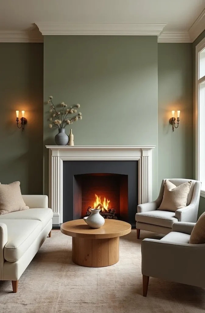
Style the mantel with objects in warm metals, natural ceramics, and organic shapes. Tall candlesticks, a simple clock, a small plant, and a single framed print above the fireplace provide enough interest without creating clutter. The rule for mantels is odd numbers: three or five objects arranged at varying heights, always leaving visual breathing room between each piece.
This approach works in any living room with a functioning or decorative fireplace, from traditional colonial homes to modern urban apartments with gas insert fireplaces. The color framing technique works regardless of the fireplace style as long as the mantel color provides contrast.
12. Sage Green Living Room With Linen Curtains: How Soft Furnishings Complete the Palette
Floor-length linen curtains in white, ivory, or a warm natural linen tone are the single most effective soft furnishing addition to a sage green living room because they introduce movement, texture, and softness that painted walls and upholstered furniture cannot provide. Curtains that pool slightly on the floor add a quality of luxury and finish that short or tailored curtains in the same room would not.
In a sage green living room, choose curtains in a color that is close to but distinct from the wall color. White linen curtains against sage walls create clean contrast. Natural undyed linen curtains in a warm flax tone add warmth that bridges the sage walls and the wood tones in the furniture. Avoid curtains that match the wall color exactly. A perfect color match between curtain and wall will make both look washed out rather than coordinated.
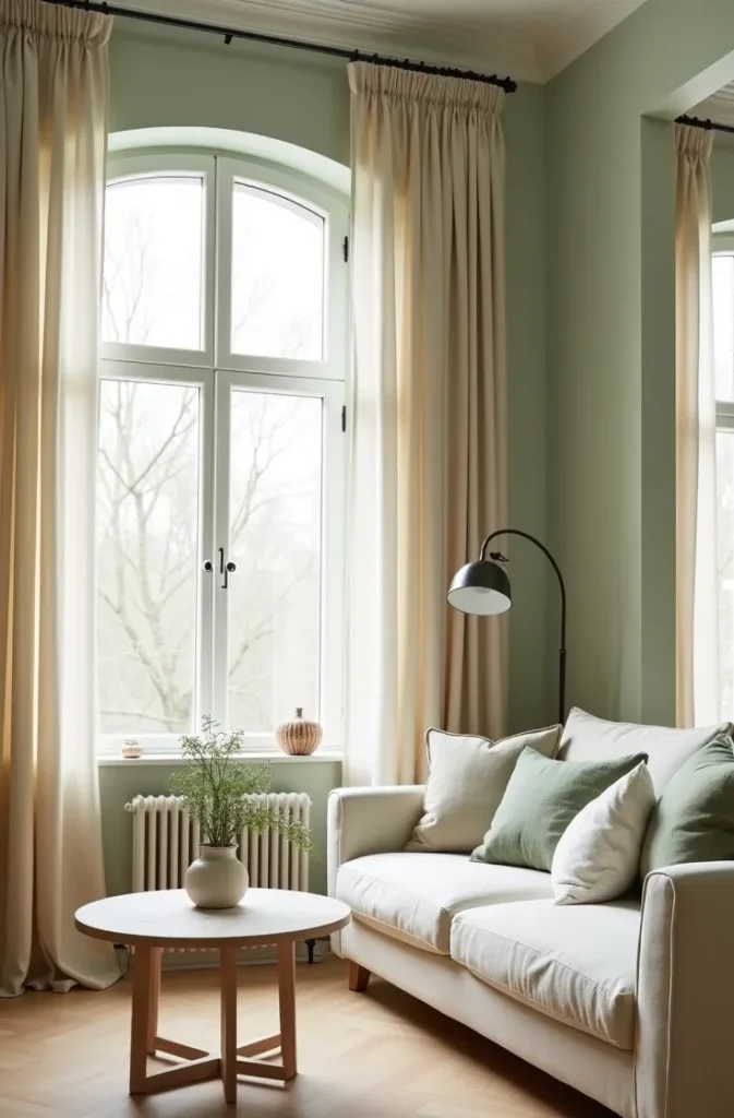
Hang curtains as high as possible, ideally within 4 to 6 inches of the ceiling, and extend the rod 10 to 14 inches beyond the window frame on each side. This makes the windows appear larger than they are, maximizes the amount of natural light when the curtains are open, and gives the curtains the full, sweeping quality that makes a room feel finished. Short curtains that only reach the window frame are one of the most common and most visually reductive mistakes in American living rooms.
Linen curtains work in almost every sage green living room context, from minimal Scandinavian to warm traditional. Their natural texture and soft drape are universally compatible with the organic quality that sage green brings to a space.
13. Sage Green Open-Plan Living Room: Managing Color Across a Connected Space
An open-plan living room that connects to a kitchen, dining area, or hallway presents a specific challenge: how far do you take the sage green? Painting the entire open floor plan in sage green creates cohesion but risks making a large space feel like a single undifferentiated room. Limiting sage to one zone, such as the living area only, can create an abrupt color break that feels awkward at the transition point.
The most effective approach in an open-plan space is to use sage green on the living area walls and transition to a coordinating neutral in the adjacent spaces. A warm white or a greige that picks up the warm undertone of the sage works well at the transition. The key is that the neutral must share the same undertone family as the sage. A cool gray-white next to a warm-undertone sage will clash at every viewing angle.
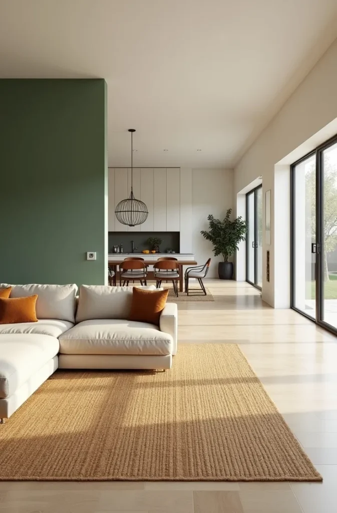
In open-plan spaces, the furniture arrangement does as much work as the paint color in defining the zones. A large area rug in the living zone, kept within the sage green walls, creates a physical boundary that reinforces the color boundary. Without the rug, the sage walls and the kitchen walls blur together in the visual field regardless of how well the colors are matched.
This is one of the most practical considerations for anyone searching for sage green living room ideas in modern homes, where open-plan layouts are the norm rather than the exception. The color transition strategy is as important as the color choice itself.
14. Sage Green Living Room With Velvet Accents: Adding Depth Through Material Contrast
Sage green walls or a sage green sofa paired with velvet accent pieces in complementary tones creates a living room that reads as layered and elevated without requiring expensive furniture or complex design decisions. Velvet introduces light-catching depth that flat linen and cotton upholstery cannot produce, and in a palette built on muted, organic tones, that shimmer adds just enough luxury to lift the room.
Use velvet in the accent chairs, throw pillows, or a small ottoman rather than in the primary sofa. A velvet sofa is a high-commitment piece that limits your future flexibility. A velvet accent chair or a set of velvet throw pillows in dusty rose, warm ochre, or deep rust alongside sage green walls gives you the material richness without the long-term constraint.
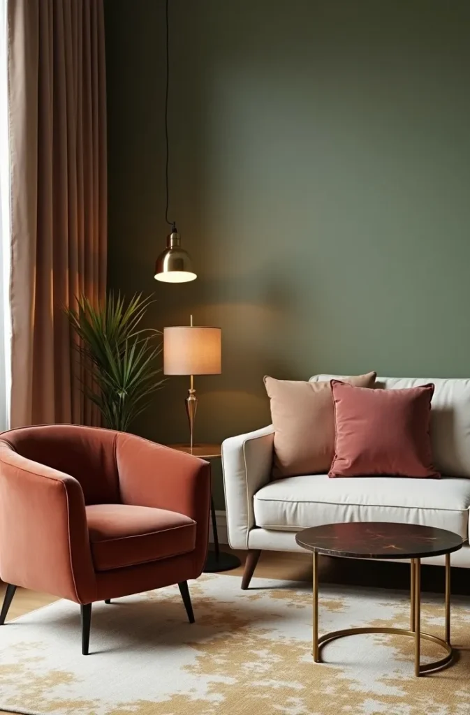
The complementary colors that work best with sage green in velvet are those in the warm, dusty family: blush, mauve, rust, ochre, and warm cognac. These tones share the same slightly muted, desaturated quality as sage itself, so they coordinate without clashing. Bright or saturated velvets in jewel tones such as cobalt, emerald, or deep purple will compete with sage rather than complement it.
This combination is particularly effective for living rooms that are used in the evening, as velvet performs its best quality, the soft shimmer and shift of pile direction, under warm lamp light rather than in bright midday sun. If your living room is primarily an evening space, velvet accents are one of the most value-effective additions you can make.
15. Sage Green Living Room With Plants: Using Greenery to Extend the Color Into Three Dimensions
Sage green walls and live plants create one of the most naturally coherent combinations in interior design because the color choice and the living objects share the same visual source: the natural world. Plants placed strategically in a sage green living room reinforce the palette without adding a new color, and they introduce scale, movement, and organic form that no manufactured object can replicate.
Use plants at multiple heights to create visual depth. A large floor plant such as a fiddle-leaf fig or a tall snake plant in one corner provides vertical scale. A mid-height trailing pothos or philodendron on a plant stand adds movement at mid-level. A small succulent or herb on the coffee table or windowsill grounds the composition at seated eye-level. Three heights, three scales, one cohesive green story.
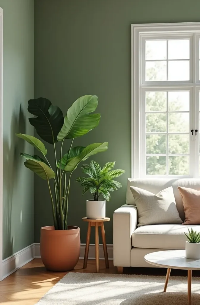
The planter choice matters as much as the plant itself. Terracotta pots reinforce the earthy palette and warm the green tones. Matte white planters keep the room feeling clean and minimal. Woven basket planters add natural fiber texture that connects to rattan and jute furniture. Avoid glossy or brightly colored planters, which draw attention to themselves rather than the plant and interrupt the calm, organic quality of the palette.
This is one of the most practical sage green living room ideas for anyone who wants the color to feel like a design decision rather than a trend response. When the wall color and the living elements share the same natural logic, the room feels grounded in a way that purely decorative choices cannot achieve.
Final Thoughts
These 15 sage green living room inspiration ideas cover the full spectrum from a single sage green pillow in a white apartment to a fully immersive dark sage room with velvet accents and warm firelight. The color is versatile enough to work in formal traditional rooms, casual open-plan family spaces, small urban apartments, and large suburban homes. What determines the outcome is not the color itself but the specific combination of shade, material, light, and proportion you choose around it.
Save this post before you paint or shop. The most common reason a sage green living room does not turn out the way someone envisioned is that decisions were made in isolation: the wall color chosen without considering the sofa, the sofa chosen without considering the rug, the rug chosen without considering the light. A reference point that shows you the full composition at once prevents that fragmented approach.
For more room-specific color guidance that goes beyond inspiration and into practical decision-making, explore posts on sage green bedroom ideas, warm neutral living rooms, and earthy open-plan color strategies.